




15 Ways to Give a U-Shaped Kitchen With a Peninsula an Open-Concept Feel
If you’ve been scrolling past open-concept kitchens wondering how your boxed-in U-shape could ever look like that, you’re not alone. The good news is you don’t need to touch a wall...

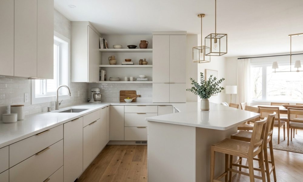
If you’ve been scrolling past open-concept kitchens wondering how your boxed-in U-shape could ever look like that, you’re not alone. The good news is you don’t need to touch a wall to get most of that feeling. This works best for U-shaped or galley kitchens with a peninsula already separating the cook space from a living or dining area. It won’t help if your peninsula is on an exterior wall with no view beyond it at all; in that case, the fix is more about light than sightlines. Here’s the counter-intuitive part: opening up a closed kitchen usually has less to do with removing something and more to do with what you let the eye travel past. These 15 ideas focus on exactly that.
U shaped kitchen with peninsula ideas refers to design and styling adjustments made to the connecting peninsula counter in a U-shaped kitchen so it visually bridges the cook space to the room beyond it. It’s less about demolition, more about sightlines, seating, and light.
If you’ve got a few extra feet of clearance, some homeowners do go with a full U-shaped kitchen layout with island instead of a peninsula, but this list is built for tighter footprints where an island simply won’t fit without blocking the walkway.
Layout and Sightline Fixes That Open the View
To make a U-shaped kitchen with a peninsula feel open, follow these steps:
- Lower or thin out anything at eye level along the peninsula
- Choose seating that doesn’t block the sightline into the next room
- Round or soften any hard edge that visually stops the eye at the counter.
1. Lower the Peninsula Ledge on the Living-Room Side to Counter Height
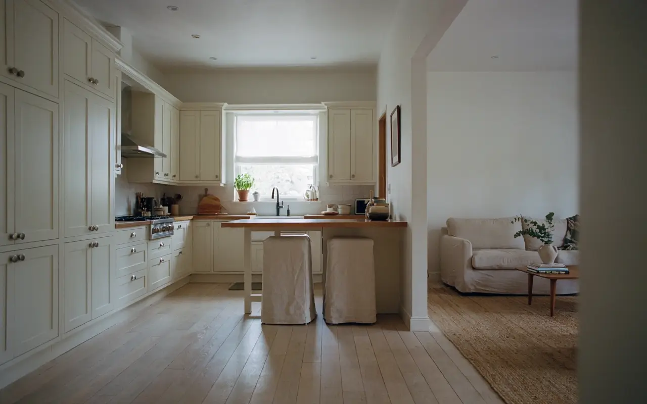
The problem is usually a raised bar-height ledge that acts like a visual wall, blocking the view into the living room even though there’s no actual wall there. Dropping that ledge to standard counter height opens a clean, uninterrupted line of sight from the sink straight through to the couch.
My read is this works best when the raised ledge was only ever hiding a small appliance garage or a messy counter; check what’s underneath before you commit. A warm wood cap on the new lower edge keeps it from feeling stripped-down.
2. Tuck Three Low-Back Stools Under the Peninsula Overhang
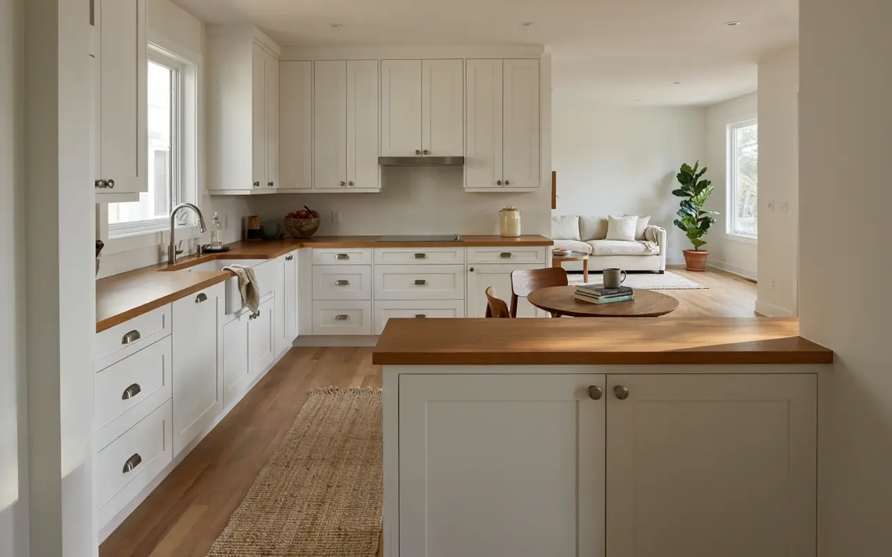
A tall-backed bar stool can block more of the sightline than the peninsula itself, which defeats the whole purpose of opening the layout up. Swapping in low-back or backless stools that tuck fully under the overhang keeps the view clear when nobody’s sitting there.
This is the detail that makes peninsula kitchen with seating layouts actually photograph as open rather than cluttered. Woven or cane seats add warmth without adding visual weight, and pushing them flush under the counter means the whole run reads as one clean line from across the room.
3. Trade Solid Upper Cabinets on the Peninsula Wall for Glass-Front Doors
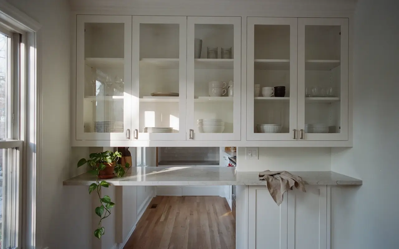
Solid upper cabinets on the peninsula-facing wall create a heavy, closed-off ceiling line that makes the whole kitchen feel shorter and boxier than it is. Swapping just those doors for glass-front panels lets light and sightlines pass through instead of stopping dead at a solid door.
IKEA SEKTION cabinet frames make this an easy swap since glass-front door options fit the same boxes already installed. Style the shelves behind the glass with a few plain white dishes instead of a packed shelf; the point is openness, not more visual noise.
4. Round Off the Peninsula’s Sharp Corner So the Path Feels Wider
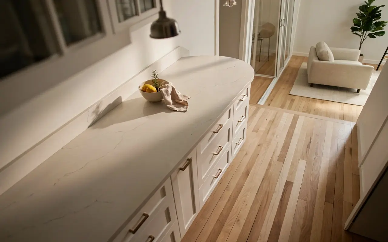
A hard 90-degree peninsula corner is the exact spot people bump into, and visually it reads as a stop sign at the edge of the kitchen. Rounding that corner, even slightly, softens the transition and makes the walkway toward the living space feel wider than it measures.
Some fabricators can bullnose an existing quartz edge without replacing the whole slab, which keeps this affordable. It’s a small fix, but it’s the kind of detail that makes a tight galley feel like it was actually designed, not just built around a wall.
Quick Comparison
| Option | Best For | Key Benefit | Limitation |
|---|---|---|---|
| Lower peninsula ledge | Kitchens with a raised bar-height counter | Opens a clear sightline into the next room | May expose what was hidden underneath |
| Glass-front uppers | Boxy peninsula walls with solid doors | Lets light and view pass through | Requires tidier, curated shelf styling |
| Rounded counter edge | Tight walkways with a hard 90° corner | Softens the path, feels wider | Small fix, won’t solve a truly cramped layout |
| Low-back stools | Any peninsula with bar seating | Keeps sightline clear when seats are empty | Less back support than a tall stool |
Some designers will tell you the only real fix for a closed U-shaped kitchen is removing a wall entirely. That’s fair advice if your budget and the wall’s structural role both allow it. For most galley layouts, though, these sightline adjustments close much of that visual gap for a fraction of the cost, and a wall doesn’t have to come down for a kitchen to stop feeling boxed in.
Lighting That Bridges the Kitchen to the Next Room
5. Hide a Warm LED Strip Under the Peninsula Overhang
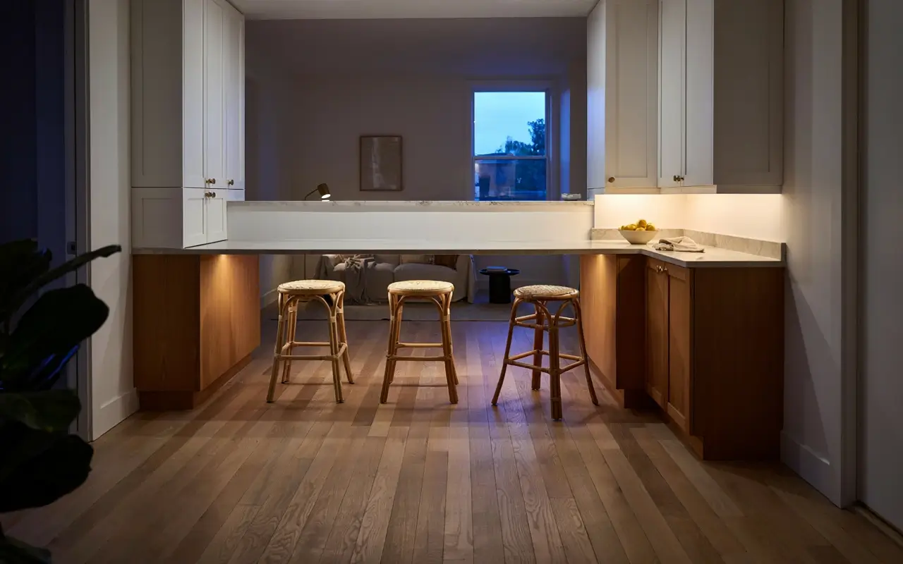
A dark, shadowed underside on the peninsula makes the whole counter feel heavier and more closed-off, especially at night. Running a warm-toned LED strip along the underside washes the floor in soft light and makes the peninsula feel like it’s floating rather than boxing the kitchen in.
This is one of those upgrades that costs very little but shows up in almost every “galley feels bigger” transformation pin. Keep the color temperature warm, not bright white; cool light flattens the wood tone instead of glowing with it.
6. Hang a Cluster of Low Woven Pendants Over the Peninsula Corner
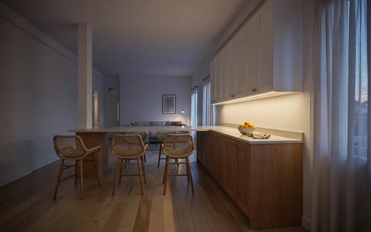
A single centered light over the whole kitchen does nothing to mark the peninsula as its own zone, which is part of why the space can feel like one flat, undefined room. Clustering two or three low-hung woven or glass pendants specifically over the peninsula corner signals “this is the bridge point” without adding a wall.
Hang them low enough to sit just above eye level when seated, and match the shade material to the wood tone on the peninsula for a pulled-together look. It’s a small styling move that reads instantly as intentional in photos.
Storage and Cabinet Moves That Don’t Sacrifice Space
7. Replace the End Cabinet With a Single Floating Shelf
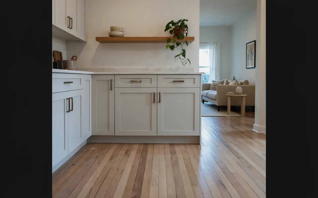
A full-height end cabinet at the tip of the peninsula is often the single bulkiest object blocking the view into the next room. Pulling it and replacing it with one floating shelf keeps a landing spot for everyday items without the visual weight of a closed box.
Style it with a small stack of bowls or a single plant instead of a row of objects; one open shelving wall styled sparingly reads as designed, while a packed one just looks like more storage moved sideways.
8. Wrap the Peninsula Base in Warm Wood While Keeping the Perimeter White
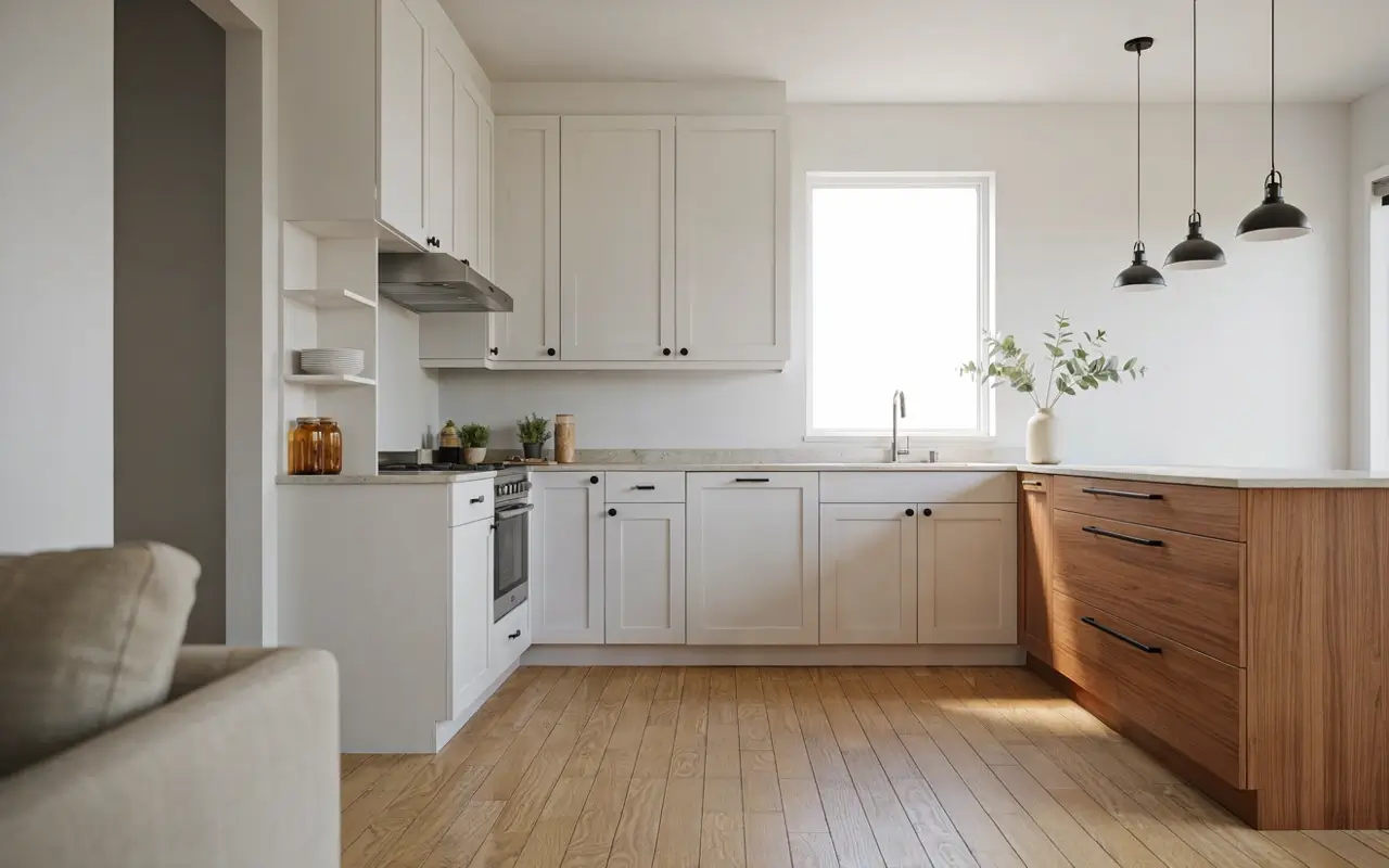
When every cabinet in the kitchen is the same tone, the peninsula disappears into the rest of the room instead of reading as its own transitional feature. Wrapping just the peninsula base in a warm wood tone, while keeping the U-shaped perimeter cabinetry white or soft sage, visually separates “cook zone” from “bridge zone” without a single wall.
Swap in brass or matte black hardware on the peninsula only for a subtle contrast point, and let the perimeter hardware stay simple so the peninsula reads as the visual anchor.
9. Slide a Narrow Pull-Out Pantry Into the Peninsula’s End Panel
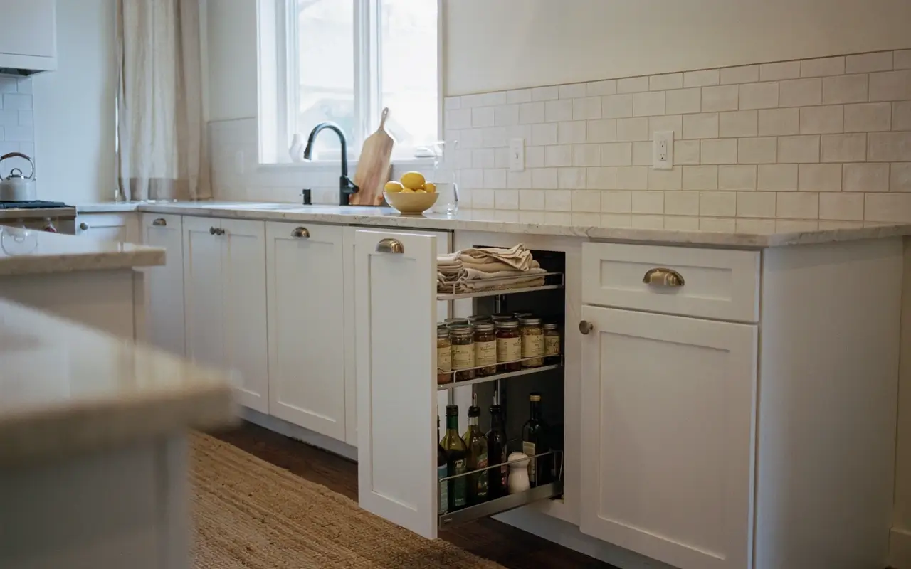
Losing a wall doesn’t have to mean losing storage, but that’s exactly what homeowners fear most about opening up a galley kitchen. A narrow pull-out pantry built into the peninsula’s end panel adds a full column of storage for oils, spices, and canned goods without adding a single visible cabinet face.
According to the National Kitchen & Bath Association’s 2025 Kitchen Trends Report, most industry professionals say homeowners now want pantries and storage tucked behind clean cabinetry rather than left in view, and this is exactly that instinct applied to a tight footprint.
Splurge-Worthy Upgrades Worth the Investment
10. Add a Waterfall Quartz Edge to Just the Peninsula’s Open End
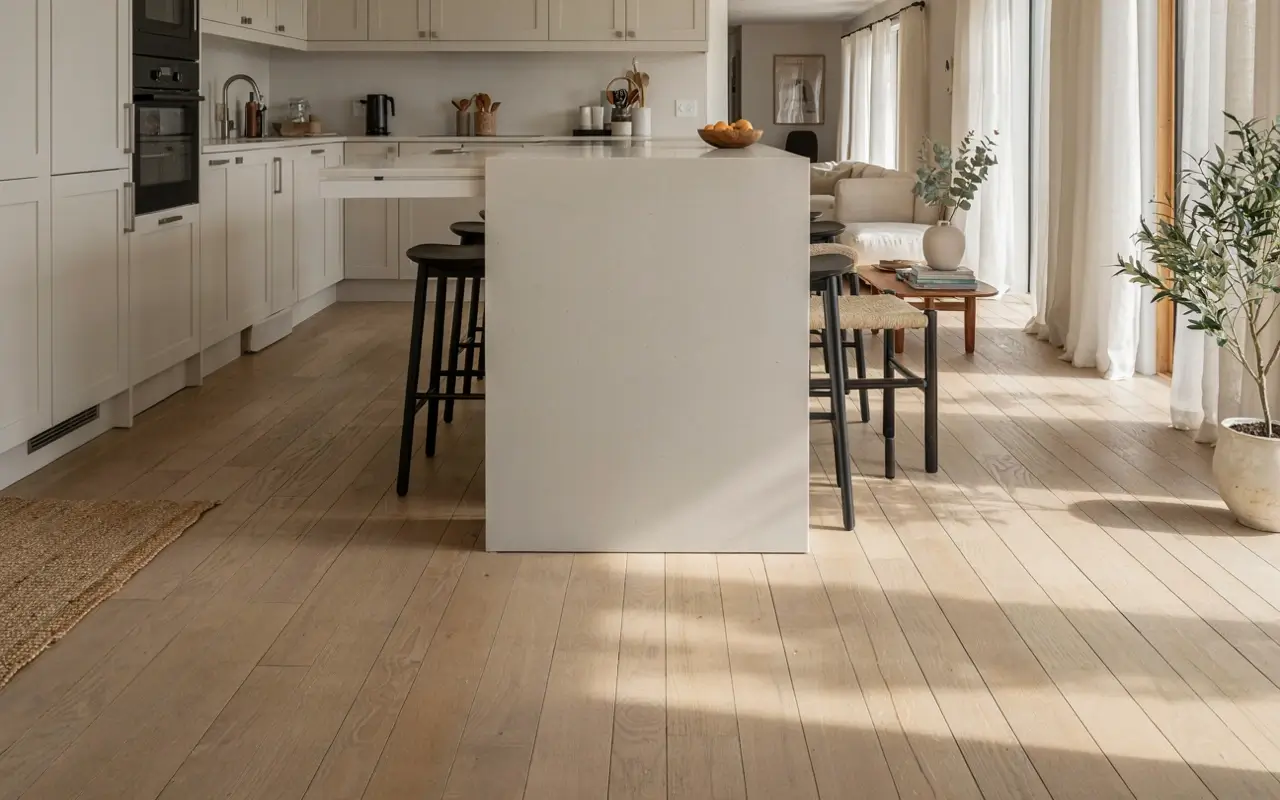
A standard square edge at the peninsula’s open end can look abrupt from the living room side, like the counter simply stops. Running a waterfall edge down just that one end — not the whole kitchen — gives the peninsula a finished, furniture-like look from the exact angle guests actually see it from.
I’d only splurge here if the peninsula end is genuinely visible from the main living area; if it’s tucked against a wall, this upgrade won’t earn its cost back in the way you’d hope. Cambria quartz in a soft, warm white keeps the look calm rather than showroom-cold.
11. Swap the Fridge for a Panel-Ready Model That Disappears Into the Peninsula Run
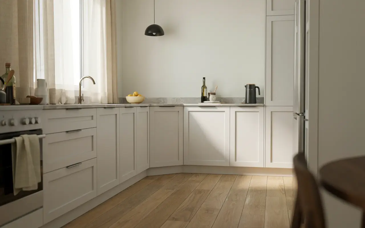
A tall stainless fridge at the end of a peninsula run often becomes the biggest visual block in the whole open-concept sightline. A panel-ready model, like a Samsung Bespoke unit fitted with a matching cabinet front, lets the fridge blend into the cabinetry line instead of standing out as a hard stop.
Waterfall quartz vs a panel-ready fridge front: waterfall edges are better for finishing a visible counter end, while a panel-ready fridge is better when the appliance itself is the thing blocking the view. The key difference is one upgrades a surface, the other removes a visual obstacle entirely.
Floor, Runner, and Finishing Touches
12. Run a Woven Runner Down the Aisle So the Path to the Peninsula Feels Designed
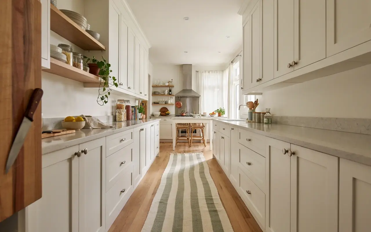
A bare galley floor between the two kitchen legs can read as a hallway rather than a room, which flattens the whole open-concept effect. Laying a woven runner down that center aisle, leading the eye toward the peninsula, turns a pass-through into a defined, walkable path.
Choose a low-pile, flat-weave runner so it doesn’t catch on stool legs or create a trip point near the peninsula. This is a five-minute change that shows up constantly in “galley kitchen makeover ideas” transformation pins for a reason — it works.
13. Skip the Threshold Strip and Run One Flooring Material Straight Through
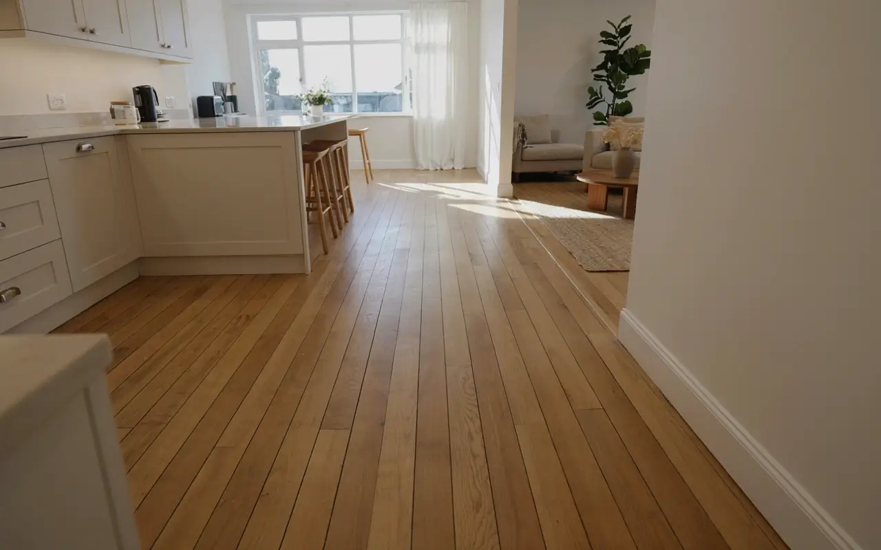
A metal threshold strip where the kitchen floor meets the living room floor is a small detail, but it visually marks exactly where the “closed” kitchen ends and the “open” room begins. Running the same flooring material straight through, without that transition strip, removes the visual cue that tells your brain two separate rooms exist.
This only works if both floors are already close in height and material, so check that before committing. It’s a quiet fix, but it’s one of the most effective for making an open concept kitchen with peninsula layout actually read as one continuous space.
14. Wrap a Rental Peninsula Face in Peel-And-Stick Wood Panels
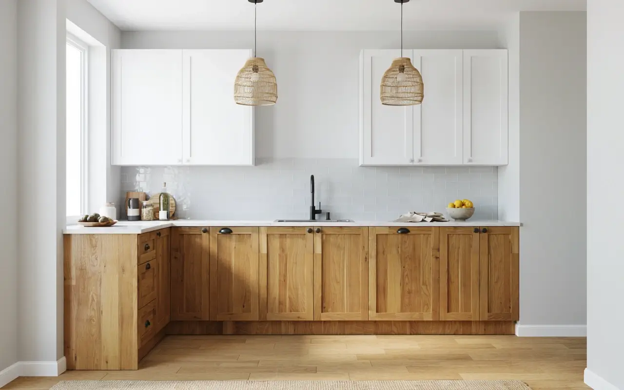
Renters get told to just live with a dated, closed-off peninsula because permanent changes aren’t an option, but that’s not entirely true. Peel-and-stick wood panel wrap applied directly over the existing peninsula face adds the warm-wood-against-white-cabinet look without a single screw, and it comes off clean at move-out.
Pair it with swapped-in cabinet knobs, since most rental hardware is held on with standard screws you can save and reinstall later. It’s the cheapest idea on this list, and it photographs like a much bigger renovation.
15. Add a Slim Ledge at the Peninsula’s Living-Room End for One Lived-In Detail
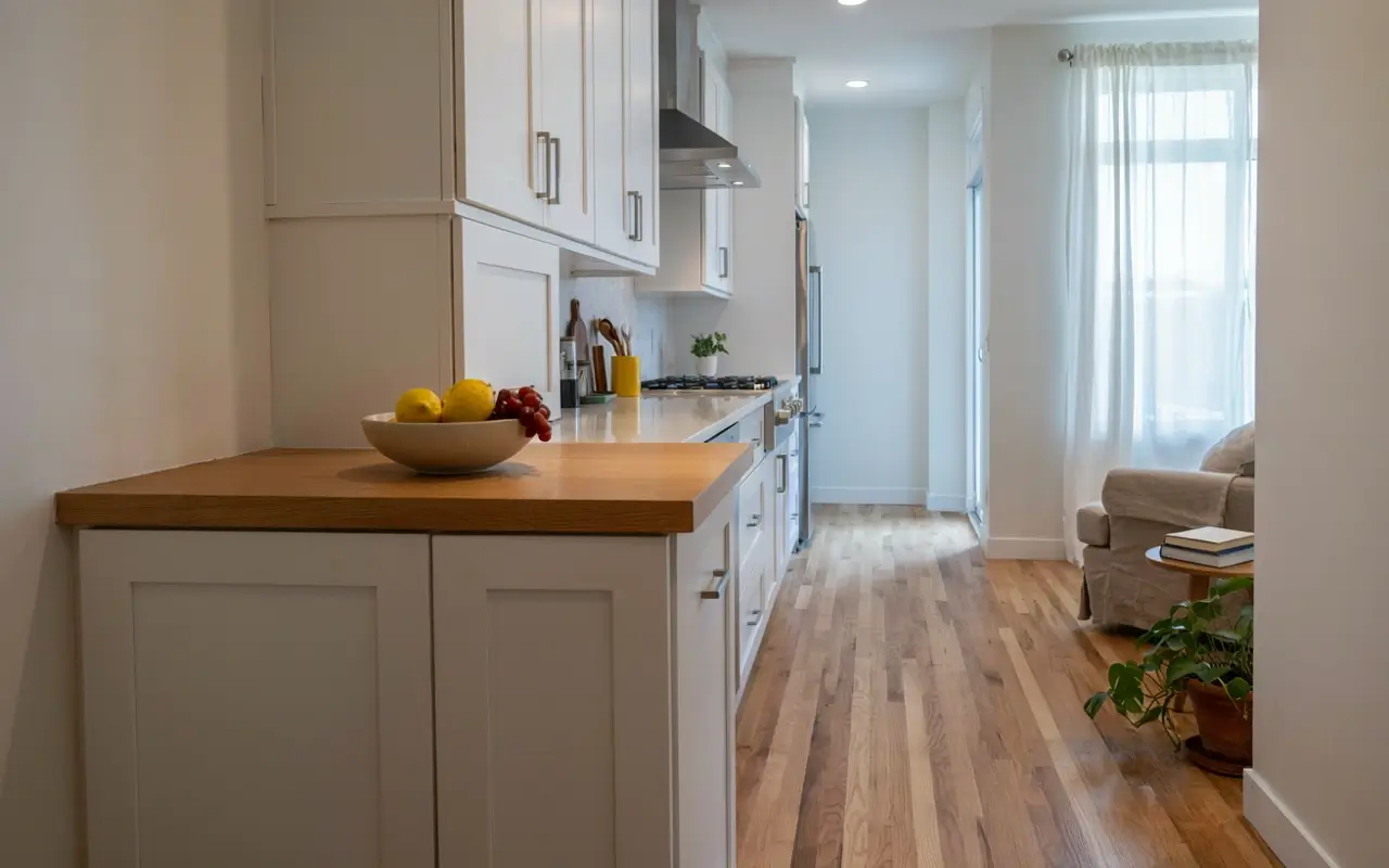
The very end of the peninsula, the part that faces the living room directly, is often left blank or cluttered with mail and keys, which undercuts the whole open-concept effect. Adding one slim ledge or ministyle shelf there, holding just a fruit bowl or a single mug, gives that end of the counter a purpose from both angles.
The trick is restraint: one object, not three. My read is this is the detail that makes a photo feel like a real home instead of a staged listing, and it’s the same instinct behind most sightline-driven peninsula pins that actually get saved.
Quick Answers Before You Start
Does a peninsula make a U-shaped kitchen feel smaller than an island would?
Not necessarily. A peninsula keeps one connection point to the perimeter, which supports more storage than most islands fit into the same footprint.
Can I open up a galley kitchen without removing any walls?
Yes, for most layouts. Sightline height, lighting, seating choice, and flooring continuity solve much of the closed-off feeling without touching structure.
What’s the cheapest way to make a peninsula feel more open?
A woven runner down the aisle and low-back stools under the overhang cost the least and show up in almost every “galley feels bigger” transformation photo.
Should I remove upper cabinets on my peninsula wall?
Only if you don’t need that storage elsewhere. Glass-front doors or one floating shelf often achieve the same open feel with less lost capacity.
Is a panel-ready fridge worth it for a small kitchen?
It’s worth it specifically when the fridge sits at the end of the peninsula and blocks the sightline into the next room; otherwise it’s a nice-to-have, not a fix.



No Comment! Be the first one.