


27 Designer Modern Luxury Kitchen Ideas That Look Expensive (But Are So Clever)
You’ve scrolled enough “luxury kitchen” boards to know the look when you see it, but nobody tells you which single detail is doing the actual work. Most kitchen inspiration articles...
")
You’ve scrolled enough “luxury kitchen” boards to know the look when you see it, but nobody tells you which single detail is doing the actual work. Most kitchen inspiration articles show you a $150K show kitchen and call it a day, leaving you no closer to knowing what to ask your contractor for or what to skip.
This list is different. Every idea below names one specific, repeatable design mechanism, the kind quiet-luxury kitchens actually use, then pairs it with a realistic way to get that look without a full custom build.
This works best for a standard-size kitchen with existing cabinet boxes in decent shape, whether you’re planning a light refresh or a real remodel. It won’t help if your kitchen needs structural changes first; that’s a conversation for your contractor before any of this.
Here are 27 modern luxury kitchen ideas worth saving to your board.
Modern luxury kitchen ideas refers to specific, repeatable design choices, like waterfall edges, matched stone veining, and consistent hardware finishes, that make a kitchen photograph and feel high-end without a full custom renovation. These are visual mechanisms, not price tags, and some cost closer to a paint can than a stone slab.
Island Details That Read as Custom-Built
The island carries more visual weight than any other surface in the room, and it’s not just about looks. According to the National Kitchen & Bath Association’s 2026 Kitchen Trends Report, 98% of surveyed kitchen and bath professionals now say islands function as multi-purpose zones for prep, dining, and gathering, not just food prep. That’s exactly why it’s worth getting right first.
1. Wrap the Island Panel in a Waterfall Edge So the Stone Reads Like One Continuous Slab
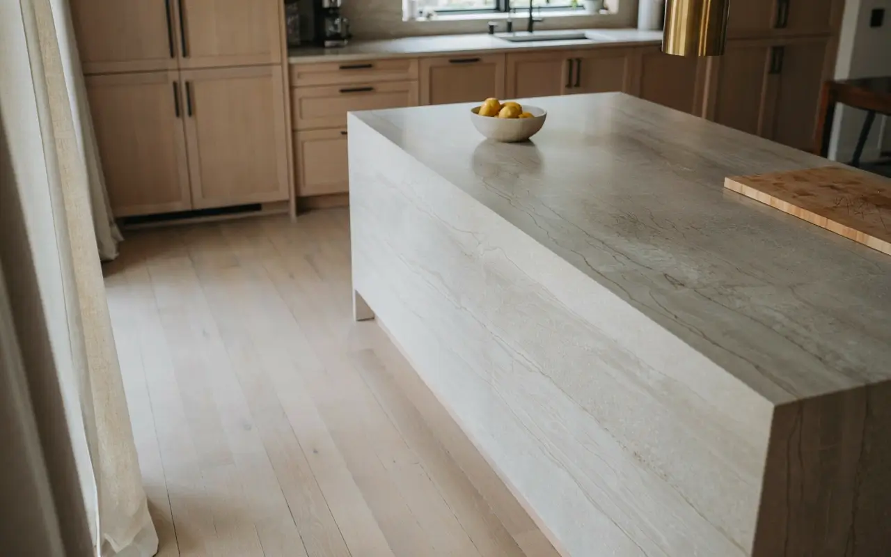
A standard island edge stops at a 90-degree corner, which is fine, but it’s also what every builder-grade kitchen does. A waterfall edge lets the countertop material drop straight down the side panel in one unbroken piece, so the eye reads it as a single sculpted form instead of a counter sitting on a box.
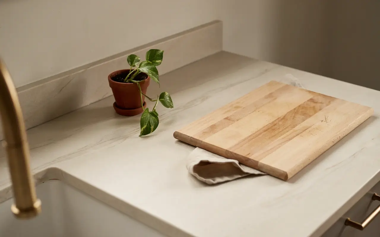
This is one of the pricier moves on this list, and my read is it’s only worth the splurge if you’re already replacing the countertop. Style the top with a wooden cutting board leaning against the base so it still feels used, not staged.
2. Match the Veining Direction Across the Island Corner So the Stone Looks Book-Matched, Not Just Expensive
Most budget quartz installs place slabs however they fit, which means veining runs in random directions across seams. Book-matching means mirroring the pattern across the corner so the veins meet and continue like an open book, which is the actual trick behind that “$150K kitchen” look, not the stone price itself.
Ask your fabricator specifically for vein-matched seams when you order, since it’s a layout request, not an upgrade in material. It costs little to nothing extra if you ask before cutting, and it’s the detail that makes people stop scrolling.
3. Curve One Corner of the Island So the Room Feels Designed Around Movement, Not Just Function
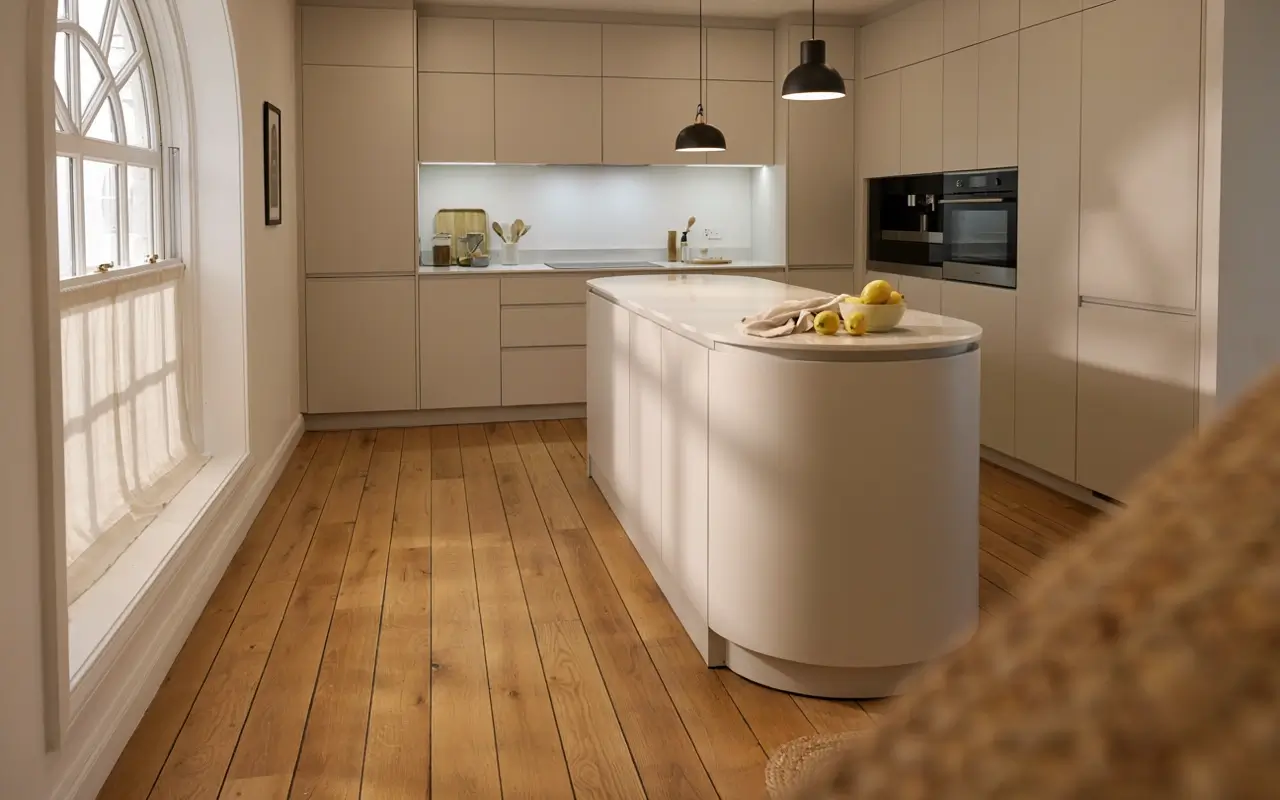
Sharp 90-degree island corners are efficient, but they’re also the first thing that makes a kitchen feel like a box with a counter in it. Rounding just one end, especially the corner nearest the walkway, softens the whole footprint and reads as intentional custom millwork rather than a stock cabinet run.
This works with an existing island if you’re only replacing the end panel, which keeps it realistic on a smaller budget. Set a small bowl of lemons on that curved end so the eye has somewhere warm to land.
4. Drop the Island Overhang to Exactly Twelve Inches So Barstools Tuck In Like a Built-In Banquette
A shallow six-inch overhang leaves stools sticking out awkwardly, and a deep eighteen-inch overhang can look unfinished and unsupported. Twelve inches is the sweet spot where stools tuck fully underneath when not in use, which makes the whole island read as one clean form instead of a counter with furniture parked against it.
This is a measurement fix, not a materials one, so it’s essentially free if you’re already planning the island layout. Push the stools in for the photo and the whole line reads intentional.
5. Paint the Island a Deeper Tone Than the Perimeter Cabinets So It Reads as a Furniture Piece
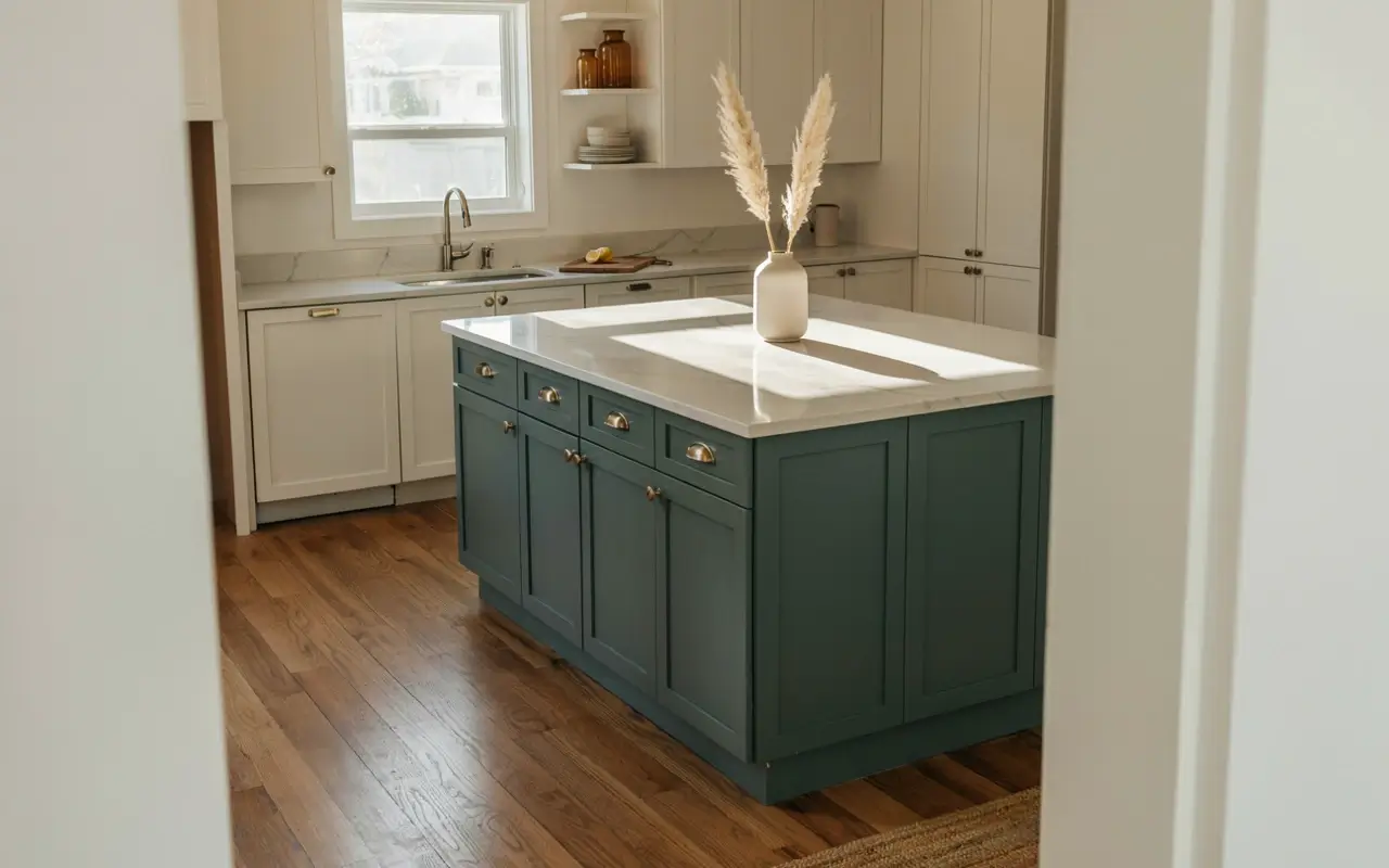
An all-matching kitchen can look like one long cabinet run instead of a designed space. Painting the island a shade or two deeper than the perimeter, think deep sage against warm white, or charcoal against oak, separates it visually so it reads like a freestanding furniture piece someone chose on purpose.
This is one of the most realistic tricks on this entire list, since it’s a paint job, not a replacement. A single ceramic vase on the island counter keeps the contrast from feeling stark.
Cabinet and Hardware Tricks That Look High-End
Cabinetry is where most kitchens accidentally look mismatched, usually because hardware finishes were bought in separate trips over separate years. Fixing consistency here does more visual work than almost any single splurge.
6. Swap Every Handle for One Matte Black Finish So the Kitchen Reads as Considered, Not Collected
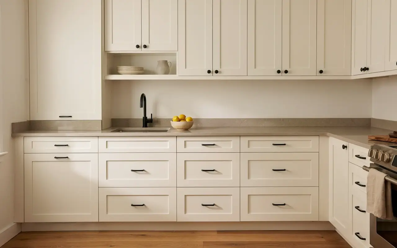
Mixed hardware, brushed nickel here, brass there, chrome on the fridge, reads as a kitchen assembled over time rather than designed at once. Committing to one finish across every cabinet, drawer, and faucet is one of the cheapest full-kitchen upgrades available, and it’s often the single biggest jump in perceived cost per dollar spent.
My read is matte black works in almost any cabinet color, which makes it the safest first move if you’re only changing one thing this year.
7. Go Handleless on the Lower Cabinets With a Push-Latch Groove for a European Look
European luxury cabinetry brands like SieMatic built their entire look around handleless fronts, where a routed finger groove or push-latch mechanism replaces visible hardware entirely, leaving a flat, uninterrupted panel. It’s the detail that makes a kitchen look architectural instead of assembled from a catalog.
One expert caveat: this only looks clean if the cabinet boxes are square and well-aligned first, since there’s no hardware to distract from a crooked door. Have a professional check alignment before converting.
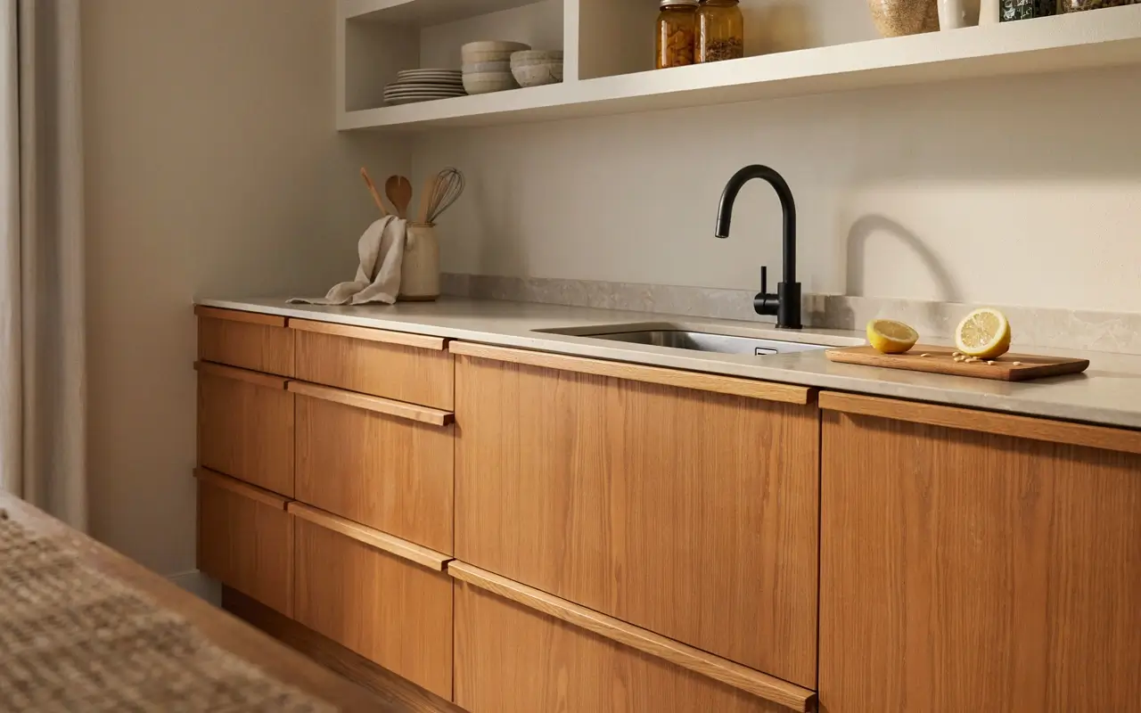
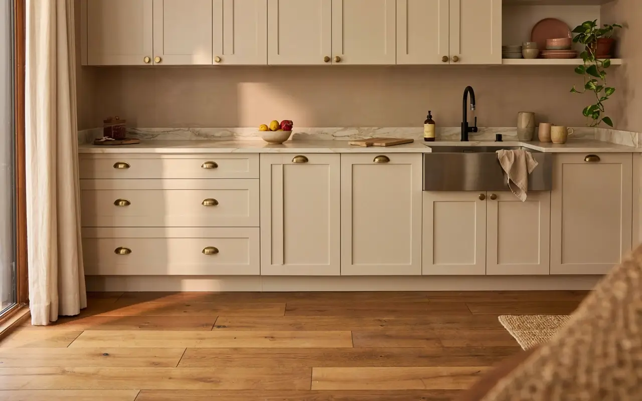
8. Pair Warm Wood Lower Cabinets With Lighter Upper Cabinets So the Kitchen Feels Layered, Not Boxy
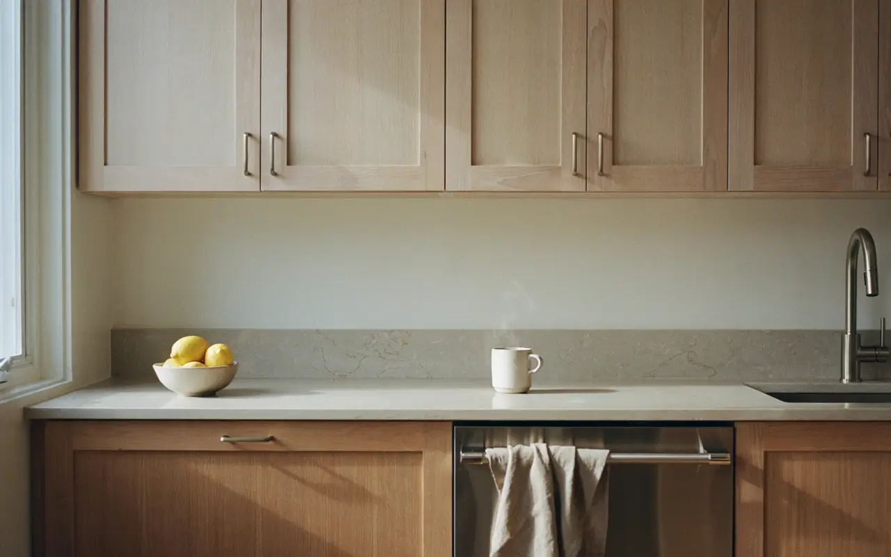
An all-one-tone kitchen, however nice the tone, tends to read flat in photos because there’s nothing separating floor level from eye level. Grounding the room with warm wood or deep-toned lower cabinets and lifting the uppers into a lighter shade, white oak or soft white, creates depth the way a rug and ceiling color do in a living room.
9. Extend the Upper Cabinets to the Ceiling So the Room Loses That Dusty Gap
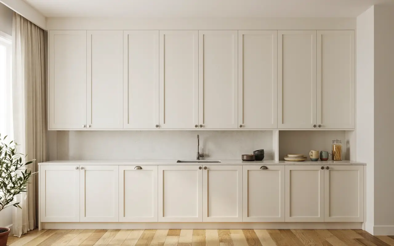
That awkward gap between the top of standard cabinets and the ceiling isn’t just wasted storage, it’s a visual stopping point that makes the whole kitchen feel shorter and cheaper than it is. Running cabinetry straight to the ceiling, even with a simple stacked box on top, removes the gap entirely and pulls the eye upward.
This is a real carpentry job, so it’s worth a contractor conversation rather than a weekend fix. Store rarely-used items up top and let the rest of the kitchen breathe.
10. Reface Just the Island in a Contrasting Wood Slab Front Instead of Replacing Every Cabinet Box
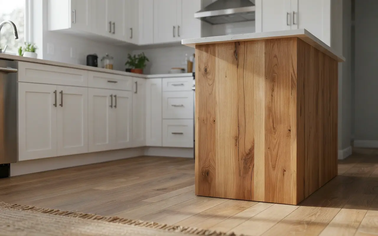
A full cabinet replacement is often the line item that makes a “custom kitchen” quote feel impossible. Refacing only the island front with a single contrasting wood slab panel gives you one strong focal point without touching the perimeter cabinets at all, and it’s a job many carpenters can quote separately from a full remodel.
This is the realistic middle ground between painting and replacing. Leave the panel unadorned so the wood grain itself becomes the decor.
11. Add a Furniture-Style Leg to the Island End So the Cabinetry Reads as Millwork
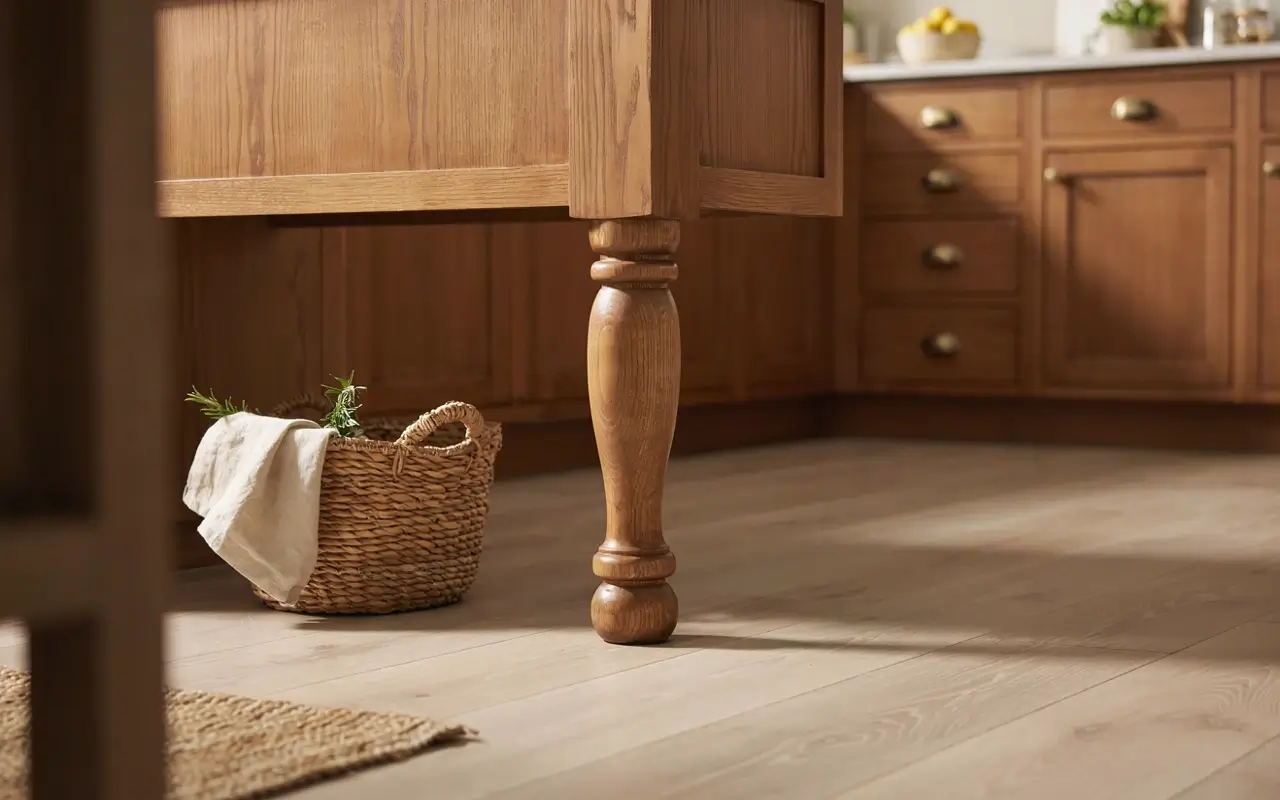
A flat cabinet panel at the end of an island can look unfinished, like the cabinetry just stopped. Adding a turned or squared furniture-style leg at that exposed end signals custom millwork rather than a stock cabinet box, the same detail high-end cabinetmakers use to dress up an otherwise simple form.
This is a small, addable piece rather than a full rebuild, which keeps it realistic for most budgets. A woven basket tucked beside the leg gives the end a lived-in, finished feel.
| Option | Best For | Key Benefit | Limitation |
|---|---|---|---|
| Matte Black Hardware Swap | Any budget, any cabinet color | Instant visual consistency | Won’t fix crooked or damaged doors |
| Handleless Push-Latch Conversion | Mid-range renovation | Seamless, architectural look | Needs square, well-aligned cabinet boxes |
| Painted Island Refresh | Renter or small budget | Custom look for the cost of paint | Only works if cabinet boxes are in good shape |
Lighting Moves That Change the Whole Room
Lighting is the fastest, cheapest category on this list to change, and it’s also the one most homeowners underuse because they think of it as “add a fixture” instead of a design layer.
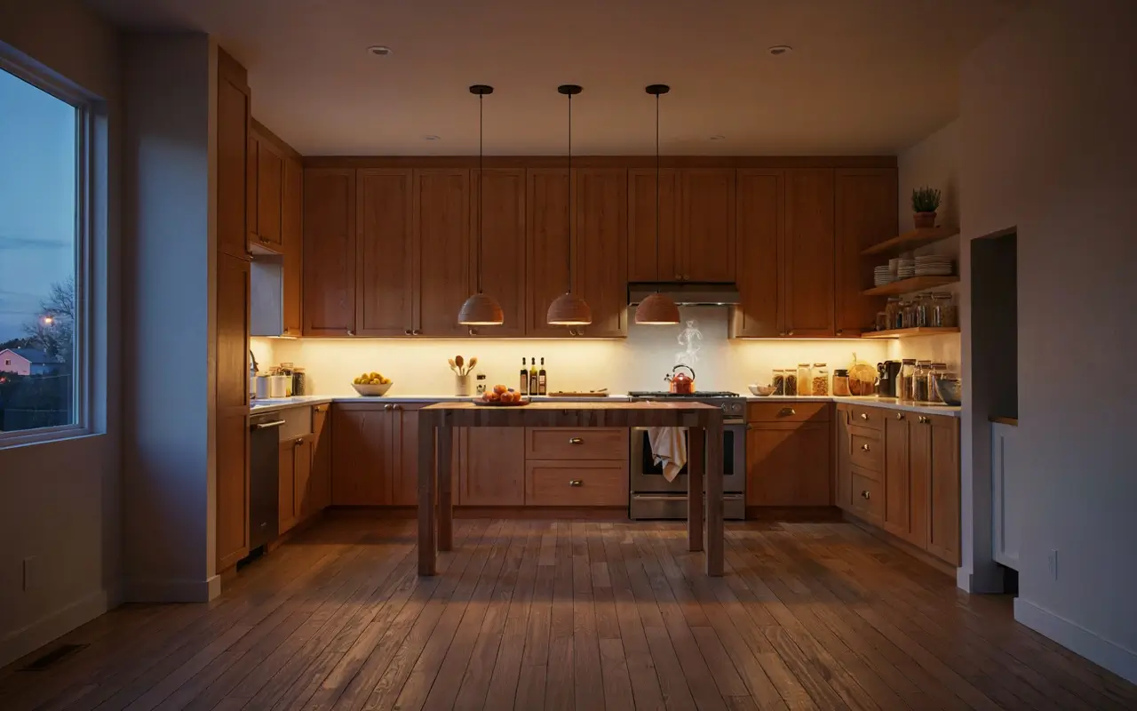
12. Hang One Oversized Single-Drop Pendant Instead of Three Small Ones Over the Island
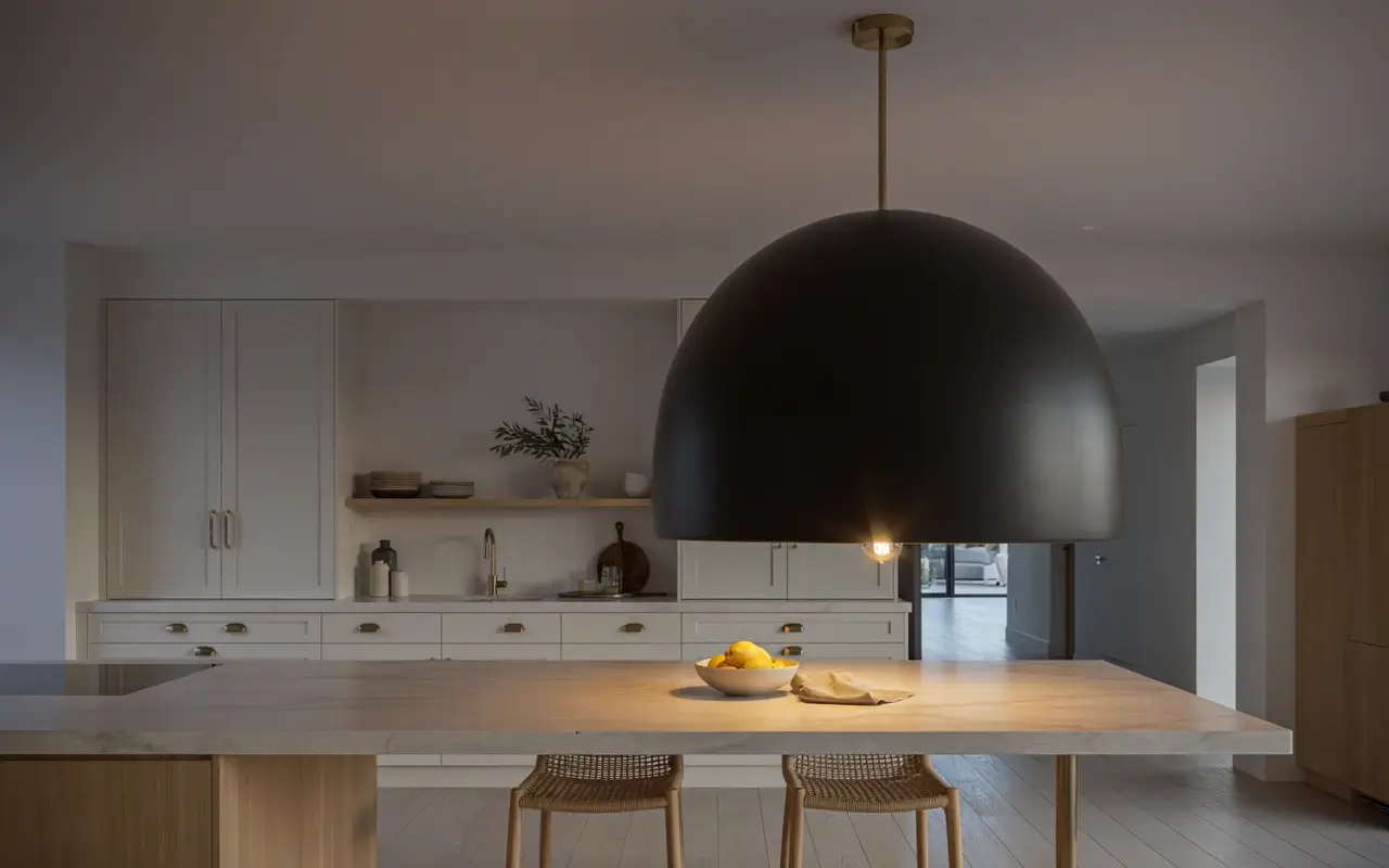
Three matching mini pendants are the default builder move, and they photograph as exactly that, a default. One oversized single-drop pendant, the kind statement-lighting brands like Visual Comfort & Co. built their reputation on, becomes the room’s focal point instead of blending into the ceiling.
This swap can happen without any electrical rework if you’re using the existing junction box. Let the fixture hang low enough to feel like real furniture in the room, not just a ceiling accessory.
13. Layer a Warm LED Strip Under the Upper Cabinets So the Counter Glows Like a Small Café at Night
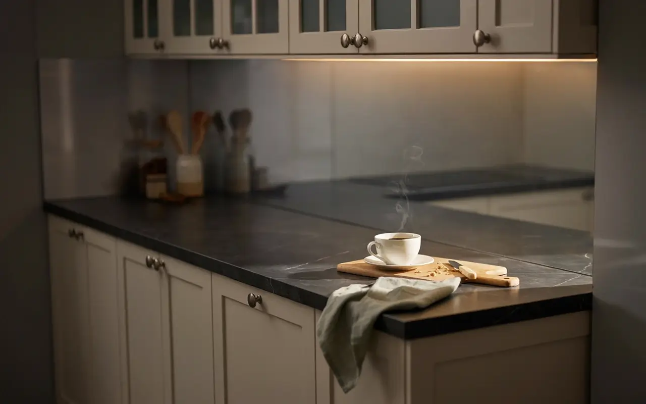
Overhead lighting alone leaves counters in shadow once the sun goes down, which flattens the whole room in photos and in real life. A warm-toned LED strip tucked under the upper cabinets throws light exactly where prep happens and gives the kitchen a soft glow that reads far more expensive than its cost.
To layer lighting properly, follow these steps:
- Install a warm 2700K LED strip under upper cabinets.
- Add a dimmer for evening use.
- Keep overhead lighting separate so each layer can be controlled on its own.
14. Swap the Builder-Grade Flush Mount for One Sculptural Fixture Near the Sink
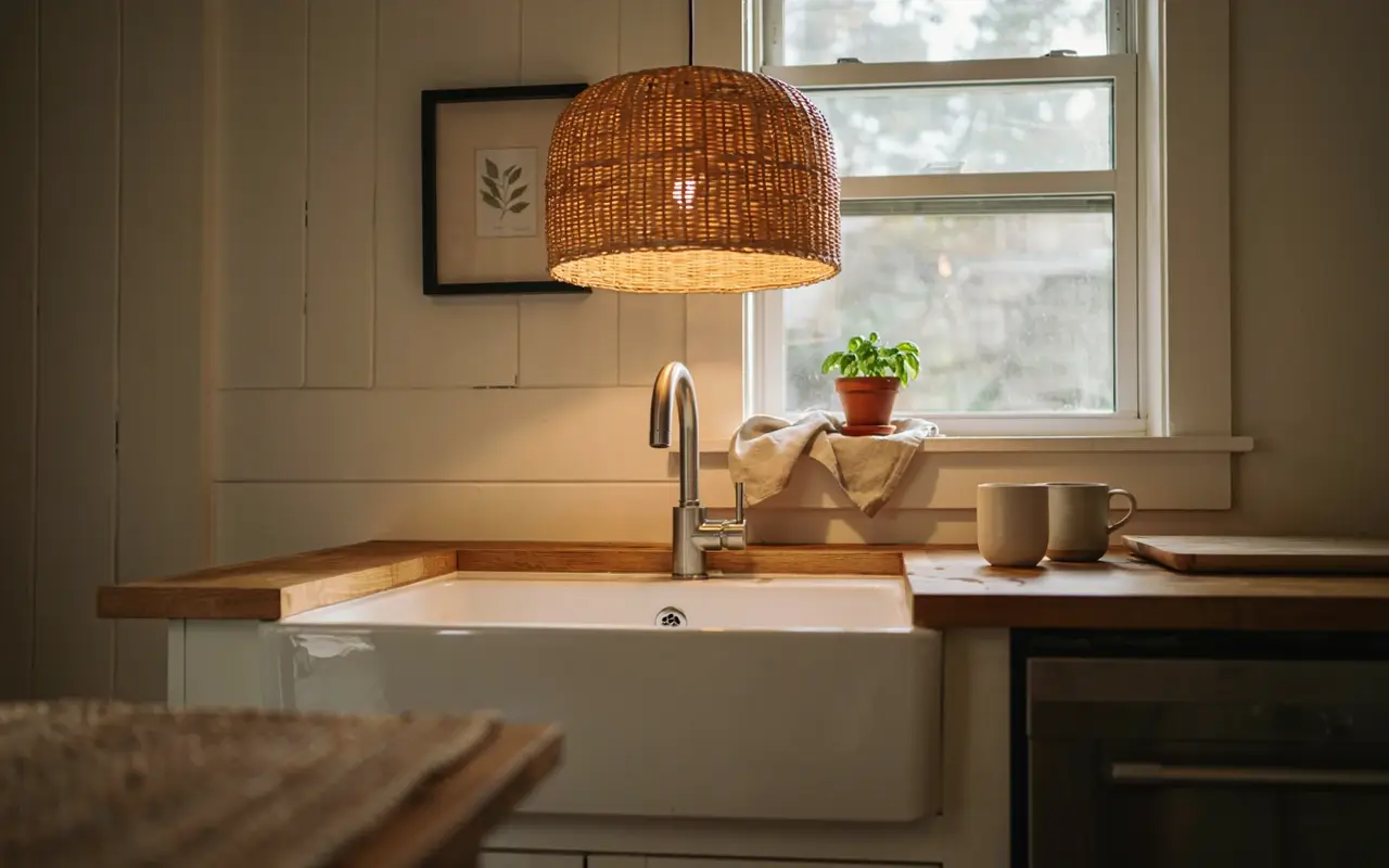
The flat glass flush mount over the sink is one of the most overlooked builder-grade giveaways in any kitchen, mostly because it’s easy to forget it’s even there. Replacing it with one sculptural fixture, a woven drum shade or a simple linear bar, gives that overlooked corner its own quiet moment instead of a leftover dome.
This is a same-box swap most electricians can do quickly. Leave the window sill below it bare so the fixture stays the visual focus.
15. Dim Every Bulb to the Same Warm Temperature So the Kitchen Never Splits Into Two Rooms
Mismatched bulb temperatures, a cool white under-cabinet strip next to a warm pendant, are one of the fastest ways to make a kitchen feel unfinished, even with expensive fixtures. Matching every bulb to the same warm temperature, generally 2700K to 3000K, unifies the whole room under one consistent light.
This is a bulb-swap fix, not a rewiring job, which makes it one of the cheapest items on this entire list. Check every fixture in one evening walkthrough and replace what doesn’t match.
16. Tuck a Small Picture Light Above the Open Shelf So the Vignette Feels Gallery-Lit at Night
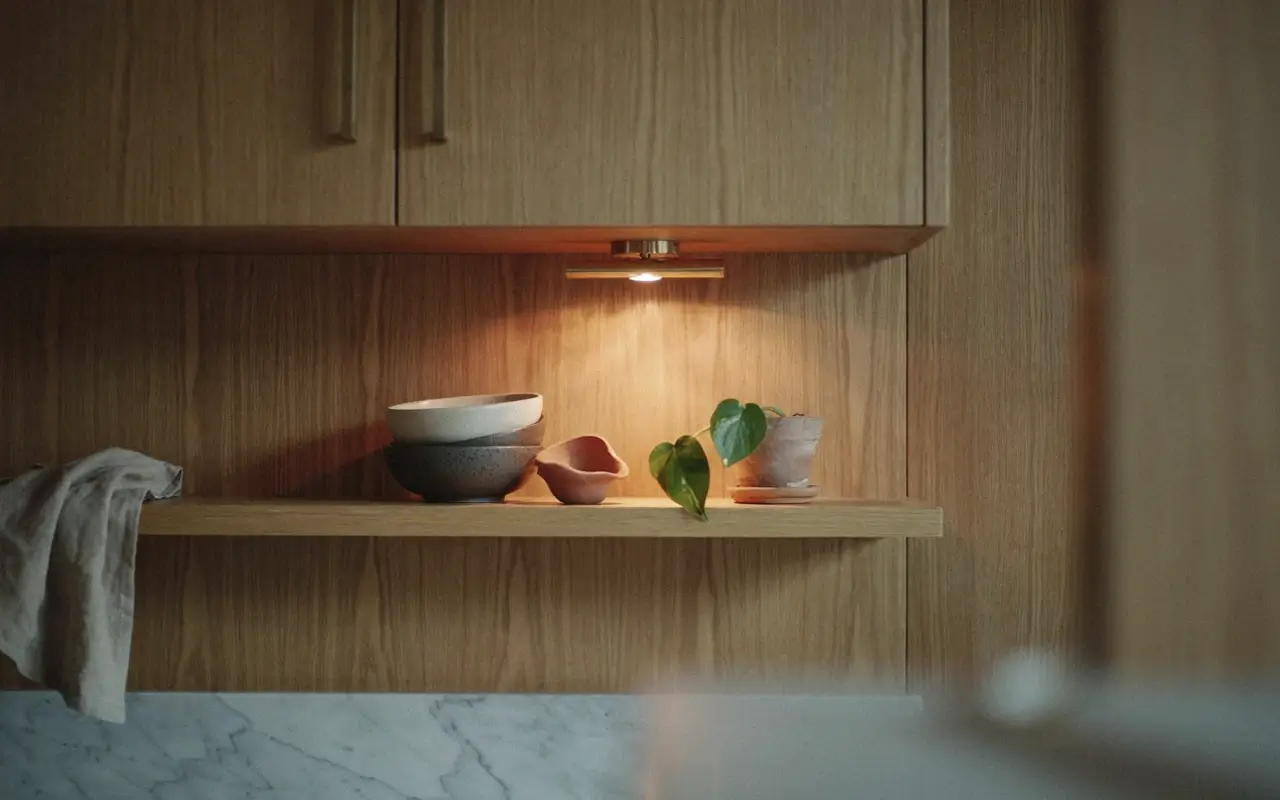
An open shelf styled well during the day can disappear into shadow once the sun sets, losing all the visual work it was doing. A small picture light or puck light mounted just above the shelf keeps the vignette lit like a small gallery display, which is exactly the effect that makes open shelving photograph well around the clock.
This is a low-cost, battery or plug-in fixture in most cases. Keep the shelf styling simple so the light has something worth highlighting.
Countertop, Backsplash, and Wall Styling That Feels Curated
This is where a lot of otherwise nice kitchens get busy instead of expensive. Fewer, better-placed decisions almost always outperform more decor.
17. Run the Backsplash Slab Straight Into the Range Hood So There’s No Grout Line to Break the Eye
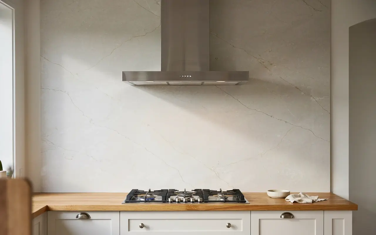
A tiled backsplash that stops at the range hood, then hands off to a different painted surface, creates a visual seam that makes the whole wall feel segmented. Running one slab material straight up behind the hood removes that break entirely, so the eye travels up the wall in one unbroken line.
This is a material and layout request for your fabricator, not necessarily a full kitchen replacement. It reads as one of the more “designer” moves on this list precisely because it’s rarely done in standard builds.
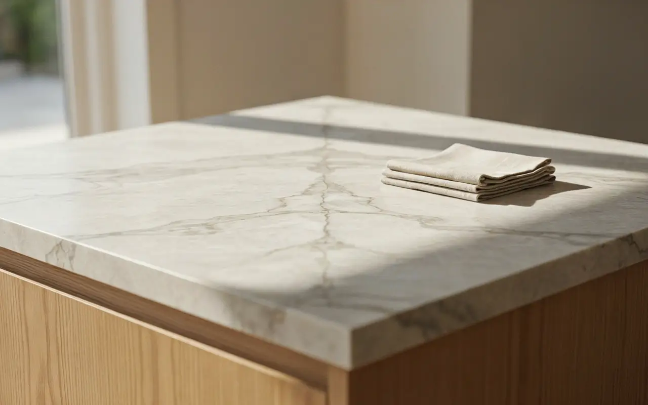
18. Choose One Engineered Quartz With Subtle, Directional Veining Instead of a Busy Pattern
Busy, high-contrast veining photographs dramatically in a single showroom slab but can feel chaotic once it’s wrapped around an entire island and backsplash. Engineered quartz options from brands like Cambria offer subtle, directional veining that reads calm and intentional at full room scale, which is closer to what quiet-luxury kitchens are actually using.
Engineered quartz vs natural marble: quartz is better for busy households because it resists staining and doesn’t need sealing, while marble works better if you want natural variation and don’t mind maintenance. The key difference is durability versus organic pattern.
19. Leave One Full Foot of Bare Wall Above the Counter So the Kitchen Can Breathe
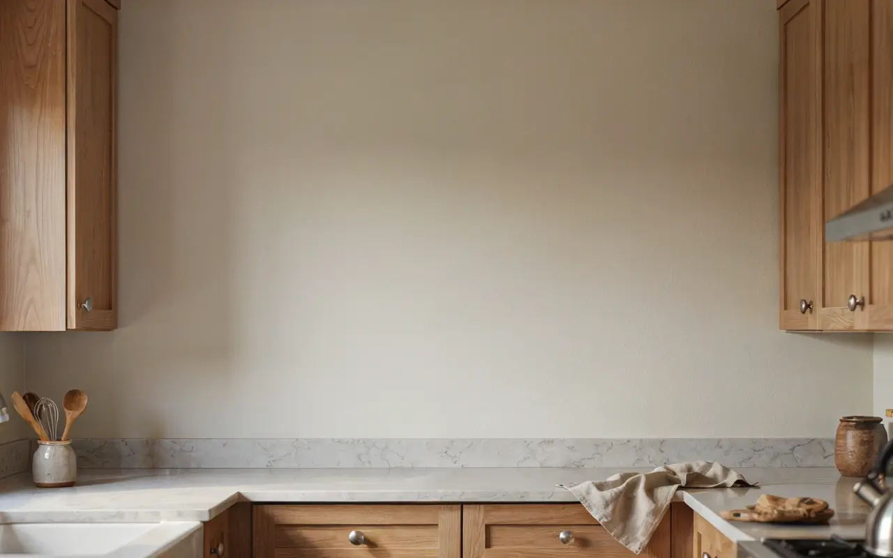
The instinct in a small kitchen is to fill every inch of wall with shelving or storage, but a kitchen with zero negative space reads as cramped no matter how nice the individual pieces are. Leaving one deliberate foot of bare wall, even a small section, gives the eye somewhere to rest, which is a counter-intuitive move since it looks like wasted space but actually does the opposite.
My read is this is the single most underused trick on this entire list, because it costs nothing and most people do the reverse.
20. Style One Open Shelf With Three Objects Max So It Reads as Curated, Not Cluttered
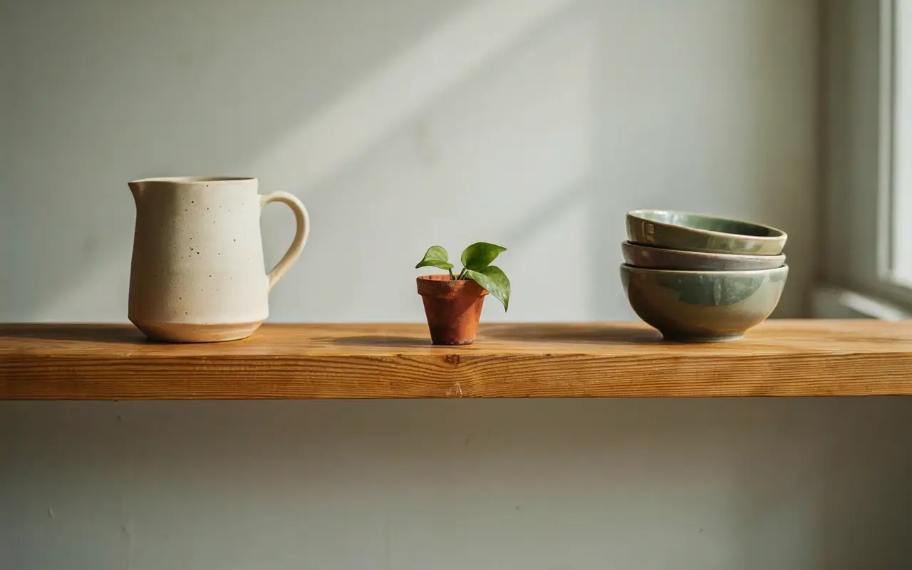
Open shelving gets a bad reputation because most attempts pile on too much, plates, mugs, cookbooks, plants, all competing for attention on one narrow board. Capping a single shelf at three objects, one tall, one short, one textured, forces the kind of restraint that actually reads as curated on camera.
This is a rearranging job with what you already own, not a shopping trip. A ceramic pitcher, a small stack of bowls, and one plant is enough for an entire shelf.
21. Frame the Range Hood in the Same Wood as the Lower Cabinets So It Disappears Into the Design
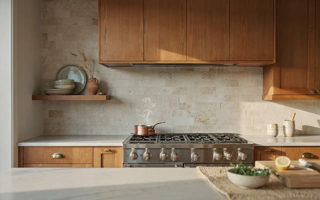
A stainless steel range hood standing alone against painted cabinetry can look like an appliance dropped into the room rather than part of the design. Wrapping it in the same wood as the lower cabinets lets it disappear into the cabinetry line instead of competing with it, which is a favorite move in warm, layered modern kitchens.
Floor, Storage, and Small-Space Illusions
Not every kitchen has room for a full island glow-up, and that’s fine. These ideas work in galley kitchens and smaller footprints, where the goal is feeling designed, not expanded.
22. Run a Vintage Runner Down the Galley Aisle So the Floor Feels Like a Designed Path
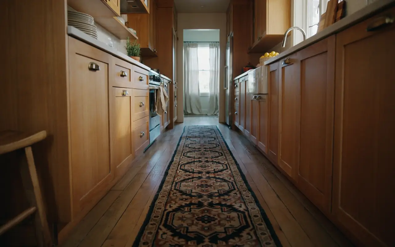
A bare galley floor, however clean, tends to read as a hallway between two cabinet walls rather than a room someone designed on purpose. A vintage-style runner down the center turns that same aisle into a defined path, adding pattern and warmth at floor level where most kitchens have none.
This is one of the most renter-friendly ideas on this list, since it requires zero permanent changes. Choose a runner with some age or fade to it rather than a flat, uniform print.
23. Slide a Six-Inch Pull-Out Pantry Beside the Fridge for Oils and Spices
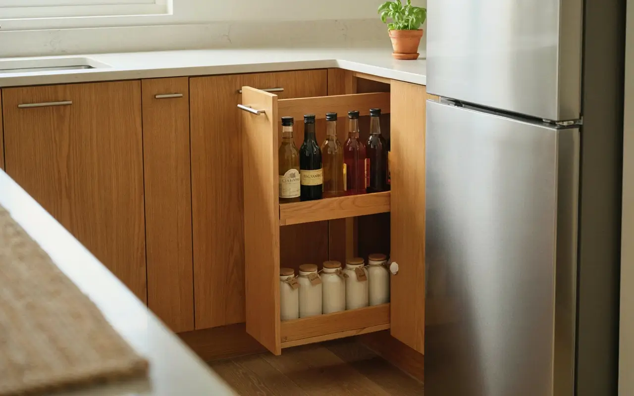
That narrow gap beside the fridge is almost always wasted, and it’s also exactly where loose spice jars and oil bottles end up cluttering the counter instead. A slim six-inch pull-out pantry fits into that gap and gives every one of those small items a home, which clears the counter enough to let the rest of your styling actually show.
This is a small carpentry add-on, not a kitchen overhaul, and it’s often available as a pre-built insert. An organized pull-out photographs surprisingly well on its own.
24. Angle the Dish Rack Inside a Closed Cabinet So the Counter Stays Clear
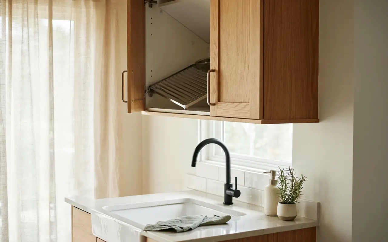
A visible dish rack is one of the fastest ways to undo every other styling choice in the room, no matter how nice the counters look otherwise. Moving drying function into a cabinet, either a slotted in-cabinet rack above the sink or a shallow drawer insert, clears the counter completely and keeps the “expensive” read intact even mid-dishwashing.
This is a small hardware add rather than a renovation. Keep just one clean dish towel folded on the counter edge for the lived-in touch.
25. Paint the Toe Kick to Match the Floor So the Cabinets Appear to Float
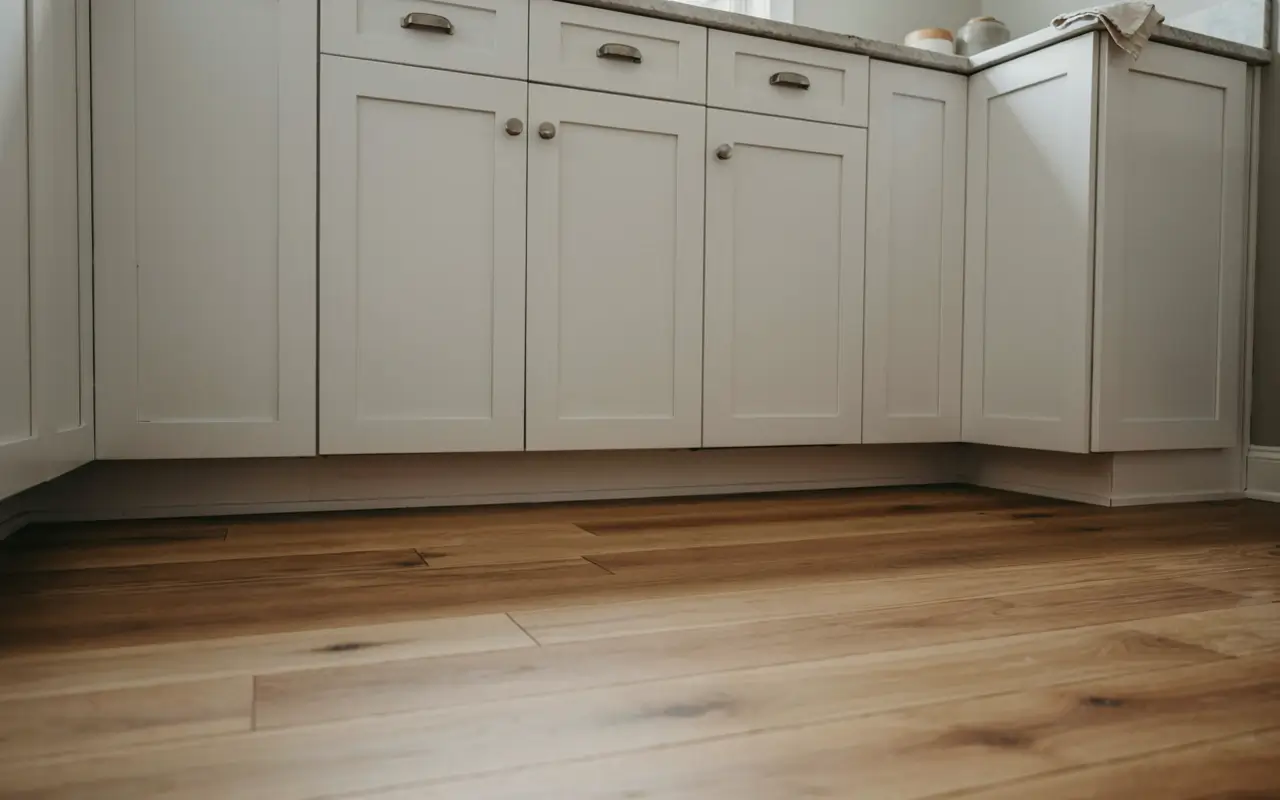
That dark strip at the base of most cabinets, the toe kick, usually gets ignored or left in whatever finish the installer defaulted to, which visually anchors the cabinetry heavily to the floor. Painting or staining it to match the floor color instead breaks that visual anchor, so the cabinets appear to hover slightly rather than sit flush against the ground.
One honest limitation here: this trick works best with wood or matte tile floors and is harder to blend seamlessly on patterned tile. A quick paint job is usually enough to test it.
Color and Finish Choices That Make Everything Look Intentional
Color is where most competitor lists default to white-marble-and-gold and stop. That’s not what’s actually driving the current luxury look.
26. Choose One Warm Neutral Wall Color Instead of Stark White So the Room Feels Collected
Stark white has been the default “clean” kitchen choice for years, but it can read cold and slightly generic in photos, especially under mixed lighting. The NKBA’s 2026 Kitchen Trends Report found that 96% of surveyed kitchen and bath professionals now name neutral palettes, mushroom, clay taupe, soft greige, as the most popular kitchen color choice, and those tones photograph noticeably warmer than pure white.
Some designers will still argue stark white maximizes resale appeal in any market, and that’s a fair point for a flip. For a kitchen you’re actually living in, my read is warm neutral wins on feel.
27. Add One Deep Jewel-Tone Accent, Like a Painted Pantry Door, So the Kitchen Feels Designed on Purpose
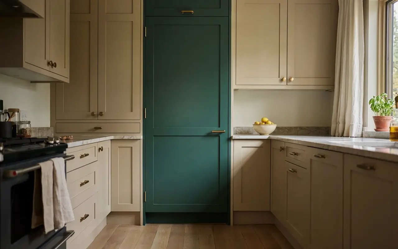
An all-neutral kitchen can start to feel a little flat once every surface matches. One deep jewel-tone accent, a forest green or aubergine pantry door, a single lower cabinet run, a painted island end, breaks that flatness and signals the palette was chosen deliberately rather than defaulted into.
Keep it to one surface only. This is one of the lowest-cost, highest-impact ideas on the whole list, since it’s a single can of paint doing all the work.
Quick Questions Before You Start
What makes a kitchen look expensive without a full renovation?
Consistency does most of the work: one hardware finish, matched stone veining, and warm, unified lighting temperature read as expensive far more than any single splurge item.
What is the biggest kitchen luxury trend right now?
According to the NKBA’s 2026 report, neutral palettes and multi-purpose islands are leading, favoring warm, livable tones over stark white showroom looks.
Is quartz or marble better for a luxury kitchen look?
Quartz suits busy households since it resists stains without sealing. Marble offers natural variation but needs more upkeep. Both can look high-end with the right veining choice.
What color kitchen looks most expensive?
Warm neutrals like mushroom, clay taupe, or soft greige currently read as more expensive than stark white, especially paired with one deep jewel-tone accent.
Do I need a waterfall island for a luxury look?
No. A waterfall edge helps, but book-matched veining, consistent hardware, and warm layered lighting create the same effect for far less money.
Final Thought
A kitchen doesn’t need a $150K budget to look designed, it needs consistency. Matched hardware, one lighting temperature, deliberate negative space, and a handful of intentional details do more visual work than any single luxury splurge. Pick two or three ideas from this list that fit your actual layout and budget, not all 27 at once.
One scope note worth saying plainly: this list assumes a kitchen with sound cabinet boxes and no structural issues. If yours needs layout changes, foundation work, or plumbing moves, start with a contractor, then come back to this list for the styling layer.
Save the ideas that fit your space, and build your “future kitchen” board around what’s actually achievable this year.
")


")
No Comment! Be the first one.