




15 Girly Kitchen Ideas That Feel Like a Romantic Brunch Spot at Home
If your kitchen feels flat, beige, and nothing like the soft pink-and-cream spaces filling your Pinterest saves, you’re not missing money — you’re missing a system. Most girly kitchen...

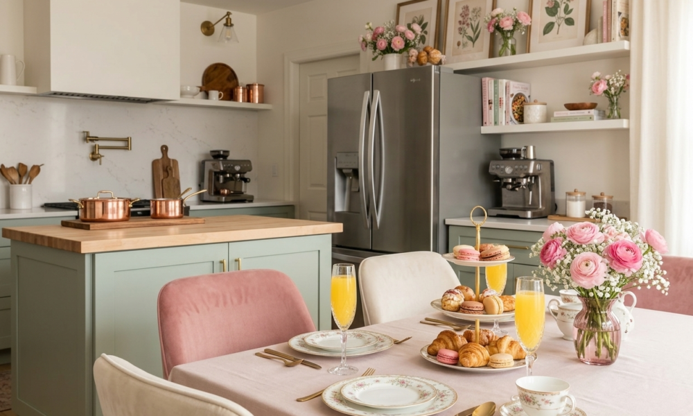
If your kitchen feels flat, beige, and nothing like the soft pink-and-cream spaces filling your Pinterest saves, you’re not missing money — you’re missing a system. Most girly kitchen inspiration assumes new cabinets, a full repaint, or a landlord who says yes to anything. This list skips all of that. Every idea here works with color layering, texture, and small styling objects you can add, remove, or take with you when you move.
This works best for a rental or starter-home kitchen with at least some natural light and one open surface — a shelf, a counter corner, or a window — to style. It won’t help if your kitchen has no natural light at all or no free surface anywhere to build on; styling needs something to land on.
Girly kitchen ideas refers to color layering, curved shapes, and small romantic props — blush and cream tones, brass hardware, displayed ceramics, soft textiles — used to style an existing kitchen without new cabinets or countertops. The look comes from objects and light, not construction.
Start With Color and Light Before Anything Else
Before you touch a single shelf, the room’s base tone and light quality decide whether everything else reads as styled or scattered. These three ideas set that foundation.
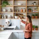
1. Layer a Blush-to-Cream Wash Across the Open Shelf Wall So Morning Light Looks Warmer Than It Is
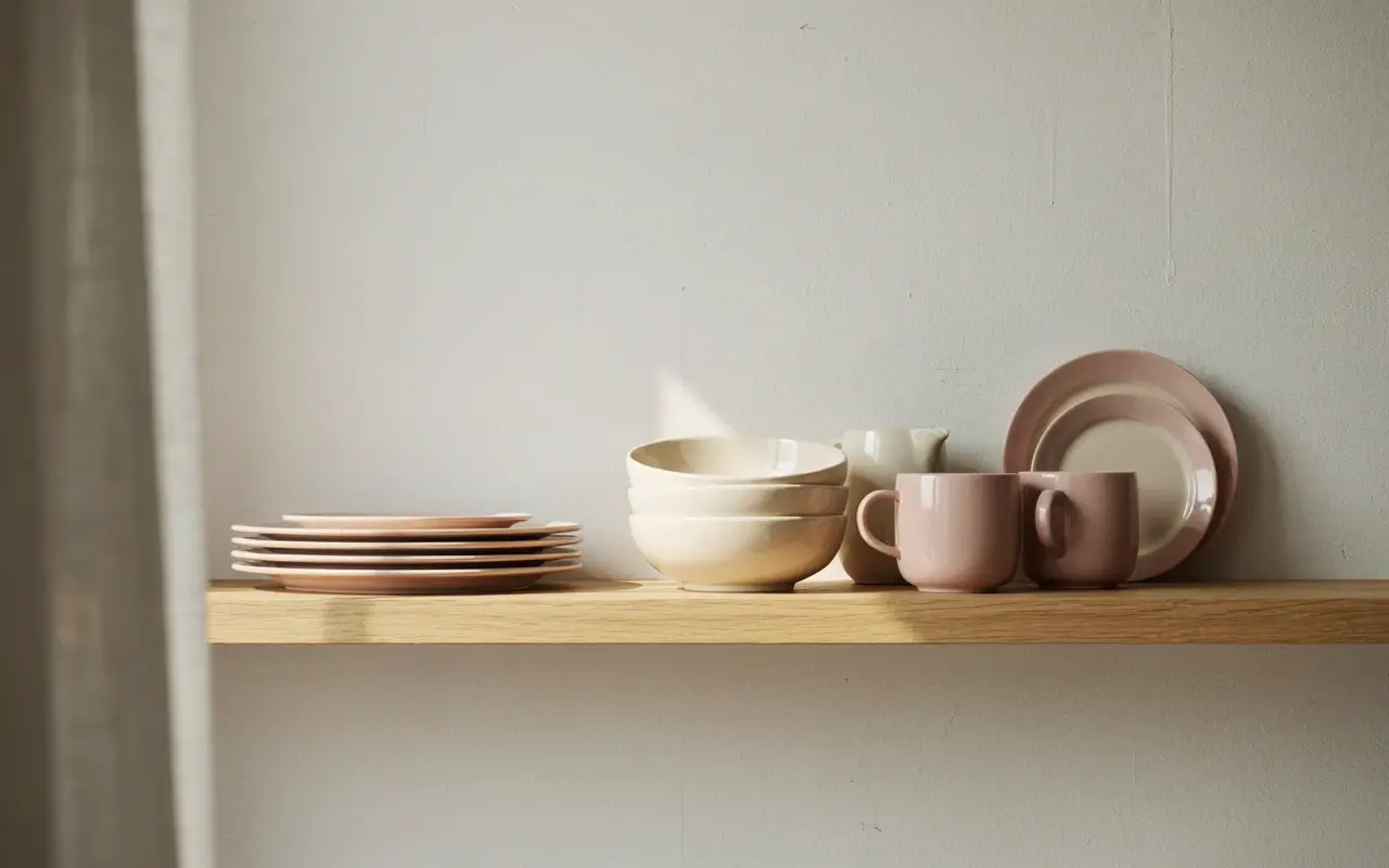
A stark white shelf wall under a cool bulb reads clinical, not cozy, no matter what you put on it. Instead, back the open shelving with a blush or cream contact paper panel, or simply group your palest pink and cream dishware toward that wall so the eye reads it as one warm block of color.
The trick is repetition, not paint — three or four blush and cream pieces clustered together do more than one bold pink item alone. My read is this works even on a single shelf, which makes it the easiest starting point in a rental kitchen.
2. Swap the Overhead Bulb for a Warm Filament Pendant Above the Sink So Dishes Feel Like a Little Ritual
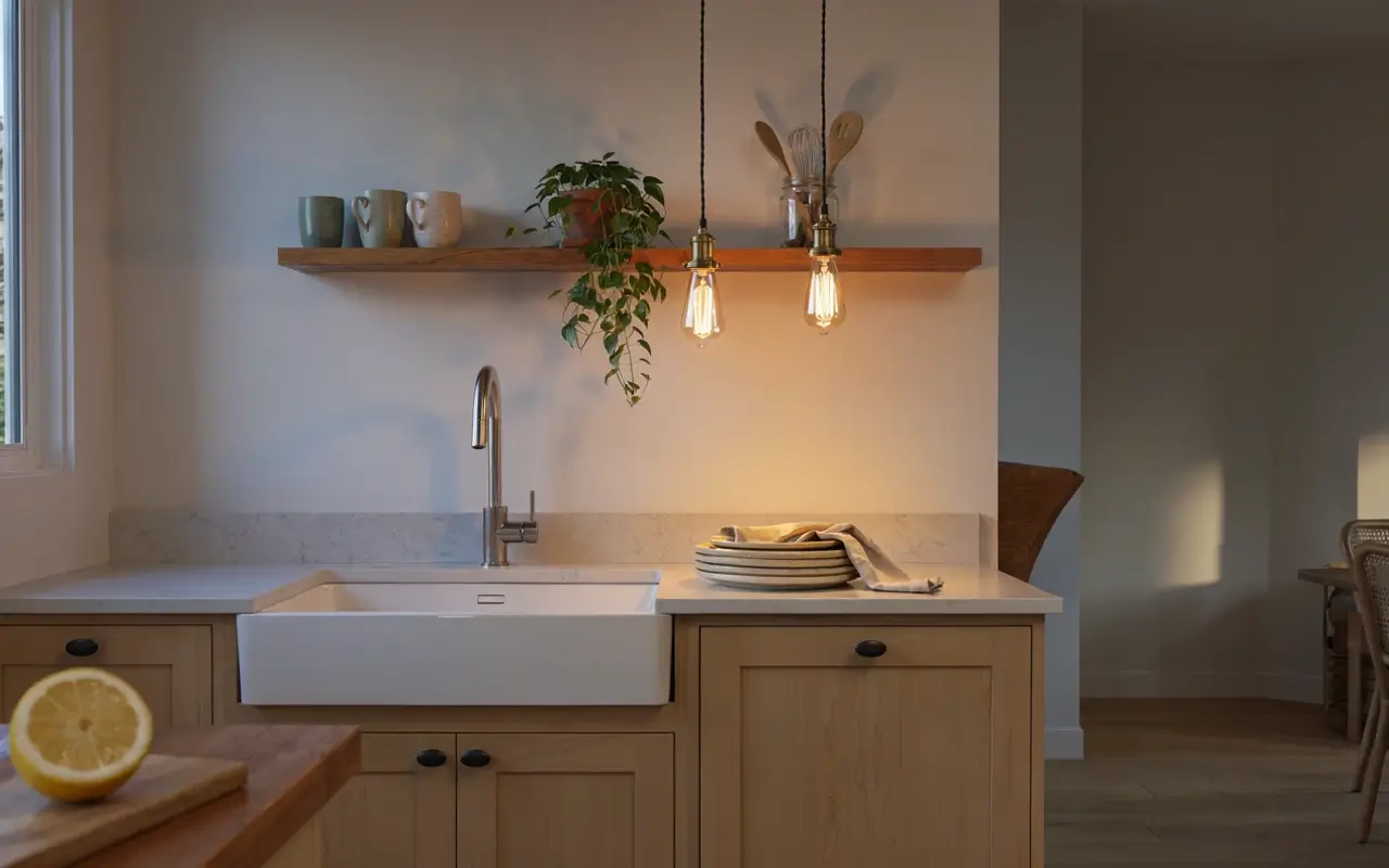
Harsh white overhead light flattens every soft color you add, which is why so many rental kitchens look cold even with pretty decor in them. Swap the main bulb for a warm filament bulb, or add a small plug-in pendant above the sink if your fixture allows it, so the light itself leans amber instead of blue-white.
This one change makes blush and cream tones look richer instantly, without touching a single wire permanently. I’d only splurge here if your current fixture already takes a standard bulb — anything requiring an electrician isn’t worth it for a rental.
3. Hang a Scalloped Café Curtain on the Lower Half of the Window So the Light Comes In Soft and Filtered
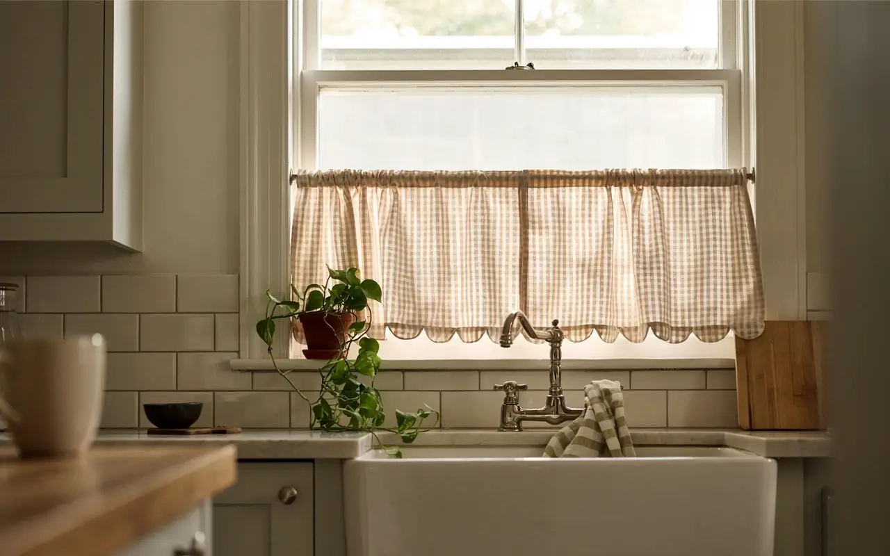
A bare kitchen window either blasts harsh light in or gets covered by a stiff mini blind — neither one feels like the diffused, dreamy light in brunch café photos. Hang a short scalloped or gingham café curtain on a tension rod across just the bottom half of the window, leaving the top open for light and view.
The scalloped edge softens the whole window line without blocking counter light, which matters if you’re also drying dishes near it. It’s a five-minute install and it comes down just as fast when you move.
Style the Shelves, Counters, and Windowsill Like a Café
Once the base tone and light are set, the shelves and counters are where the “girly kitchen” pins actually earn their look. This is the part most competitor lists skip past with vague advice like “style your shelves” — here’s exactly how.
4. Group Mismatched Cream Ceramics on the Top Shelf So the Collection Reads as One Cohesive Set
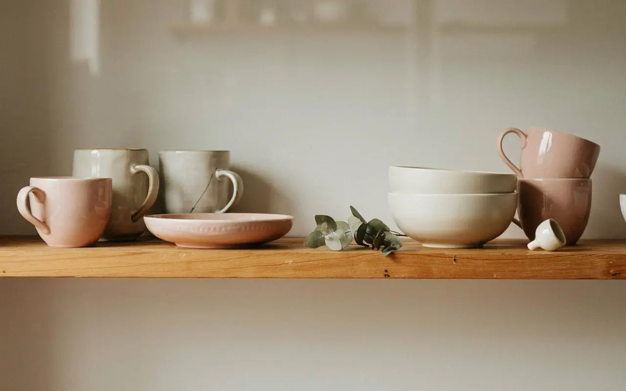
Random pink mugs and mismatched plates scattered across shelves is exactly how those first rushed pink-decor purchases end up looking cluttered instead of curated. Pull every piece that’s cream, blush, or off-white onto one shelf and group by shape — bowls with bowls, mugs with mugs — instead of spreading color everywhere.
Grouping by both color and shape is what makes a mismatched thrifted collection photograph like a matching set. Leave a small gap of negative space between clusters so it reads as arranged, not crammed.
5. Rest a Glass Cake Stand on the Counter Corner Empty or Full So There’s Always One Pretty Object at Eye Level
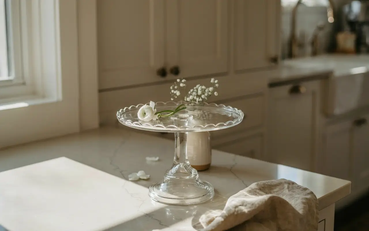
Most counters have a dead corner that collects mail or keys instead of doing anything for the room. A glass cake stand — the kind Anthropologie Home sells in soft scalloped shapes — fills that exact spot, whether you’re using it for actual pastries or just leaving it empty with a single lemon or a small floral stem on top.
It works because it adds height, which flat counter clutter never does. This is the one prop I’d tell a beginner to buy first if she only buys one thing this month.
6. Stack Vintage-Style Glassware by Height on a Floating Shelf So the Light Catches Every Rim
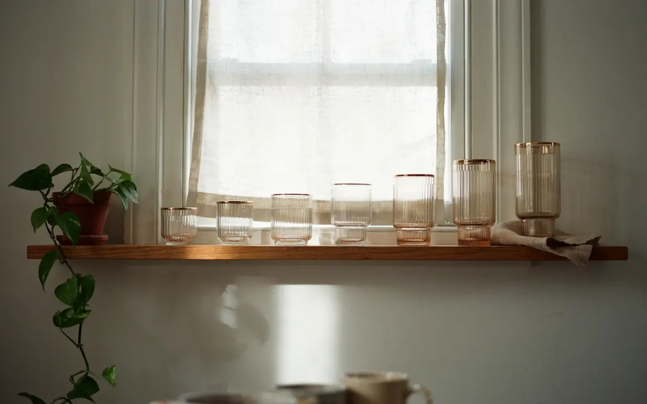
Glass cabinet doors and open shelves full of plain drinking glasses look like storage, not styling, because there’s no shape logic to how they’re arranged. Line up vintage-shaped glasses — the kind with a slight curve or ribbed texture — from shortest to tallest along one shelf so the row itself becomes a visual line.
Placed near a window, the height gradient catches light differently on each glass, which is the exact detail that makes those Pinterest glassware shelves photograph so well. It costs nothing if you already own the glasses — just the ten minutes to rearrange them.
7. Pin a Small Dried Floral Bundle to the Underside of a Shelf So the Corner Feels Finished Without Taking Counter Space
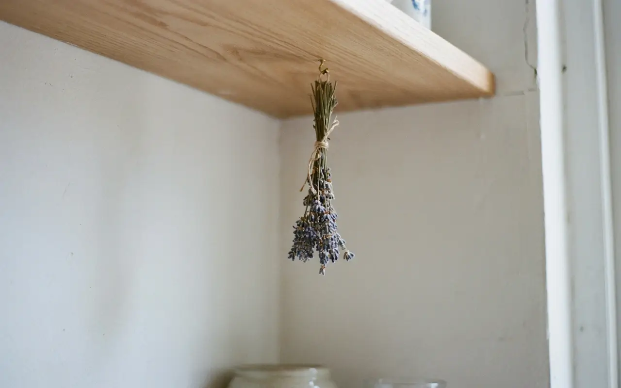
Fresh flowers die in a week and fake ones can look plasticky under kitchen light, which is why a lot of floral styling attempts fall flat fast. A small dried floral or dried lavender bundle, tied with ribbon and pinned upside down to the underside of a shelf, adds that romantic detail without needing water, a vase, or any counter space at all.
It’s the kind of tiny finishing touch that photographs beautifully in a corner shot and never needs maintenance.
Layer In the Small Romantic Details
The pins that read as “coquette kitchen” instead of just “pink kitchen” almost always have one or two small, unexpected details doing the romantic work. These four ideas are that layer.
8. Swap Plain Cabinet Knobs for Brass Scalloped Pulls So the Whole Kitchen Feels Dressed Up in Ten Minutes
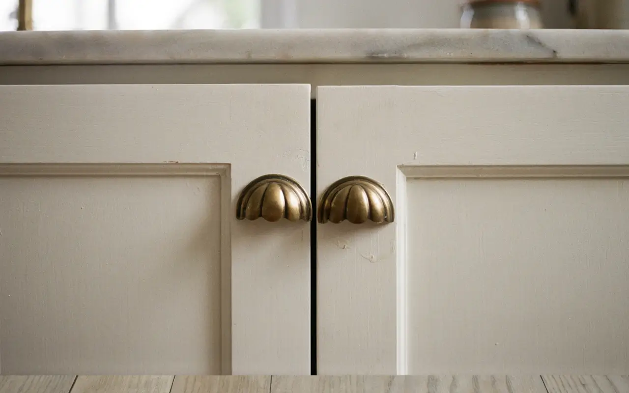
Plain builder-grade knobs are the single biggest reason a kitchen reads generic, and they’re also one of the few hardware changes most leases actually allow since you keep the originals to reinstall later. Unscrew the existing knobs, keep them in a labeled bag, and swap in brass or gold scalloped pulls across just the lower cabinets for contrast against a lighter upper section.
You don’t need to do the whole kitchen at once — even six or eight new pulls on the most visible cabinets changes the whole feel.
9. Drape a Gingham Tea Towel Over the Oven Handle So the Stove Stops Looking Like an Appliance
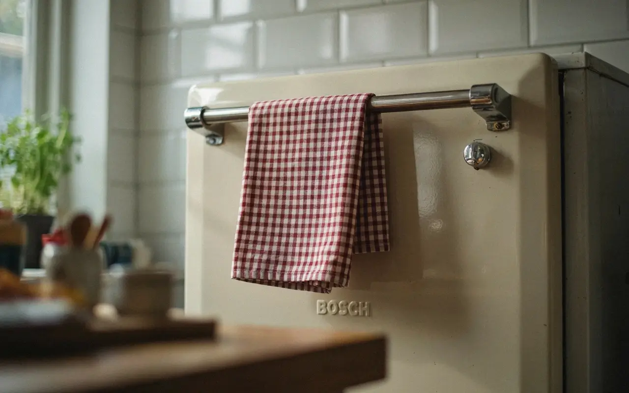
A bare oven handle or a plain dish towel is one of the most overlooked cold spots in a kitchen, mostly because it’s functional and easy to ignore. A gingham or floral-print tea towel, like the ones Rifle Paper Co makes, draped neatly over the oven handle softens that one hard metal line every time you walk past it.
It’s genuinely one of the cheapest swaps on this list and it gets replaced in seconds when it’s in the wash, so there’s zero downside to trying it first.
10. Set a Small Two-Person Tea Tray by the Window So the Counter Has a Reason to Look Like a Café Table
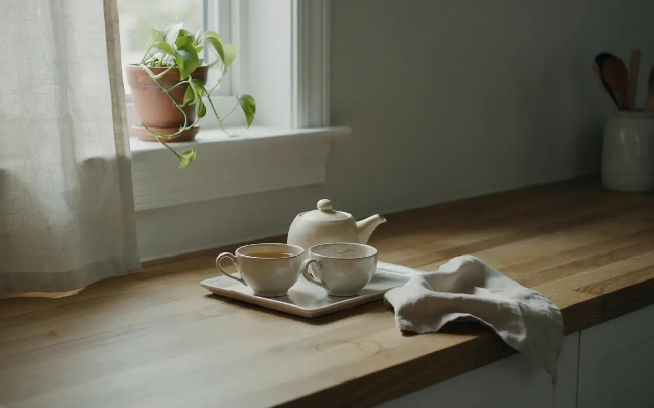
A counter with no purpose beyond food prep never quite reads as a lived-in, styled space, because nothing about it suggests you’d sit and linger there. Set a small tray near the window with two teacups, a tiny teapot, and a folded napkin, left permanently staged like it’s mid-conversation.
This is the detail that shifts a kitchen from “functional” to “the brunch spot” feeling, because it implies a moment happening rather than just storage. I’d skip this if your counter space is already tight — a cramped tray looks like clutter instead of a scene.
11. Line the Windowsill With Three Bud Vases Instead of One Big Arrangement So the Light Has Something to Pass Through
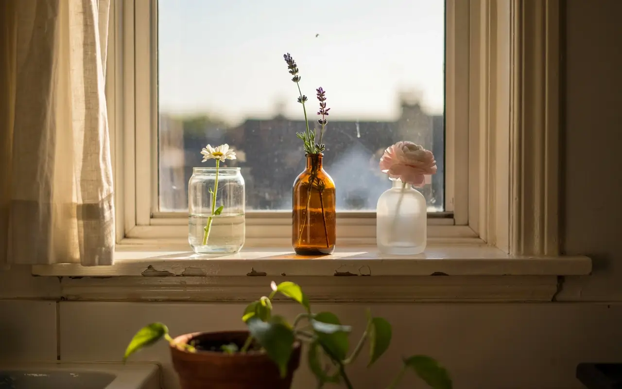
One large floral arrangement blocks the window and dies all at once, which means the whole display disappears the moment it wilts. Three small, mismatched bud vases spaced along the windowsill, each holding one or two stems, let light pass between them and give you three small refreshes instead of one big one.
It also costs less per vase to keep fresh, since a single stem from the grocery store fills a bud vase completely. This is the detail that photographs best backlit, right at golden hour.
Handle Storage and Layout Without Losing the Softness
A soft kitchen still has to function, and this is where most “girly kitchen” boards go quiet — they never show where the actual stuff goes. These three ideas keep storage visible and styled at the same time.
12. Tuck a Six-Inch Rolling Cart Beside the Fridge So Extra Mugs and Linens Have a Home That Still Looks Styled
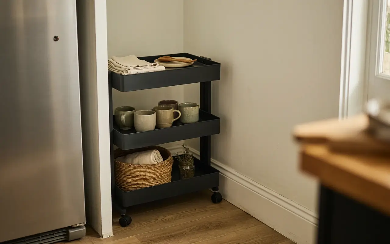
Extra tea towels, spare mugs, and small props need somewhere to live that isn’t a junk drawer, especially once you’ve started collecting pieces for the shelves above. A narrow rolling cart, six to ten inches wide, slides into the gap beside the fridge and holds backup linens, spare glassware, or baking props on its tiers.
Because it’s on wheels, it counts as furniture, not a fixture, so it moves with you and never needs permission. Style the top tier the same way you’d style a shelf, and the storage disappears into the look.
13. Run a Vintage Floral Runner Down the Galley Aisle So the Walkway Feels Like Part of the Design
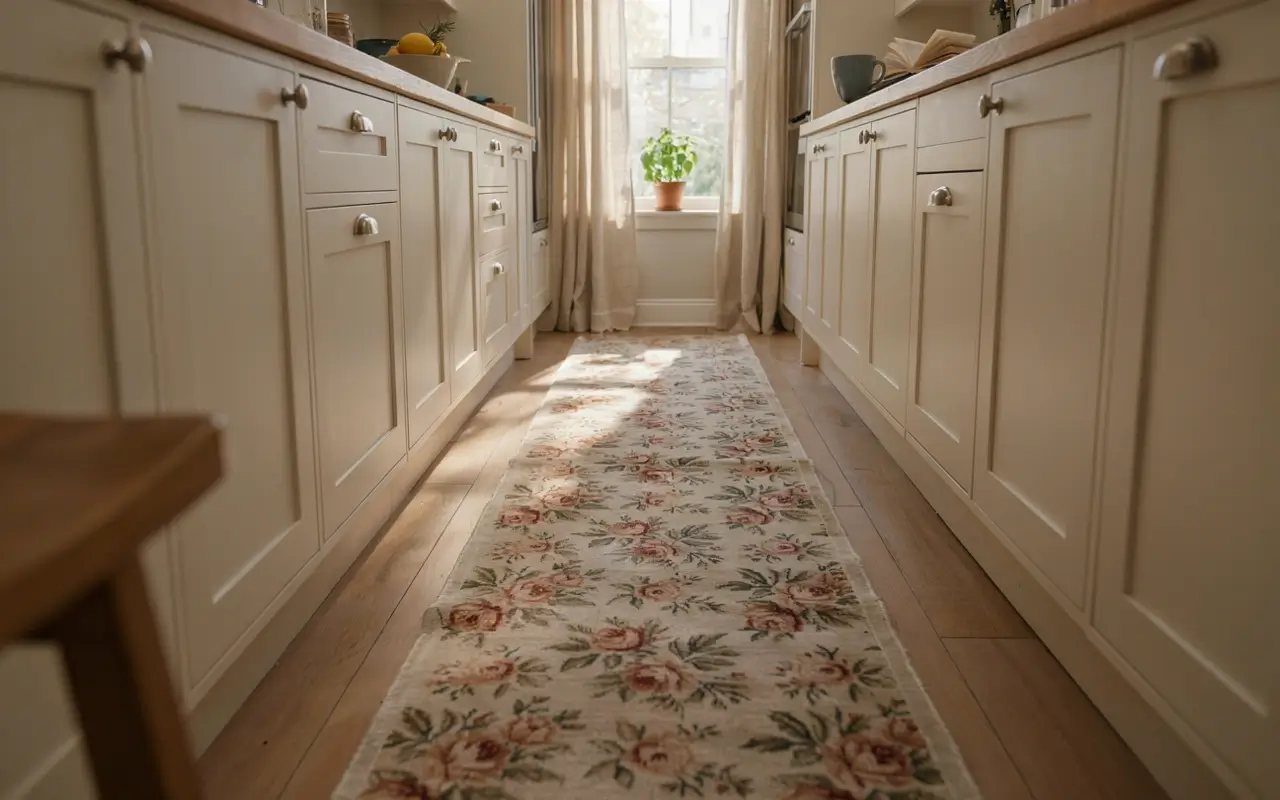
A bare tile or laminate floor down a galley kitchen is one of the coldest, most overlooked surfaces in the whole room, and it’s rarely mentioned in girly kitchen inspiration at all. A washable vintage-style floral or scalloped-border runner laid down the main walkway turns that dead floor space into an intentional design line instead of just a path between counters.
Choose a runner with the same blush or sage tones as your shelf styling so the floor ties back into the rest of the room. Washable cotton or low-pile options handle kitchen spills better than a plush rug would.
14. Line a Drawer With Rose-Print Paper Before You Refill It So Even the Hidden Spaces Feel Considered
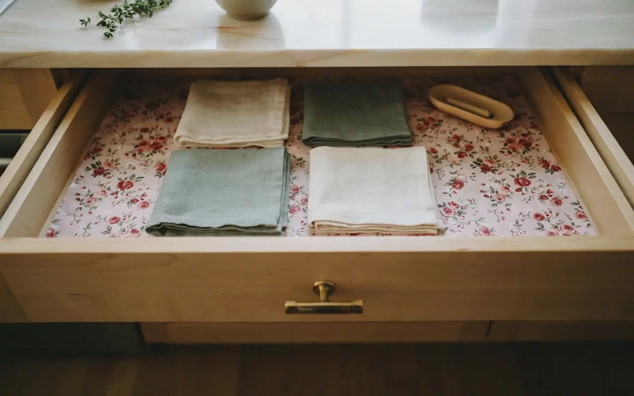
Nobody photographs the inside of a utensil drawer, but the small satisfaction of opening one that’s actually pretty is part of what makes a space feel loved rather than just tolerated. Line the bottom of one drawer — cutlery, junk, or linens — with a rose or floral-print shelf liner before putting anything back in.
This one is entirely for you, not for Pinterest, and that’s exactly the point. My read is these invisible details are what separate a kitchen that just looks styled from one that actually feels cared for day to day.
One Splurge Worth Considering, and How These Ideas Compare
15. Splurge on One Retro-Colored Small Appliance as the Room’s Single Color Statement So You Don’t Need to Repaint Anything
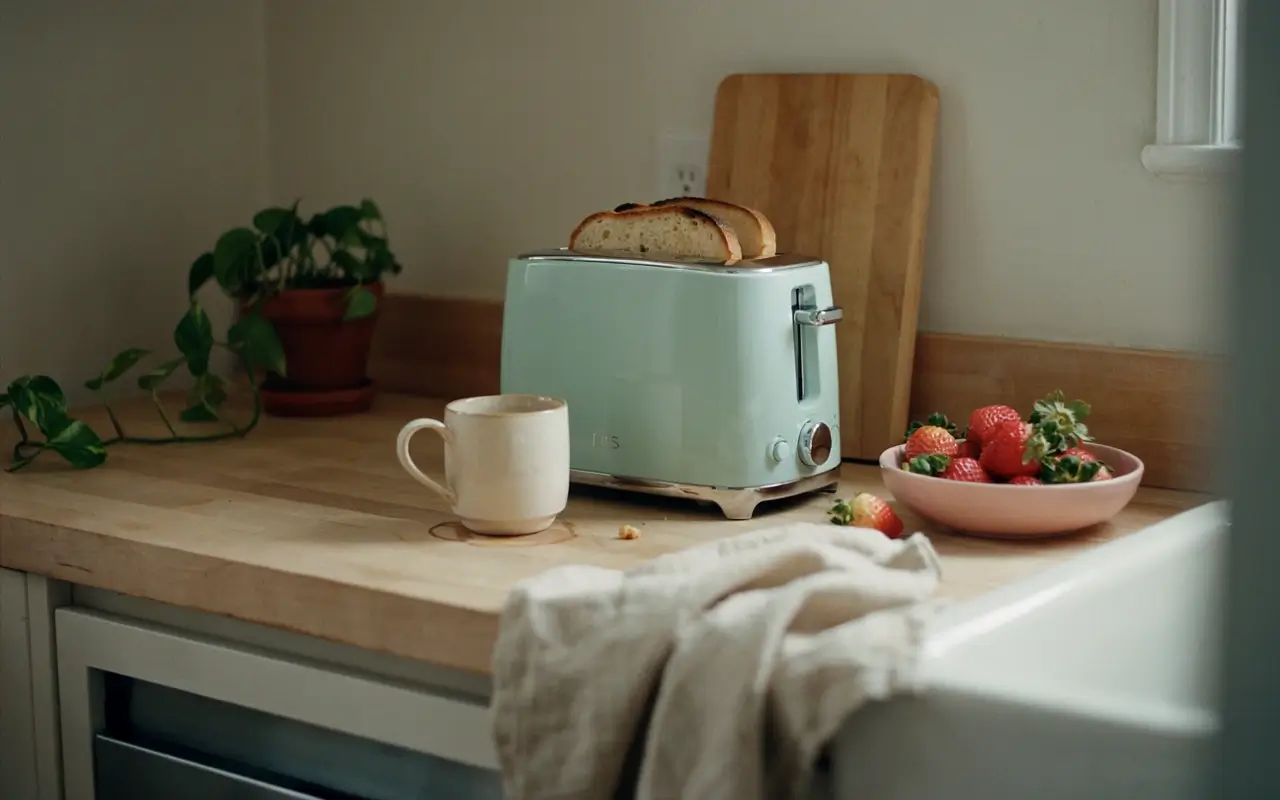
A full pink kitchen renovation isn’t realistic for most renters, but one retro-colored appliance can carry that same color statement for the whole room. A pastel stand mixer or a small retro-colored fridge, like the ones Big Chill makes, becomes the one saturated color note everything else — blush, cream, sage — gets to support instead of compete with.
I’d only splurge here if you’ve already got the neutral base and small styling details in place first; one bold appliance in an otherwise bare kitchen just looks like a mismatched purchase, not a design choice.
Not every idea on this list costs the same or fits every kitchen, so here’s how the main tiers stack up:
| Option | Best For | Key Benefit | Limitation |
|---|---|---|---|
| Removable styling (curtains, liners, runners) | Renters with strict lease rules | Fully reversible, no damage deposit risk | Won’t hide dated tile or laminate underneath |
| Shelf and counter styling (ceramics, glassware, props) | Anyone with at least one open surface | Cheap, high visual impact, easy to rotate | Needs a consistent palette or it looks cluttered |
| One retro appliance splurge | Homeowners or long-term renters | Replaces the need to repaint entirely | Higher upfront cost, harder to change later |
To layer color into a rental kitchen without paint, follow these steps:
- Pick one base tone — cream or blush — for your largest soft surface, like a curtain or runner.
- Add a second tone, like sage or lavender, through smaller objects such as tea towels or bud vases.
- Repeat one metal tone, brass or gold, in at least three spots — pulls, a tray, a picture frame — so the room reads as intentional.
Open shelving vs glass-front cabinets: Open shelving is better for renters because it needs no structural change and lets you rotate ceramics by season. Glass-front cabinets work better if you already have them and want the same soft display without dusting exposed dishes. The key difference is commitment — open shelving is temporary, glass-front is a fixed feature you’re styling around.
The 2025 U.S. Houzz Kitchen Trends Study found that white and off-white finishes remain the top choice for kitchen countertops and cabinetry at 64% combined, and traditional-style kitchens rose five points to become the second most popular style.
My read is that too much of one pink shade is what makes a rental pink kitchen look cheap, not the color itself — the photos that read expensive almost always mix cream and sage in to break the pink up. Some designers argue paint is the only way to meaningfully shift a kitchen’s mood, and a real color change on cabinetry does read as more permanent and intentional in photos. But in a rental where painting isn’t an option, layered textiles and displayed ceramics get you most of that same visual shift without breaking a lease.
None of this replaces basic lighting and layout fundamentals — a kitchen with one harsh bulb and zero natural light won’t fully transform through styling alone, and this list works best on kitchens that already have at least one shelf, counter, or window to build on.
Quick Answers Before You Start Styling
What makes a kitchen look “girly” without renovation?
Layered color tones, brass or gold hardware, soft textiles, and displayed ceramics or glassware do most of the work — no new cabinets or countertops needed.
What colors are used in a coquette kitchen?
Blush pink, cream, sage green, and butter yellow, usually layered over white or off-white cabinetry as the neutral base.
Can you get a pink kitchen aesthetic while renting?
Yes. Focus on removable textiles, open-shelf styling, and swappable hardware or drawer liners instead of paint or fixed features.
Is a full pink renovation necessary for this look?
No. Most girly kitchen pins rely on styling layers — textiles, ceramics, small props — not new cabinetry or countertops.
What’s the easiest first step for a feminine kitchen look?
Style one open or glass shelf with matching cream or blush ceramics before changing anything else in the room.
Final Thoughts
A generic beige kitchen and a soft, brunch-cafe kitchen are often the same four walls with a different styling layer on top. Start with color and light, add shelf and counter styling next, then layer in the small romantic details — the tea towel, the bud vases, the brass pulls — that most lists skip entirely. Save the appliance splurge for last, once the rest of the room already has a palette for it to support. None of it requires your landlord’s permission, and all of it comes with you when you move.


No Comment! Be the first one.