


21 Luxurious Living Room Modern Ideas That Actually Elevate Your Space
Your living room probably checks every box already. Sofa, rug, coffee table, maybe a plant you’ve moved three times trying to find its spot. And yet it still feels like it’s missing...

Your living room probably checks every box already. Sofa, rug, coffee table, maybe a plant you’ve moved three times trying to find its spot. And yet it still feels like it’s missing something — that settled, polished feeling you keep saving from Pinterest boards labeled “Dream Living Room.” If you’ve been searching for luxurious living room modern ideas that work in a real home (not a showroom), this list is built for that exact gap.
Maybe you’ve already tried the obvious moves — a few new throw pillows, a faux fur blanket draped over the arm of the couch, a fresh coat of greige on the walls. Those things help a little, but they don’t close the distance between “nice” and “high-end.” What actually does that is a combination of scale, lighting, color, and material working together on purpose, not by accident. Below are 21 specific ideas — pick a handful that fit your space and budget, and the room starts feeling intentional instead of just decorated.
What Actually Makes a Living Room Feel Luxurious?
A living room feels luxurious when furniture is sized generously for the space, lighting is layered across at least three sources instead of one overhead fixture, the color palette stays cohesive rather than busy, and materials like velvet, marble, brass, and linen are mixed with restraint. Scale and proportion matter most — expensive pieces in the wrong size will still feel off.
This isn’t just a feeling, either. Houzz’s annual Home Renovation Trends Study has found that living rooms consistently rank among the top spaces homeowners prioritize, with layered lighting and elevated materials coming up again and again as renovation goals. The interior design principles behind truly luxurious living rooms reinforce many of the same ideas, emphasizing thoughtful layering, quality materials, and a cohesive overall design.
If you’re working with a small apartment or a rental where painting and permanent changes aren’t an option, keep reading — most of these ideas have a renter-friendly version, and our guide on how to make a small or rental living room feel bigger and more luxurious goes deeper on that specific situation.
A quick note before you dive in: you don’t need all 21 of these. Trying to do everything at once usually backfires, both on your budget and on the room itself. Read through, notice which ones you keep nodding at, and start with three to five. That’s enough to shift the whole feel of the space.
21 Luxurious Living Room Modern Ideas
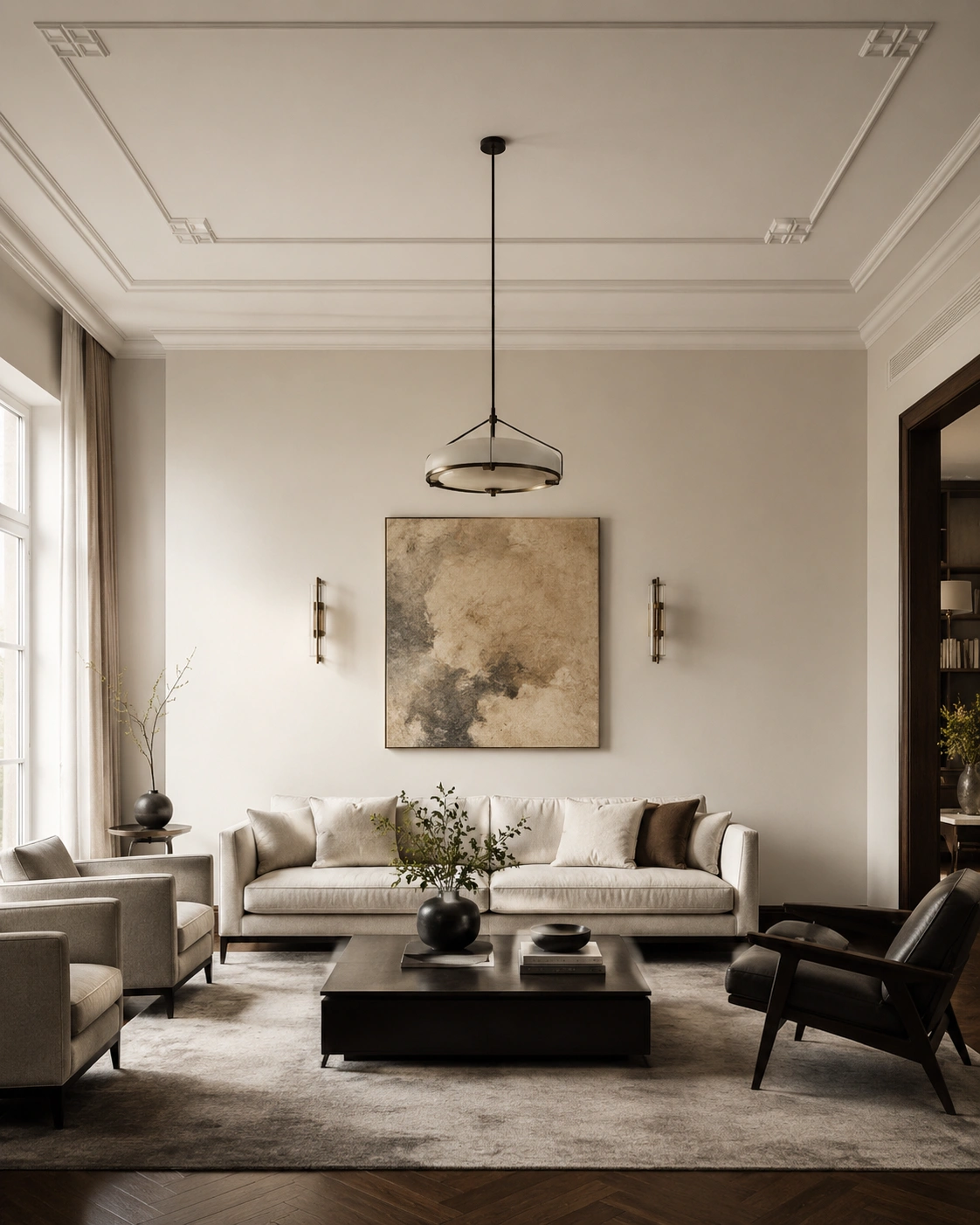
1. Velvet Statement Sofa in a Deep Jewel Tone
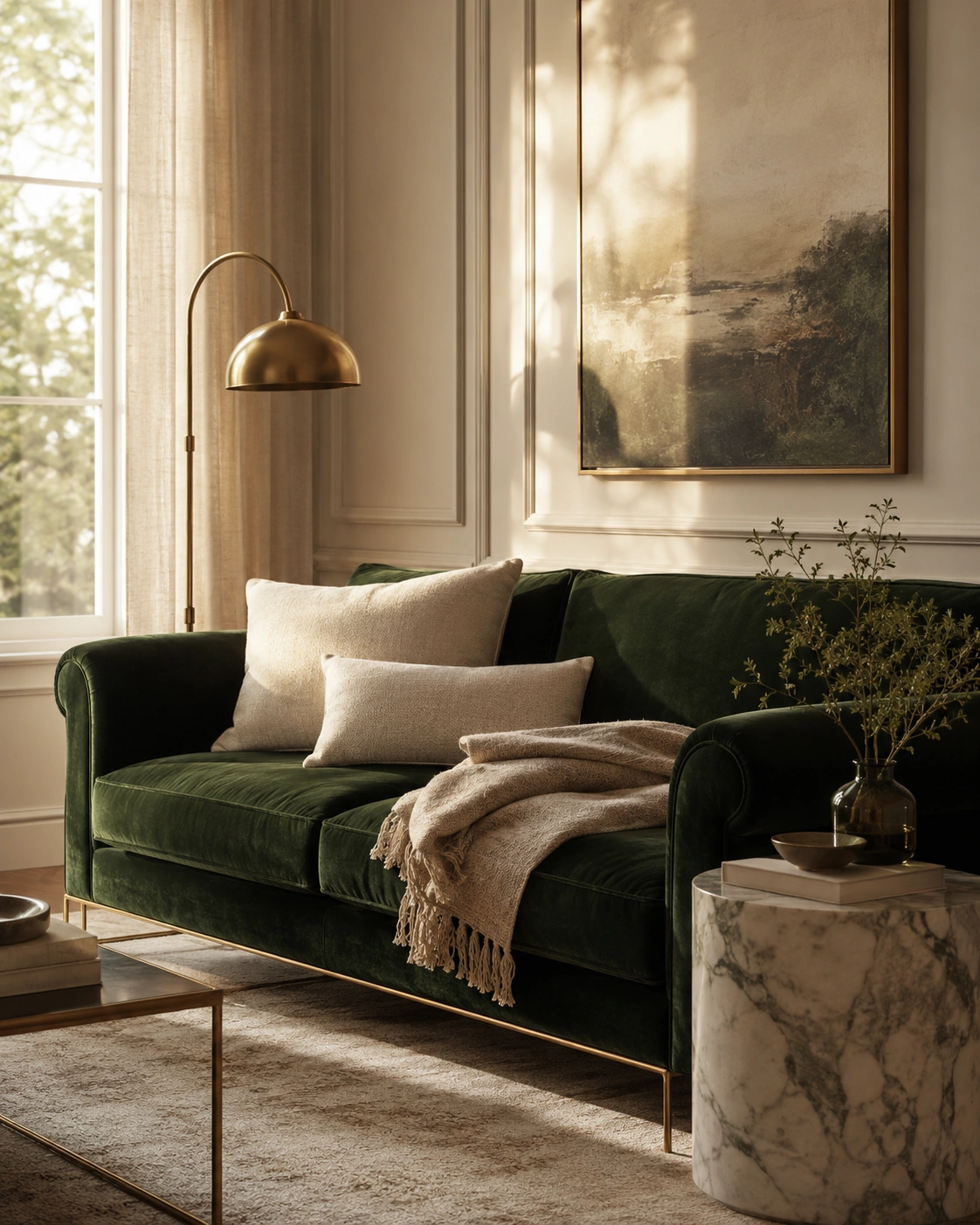
Swap a beige or gray sofa for one in a deep jewel tone — emerald, sapphire, or a warm burgundy — and the whole room shifts. Velvet catches light differently than flat cotton, so the color moves between matte and glowing depending on where you’re standing. That depth is what reads as expensive. A neutral sofa photographs fine, but a jewel-toned velvet one becomes the anchor everything else gets styled around, the way a great pair of shoes pulls an outfit together.
If a full reupholstery feels like too much right now, start smaller — a velvet accent chair, an ottoman, or even a slipcover in the same color family gets you most of the effect for less. CB2 carries approachable velvet pieces at a friendlier price point than higher-end retailers. For help choosing the right shape and proportions for your space, how to choose a sofa that looks and feels high-end covers scale, upholstery, and leg finish for this exact idea.
2. Marble Coffee Table with Brushed Gold Legs
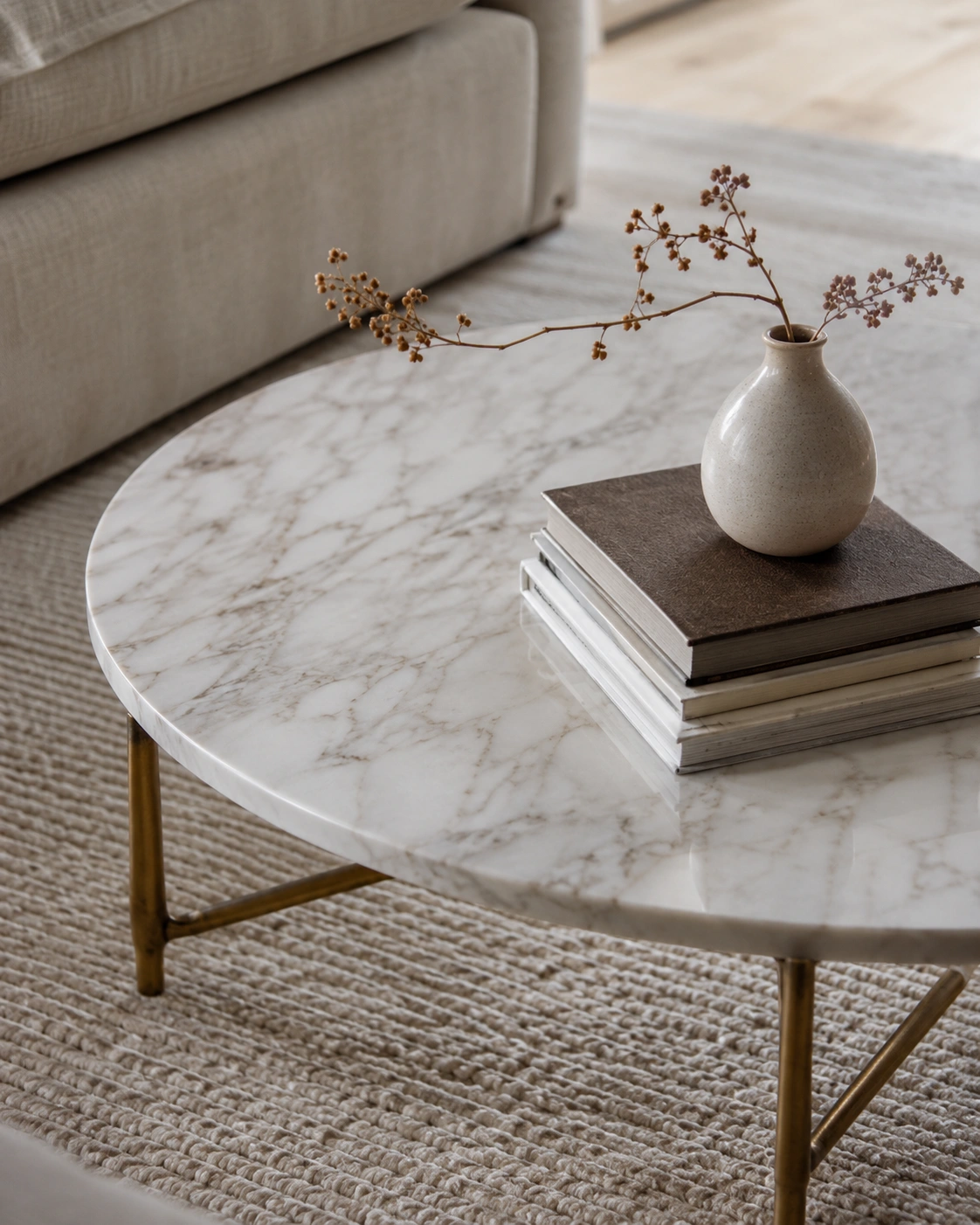
A marble top does something a wood or glass coffee table can’t — it has movement. The veining catches light unevenly, so the table never looks completely flat or static, even when nothing is on it. Pair that stone with thin brushed gold or brass legs, and you get a quiet contrast between something heavy and something delicate. That tension between materials is a big part of what separates a “fine” table from one that actually elevates the room.
Real marble can be pricey and prone to staining, so a porcelain or marble-look ceramic top is a smart stand-in — most people can’t tell the difference from across the room. Keep the styling on top minimal: one tray, one stack of books, maybe a small object with texture. The mistake to avoid is crowding it with too many small items, which makes even a beautiful table look cluttered and busy.
3. Floor-to-Ceiling Linen Curtains in Warm Ivory
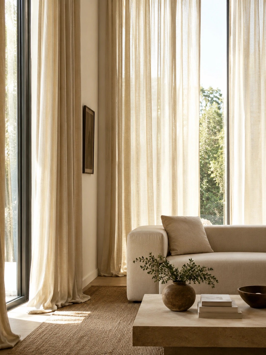
Curtains hung at standard window height make a room look like it’s wearing clothes that don’t fit. Mounting linen panels close to the ceiling, even several inches above the actual window frame, draws the eye upward and makes the whole wall feel taller. Linen specifically has a slight texture and drape that holds light softly instead of blocking it harshly, which gives the room a warm, almost hazy glow during the day — something heavier blackout fabric just can’t do.
Budget-friendly linen-blend panels from Target or IKEA work well here; the trick is in the hanging, not necessarily the fabric cost. Use a slim rod mounted as close to the ceiling as your wall allows, and let the curtains just brush or slightly pool on the floor. Avoid curtains that stop short above the floor — that gap is one of the fastest ways to make a room feel unfinished.
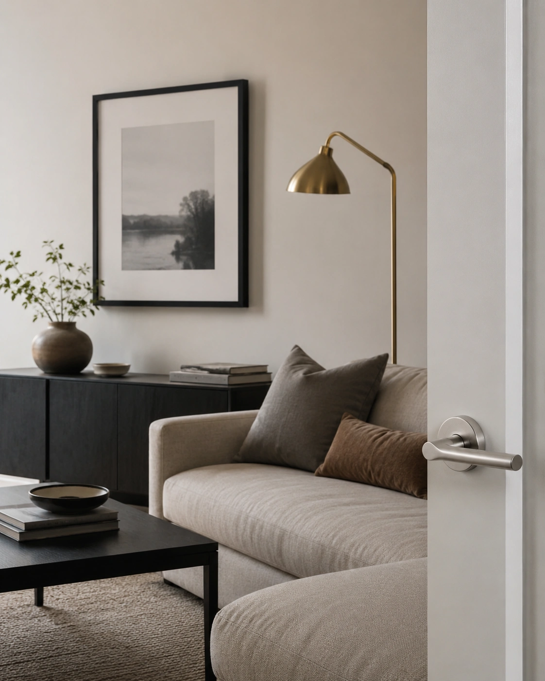
4. Sculptural Pendant Lighting as the Room’s Focal Point
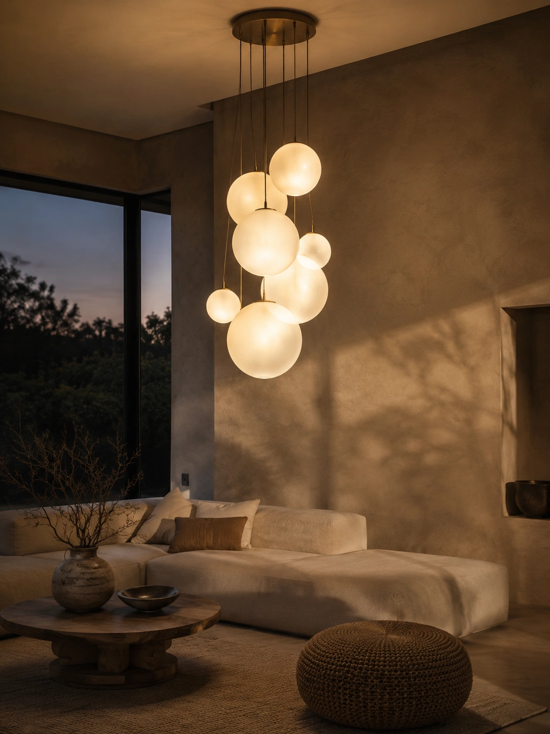
Most living rooms rely on one ceiling light doing all the work, which is exactly why they feel flat once the sun goes down. A sculptural pendant — something with shape, texture, or an interesting material like frosted glass or woven rattan — gives the room a visual centerpiece even before it’s switched on. Once it is, the light pools downward in a softer, more directional way than a flush-mount fixture, which immediately reads as more designed.
Rejuvenation makes statement pendants that work well over a seating area or in place of a flush ceiling light, and many plug-in versions don’t require any rewiring — a real option for renters. Hang it low enough to feel like part of the seating arrangement, not just a ceiling decoration. Pair it with a dimmer if your fixture allows, since that single switch does more for atmosphere than almost anything else.
5. Built-In Bookcase with Curated, Intentional Styling
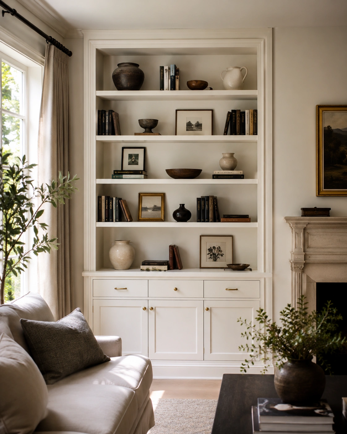
A bookcase that looks “designed” rather than “filled” usually comes down to restraint and rhythm. Books grouped in short stacks, mixed with a few objects — a vase, a piece of pottery, a small framed print leaning rather than hung — create visual breathing room. Empty space between groupings is doing as much work as the items themselves, giving the eye somewhere to land instead of scanning a wall of clutter.
You don’t need actual built-ins to get this look. An IKEA BILLY bookcase, painted to match the wall and trimmed with simple molding along the top and sides, mimics a built-in for a fraction of the cost. Whatever shelving you use, edit down to about two-thirds full — a packed shelf, even with beautiful objects, tends to look busy rather than curated.
6. Monochromatic Greige or Warm Taupe Color Palette
Painting just the walls greige and leaving the trim, ceiling, and furniture in completely different tones is one of the most common reasons a room still feels disjointed after a repaint. A true monochromatic approach — where walls, trim, and even some furniture sit within the same warm neutral family, just at different depths — makes the whole space feel calmer and more cohesive, almost like the room was designed as one piece rather than assembled.
If you’re choosing a greige or taupe and aren’t sure which shade to commit to, Farrow & Ball’s curated living room color inspiration is a good place to look at named shades like Elephant’s Breath or Mole’s Breath. For a deeper breakdown of palettes that work specifically for this aesthetic, the best neutral and jewel-tone color palettes for modern living rooms can help you narrow down combinations that feel balanced, sophisticated, and cohesive.
7. Layered Area Rugs for Depth and Textural Luxury
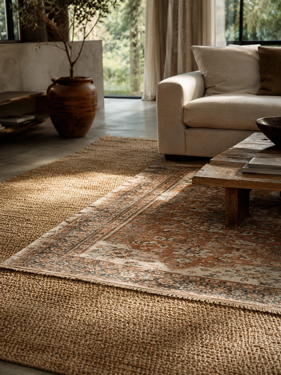
A single rug, no matter how nice, can still look like it’s just sitting on the floor. Layering a smaller patterned or textured rug over a larger flat-weave one — jute, sisal, or a simple wool — adds depth the same way a rug pad would, but visually. It breaks up a large expanse of flooring without needing a giant, expensive single rug, and it gives the seating area a defined, grounded edge.
This is one of the easiest ideas to try without spending much, especially if you already own an old rug that’s a little worn — it becomes the base layer instead of the star. Keep the top rug smaller and centered under the coffee table, with the larger one extending under the front legs of the sofa and chairs. Avoid two rugs with competing busy patterns; one should be the quiet one.
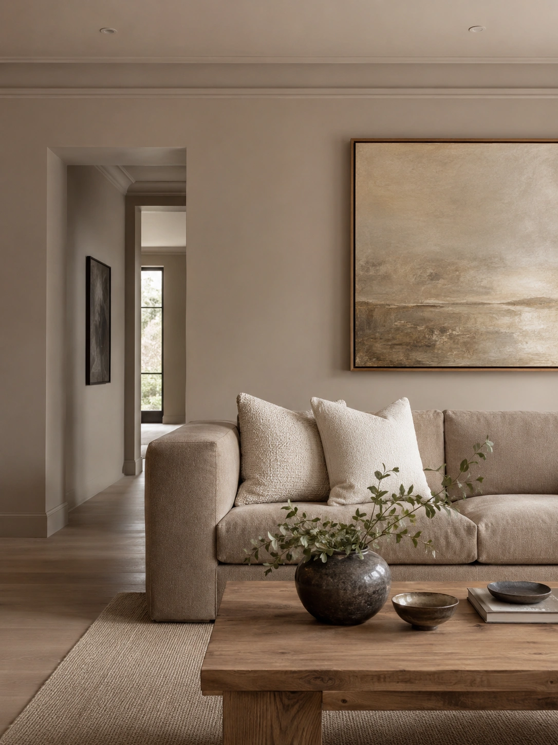
8. Oversized Abstract Art Anchored Above the Sofa
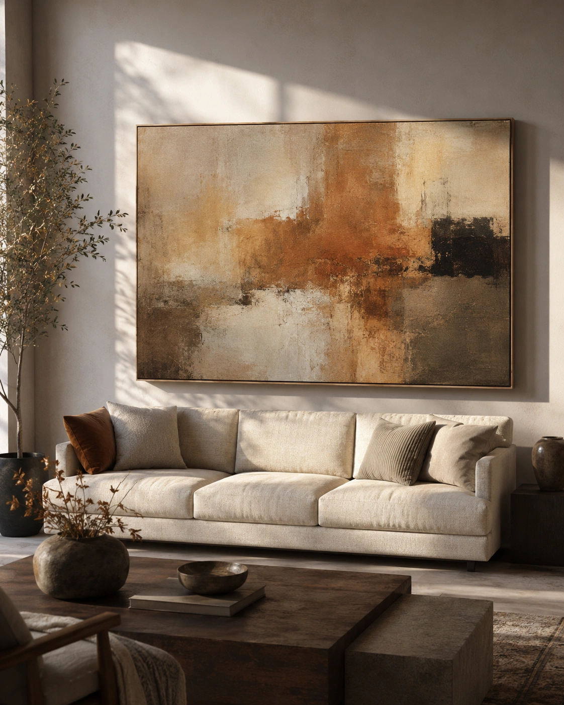
Small framed art above a sofa is one of the fastest ways to make a room feel under-furnished, even if everything else is right. Scaling up — choosing one large abstract piece that spans roughly two-thirds of the sofa’s width — gives the wall a sense of intention instead of an afterthought. Abstract pieces work especially well because they don’t compete with patterned pillows or rugs the way a busy landscape or portrait might.
Large canvases can be expensive, but oversized abstract prints from retailers like Society6 or even a DIY canvas painted in your palette’s tones can fill the same visual space for much less. Hang it so the bottom edge sits roughly six to eight inches above the sofa back — too high and it floats awkwardly, too low and it crowds the cushions.
9. Bouclé Accent Chair Placed in a Corner Nook
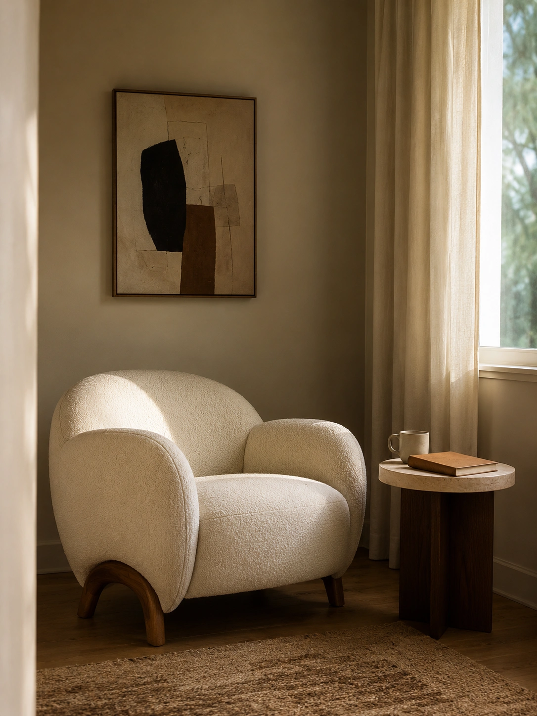
Every living room has that one awkward empty corner that ends up holding nothing, or worse, a pile of mail and chargers. A single bouclé chair, with its soft, looped texture, fills that space in a way that feels intentional rather than like overflow seating. The texture itself does a lot of the work here — bouclé reads as soft and tactile even in a photo, which is part of why it’s everywhere on Pinterest right now.
Target, H&M Home, and Amazon all carry bouclé-style chairs and slipcovers at accessible prices, so this doesn’t have to be a splurge piece. Add a small side table and a single lamp next to it to turn the corner into a little reading nook rather than just a chair against a wall. Save this idea if you’ve got one of those corners that’s never quite known what to do with itself.
10. Curved Sofa Silhouette for Softer, Modern Luxury
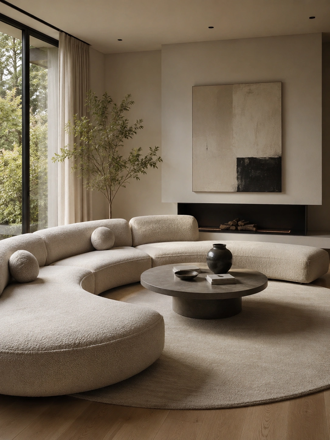
Straight-lined sofas are everywhere, which is part of why a curved one stands out immediately. The gentle arc softens the whole room — there are fewer hard right angles for the eye to land on, and the shape naturally encourages a more circular, conversational seating arrangement. This is one of those ideas that’s easy to recreate visually even with a smaller curved loveseat instead of a full sectional.
If a curved sofa isn’t in the budget or doesn’t fit your space, a curved-back accent chair or an oval ottoman can introduce the same softness on a smaller scale. Curved furniture tends to need a little more open floor space around it to read correctly, so this idea works best in rooms that aren’t already tight on walking room — a narrow apartment living room might do better starting with a smaller curved piece.
11. Integrated Cove Lighting with Layered Ambient Glow
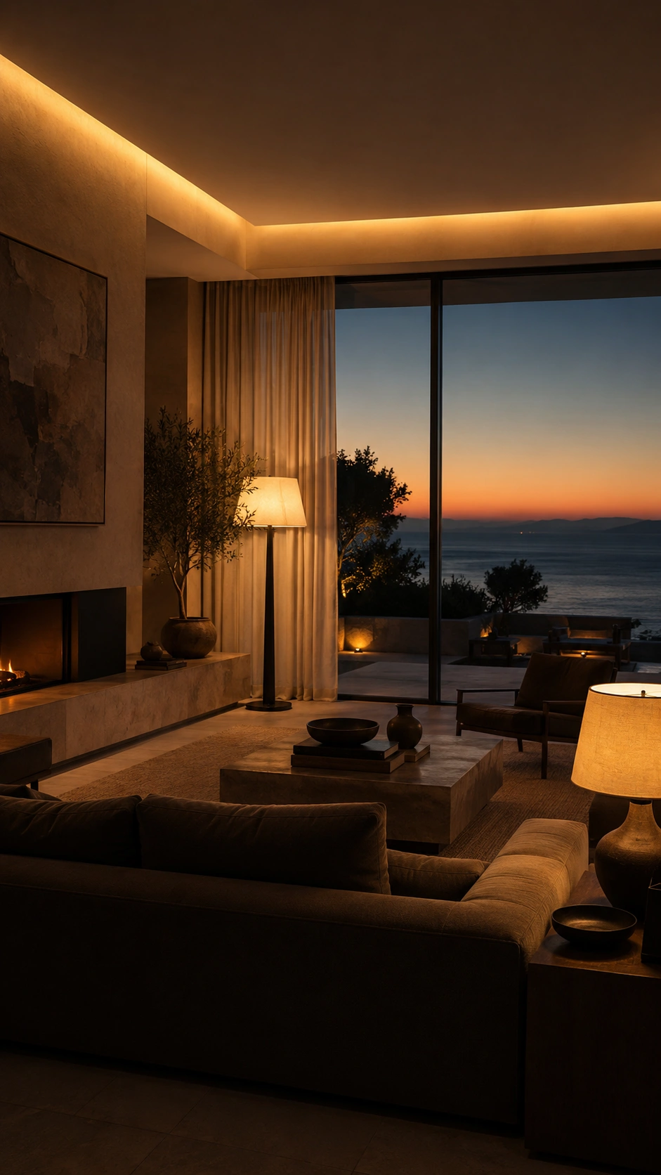
Cove lighting — a hidden LED strip tucked along a ceiling ledge or behind crown molding — washes light upward and across the ceiling instead of down onto people’s heads. That upward wash is what gives hotel lobbies and high-end living rooms their soft, glowing feel after dark. Combined with at least one floor lamp and one table lamp, you get three distinct light sources at different heights, which is the real difference between a flat room and a layered one.
This idea does involve a bit more effort than most on this list, but battery-powered or plug-in LED strip lights can mimic cove lighting along a shelf or behind a TV unit without any electrical work — a genuinely renter-friendly version. The goal isn’t brightness, it’s variety: a few softer sources scattered around the room will always feel more expensive than one bright overhead light.
12. Fluted Glass or Fluted Wood Cabinet as an Accent Feature
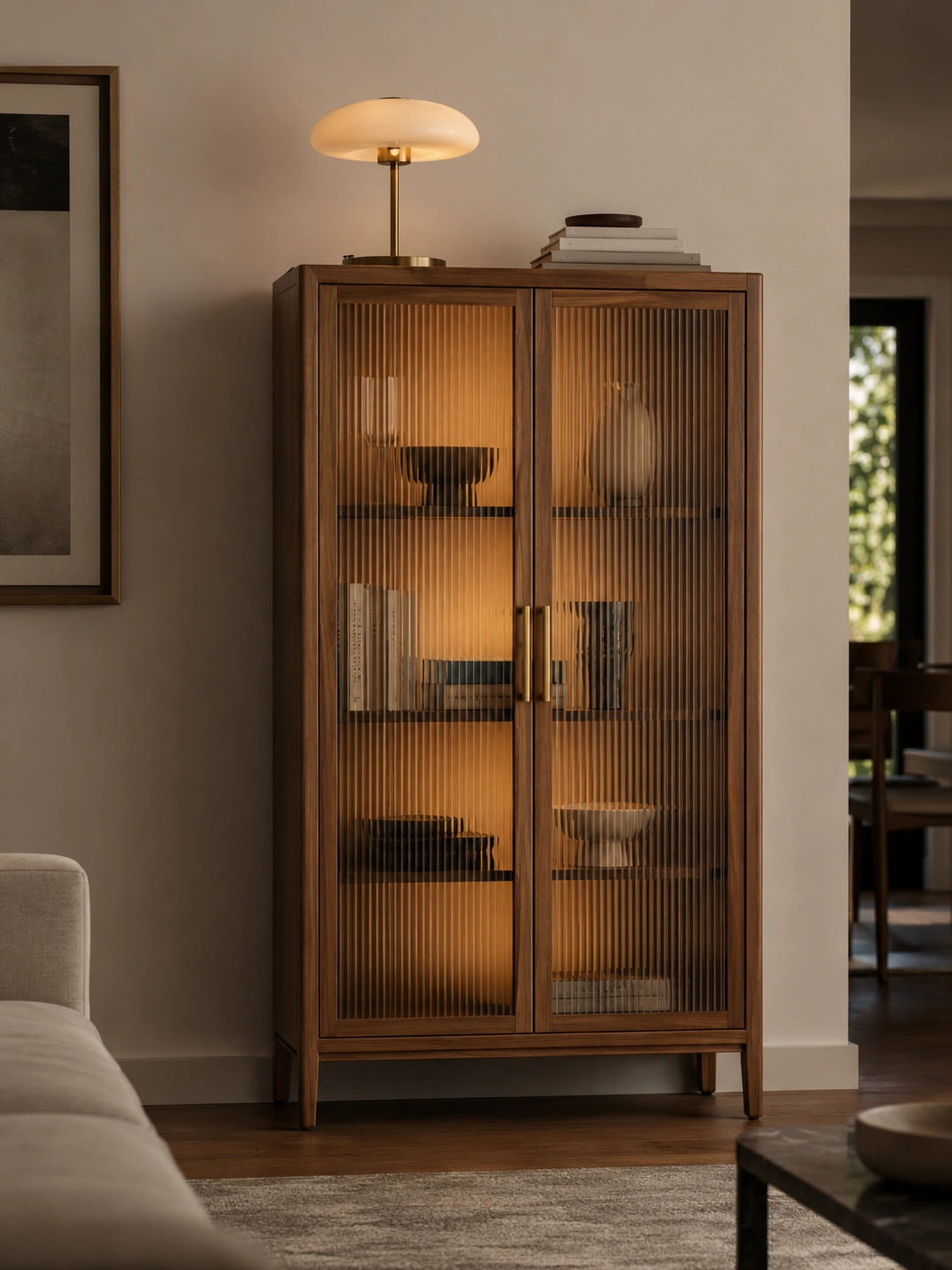
Fluted detailing — those vertical ribbed grooves you’ve probably noticed on cabinets and headboards all over Pinterest lately — adds texture and shadow play to a flat surface without adding any extra color or pattern. On a cabinet, fluted glass doors also soften whatever’s stored inside into a hazy outline, which looks intentional even if what’s behind it is just your media equipment or extra blankets.
A full fluted cabinet is a bigger purchase, but fluted glass adhesive film or reeded wood paneling can be applied to an existing plain cabinet for a fraction of the price — this is a popular renter hack precisely because it’s removable. Place the cabinet somewhere it can be the visual “moment” of that wall, rather than tucked into a spot where it competes with art or shelving nearby.
13. Deep Forest Green or Moody Navy Accent Wall
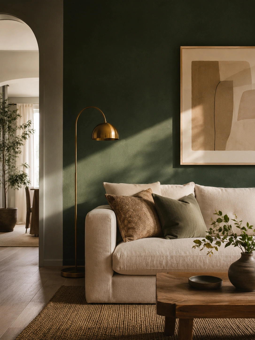
A deep green or navy wall behind the sofa does something a bright accent color never quite manages — it recedes rather than shouts. Dark, saturated colors in a matte or eggshell finish absorb light instead of bouncing it back, which makes the wall feel like a backdrop rather than a statement. Against that backdrop, lighter furniture and brass or gold accents suddenly pop in a way they wouldn’t against white.
This works in rental-friendly versions too — large fabric wall panels or a removable wallpaper in a deep tone can stand in for paint if you’re not able to repaint. If you do paint, stick to one wall, ideally the one your seating faces toward rather than away from, so you actually get to look at it. Two dark walls in a small room can start to feel heavy rather than cozy.
14. Travertine or Organic Stone Side Table
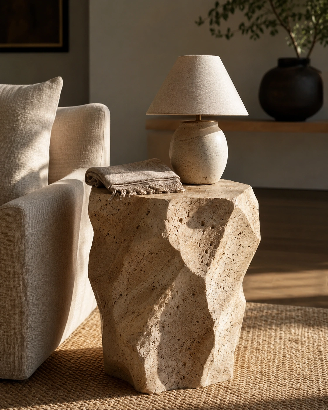
Travertine has a porous, slightly uneven surface that catches light unevenly — small shadows and texture variations that a smooth manufactured table just doesn’t have. As a side table, it introduces an organic, almost sculptural quality next to a chair or sofa, especially when its shape is irregular or rounded rather than a perfect square or circle.
Genuine travertine pieces can be pricier, but resin or composite versions designed to mimic the stone’s texture are widely available and hold up well for everyday use, including drinks and books on top. One stone-look piece is usually enough — pairing it with a second stone or marble item nearby can start to feel like a showroom display rather than a lived-in room.
15. Minimalist Fireplace with a Marble or Plaster Surround
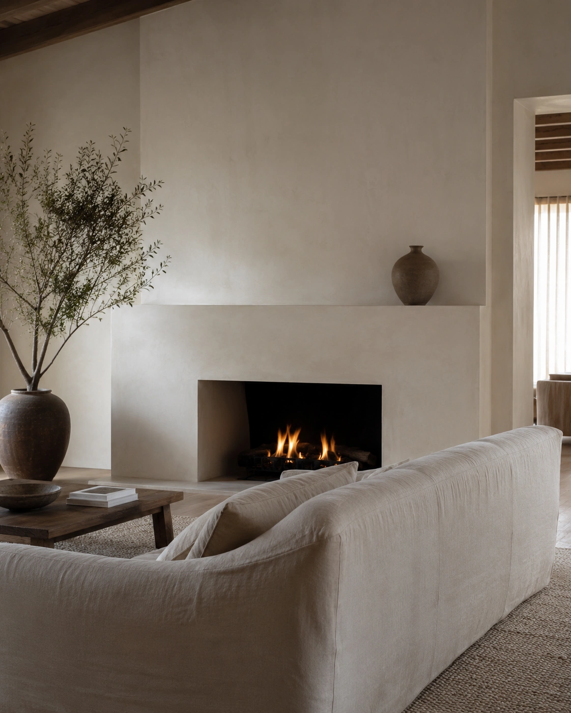
A fireplace surrounded in ornate tile or dated brick can date an entire room, even if everything else around it is updated. A smooth plaster or marble-look surround, kept deliberately minimal — no busy mantel display, just one or two objects — turns the fireplace into a quiet focal point rather than a competing pattern in the room.
If you’re renting or can’t alter an existing fireplace, a heat-safe plaster-effect paint or a removable surround panel can update the look without permanent changes — just confirm any product is rated safe for the fireplace type before using it. For homes without a working fireplace, a simple framed mirror or art piece above a low console can borrow this same calm, anchored feeling.
16. Mixed Metal Finishes Used with Restraint and Intention
The old rule of matching every metal finish in a room actually works against you here. A small amount of contrast — warm brass on a lamp, matte black on a frame, brushed nickel on a hardware detail — reads as more considered than an all-matching set, almost like the room was furnished over time rather than bought as a kit. The key word is small: two or three finishes, used sparingly, not scattered everywhere.
Start with what you already own. If your lamps are brass and your picture frames are black, you may already have this mix without realizing it — the goal is just to notice it and lean into it rather than rushing to make everything match. Avoid introducing a third or fourth finish just for variety’s sake; restraint is what keeps this looking intentional instead of mismatched.
17. Statement Ceiling with Plaster Molding or Painted Detail
Ceilings are the most overlooked surface in most living rooms, which is exactly why adding detail there has such an outsized effect. Simple geometric molding, or even just painting the ceiling a soft tone slightly different from the walls, draws the eye upward and makes the room feel taller and more finished — almost like the space was architecturally designed rather than just painted and left.
This is firmly a “bigger project” idea, and it’s fair to say it’s not realistic for everyone, especially renters. A lower-effort version is peel-and-stick ceiling medallions around a light fixture, or simply painting the ceiling in a warm white rather than stark white — a small shift that still adds a sense of intention overhead.
18. Gallery Wall with Oversized Black Frames and Monochrome Art
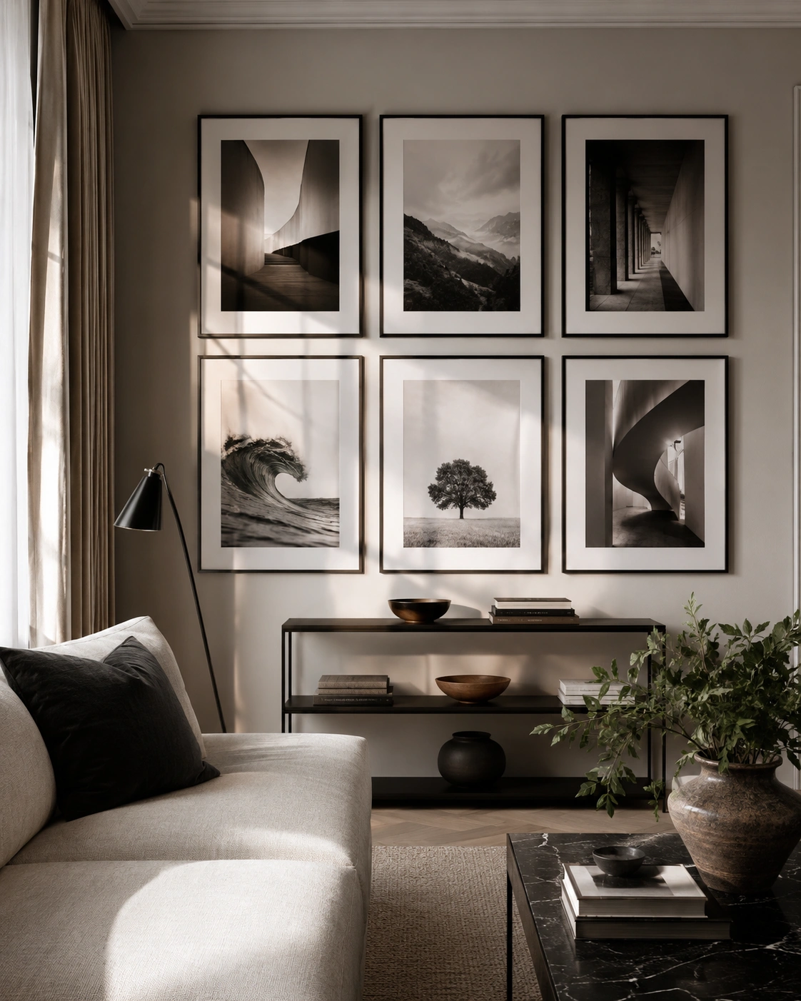
A gallery wall made of mismatched frame sizes and colors can look chaotic fast. Switching to identical oversized black frames with black-and-white or sepia-toned art creates a grid-like structure that reads as curated even with very different images inside. The repetition of the frame color does most of the work — it ties everything together visually, even if the subject matter varies from photography to line drawings.
For inspiration on spacing and arrangement, designer-approved living room ideas from Elle Decor are worth a look. Budget-wise, IKEA and Amazon both sell affordable black frames in matching sizes — measure your wall and lay the arrangement out on the floor first, since this is the step most people skip and regret.
19. Tall Sculptural Indoor Plant as a Living Design Element
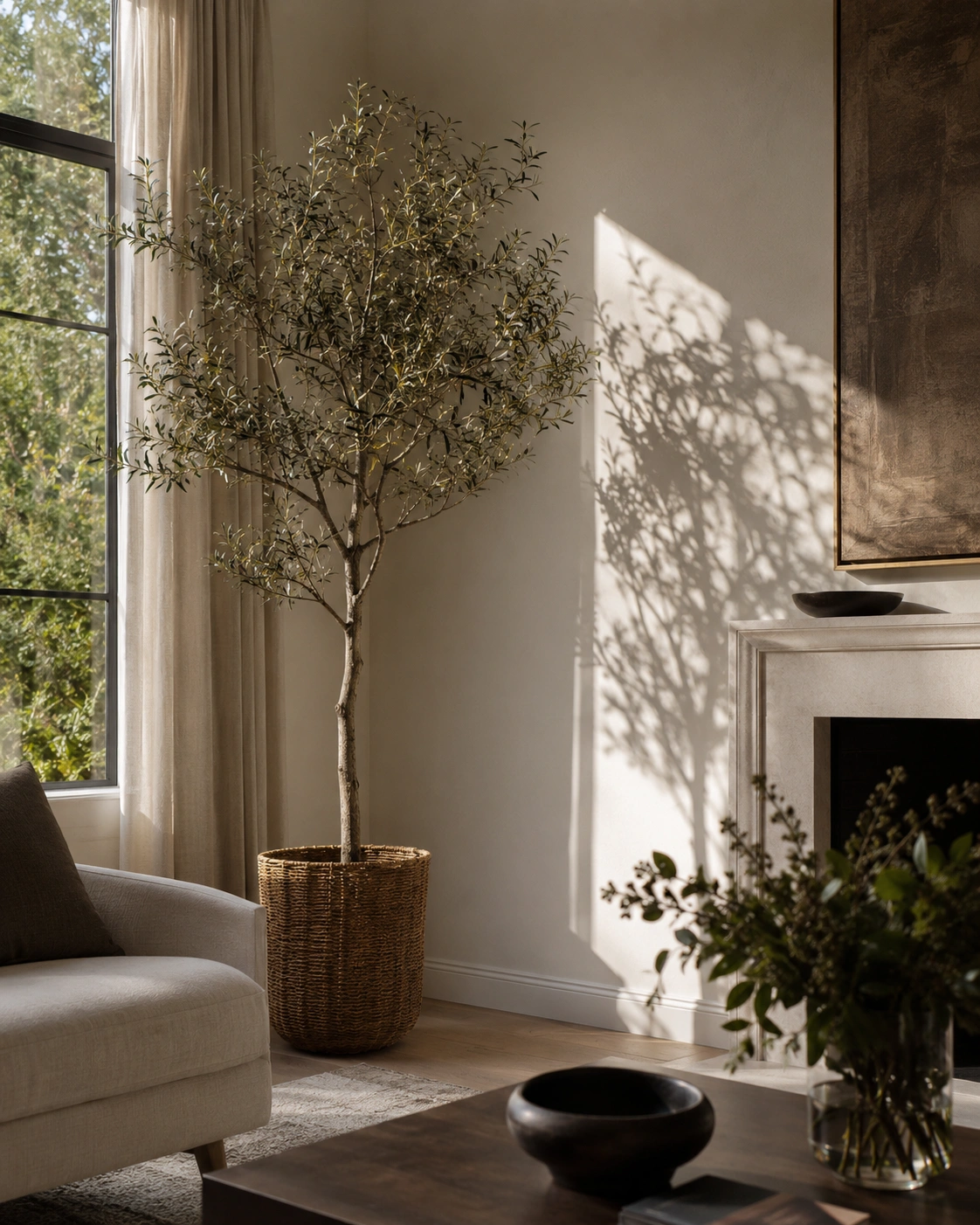
A tall plant does something most decor items can’t — it adds height and movement without adding color or pattern. Placed in an empty corner or beside a window, a fiddle leaf fig, olive tree, or even a large faux version fills vertical space that often goes unused, softening the hard lines of furniture and walls around it.
If a live plant feels like a commitment, a high-quality faux version has come a long way and works just as well visually, especially in low-light corners where a real plant would struggle anyway. Skip the small tabletop plants for this particular spot — at this scale, a single tall plant has more impact than several small ones scattered around.
20. Concealed Storage with High-End Hardware and Clean Lines
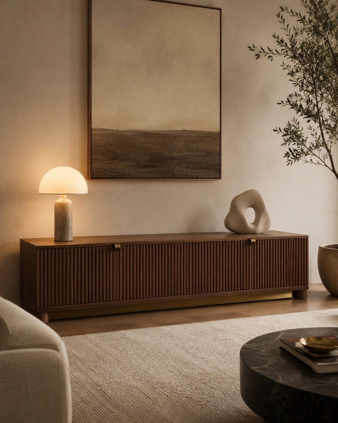
Clutter is one of the fastest ways to undo every other idea on this list. A media console or low cabinet with closed storage and a nice handle — brass, leather pull, or sculpted wood — lets remotes, cables, and games disappear behind clean lines, while the hardware itself becomes a small detail that adds polish.
This is a genuinely easy swap if you already own an open shelving unit that’s become a catch-all — even adding a few woven baskets with lids to existing shelves achieves a similar effect for very little money. The goal is for surfaces to have breathing room; a console with two or three styled objects on top will always look more high-end than one with a dozen random items.
21. Hotel-Inspired Symmetry in Sofa Styling and Cushion Arrangement
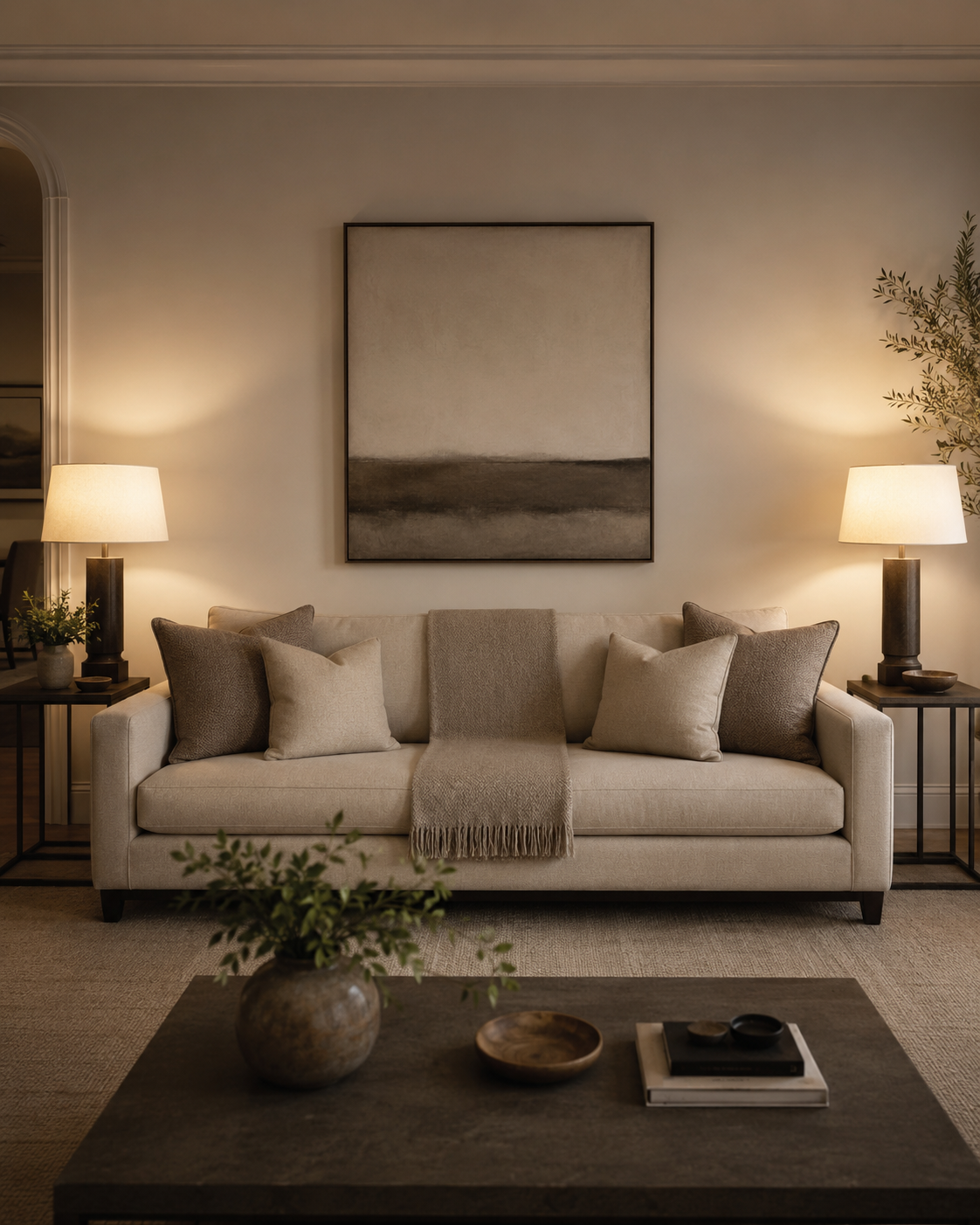
Hotel lobbies and lounges feel calm partly because of symmetry — matching lamps, matching cushions, balanced arrangements on either side of a central piece. Applying that same logic to your sofa, with mirrored cushion pairs and a centered throw, gives even a mismatched collection of pillows a sense of order. It’s a small adjustment that photographs beautifully and takes about ten minutes.
This is genuinely one of the easiest ideas to try this weekend with things you already own — no shopping required. Try this: lay two similar cushions on each side, fold a throw in thirds along the back edge, and step back. If your side tables and lamps don’t match, even pairing them by height or color family gets you most of the symmetrical effect without buying anything new.
FAQs
What is the best color for a luxury modern living room?
Warm neutrals like greige, taupe, and warm white work as a base, paired with one deeper tone — forest green, navy, or terracotta — used sparingly on a wall, sofa, or accent piece for contrast.
Can renters create a luxurious living room without renovating or painting?
Yes. Layered lighting with plug-in lamps, removable wallpaper or fabric panels, fluted adhesive film, and styling changes like symmetry and layered rugs all work without any permanent changes to the space.
What single piece of furniture makes the biggest luxury impact in a living room?
A well-scaled sofa in a rich color or texture, like velvet or bouclé, tends to have the biggest impact, since it’s the largest piece in the room and sets the tone for everything around it.
How do I choose the right size area rug for a modern luxury living room?
A rug should be large enough for the front legs of your sofa and chairs to sit on it, not float beside it. Undersized rugs are one of the most common reasons a room feels off.
What small, inexpensive changes make a living room look most expensive?
Symmetrical cushion styling, layering a second smaller rug, swapping a single light bulb for a warmer tone, and adding one tall plant or oversized art piece all make a noticeable difference for very little money.


No Comment! Be the first one.