


26 Grey and Green Living Room Ideas You’ll Love
Grey living rooms are everywhere. And yet somehow, most of them feel cold. You know the room — good bones, decent furniture, but something flat and slightly joyless about it by 4 p.m. Adding green is...

Grey living rooms are everywhere. And yet somehow, most of them feel cold.
You know the room — good bones, decent furniture, but something flat and slightly joyless about it by 4 p.m. Adding green is the right instinct. But walking away from the paint display at B&Q without buying anything is basically a rite of passage for anyone who’s tried this.
This article cuts through that. You’ll find 26 specific grey and green living room ideas, each with a real design action, the reasoning behind it, and at least one named paint pick where it matters. There are also practical notes on undertones and room orientation — the two things most inspiration roundups quietly skip.
A 2025 study in Frontiers in Psychology found that nature-inspired green colour schemes measurably improve the perceived restorativeness of residential spaces. Science aside, the palette just works. Here’s how to make it work in your room.
Why the Grey and Green Pairing Works Better Than You Think
Colour theory doesn’t fully explain this combination. Grey is achromatic, green is saturated — on paper, that contrast reads clinical. But in practice, the right grey acts as a neutral canvas that lets green breathe without competing.
Green is the colour most strongly associated with natural environments in the human visual system. In a living room, where the psychological goal is decompression, that matters more than it might in a kitchen or hallway. Grey on its own reads as controlled, slightly industrial. Add green and the same room starts to feel inhabited.
Most people assume any grey works as a base for green. It doesn’t. Greys with pink or purple undertones — Farrow & Ball’s Purbeck Stone is a good example — fight sage and olive greens badly. Greys with blue or green undertones, like Mizzle No.274, sit far more comfortably with cool-leaning greens like sage and eucalyptus.
Or maybe I should say it this way — the grey isn’t the backdrop. It’s half the palette. Get its undertone wrong and no amount of green styling will fix it.
Grey and green living room ideas pair one or more shades of grey with at least one green — from pale sage to deep forest — across walls, furniture, and accessories. The combination works because green’s biophilic warmth counteracts grey’s tendency to read cold in artificial light. Undertone alignment between the two is the deciding factor in whether the result feels cohesive or chaotic.
According to the 2025 Frontiers in Psychology research, nature-inspired colour palettes in living spaces directly enhance occupants’ psychological wellbeing and sense of restorativeness. Grey and green living room ideas capitalise on this by combining grey’s visual calm with green’s biophilic warmth — but only when the undertone temperatures of both colours are properly matched. That’s the step most online inspiration skips.
How to Match Your Grey Undertone to the Right Green
This is where most decorating decisions collapse. You pick a grey. You pick a green. The room looks off. You can’t figure out why.
The fix is simpler than it sounds. Greys split into two camps: those that pull warm (towards beige, yellow, or blush) and those that pull cool (towards blue or violet). Green does the same thing. Sage and olive lean warm. Emerald and forest lean cool. Eucalyptus and seafoam can go either way depending on the light.
Match warm to warm. Match cool to cool. Mismatch them and the room will feel permanently unsettled — not dramatically wrong, just slightly off no matter what you change.
Some colour consultants argue that deliberately contrasting undertone temperatures — a cool grey with a warm green — creates visual tension that’s actually more interesting. That’s valid in commercial spaces or in rooms styled primarily for photography. But if you’re decorating somewhere you live in every day, matching undertone temperatures creates a room that feels effortlessly coherent rather than quietly agitated.
My read is that matching gives you a safe starting point, not a ceiling. Once the base pairing feels settled, one deliberate mismatch — say a brass lamp or a warm wood floor — adds exactly the tension you need without destabilising the whole scheme.
Quick Comparison
| Grey Undertone | Best Green Pairing | Named Paint Examples | Avoid |
|---|---|---|---|
| Cool (blue/violet) | Sage, eucalyptus | F&B Mizzle No.274 + SW Quietude | Olive, warm moss |
| Warm (beige/yellow) | Olive, muted sage | Dulux Tranquil Dawn + Dulux Buckingham Green | Icy mint, bright emerald |
| Neutral/balanced | Most greens | Dulux Polished Pebble + F&B Mizzle No.274 | Neon or yellow-green |
| Dark/charcoal | Forest, dark sage | F&B Plummett + F&B Studio Green No.93 | Pale sage (disappears at depth) |
Sage green vs emerald green for a grey living room: sage pairs better with warm-toned greys because both share yellowish undertones. Emerald suits cool or neutral greys — its blue-green base complements without clashing. The key difference is undertone temperature. If your grey pulls pink or beige, choose sage. If it pulls blue or stone, emerald is the stronger decision.
To pair grey and green successfully, identify your grey’s undertone in daylight first — not under ceiling lights. Cool greys that read slightly blue work best with sage and eucalyptus. Warm greys that pull beige or yellow pair better with olive and muted sage. According to Farrow & Ball’s colour guidance, Mizzle No.274 bridges both families as a naturally grey-green base.
How to Choose Your Shade Based on Room Orientation
This is what most guides skip entirely.
Your room’s orientation — which direction the windows face — determines how both grey and green will behave in the actual light those walls receive. It changes the right decision more than the paint chip in your hand ever will.
To choose the right grey and green for your room’s light:
- Identify your window orientation — north, south, east, or west.
- For north-facing rooms, choose a warm grey base and a deeper, richer green (pale sage washes out in cool indirect light).
- For south-facing rooms, use a cooler grey and a bolder or darker green — direct sunlight will lift it.
- For east or west-facing rooms, test your swatch at both morning and evening before committing.
- Always view swatches at A4 size minimum. Small chips lie consistently.
Look — if you’re in a north-facing room, here’s what actually works: go lighter on the grey and richer on the green. North-facing rooms receive cool indirect light all day, which drains warmth and turns pale sage into washed-out grey. A deeper muted green holds its colour even as the light drops. Your grey should lean warm — Dulux’s Tranquil Dawn shifts noticeably greener in dim conditions, which actively helps.
South-facing rooms face the opposite problem. Direct sunlight bleaches pale colours by midday. Here you can afford a darker green — even Studio Green No.93 — because the light will lift it naturally. The grey can run cooler without feeling cold.
East-facing rooms get warm morning light and cool afternoon light. A neutral grey with a sage that reads differently across the day feels warm at breakfast, calmer by evening. West-facing rooms reverse that: golden late-afternoon light makes olive and warm sage absolutely sing.
26 Grey and Green Living Room Ideas
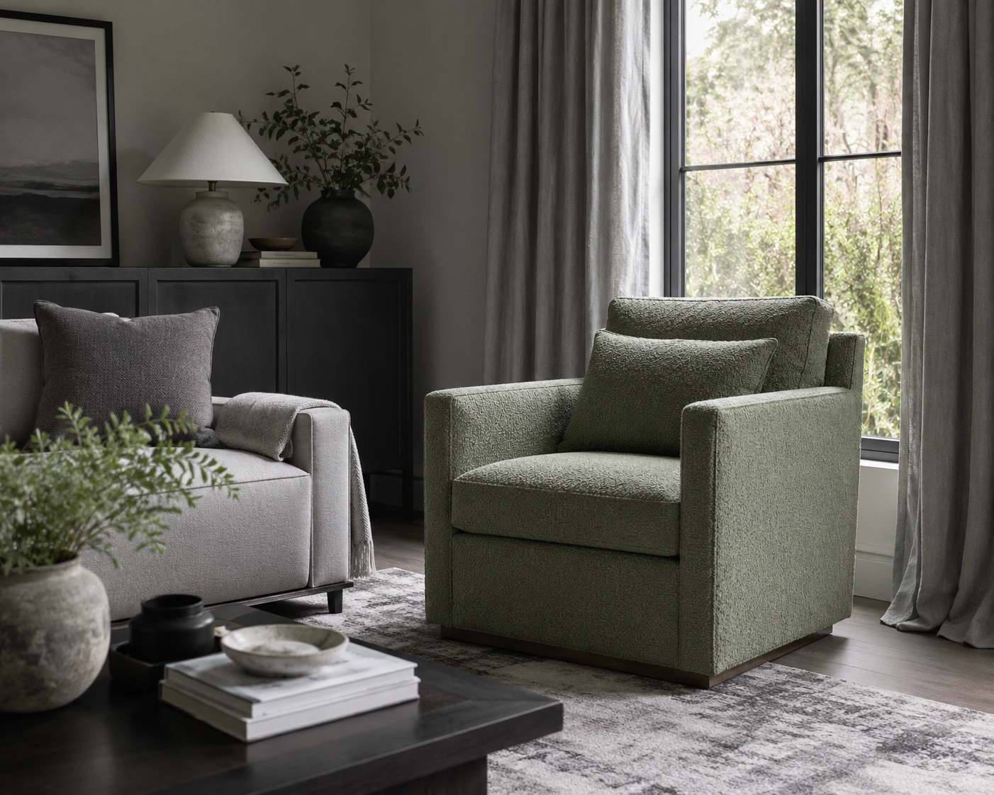
1. Sage Green Sofa Against Cool Grey Walls
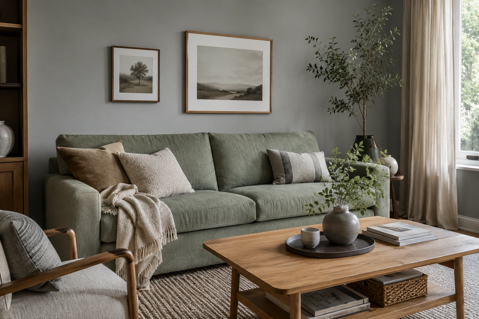
A sage green sofa is one of the safest entry points into this palette — warm enough to soften grey walls without dominating. Choose linen or boucle to keep it casual. Pair with Farrow & Ball’s Mizzle No.274, which carries a green undertone itself and prevents the walls reading as blue. Add a warm oak coffee table to ground the combination.
2. Forest Green Velvet Accent Chair on a Grey Rug
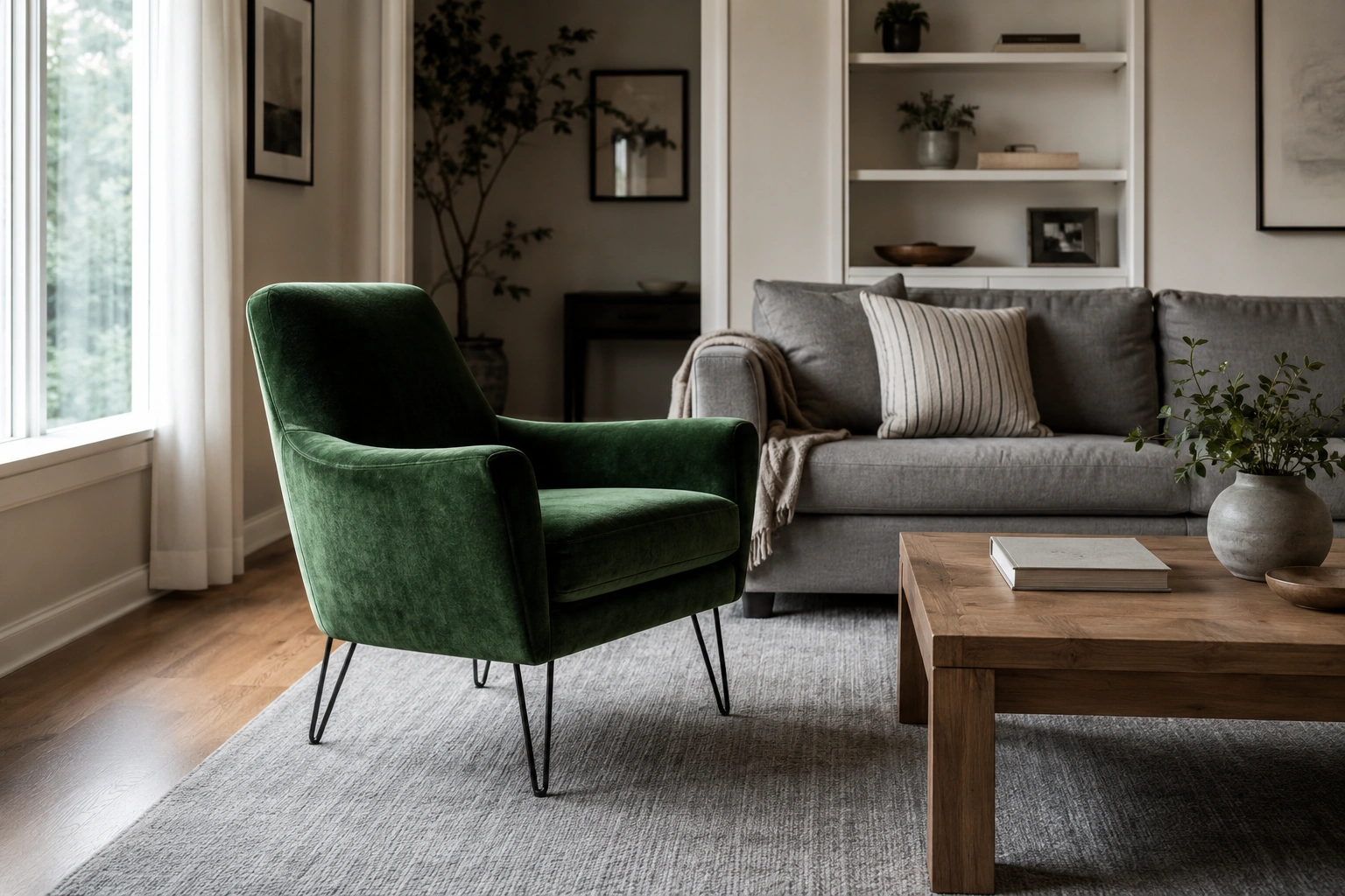
A single forest green velvet chair against a light-to-mid grey rug reads more expensive than it costs. Velvet catches light differently at different times of day, preventing the green from flattening out. Keep surrounding furniture grey or natural so the chair carries all the colour work. A hairpin-leg frame keeps the silhouette from feeling heavy.
3. Dark Green Painted Alcoves in a Light Grey Room
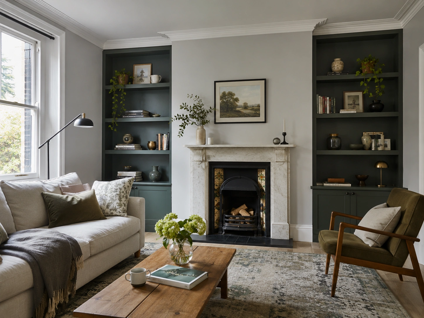
If your living room has recessed alcoves — typical in Victorian and Edwardian terraces — paint them in Farrow & Ball’s Studio Green No.93 while keeping surrounding walls a pale grey. The contrast makes the alcoves read as intentional features, not architectural accidents. Objects on shelves inside the alcoves immediately look more curated. It’s the lowest-commitment way to try a bold green without painting an entire wall.
4. Sage Green Curtains with Dove Grey Walls
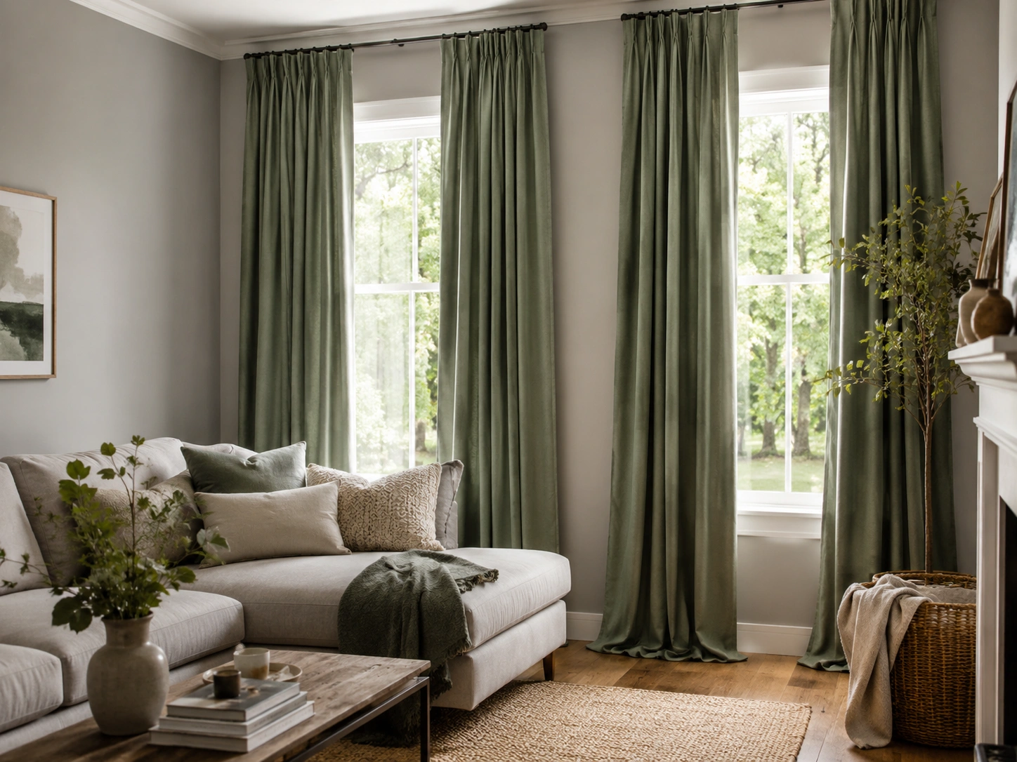
Floor-length sage green curtains in a dove grey room consistently rank among the most-saved combinations on Pinterest — and they earn that. The curtains add instant height and softness simultaneously. A linen or velvet weave hangs better than polyester and shows texture in both photographs and in person. Dulux’s Polished Pebble is a reliable dove grey that doesn’t pull too blue in afternoon light.
5. Emerald Green Cushions on a Grey Sectional
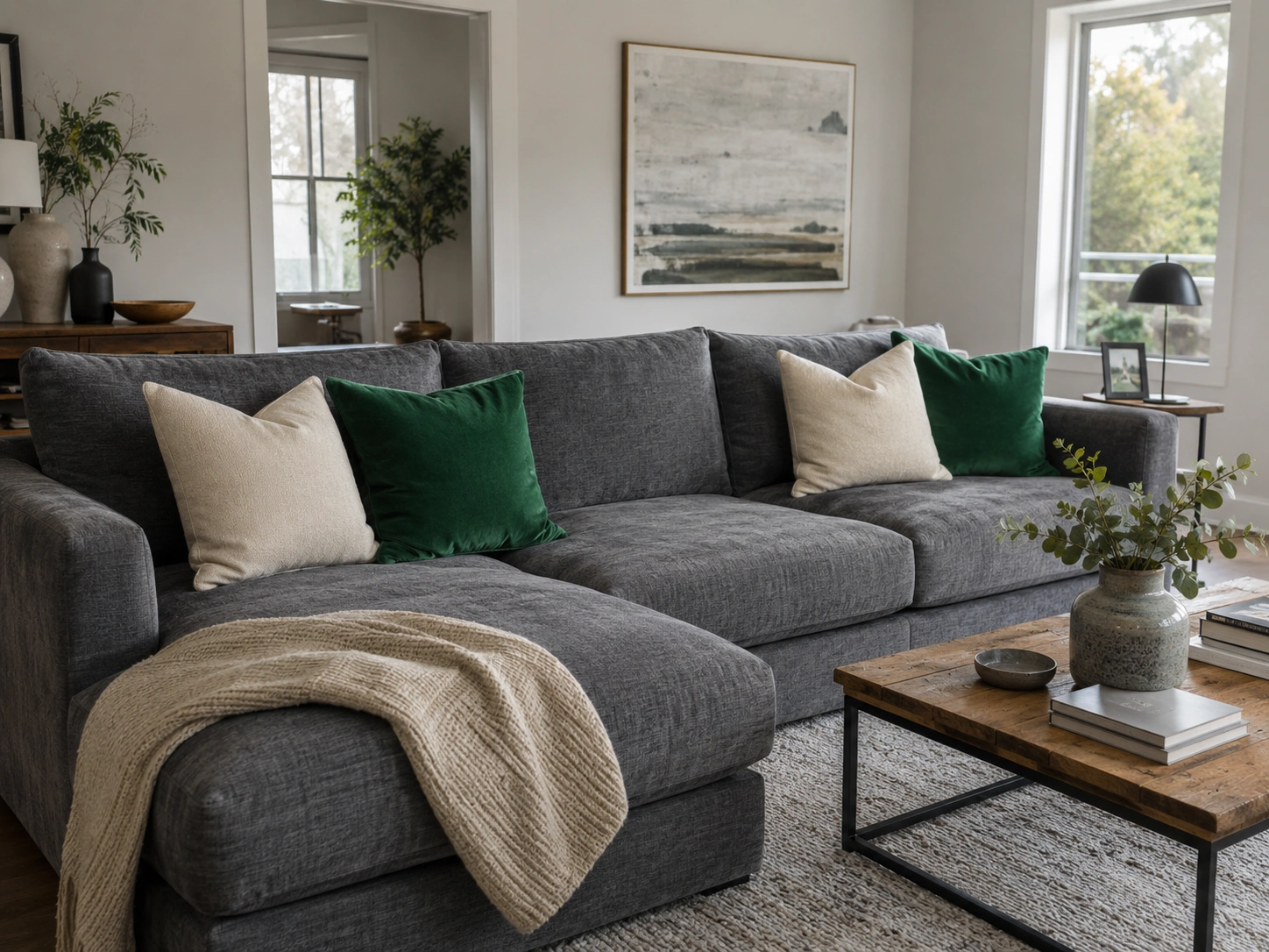
The fastest way to test this palette before committing to paint. Two emerald green cushions on a grey sectional, paired with two in warm cream, inject saturated colour without permanent consequences. The cream stops the contrast looking too stark. It’s a £40 experiment that gives you a full season of visual data before you pick up a paintbrush — and most people who try it end up going further.
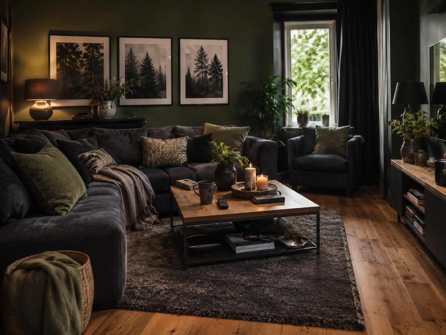
6. Charcoal Grey Walls with a Deep Forest Green Sofa
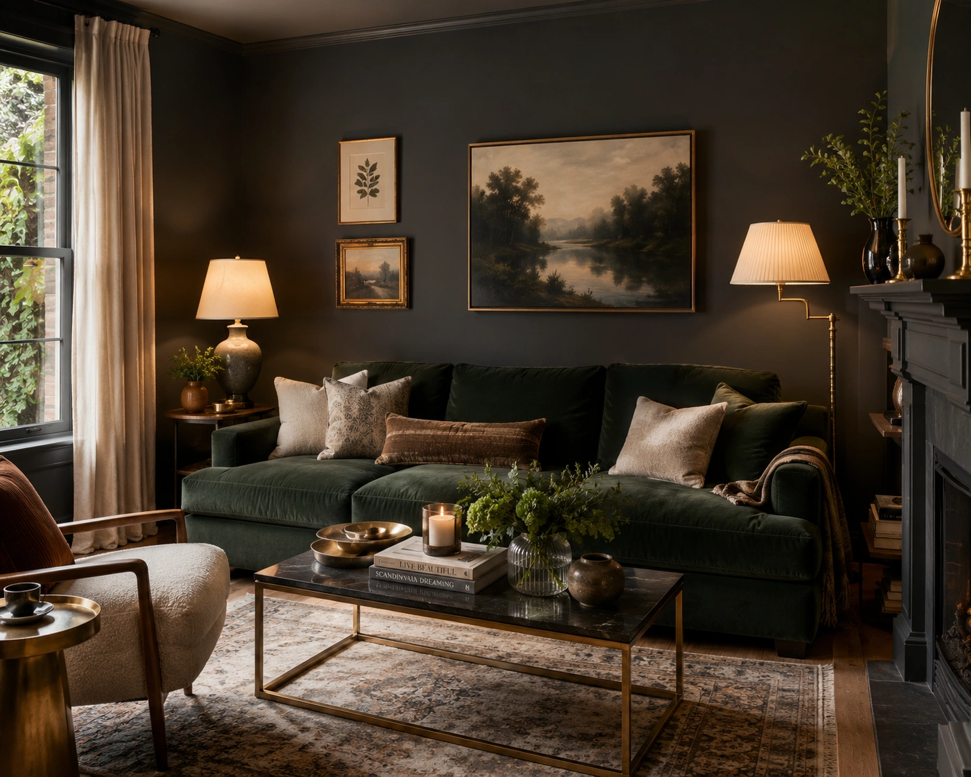
Dramatic and achievable. Charcoal grey walls — Farrow & Ball’s Plummett handles this well — and a deep forest green sofa create a moody, enveloping room that photographs exceptionally well. The trick is lighting. Recessed ceiling spots make the room feel cavernous; instead, use table lamps and floor lamps to pool warm light at seated level. Cream and brass accents stop it feeling like a cave.
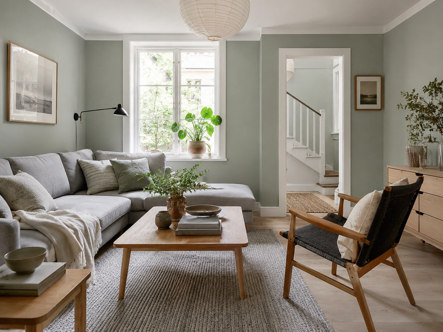
7. Sage Green and Warm Grey with Natural Wood Accents
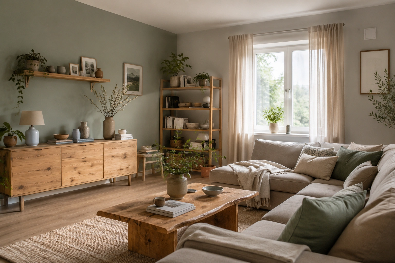
A warm grey — one with yellow or beige in its base — combined with sage green and natural oak or pine furniture creates a Nordic-adjacent palette that feels relaxed rather than designed. Open shelving, a wooden sideboard, or a raw-edge coffee table anchors the look in organic material. It’s the combination most likely to appear in Scandinavian interiors accounts, and the most achievable on a realistic budget.
8. Olive Green and Stone Grey — the Earthy Pairing
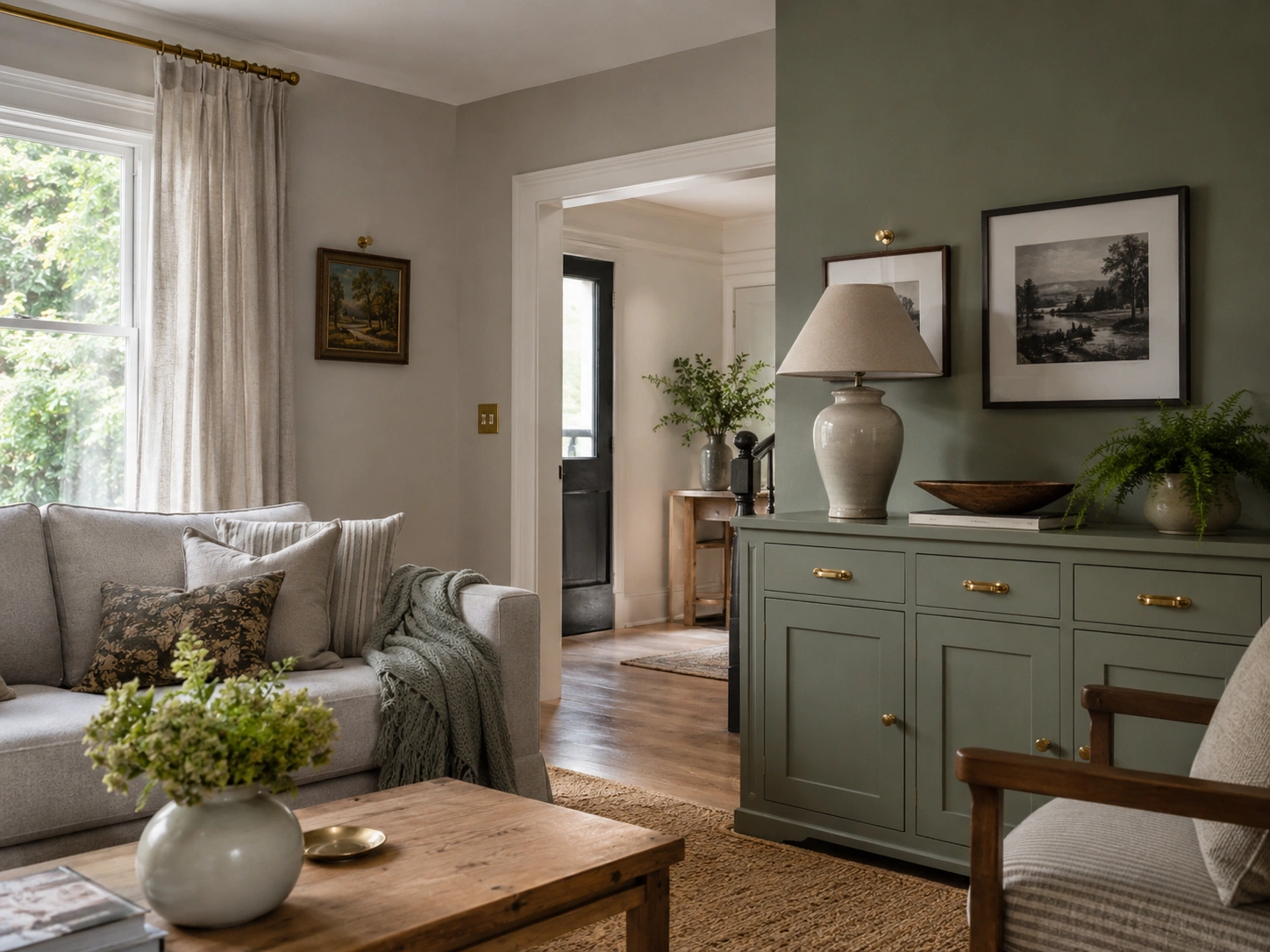
Olive is the most underrated green in this palette. Warmer and more muted than sage, it layers beautifully with stone greys — those pale, beige-toned neutrals rather than cool blue greys. Think Dulux Natural Slate on walls, olive green on one armchair or a set of cushions. The combination reads as considered and grown-up without looking like a trendy mood board that’ll date badly.
9. Botanical Print Gallery Wall on a Grey Background
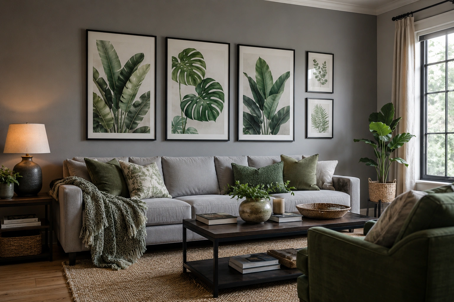
A gallery wall of green botanical prints — framed in thin black or brass frames — mounted on mid-grey walls brings pattern and colour simultaneously. It’s also infinitely adjustable; start with three large prints and see how the room feels before committing further. The grey background makes the greens in the prints pop without requiring any paint changes at all.
10. Dark Green Fireplace Surround on Grey Walls
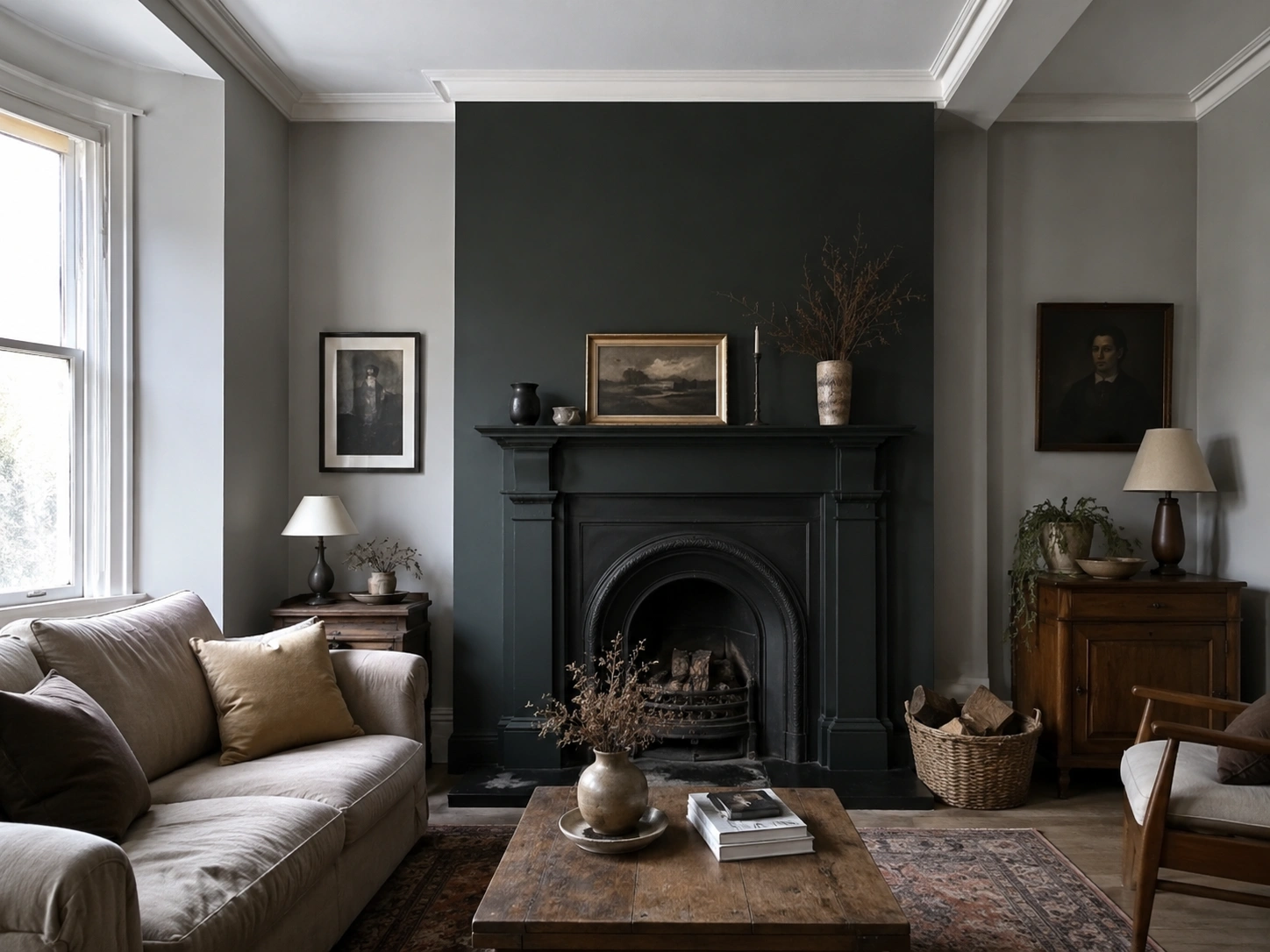
A painted fireplace surround in Studio Green No.93 or a similar deep green against grey walls turns a standard Victorian surround into the room’s centrepiece. Keep the wall colour a few shades lighter than the surround — not matching — and resist painting the mantel the same colour as the walls, which loses all definition. This works in north-facing rooms where a dark accent reads stronger than a pale one.
11. Grey Sofa with Green Throw and Terracotta Accents
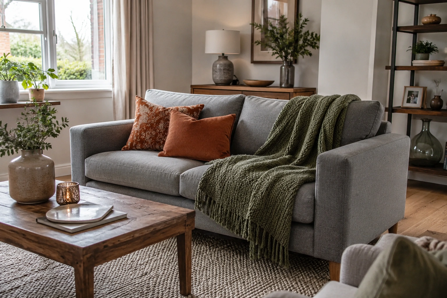
Three colours, one approach. A mid-grey sofa dressed with a moss or sage green chunky-knit throw, then punctuated with one or two terracotta cushions, gives warmth, richness, and visual interest without touching a wall. Terracotta lifts the grey-green combination out of the slightly flat register it can hit in winter light. It’s a weekend change, not a decorating project.
12. Green Wainscoting Below Grey Upper Walls
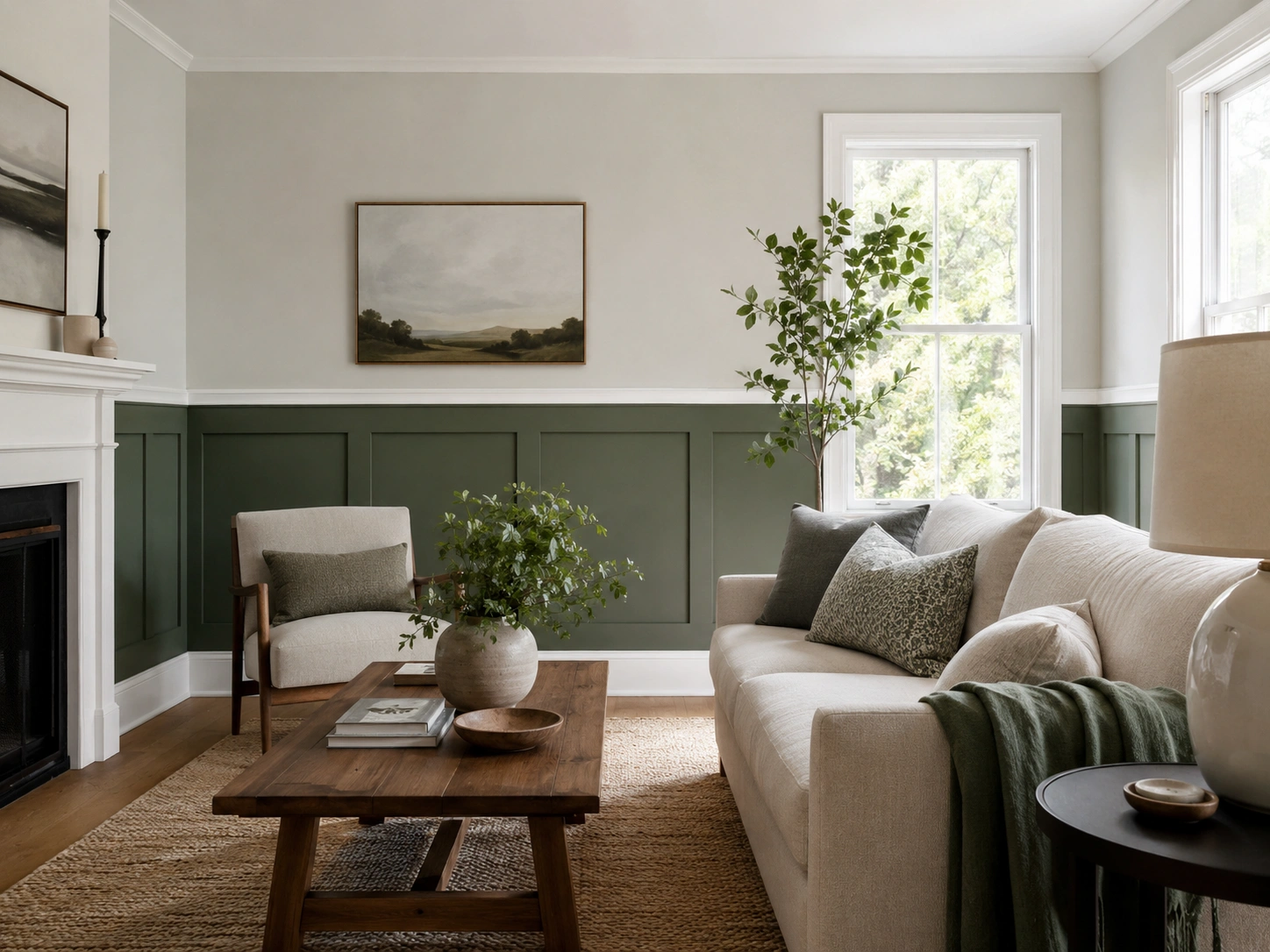
Painting the lower third of your walls in a muted green while keeping the upper section in light grey is a classical technique with strong current interest. Visual weight sits at floor level, which makes ceilings feel taller. Use a deep sage or muted forest for the wainscoting and a barely-there grey above — Dulux Light & Space Cloud Burst works here. Add a simple white dado rail to clean the transition.
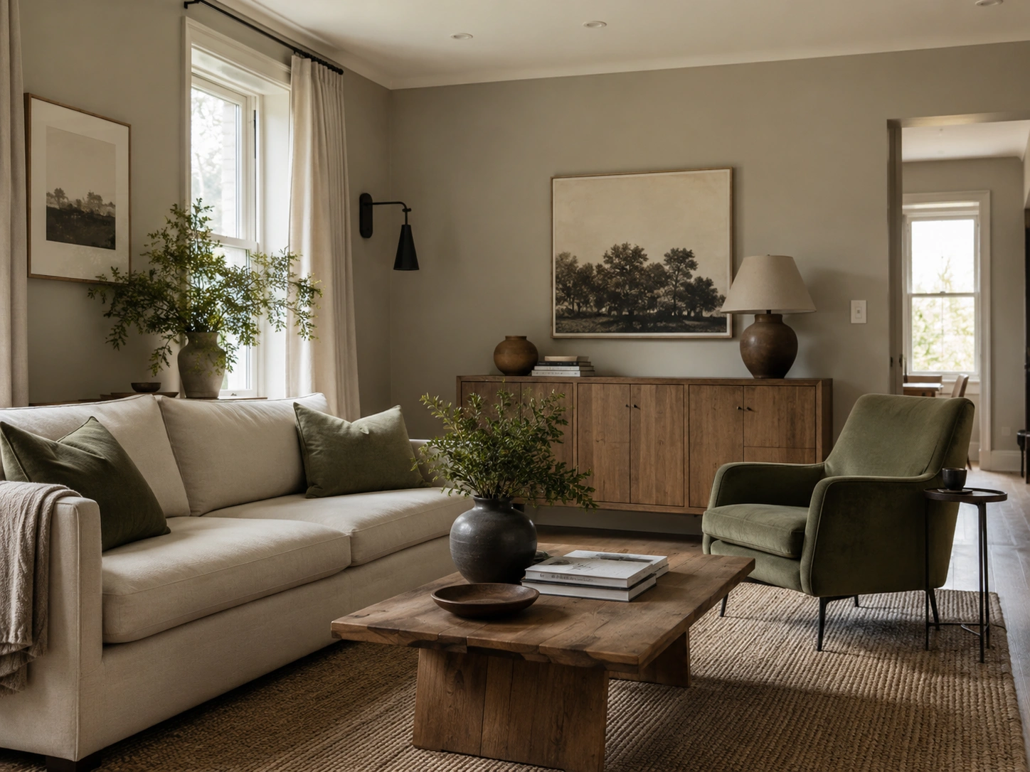
13. Muted Sage Green Armchair as a Solo Focal Accent
Quick note: you don’t need a lot of green to make this palette land. A single muted sage green armchair in an all-grey room can anchor a colour scheme entirely on its own, especially positioned near a window in natural light. Choose a boxy, structured frame rather than a low-slung design — the cleaner silhouette reads as deliberate. Reupholstering an existing chair in sage boucle is usually cheaper than buying new.
14. Green Geometric Rug as the Colour Anchor
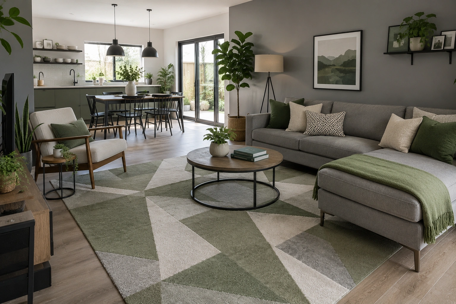
A green and grey geometric rug can do more decorating work than any single furniture piece. It introduces colour, pattern, and floor-level visual hierarchy simultaneously. From the rug, you pull your wall grey and your accent green — the palette is already made. This is particularly effective in open-plan rooms where the rug defines the seating zone before any colour decisions are committed to the walls.
15. One Oversized Statement Plant in an All-Grey Room
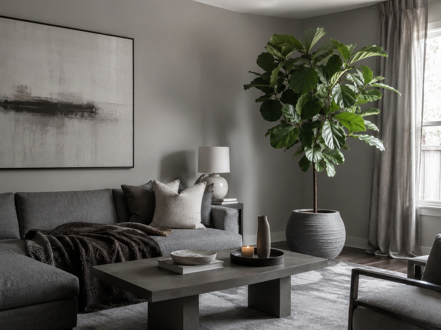
This is technically not a paint solution. But it belongs here. A single large plant — a fiddle-leaf fig, a monstera, or a large-leafed banana plant in a textured pot — introduces green without committing to any palette at all. Grey rooms with one large healthy plant read as curated rather than cold. The biophilic effect is immediate. It’s also the most reversible green decision on this list.
16. Sage Green and Light Grey with Brass Hardware
Brass is the metal that makes grey-green combinations feel finished rather than preliminary. Swap chrome or brushed silver for brass across light switches, curtain poles, picture hooks, and cabinet handles. In a sage green and light grey room, warm brass reads as a third colour that bridges the two without competing with either. It costs less than a tin of paint and the lift is disproportionate to the effort.
17. Dark Green Painted Ceiling in a Grey Living Room
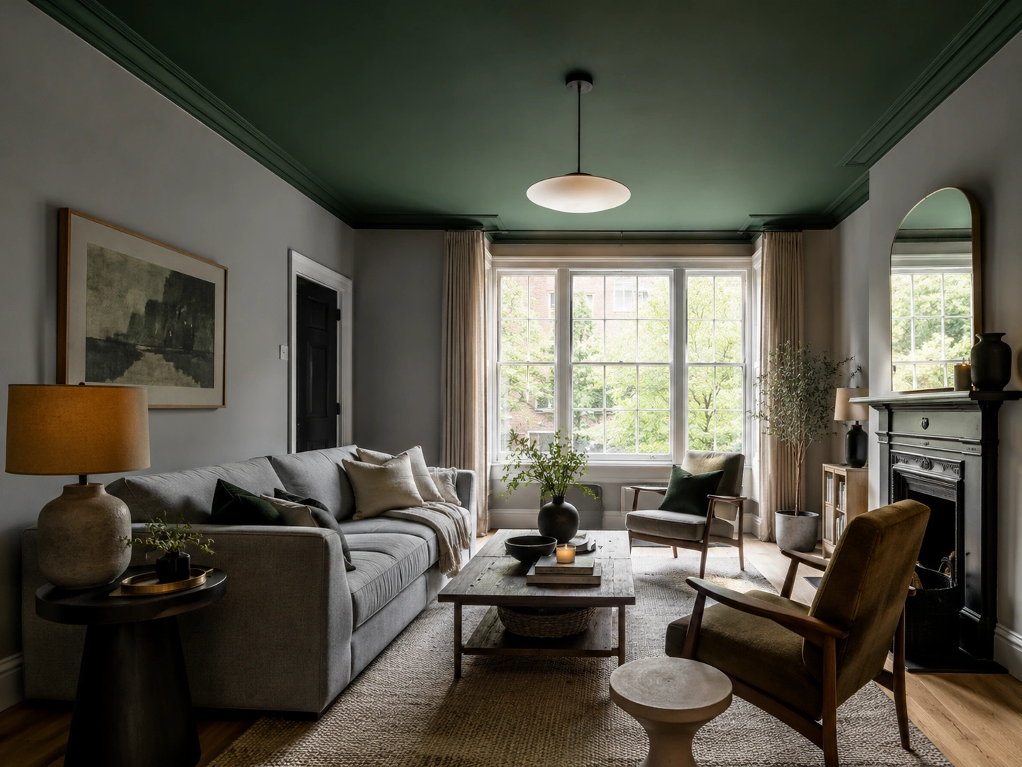
Painting a ceiling in Farrow & Ball’s Studio Green No.93 above grey walls creates a jewel-box quality that no white ceiling achieves. The room feels smaller in footprint but taller in atmosphere. It works best with ceiling heights above 2.4 metres and at least one large window to stop the effect from turning oppressive. This is the boldest idea here. It’s also the most photographed when it works.
18. Japandi Grey with Subtle Sage Green Accents

Japandi — the cross of Japanese and Scandinavian aesthetics — relies on restraint, natural materials, and carefully placed accents. In grey and green terms this means a low-contrast palette: pale grey walls, white or cream furniture with clean lines, sage green in small doses — one cushion, one plant, one ceramic vase. Nothing competes. Nothing clashes. The room reads as intentional and calm, which is exactly the point.
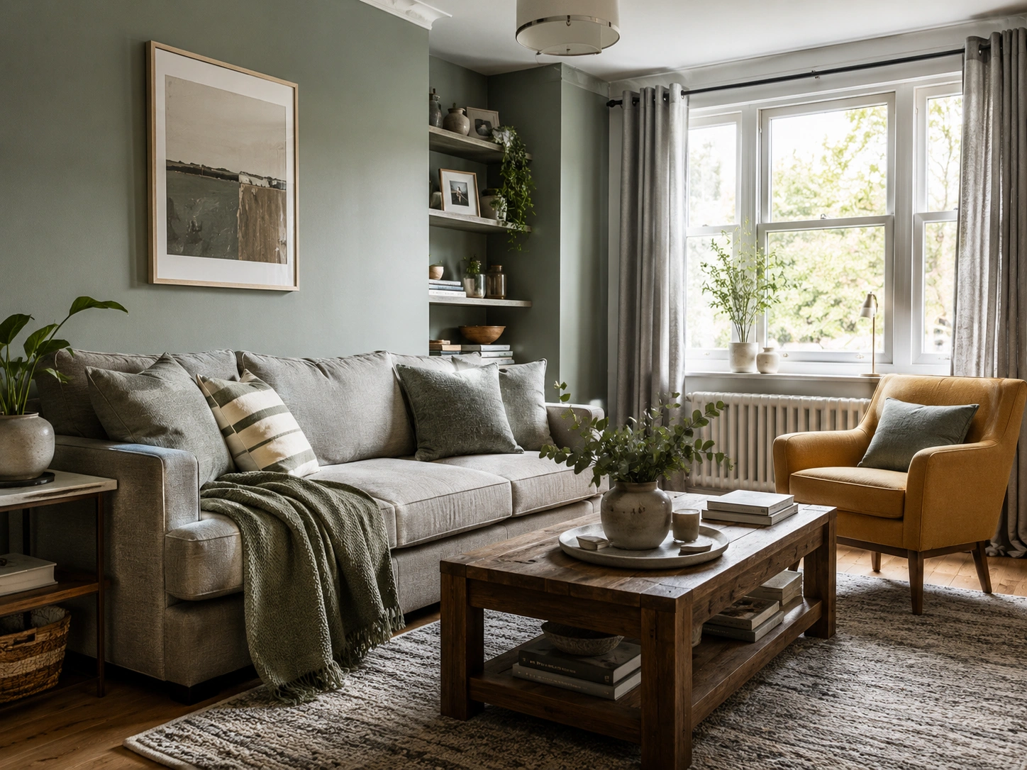
19. Bottle Green and Mid-Grey with Warm Linen Cushions
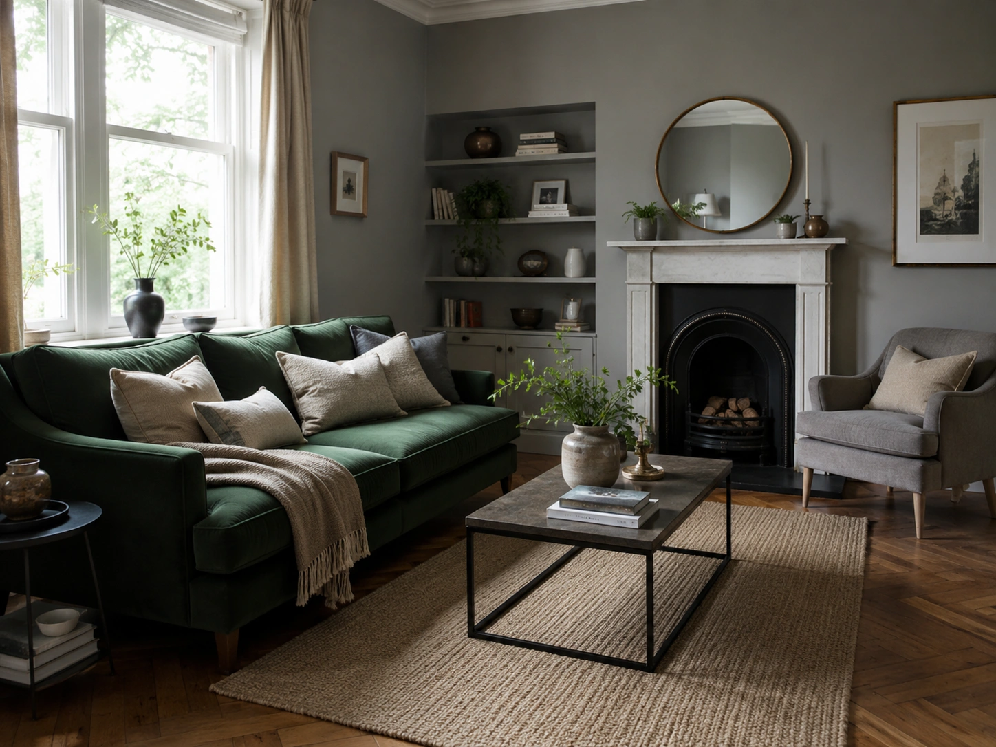
Bottle green is saturated enough to hold its own against a mid-tone grey without darkening the room the way forest or racing green can. It reads as confident rather than heavy. Pair it with warm undyed linen cushions — oatmeal or natural — to stop the contrast tipping too stark. This combination features regularly in contemporary British interior design and suits herringbone wood floors particularly well.
20. Green Built-in Shelving Against a Grey Feature Wall
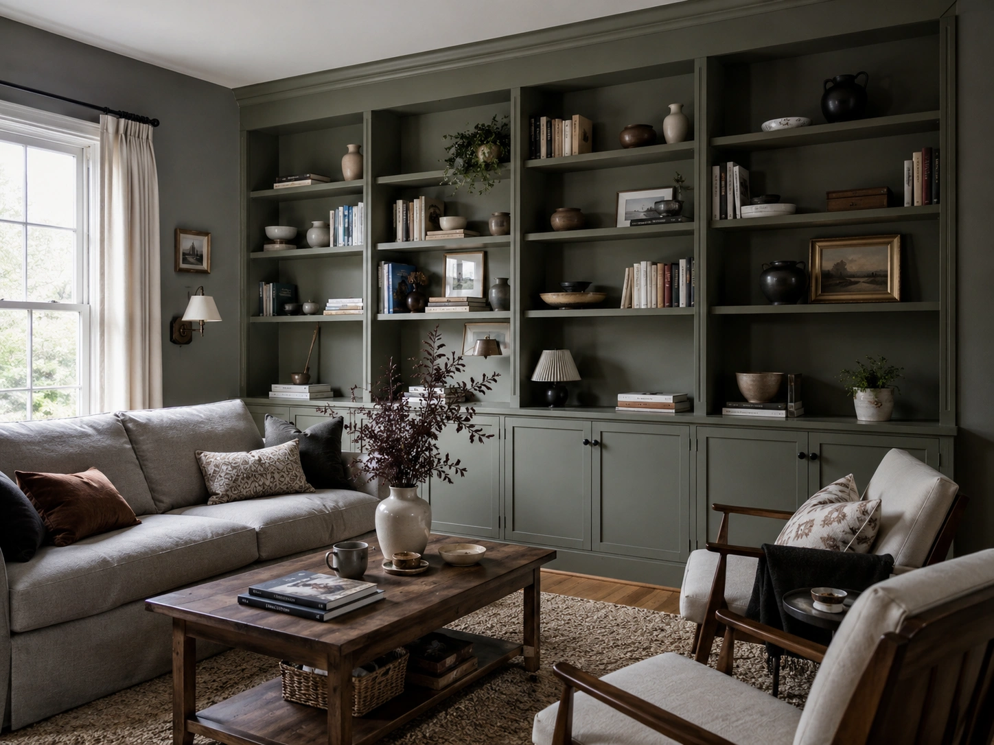
Built-in shelving painted in muted green — sage, thyme, or an olive — against a contrasting grey feature wall creates a library-esque backdrop that doubles as functional storage. The colour contrast defines the shelving as a design feature rather than just furniture. Farrow & Ball’s Calke Green is widely used here — muted enough not to compete with books, ceramics, and objects displayed on the shelves.
21. Sage Green, Grey, and Cream — the Three-Tone Palette
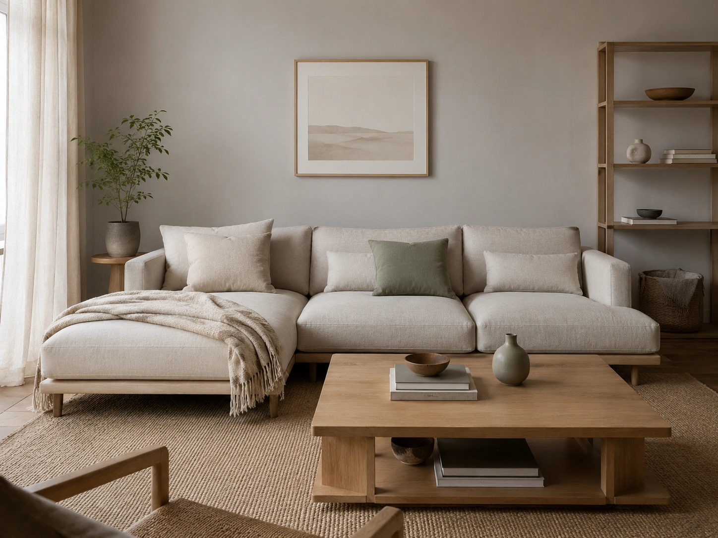
Cream is the unacknowledged hero of this combination. Introduce it as your sofa colour — or as your curtains, rug, or walls if grey is reserved for one feature surface — and sage green immediately reads as warmer and more deliberate. Sage, grey, and cream together avoid the cold quality that a two-tone grey-and-green room can carry in winter evening light. It’s also the most neutral combination for eventual resale.
22. Forest Green and Charcoal with Warm Wood Flooring
Forest green and charcoal together should be overwhelming. Warm wood flooring — oak, walnut, or a warm pine — stops it tipping into darkness. The floor introduces a mid-tone that sits between the two stronger colours and adds warmth that neither green nor charcoal carries alone. This pairing suits evening-use rooms: a snug, a television room, or anywhere that sees most of its life after sunset.
23. Green and Grey with White Trim for a Crisp, Scandi Feel
White ceiling and white skirting boards in a grey and green room act as visual breathing room between two stronger colours, preventing the space from feeling crowded. Sherwin-Williams’ Quietude — named their 2025 Colour of the Year, a cool sage with blue undertones — works particularly well against bright white trim because the coolness reads intentional rather than cold when the white frame contains it cleanly.
24. Sage Green and Stone Grey with Mustard Yellow as a Third Accent
One mustard yellow element — a cushion, a lamp base, a small accent chair — in a sage and stone grey room immediately lifts the palette out of the predictable. Mustard shares olive’s warmth and complements sage without fighting it. Use a little. Treat it as punctuation rather than a sentence — one or two pieces at most, never a full wall or furniture item, or the warmth tips into busy.
25. Grey Painted Room with a Green Velvet Ottoman as the Centrepiece
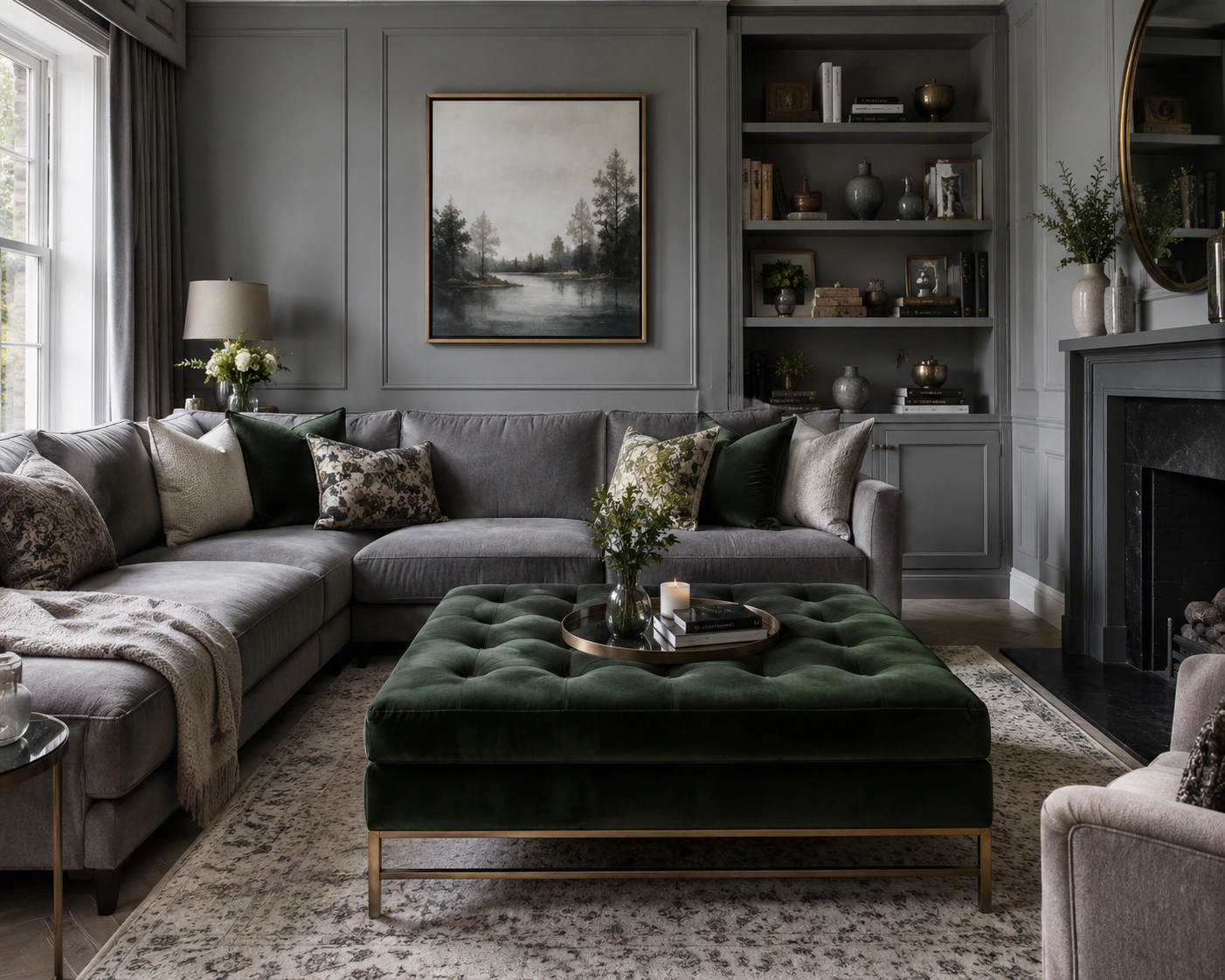
If the room’s seating arrangement revolves around a central footstool or coffee table, replacing it with a large green velvet ottoman transforms it into the visual anchor of the whole scheme. A rectangular ottoman in forest or sage velvet, on a brass or hairpin base, pulls attention to the centre of the room. In an otherwise all-grey interior, a single upholstered green piece like this defines the palette without committing anything to the walls.
26. Monochromatic Grey Room Lifted Entirely by Cascading Greenery
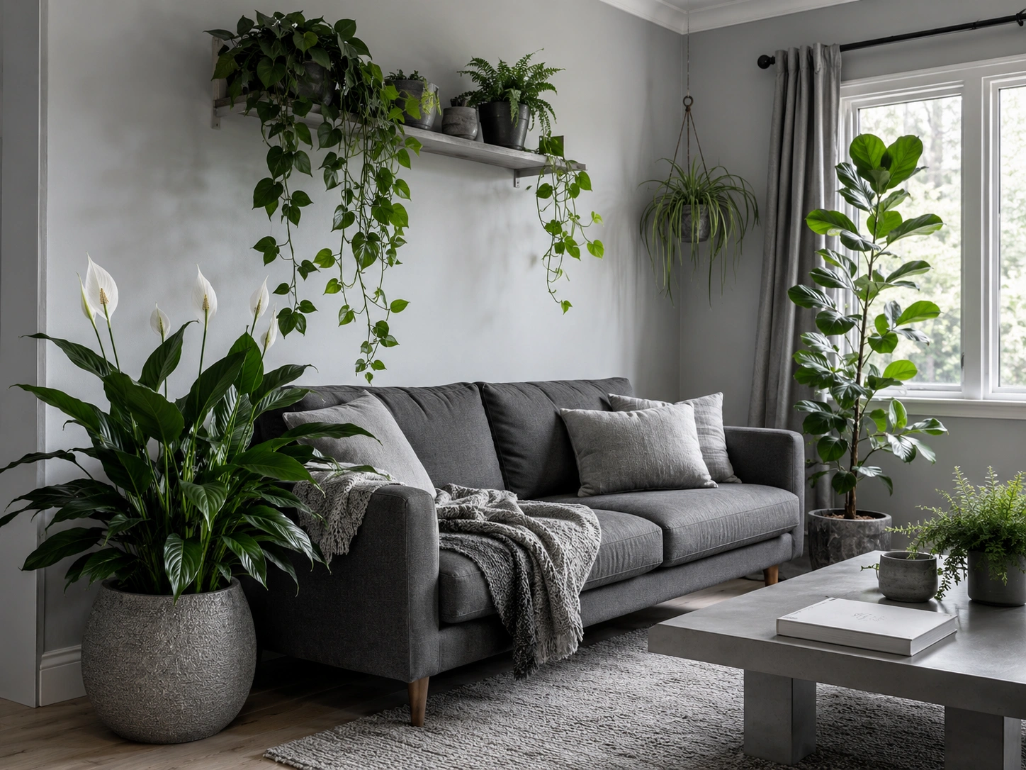
The most considered version of this palette: a room in layered shades of grey — walls, sofa, rug — where every note of colour comes from plants. A trailing pothos from a shelf. A large peace lily in a textured ceramic pot. A fiddle-leaf fig positioned near the window. The green here is living, which means it shifts through the year, responds to the light, and never becomes dated. It’ll look more like your room than any styled photograph ever could.
Your Grey and Green Questions, Answered
What’s the best grey paint to pair with a sage green sofa?
Choose a grey with a blue or green undertone — Farrow & Ball Mizzle No.274 and Dulux Tranquil Dawn are both reliable. Avoid greys with pink undertones; they fight sage consistently and the clash is difficult to style around.
How do I add green to a grey living room without repainting?
Start with a green velvet cushion, a large plant, or a chunky-knit green throw. A green geometric rug is the highest-impact single purchase — it anchors the colour story of the whole room without any paint work involved.
Should I use the same green shade throughout or mix shades?
One dominant green, one supporting shade. Sage as the main, olive as the accent — that kind of distance. Mixing more than two greens works only when they’re separated by clear tonal distance, like a pale sage and a deep forest green, with nothing similar in the middle.
Why does my green paint look grey on the wall once it dries?
Green paint consistently dries cooler and more muted than the chip suggests. This is more pronounced in north-facing rooms with indirect light all day. Always test at A4 size minimum and view at both morning and evening light before committing to a full wall — small swatches reliably lie.
Should I use dark green in a small grey living room?
Yes, but with intention. Use dark green on one alcove, a chimney breast, or a single feature wall rather than all four sides. Contrast with light grey on remaining surfaces and install ambient lighting at floor and table level to prevent the room from reading smaller than it is.
Bringing It Together
The grey and green combination earns its current popularity because it solves a genuine decorating problem. Grey alone is controlled and versatile — and a bit lifeless. Green, introduced thoughtfully, turns the same room into something that feels inhabited and considered rather than staged.
The 26 ideas here range from a £20 plant to a painted ceiling, which means there’s a real entry point for every level of commitment and confidence. Start with the one that scares you least. Once the combination is in the room — even in a small way — the next step usually becomes obvious on its own.


No Comment! Be the first one.