


Think You’ve Seen It All? Wait Until You See These 21 Dark Green Kitchen Cabinet Ideas
If you’ve spent the past few weeks scrolling “dark green kitchen” pins on your phone after dinner, you already know the feeling — every photo looks gorgeous, but none of them tell...

If you’ve spent the past few weeks scrolling “dark green kitchen” pins on your phone after dinner, you already know the feeling — every photo looks gorgeous, but none of them tell you why. Which green is that? What’s on the counters? Why does her kitchen look rich and warm while yours might look like a cave? This roundup pulls from the dark green cabinet pins that actually get saved and repinned, not just liked, and breaks down the exact shade, hardware, and pairing logic behind each one so you can recreate it in an ordinary-sized kitchen, not just an open-plan showroom.
This works best for someone choosing between a few real green shades who wants to know exactly which hardware, countertop, and layout makes each one work. It won’t help if you’re hoping one universal shade works in every kitchen regardless of light direction — it doesn’t.
Dark green kitchen cabinet ideas refers to specific ways of pairing deep, jewel-toned greens like hunter, forest, or pewter green with hardware, countertops, and lighting so the color reads warm and intentional rather than heavy. The right pairing depends more on your kitchen’s light direction than on the shade itself.
Why Dark Green Kitchens Are Suddenly Everywhere on Pinterest
Green isn’t a passing trend headline — NKBA’s 2026 trend reporting places green ahead of blue and brown as homeowners’ top kitchen color preference. That tracks with what’s getting pinned: full-wall greens, two-tone layouts, and single green islands all show up constantly, but they’re not interchangeable. Each one solves a different problem.
Some designers will tell you a classic all-white kitchen resells more predictably than any trend color, dark green included, and if you’re flipping a starter home in the next year or two, that’s a fair point worth weighing. But if you’re settling into a kitchen for the long haul, a well-paired dark green — grounded in warm wood, brass, and natural stone rather than chasing one trendy shade — tends to read as intentional rather than dated.
Full-Color and Two-Tone Cabinet Looks Worth Recreating
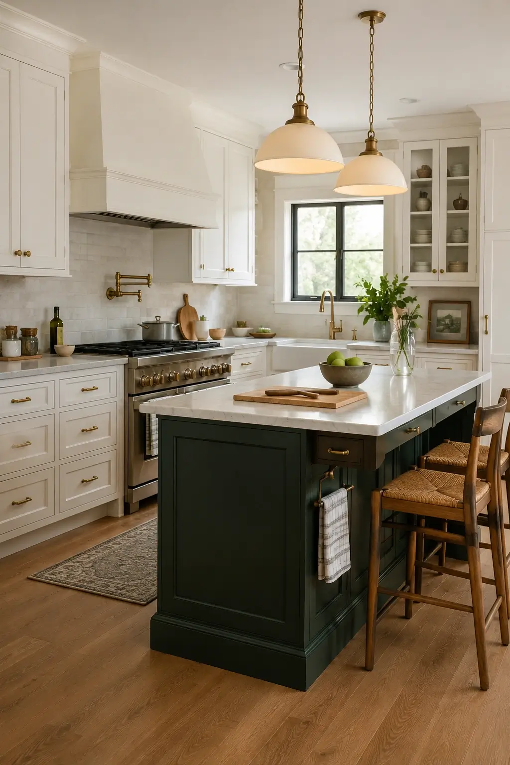
1. Two-Tone Hunter Green Lower Cabinets with Crisp White Uppers for a Small Kitchen That Still Feels Light
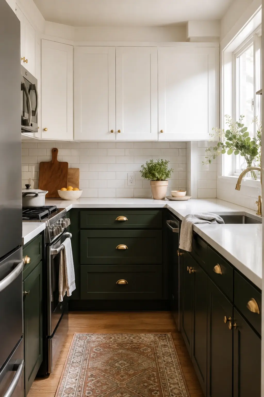
This is the pairing that gets saved more than almost any other dark green pin, and it’s not an accident. Painting only the lower cabinets in Benjamin Moore Hunter Green keeps the color at counter height, where it grounds the room, while white uppers keep your eyeline light and your ceilings feeling tall.
It works because your eye reads the white first, then notices the green as an accent rather than a wall of color. Pair it with simple brass cup pulls and a plain white or light stone counter so the transition line stays clean.
My read is this is the safest entry point if you’re nervous dark green will swallow a small kitchen — it almost never does.
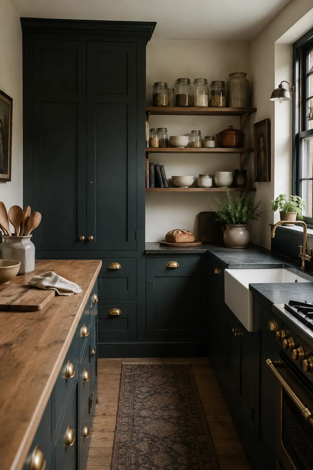
2. Recreate an English Pantry Mood with Farrow & Ball Studio Green on Shaker Doors and Brass Cup Pulls
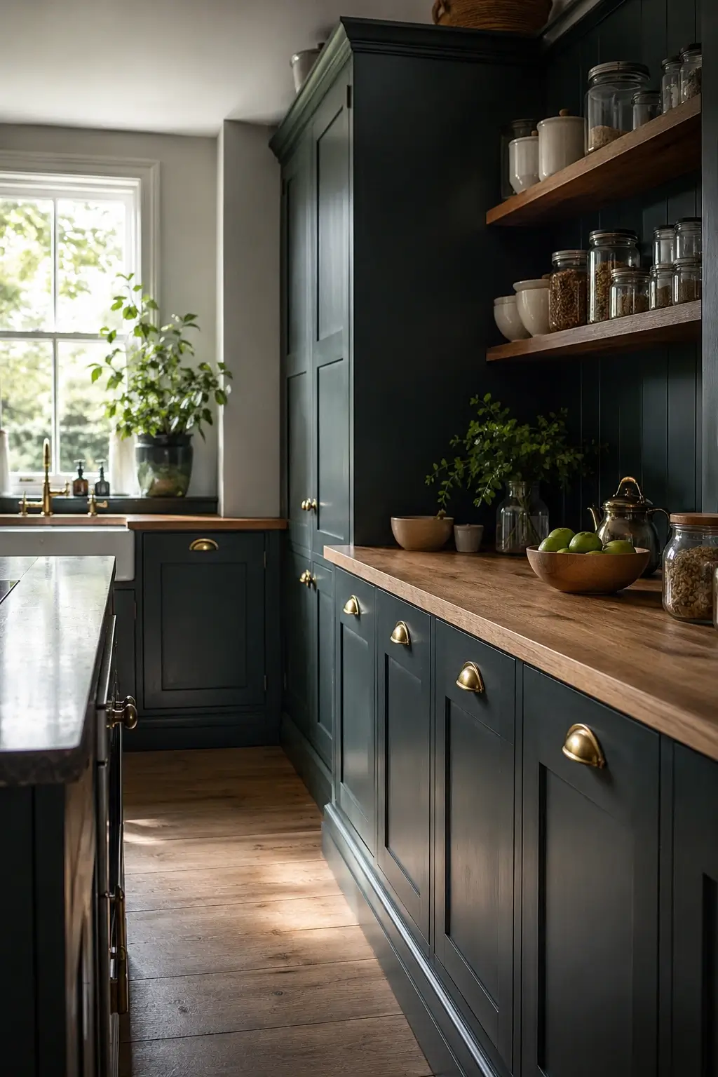
If the kitchens you keep saving have a slightly old-world, apothecary feel, you’re probably drawn to Farrow & Ball Studio Green rather than a brighter hunter shade. It’s deeper and more blue-leaning, which gives shaker-style doors a quiet, almost library-like richness.
Pair it with brass cup pulls instead of bar handles, a plain wood countertop or butcher block on one run, and open shelving for jars and crockery. The mood comes from restraint, not extra decor.
I’d only reach for this shade if your kitchen gets decent natural light during the day — Studio Green is moody enough that a dim room can tip it toward looking almost black.
3. Choose Sherwin-Williams Pewter Green for a North-Facing Kitchen That Gets Flat, Cool Light
North-facing kitchens get the most complaints in green-cabinet comment sections, because cooler natural light can make a true hunter or forest green look almost gray by midafternoon. Sherwin-Williams Pewter Green is softer and more muted, which reads more consistently in flat light than a deeper, more saturated shade does.
Test it on a large swatch taped near your main window and check it in both morning and late-afternoon light before committing. Pair it with warm brass or aged-brass hardware to add back some of the warmth the cooler light takes away.
This is the shade I’d point a worried north-facing-kitchen reader toward first.
4. Go Two-Tone with Walnut Upper Cabinets Over a Green Lower Run Instead of the Usual White
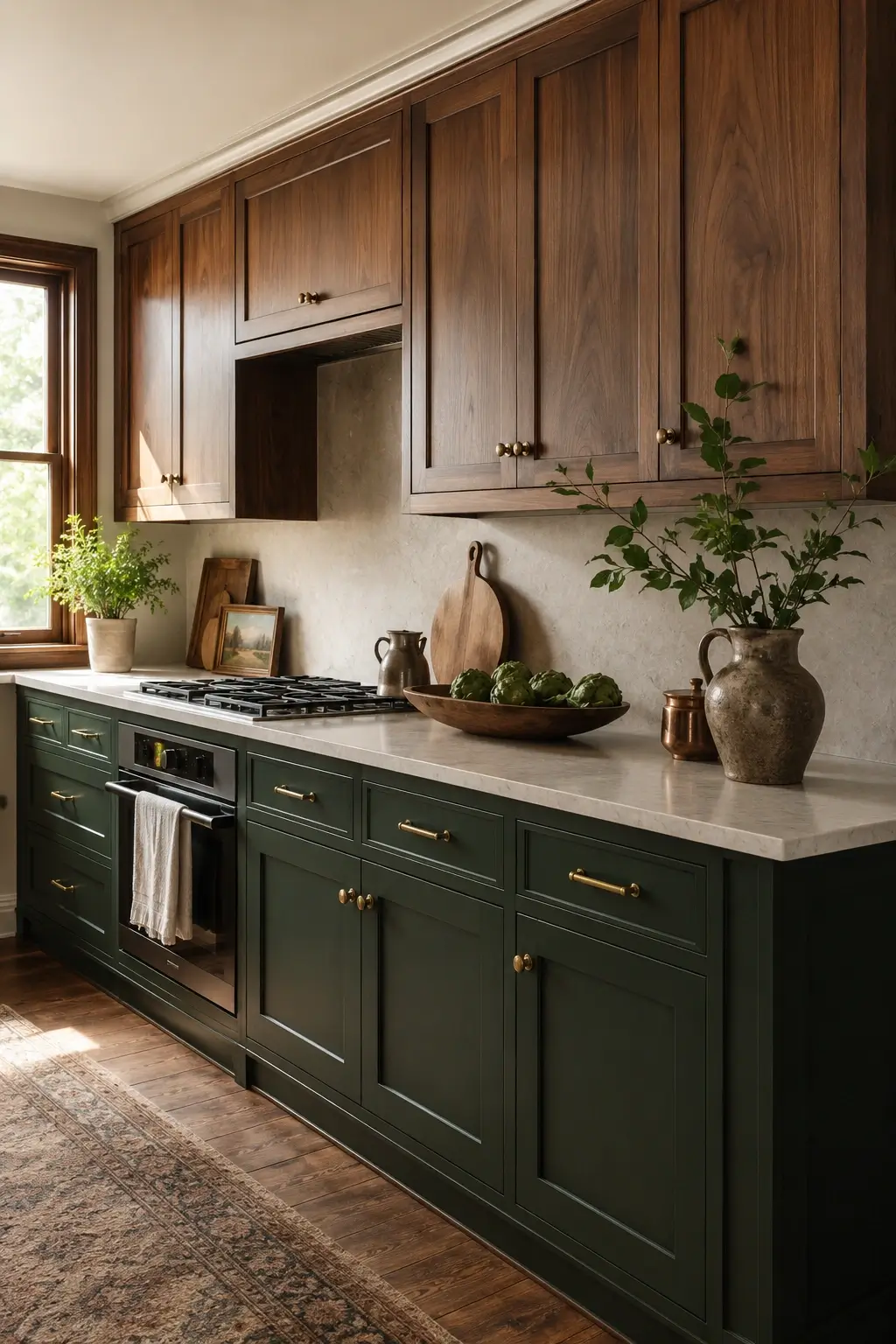
White upper cabinets aren’t the only two-tone option, and walnut uppers over a deep green lower run show up constantly in warmer, farmhouse-leaning kitchen pins. The wood tone softens the contrast so the kitchen feels layered instead of split in half.
This works especially well if your floors already lean warm — oak or walnut flooring ties the upper cabinets back to the floor, while the green lower cabinets anchor the room visually.
One styling detail that makes this read intentional rather than mismatched: keep the hardware finish identical on both upper and lower cabinets, usually brass.
Small-Kitchen and Renter-Friendly Ways to Try Dark Green First
Before repainting an entire kitchen, it helps to know which approach actually matches your situation.
| Option | Best For | Key Benefit | Limitation |
|---|---|---|---|
| Full-Wall Green | Open-plan kitchens with strong daylight | Cohesive, statement-making | Can read heavy in small or dim rooms |
| Two-Tone (Green + White) | Small or average kitchens | Keeps sightlines light while adding color | Needs a clean transition line, usually the counter |
| Island-Only | First-time green users, owned islands in rentals | Low commitment, easy to repaint later | Less dramatic, can look matchy with a white perimeter |
| Two-Tone (Green + Wood) | Warm or farmhouse-leaning kitchens | Adds warmth without white starkness | Wood tone has to coordinate with existing floors |
Here’s the part that surprises most people: the kitchens that photograph brightest in dark green aren’t always the ones with the most square footage or the biggest windows — they’re the ones with the warmest light temperature. A small kitchen with warm bulbs and brass fixtures often reads richer than a large kitchen lit with cool, blue-toned light.
To test a dark green cabinet color before committing to a full repaint, follow these steps: 1. Paint a large poster-board swatch and tape it near your main cabinet run. 2. Check it in both morning and evening light for at least three days before judging the undertone. 3. Repaint just the island or one end cabinet before committing to the whole kitchen.
5. Paint Only the Kitchen Island Hunter Green and Leave the Perimeter White as a Low-Risk Test
If you’re not ready to commit your whole kitchen to a dark color, the island is the obvious place to start, and it’s one of the most-pinned dark green kitchen island ideas for exactly that reason. One piece of furniture-style color, surrounded by white, reads as a deliberate design choice rather than an unfinished project.
It also gives you a real-world test of how the shade behaves in your actual lighting before you repaint a single perimeter cabinet. Pair the island with a butcher block or simple stone top and hardware that matches your existing finishes.
I’d start here if you’re genuinely undecided between committing fully and staying neutral.
6. Choose a Satin Sheen Over Matte on Green Cabinets So a Small Kitchen Bounces More Light
Sheen level matters almost as much as the shade itself, and it’s the detail most generic roundups skip entirely. Matte finishes absorb light, which can make an already dark color feel even heavier in a small room. A satin or low-luster finish reflects just enough light to keep the green looking rich instead of flat.
This is worth asking your painter or cabinet maker about directly, since “dark green cabinets” alone doesn’t tell them which sheen to use.
One honest caveat here: satin finishes show fingerprints and water spots more visibly than matte does, so plan on wiping down handles and the area near the sink a little more often.
7. Keep Green Paint Below the Counter Line in a Galley Kitchen to Trick the Eye Taller
Galley kitchens have two parallel walls and not much room to play with, which is exactly why where you stop the green paint matters so much. Keeping the color strictly below the counter line, with white or a light tone above, draws the eye upward and makes the ceiling feel higher than it is.
This is a different move than a standard two-tone cabinet split, since it’s about the paint line specifically — it works even with open shelving instead of upper cabinets.
It’s a small detail a glossy showroom photo never points out, and it’s often the difference between a galley feeling narrow or feeling intentional.
8. Try a Removable Green Cabinet Wrap on Rental Lower Cabinets You Can Peel Off at Move-Out
Renters get left out of almost every dark green kitchen roundup, which is frustrating when the color is this popular. A removable cabinet wrap or adhesive film in a deep green tone lets you commit to the look on lower cabinets only, without touching the actual finish underneath.
Swap the existing hardware for inexpensive brass pulls at the same time, and keep the original hardware in a labeled bag so you can put it back exactly as it was.
I’d skip this on cabinets with heavy texture or detailed paneling, since wrap film looks best on flat or simple shaker-style doors.
9. Paint a Walk-In Pantry Door Hunter Green as the One Bold Surprise in an All-White Kitchen
Not every dark green moment has to live on the cabinets. A single pantry door painted in a deep, saturated green works as a surprise focal point in an otherwise all-white kitchen, and it’s a far smaller, cheaper commitment than repainting cabinetry.
It also gives you a genuine test run for the color in your space before you decide whether to bring it onto the cabinets themselves. Add a simple brass knob to match whatever metal finish you’re leaning toward elsewhere in the room.
This is one of the few “just paint one thing” ideas that actually earns its spot here, because it’s specific, visible, and reversible.
Hardware, Countertop, and Backsplash Pairings That Keep Green Warm
The pairing matters more than the shade itself. The same green can look moody and elegant or flat and heavy depending on what’s sitting next to it.
Brass Hardware vs Matte Black Hardware: Brass works better with warm wood tones and jewel-toned greens because it picks up the same warmth and softens with a natural patina over time. Matte black works better in higher-contrast, more modern kitchens with cooler whites and stone. The key difference is warmth — brass softens dark green, black sharpens it.
10. Pair Deep Green Cabinets with Unlacquered Brass Pulls That Patina Over Time
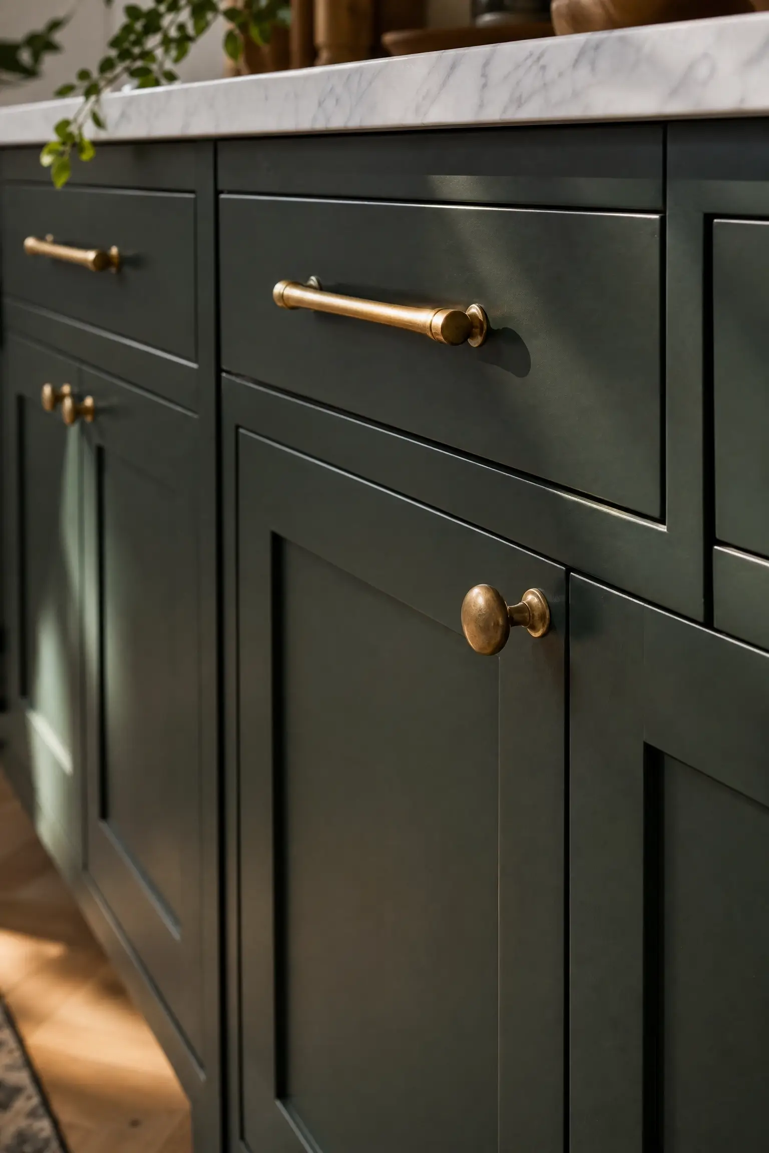
Unlacquered brass is the single most repeated hardware detail across high-performing dark green kitchen pins, and it’s not just an aesthetic preference. Unlike lacquered or plated brass, unlacquered hardware is meant to tarnish and darken slightly with use, picking up fingerprints and water marks as a feature rather than a flaw.
Against a deep green door front, that slowly aging brass reads as collected and lived-in instead of brand new — exactly the warm, slightly imperfect look that keeps getting saved.
One small note: if a perfectly uniform, shiny finish matters to you, lacquered brass or a brushed finish will hold its look longer with less maintenance.
11. Top Hunter Green Cabinets with Warm-Veined Quartzite for Contrast That Doesn’t Go Cold
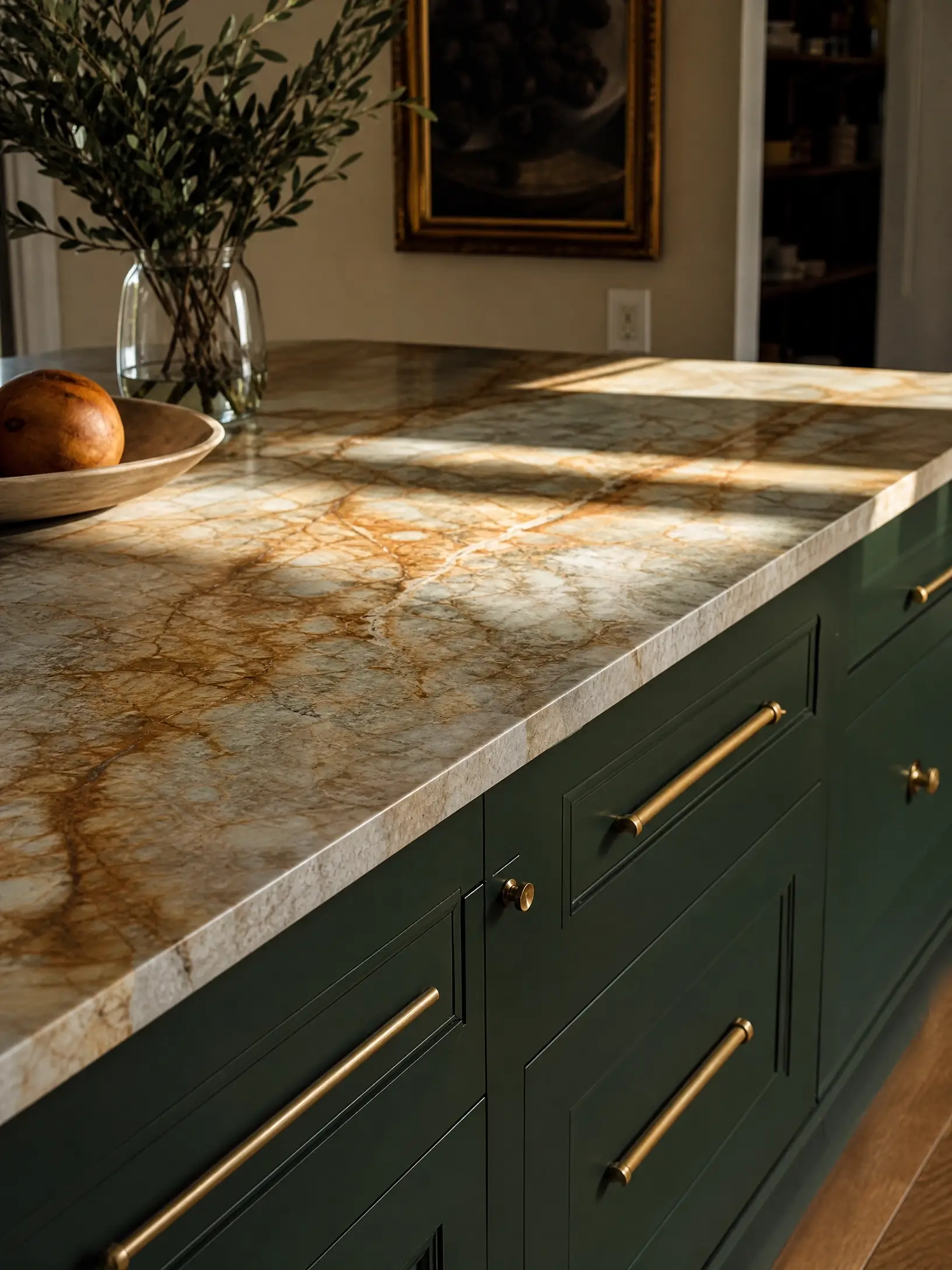
A pure white or gray-veined stone can make dark green cabinets feel cold and a little clinical by comparison. Warm-veined quartzite, with golden or rust-toned movement running through it, pulls the same warmth out of the green that brass hardware does, just at countertop scale.
This is a pairing worth asking your fabricator about by name rather than just saying “white countertop,” since the undertone of the veining is what makes or breaks the look against a deep green door front.
12. Tile a Cream Zellige Backsplash Behind Green Lower Cabinets for Handmade Texture
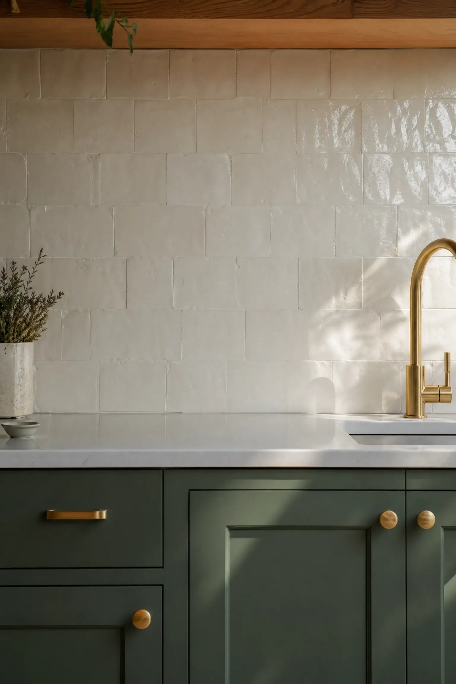
Flat subway tile reads a little flat next to a color as rich as dark green. Handmade cream zellige tile, with its uneven glaze and slight texture, catches light unevenly across the wall, which adds visual movement without competing with the cabinet color.
It also keeps the overall palette warm rather than stark, since true zellige tends to run slightly off-white instead of bright white.
My read is this is worth the small upcharge over standard subway tile if the backsplash sits directly behind your most-photographed cabinet wall.
13. Mix Brass and Matte Black Hardware on the Same Green Cabinet Run for a Collected Look
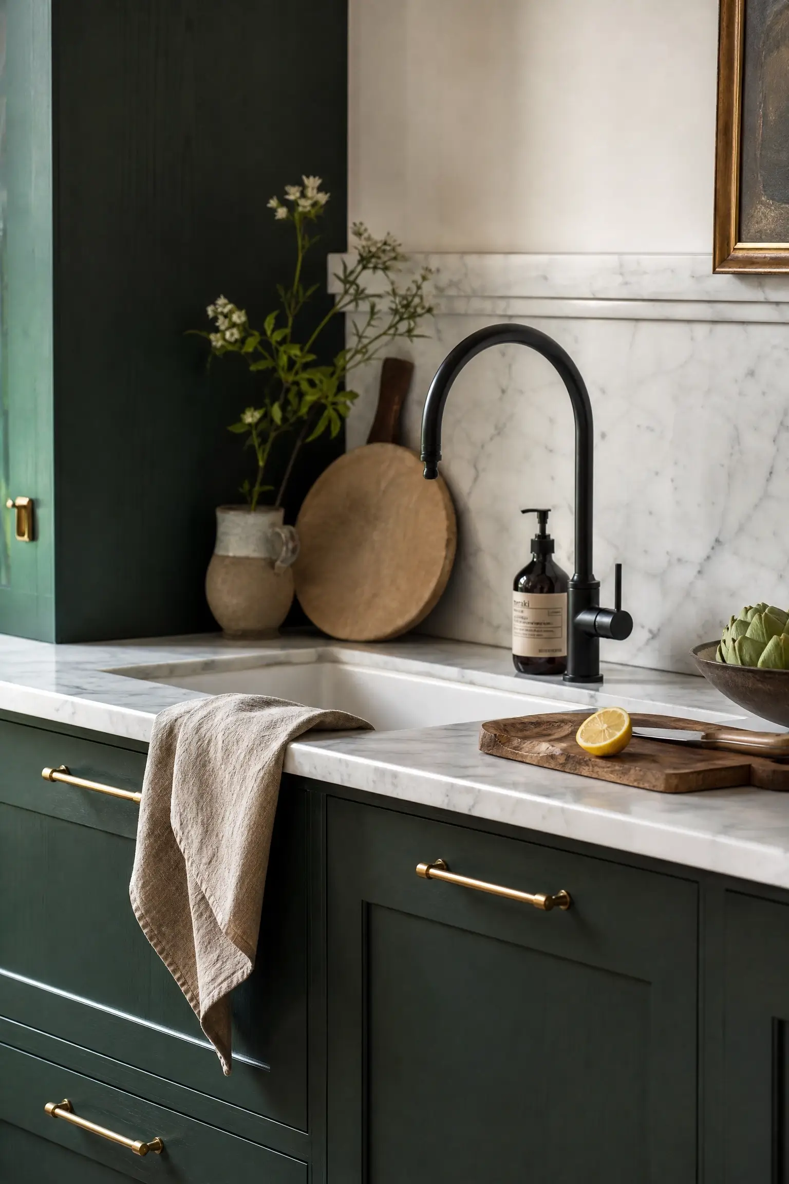
Matching every single piece of metal in a kitchen can end up looking more like a showroom display than a real home. Using brass pulls on the cabinets and a matte black faucet or pendant fixture, all against the same deep green, gives the room a collected-over-time feel instead.
This works because both metals share the same undertone family as the dark green, so nothing clashes — it just reads layered.
I’d avoid going further than two metal finishes in one kitchen, though, since a third tends to start looking unplanned rather than intentional.
14. Paint Just the Range Hood Dark Green as a Focal Point Above White Surrounding Cabinetry
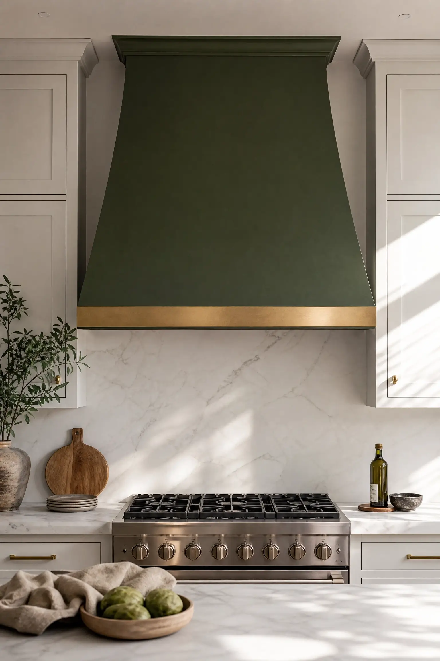
A range hood is already the architectural focal point of most kitchens, so painting just that one element in a deep green color gives you a bold visual moment without touching a single cabinet door.
It works particularly well on a plaster or wood hood surround, where the green can sit as a solid block of color against simple white cabinetry on either side. Add a slim brass trim strip along the bottom edge if you want to tie it to brass hardware elsewhere in the room.
This is one of the more unexpected ideas here, and it’s a genuinely budget-friendly way to get a strong green moment in a mostly white kitchen.
Lighting and Shelf Styling That Stops Green From Reading Heavy
Cabinet color is only half the equation. The wrong light temperature can make even a well-chosen green look murky by evening, and the right shelf styling keeps a full cabinet wall from feeling flat.
15. Swap In Warm White Oak Floating Shelves Beside Green Wall Cabinets and Style Them with Three Ceramic Bowls
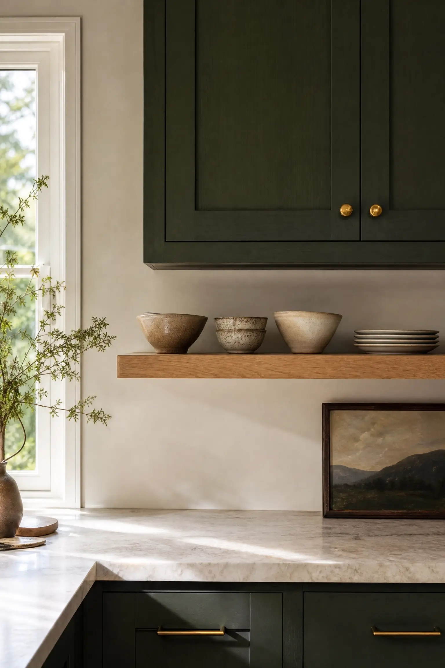
A full wall of green upper cabinets can start to feel like a solid block of color, especially in a smaller kitchen. Breaking up one section with open white oak floating shelves gives the eye a place to rest, and the warm wood grain pulls the same undertone out of the green that wood flooring or a wood countertop would.
Keep the styling restrained: three or four ceramic bowls or a small stack of plates is enough. Overloading open shelving next to a bold cabinet color usually makes the whole wall look busy instead of curated.
A handful of well-chosen pieces reads intentional; a shelf full of everything you own reads cluttered.
16. Hide a Warm LED Strip Under One Floating Shelf So Green Cabinets Glow Instead of Going Murky at Night
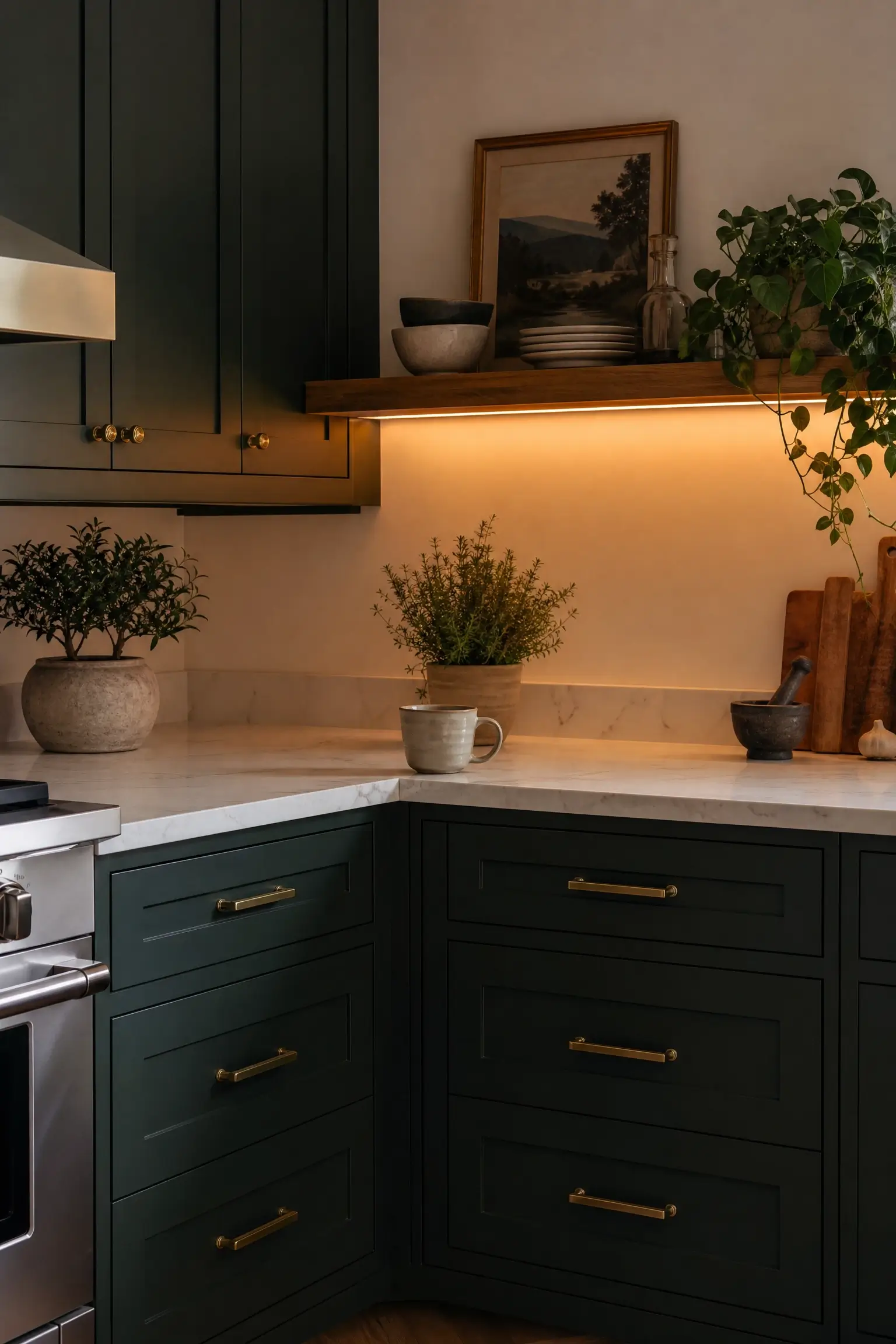
Dark cabinets and overhead lighting alone are a rough combination once the sun goes down — without a secondary light source, deep green can read almost black under a single ceiling fixture. Tucking a warm-toned LED strip under one floating shelf or the underside of an upper cabinet adds a soft glow at counter level, where you actually need to see what you’re doing.
Choose a warm white bulb temperature, not a cool or daylight one, or the green will look gray instead of rich.
It’s a small electrical add, but it’s the biggest difference between a green kitchen that photographs well at night and one that just looks dim.
17. Cluster Three Small Brass Pendants Over a Green Island Instead of One Big Fixture
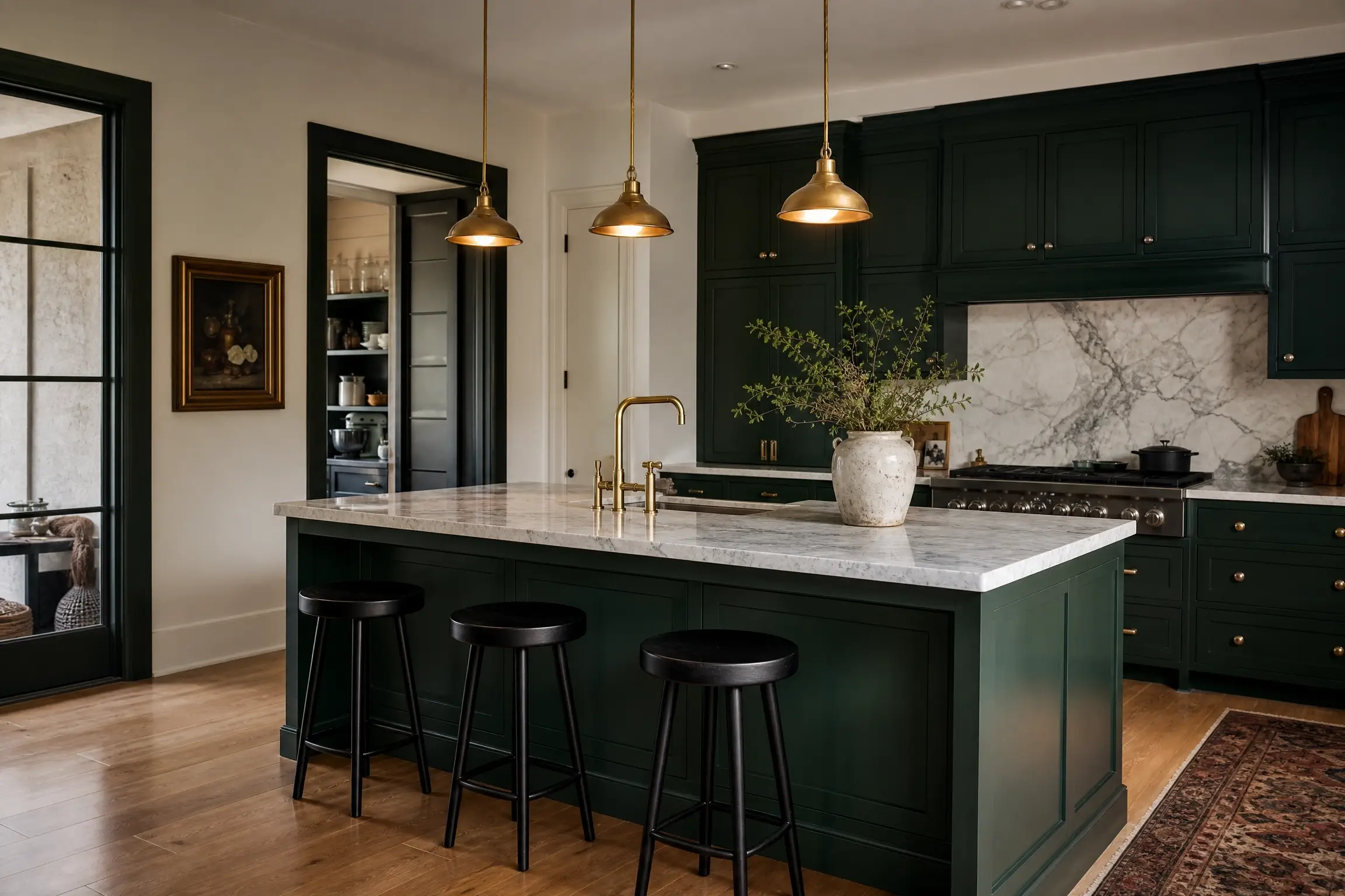
One oversized pendant over an island can leave the corners of a kitchen in shadow, especially once the cabinets are already dark. Clustering three smaller brass pendants in a row, instead of one statement fixture, spreads warm light more evenly across the island surface and reads as more current than a single large shade.
It also adds rhythm to the room visually, echoing the repetition of cabinet doors and hardware pulls along the island front.
This is a detail worth raising with your electrician before installation, since spacing three fixtures evenly takes a bit more planning than hanging one.
18. Add Glass-Front Upper Cabinets Painted Cream Inside to Display Dishware Against Green Lowers
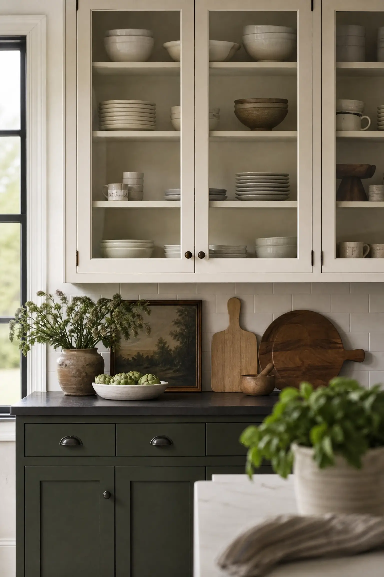
Solid cabinet doors on every upper can make a kitchen feel like a wall of color with nowhere for the eye to land. Swapping one or two uppers to glass fronts, with the interior painted a soft cream instead of matching the green, creates depth and a lighter visual break above deep green lower cabinets.
Stack everyday dishware inside instead of decorative pieces you never use — it should look like a kitchen people actually cook in, not a styled display case.
This works especially well directly above an open shelf or near a window, where natural light can reach inside the glass.
Storage, Floor, and Splurge Details for a Finished Green Kitchen
The last details are the ones that make a green kitchen feel complete in person, not just in a single hero photo.
19. Run a Vintage Wool Runner Down a Galley Aisle to Ground Deep Green Cabinetry Underfoot
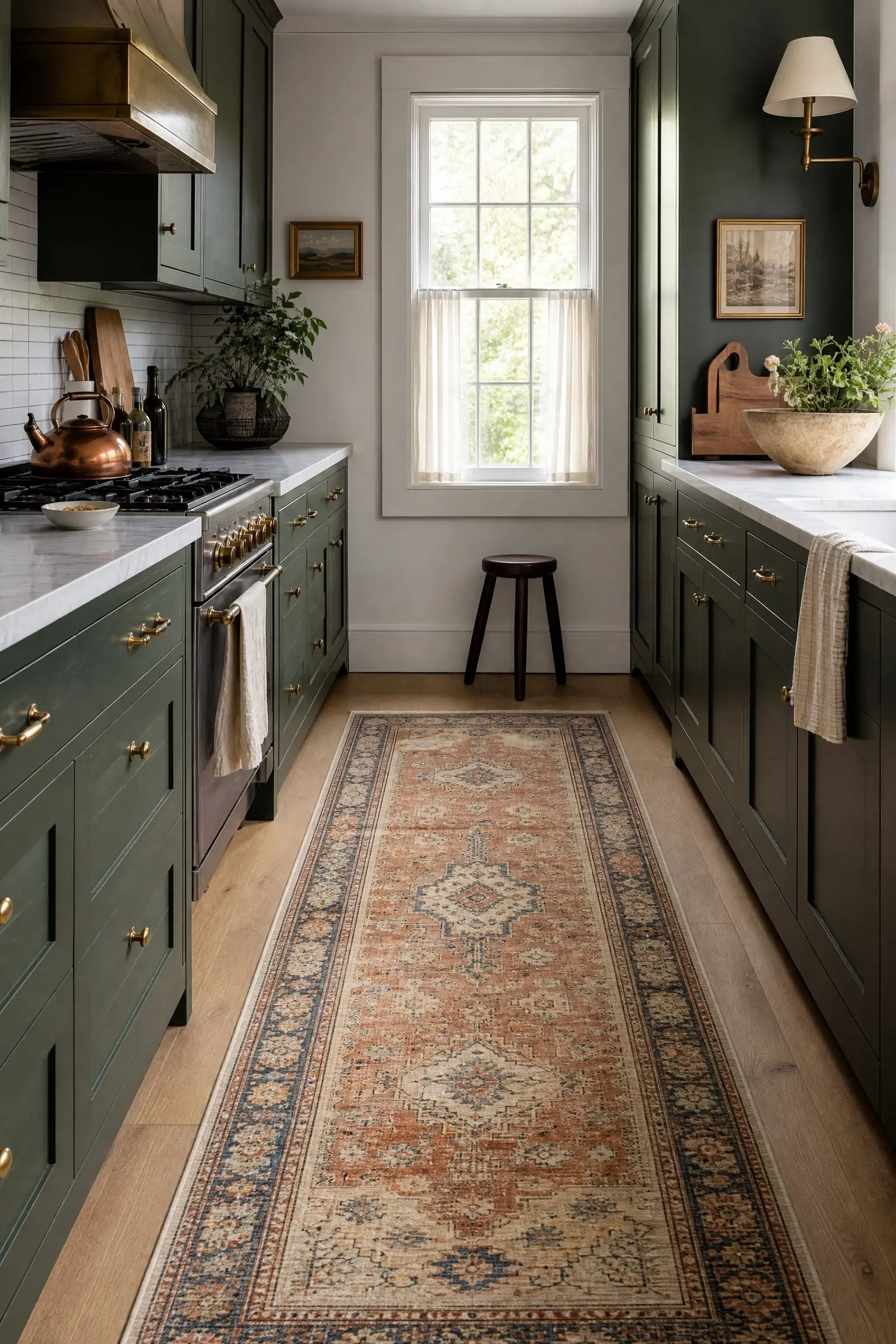
A galley kitchen with deep green cabinets on both sides can start to feel like a tunnel of color without something to break up the floor. A vintage-style wool runner, in a muted rust, cream, or faded blue pattern, gives the eye a path to follow and pulls warmth up from the floor to meet the cabinets.
Choose a runner with some pattern movement rather than a flat solid color — it reads more collected and less like a single matching set with the cabinetry.
This is one of the cheaper finishing details on this list, and one of the easiest to change later if your taste shifts.
20. Slide a Narrow Pull-Out Spice Tower Beside the Fridge in a Green Cabinet Run
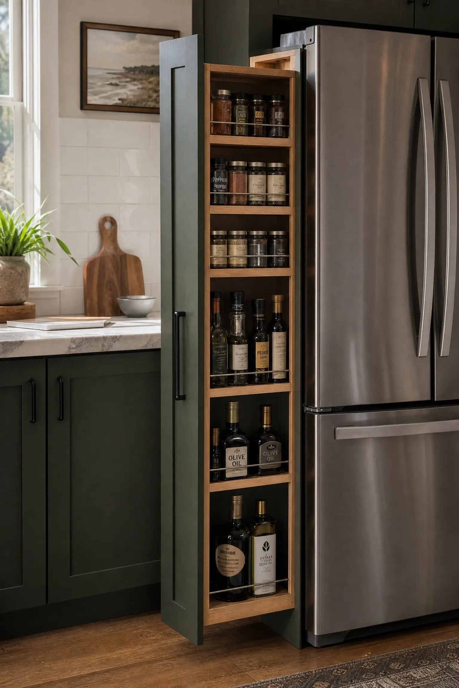
Deep cabinet colors tend to show up in kitchens getting a full functional update, and a narrow pull-out spice tower next to the fridge is one of the most useful, least glamorous additions you can make at the same time. A six-inch gap is usually all it takes.
It keeps oils, spices, and small jars out of sight behind a matching green door front, instead of cluttering the counter in front of your new backsplash.
This is the kind of detail that never shows up in a styled photo but makes the kitchen genuinely easier to live in once the cameras are gone.
21. Splurge on a Single Book-Matched Marble Waterfall Edge for a Green Kitchen Island
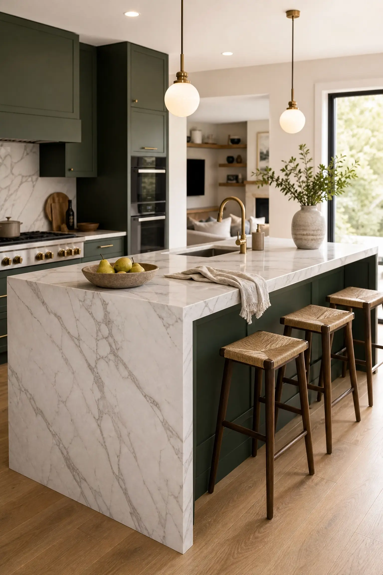
This is the one true splurge on this list, and it earns its place because it’s the detail that turns a green island from nice into genuinely memorable. A single slab of book-matched marble, with the veining mirrored down the waterfall edge, gives the island a sculptural quality a standard countertop simply can’t match.
I’d only spend here if the island is the visual centerpiece of an open-plan kitchen — in a smaller or more closed-off layout, the cost rarely matches the visual payoff.
A warm-veined engineered quartz waterfall edge gives a similar silhouette at a fraction of the price if the slab itself is out of budget.
Quick Answers Before You Pick a Paint Sample
What is the best dark green for kitchen cabinets?
Benjamin Moore Hunter Green, Farrow & Ball Studio Green, and Sherwin-Williams Pewter Green are the most-saved shades, with Pewter Green working best in low-light kitchens.
Will dark green cabinets make my kitchen look smaller?
Not if you pair them with a lighter counter, satin sheen, and warm lighting. A two-tone layout or island-only approach keeps a small kitchen feeling open.
What hardware goes with dark green kitchen cabinets?
Unlacquered or aged brass is the most-pinned pairing because it warms the green. Matte black works for a more modern, higher-contrast look.
Is dark green a passing kitchen trend?
NKBA’s 2026 reporting places green ahead of blue and brown in homeowner preference, suggesting it’s settled into a long-term neutral rather than a passing trend.
Should I paint my whole kitchen dark green or just the island?
Start with the island or one wall if you’re unsure. It’s lower-risk, cheaper to test, and easy to expand once you’ve lived with the color.
Where to Start If You’re Still Holding Paint Swatches
Twenty-one ideas is a lot to scroll through, but the goal was never just a pretty photo dump — it’s giving you the actual shade names, hardware logic, and lighting details that competitor roundups tend to skip. These pairings are based on patterns across real, photographed kitchens, not a guarantee for every layout, since your ceiling height, floor tone, and light direction will all shift how a shade reads once it’s actually on your walls. Start small if you’re unsure — an island, a pantry door, or a single poster-board swatch taped near your main window will tell you more than another hour of scrolling ever could.


No Comment! Be the first one.