




22 Little-Known Secrets to Styling Natural Hickory Kitchen Cabinets Like a Pro
If you’re standing in your kitchen right now looking at your hickory cabinets and wondering whether you made a mistake, you didn’t. Hickory is one of the most durable, striking woods you...

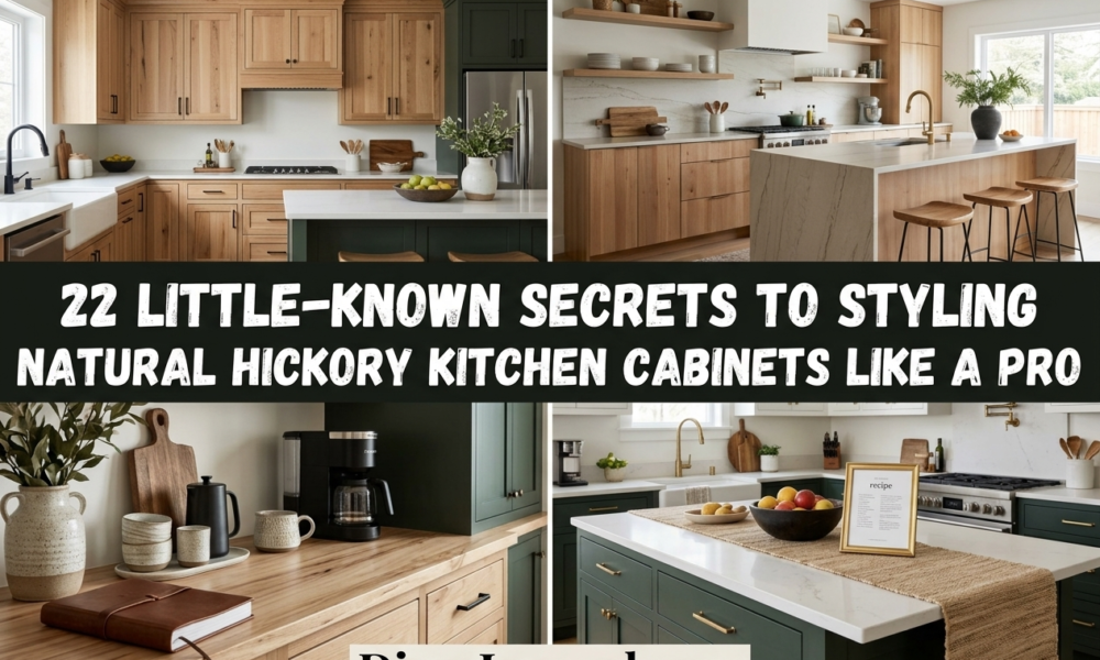
If you’re standing in your kitchen right now looking at your hickory cabinets and wondering whether you made a mistake, you didn’t. Hickory is one of the most durable, striking woods you can put in a kitchen — the problem is almost never the wood itself. It’s everything placed around it. This works best for kitchens where the hickory cabinets are already installed and staying put. It won’t help if you’re still choosing between wood species, since that’s a different decision entirely.
The good news: hickory’s busy reputation comes from a handful of fixable pairing mistakes, not from the wood being wrong for your space. Below are 22 specific, doable fixes — for color, hardware, counters, backsplash, lighting, and layout — built around the actual complaint homeowners have: the grain feels loud, the tone reads orange, and the whole room feels stuck in 1998.
Natural hickory kitchen cabinets refers to cabinetry built from unstained, clear-coated hickory wood, prized for dramatic color swings between pale sapwood and deep amber-brown heartwood, plus visible knots. The wood does its own decorating — every other choice in the room needs to support it, not compete with it.
Why Hickory Cabinets Look Busy And What Actually Fixes It
Hickory earns its reputation honestly. It’s one of the hardest domestic woods available for cabinetry — roughly 1,820 lbf on the Janka hardness scale, over 40% harder than red oak, according to The Wood Database’s species hardness data. That density is exactly why hickory shrugs off dings, heavy hardware, and daily use better than softer cabinet woods, which matters when you’re choosing bold black pulls or a statement hood — the wood can take it.
My read is that most “busy hickory” complaints aren’t really about the wood at all. They’re about everything installed around it fighting for the same visual attention: patterned backsplash, warm-white bulbs that push the orange further, and hardware so small it disappears into the grain instead of grounding it. Manufacturers like Diamond Cabinets, in their Rustic Hickory line, and Showplace Cabinetry, in their grain and color literature, both acknowledge this upfront — color variation is the selling point, not a defect to hide.
The counter-intuitive part: the fix for “too much grain” is rarely less wood. It’s more consistency everywhere else — one hardware finish, one dominant counter material, one calm wall color. Some designers argue busy wood needs high contrast to balance it — stark white counters, a bold graphic backsplash. That can work on some woods, but on hickory specifically it tends to amplify the chaos rather than settle it, because now two loud elements are competing instead of one.
Cabinet and Hardware Fixes That Calm Hickory’s Grain
1. Swap Every Knob for Long Matte Black Bar Pulls to Calm Hickory’s Color Jumps
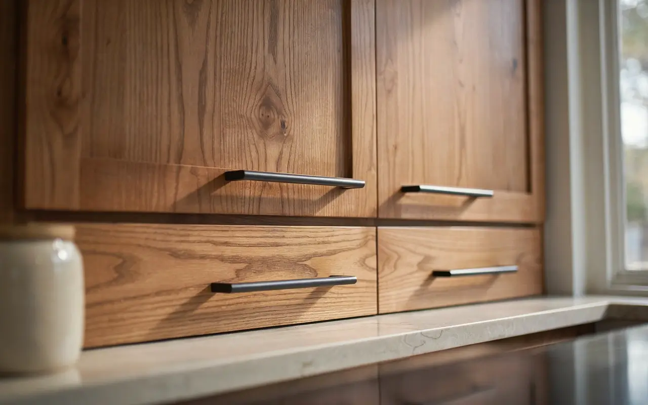
The problem: small knobs get visually swallowed by hickory’s light-and-dark patchwork, so your eye jumps around the cabinet face instead of resting anywhere. The fix is length, not just finish — a long horizontal bar pull draws one clean line across each door, which gives the eye a place to land before it notices the grain shift underneath. Matte black works because it reads as a shadow line, not a shiny distraction. One warm detail: pick pulls with slightly rounded edges so the hardware feels soft against all that texture, not clinical.
2. Order Horizontal-Grain Door Fronts for the Island So the Grain Reads as Calm Lines
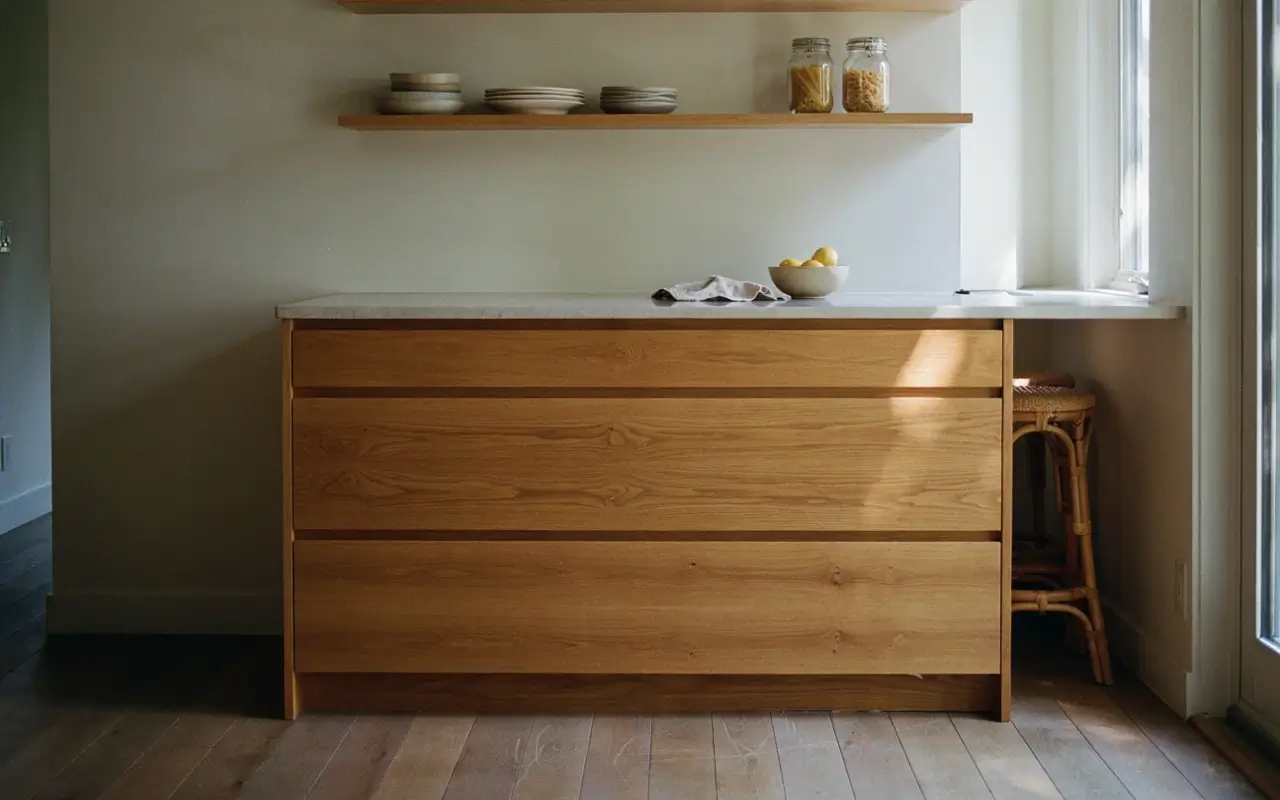
If you’re still selecting doors for an island or a secondary run, ask your supplier for horizontal grain orientation instead of vertical. Vertical grain on tall doors stacks knots and color changes on top of each other, which is where “busy” really comes from. Horizontal grain turns the same wood into calm, repeating lines, almost like a plank floor turned sideways. This is a request you make before doors are cut, so it’s most useful if your island or a cabinet run hasn’t been ordered yet.
3. Ask Your Cabinet Shop to Sort Panels by Color Before Install
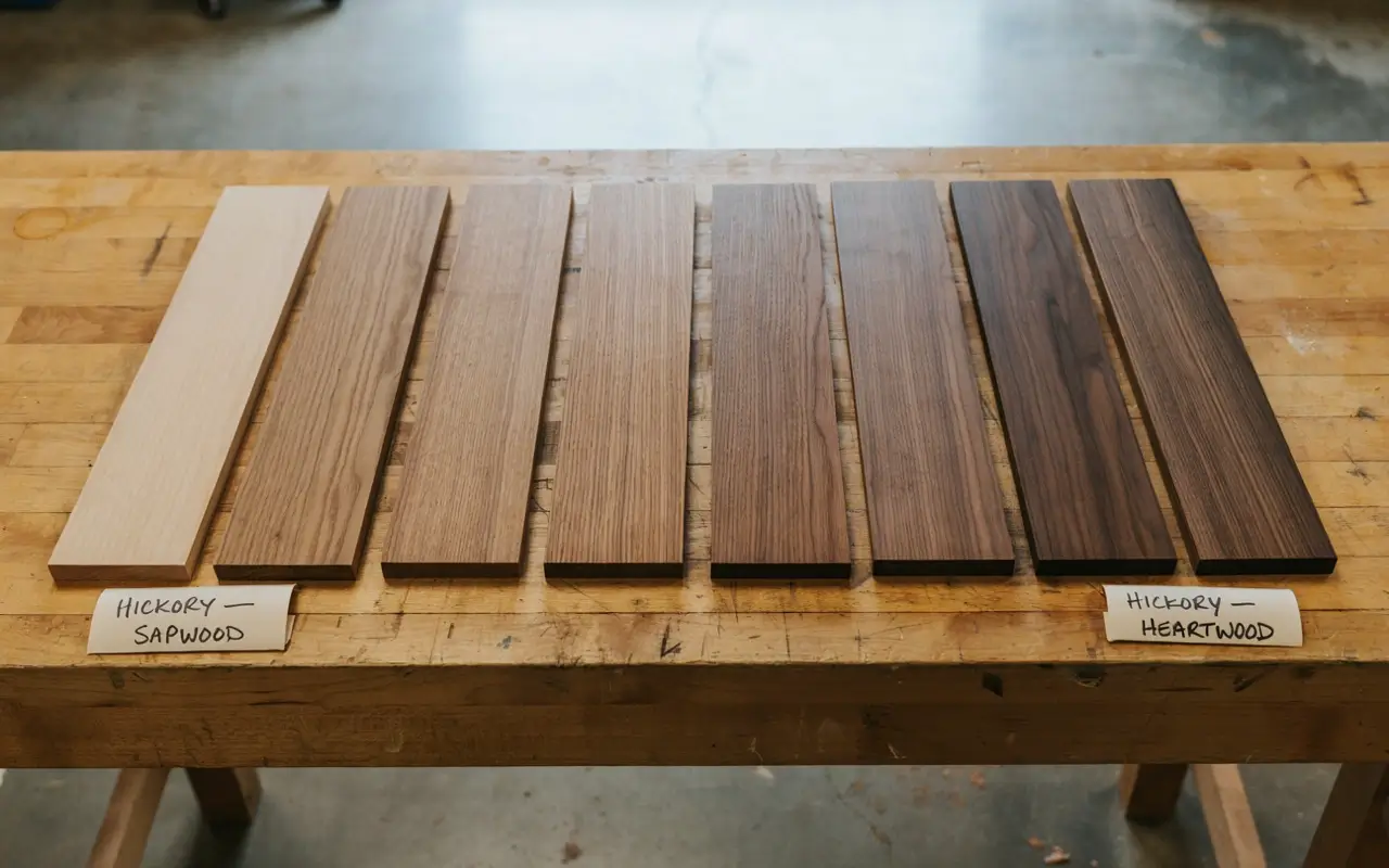
Here’s a fix almost nobody mentions: hickory boards vary so much that two doors right next to each other can look like different wood species if they’re installed randomly. Before install, ask your cabinet maker to lay all the door panels out and group them by color tone — pale sapwood together, deeper heartwood together — then distribute them so the transition across the run feels gradual instead of jarring. This is the single biggest reason some hickory kitchens look intentional and others look like a mismatched pile of scrap.
I’d only skip this if your cabinets are already hung — at that point it’s not worth pulling doors to re-sort them.
4. Mix an Aged Brass Faucet with Black Pulls for a Two-Metal Palette That Feels Intentional
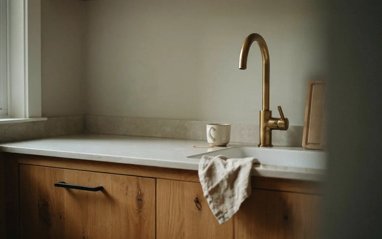
One metal finish everywhere can feel flat against hickory’s warmth. Two, used deliberately, feels curated — a warm aged brass faucet at the sink paired with matte black pulls on the cabinets. The rule that keeps this from looking accidental: pick one finish for “function” fixtures (faucet, pot filler) and one for “hardware” (knobs, pulls, hinges), and never mix them within the same category.
Matte black hardware vs aged brass hardware: matte black is better for busy grain because it visually recedes and grounds the wood without adding shine. Aged brass works better as a single accent piece, like a faucet or a light fixture, where a little warmth and reflection is welcome. The key difference is that black calms, brass highlights.
5. Commit to One Hardware Finish for the Whole Kitchen So Nothing Competes With the Wood
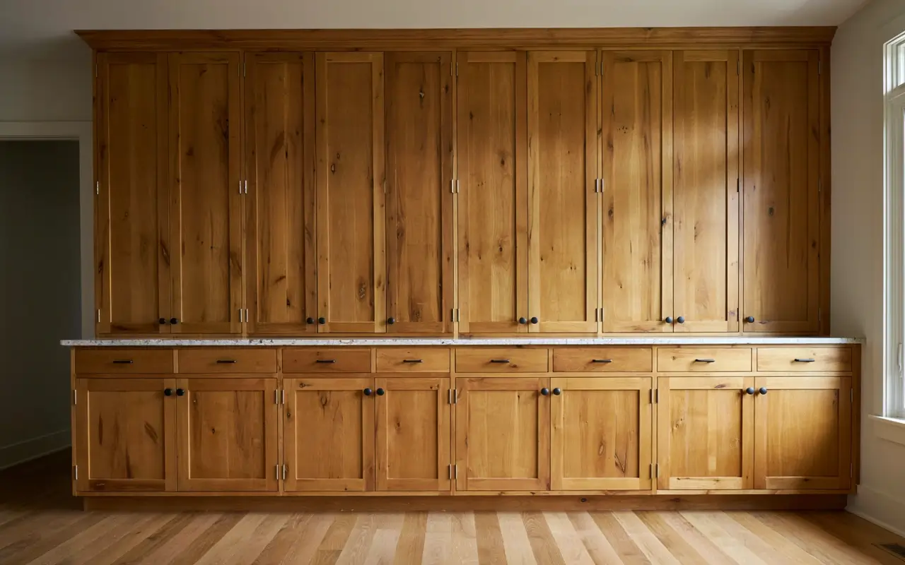
This is less an idea and more a rule worth repeating: pick a single hardware finish — matte black, aged brass, or brushed nickel — and use it on every cabinet, drawer, and hinge in the room. Hickory already provides plenty of visual variety on its own. When hardware finishes also vary, the kitchen has two competing “busy” elements instead of one calm one, and that’s usually the moment a kitchen tips from warm-rustic into cluttered-looking.
6. Anchor the Ceiling Line with a Single Dark Vent Hood That Matches Your Hardware
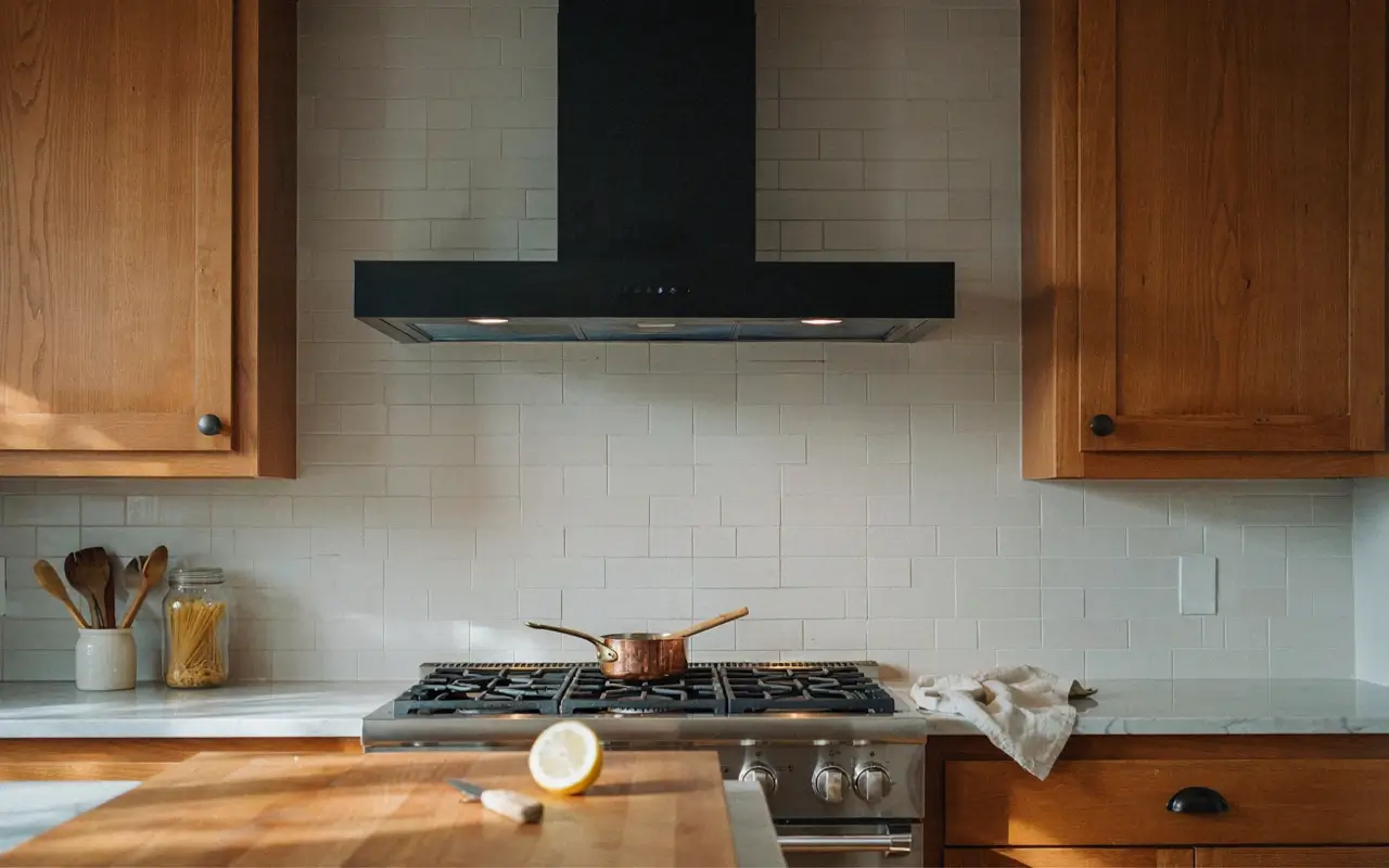
A stainless or wood-panel hood over hickory cabinets often just adds a third competing texture at eye level. Swap it — or have it panel-wrapped — for a single matte black hood that echoes your hardware finish. It gives the top of the kitchen a visual anchor, the same way a dark picture frame anchors a busy piece of art, and because hickory can handle heavy daily use, a bold statement hood doesn’t feel out of place functionally either.
Countertop and Backsplash Pairings That Balance Hickory’s Warmth
7. Top Hickory with a Quiet Warm-White Quartz Counter to Give the Eye a Resting Spot
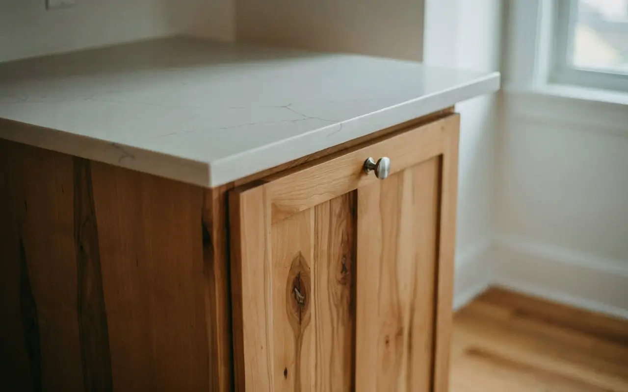
Hickory’s color range is already doing a lot of work, so the countertop’s job is to stay quiet. A warm-white or soft greige quartz with minimal veining gives your eye a flat, calm surface to rest on between the grain above and below. Skip heavily veined stone-look quartz here — busy veining on top of busy grain just doubles the noise instead of balancing it.
To choose a countertop that calms rather than competes with hickory grain, follow these steps:
- Hold a sample directly against your actual cabinet door, not a showroom sample.
- Rule out anything with strong veining or dark speckling.
- Pick the option that reads as one flat tone from three feet away.
8. Run a Honed Soapstone-Look Backsplash Behind the Range for Cool Contrast
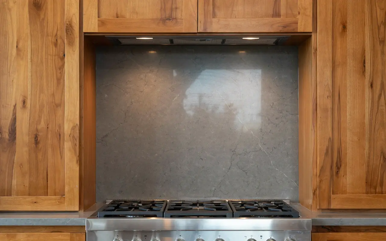
Behind the stove, where grease and grain both need managing, a honed soapstone-look tile or slab brings a cool gray undertone that pushes back against hickory’s warmth without introducing a busy pattern. The matte, low-sheen finish is doing double duty — it’s practical for a cooking wall and it visually cools down the warmest, most orange-leaning part of the kitchen.
Option A: honed soapstone-look tile vs Option B: butcher block backsplash: soapstone-look is better for range walls because it handles heat and grease while adding cool contrast. Butcher block backsplash works better on a sink wall away from direct heat. The key difference is heat tolerance and color temperature.
9. Choose Plain Subway Tile Over a Busy Mosaic So the Backsplash Doesn’t Compete
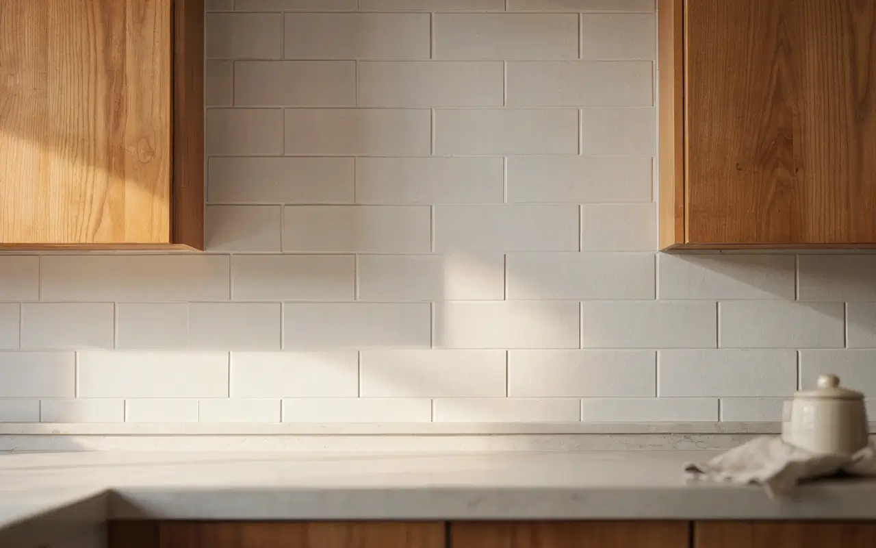
A patterned mosaic backsplash next to variegated hickory is one of the fastest ways to tip a kitchen into visual overload. A plain, matte subway tile in a warm white or soft greige gives the wall a calm grid instead of another competing texture. If you want interest, get it from the grout line or a slightly larger tile format, not from a busy print.
10. Pick a Simple Eased-Edge Countertop Profile Instead of an Ornate One to Keep Lines Modern
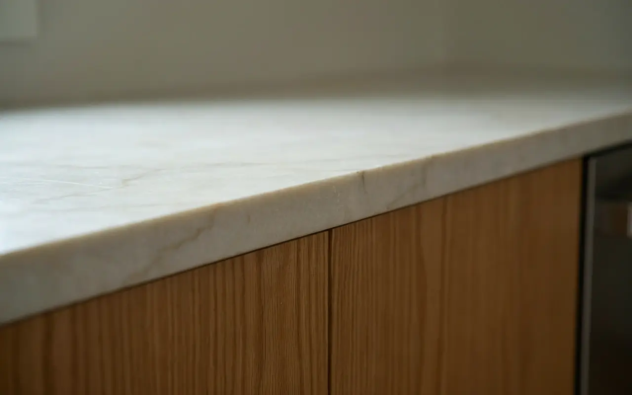
Ornate counter edges — bullnose, ogee, decorative router details — echo the same old-cabin feeling that makes hickory read dated. Swapping to a simple eased or square edge instantly modernizes the whole counter line without touching the cabinets at all. It’s a small, inexpensive spec change that has an outsized effect on whether the kitchen feels current.
Quick Comparison: Countertop Options for Hickory Cabinets
| Option | Best For | Key Benefit | Limitation |
|---|---|---|---|
| Warm-white quartz | Most hickory kitchens | Calm, consistent surface | Can feel plain without a texture accent elsewhere |
| Butcher block | Sink-adjacent, budget remodels | Warms up cooler wall colors | Needs regular oiling and sealing |
| Soapstone-look slab | Range walls | Cool contrast, heat resistant | Limited color range |
11. Splurge on a Honed Natural Stone Island Top if the Rest of the Kitchen Stays Simple
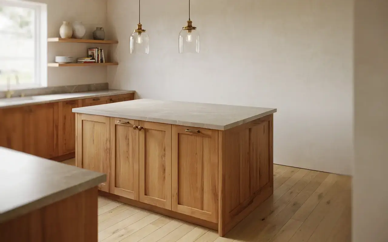
This is the one place worth spending more, and only if everything else in the room is doing the quiet, supporting-role work described above. A single honed natural stone slab on the island — not veiny, not polished to a shine — becomes the one rich, tactile moment in the kitchen. I’d only splurge here if your perimeter counters, backsplash, and hardware are already simple; otherwise this just becomes one more loud element in a room that already has plenty.
Wall, Shelf, and Lighting Styling That Keeps Hickory From Reading Dated
12. Choose a Cool Greige for the Walls to Cancel Hickory’s Orange Undertone
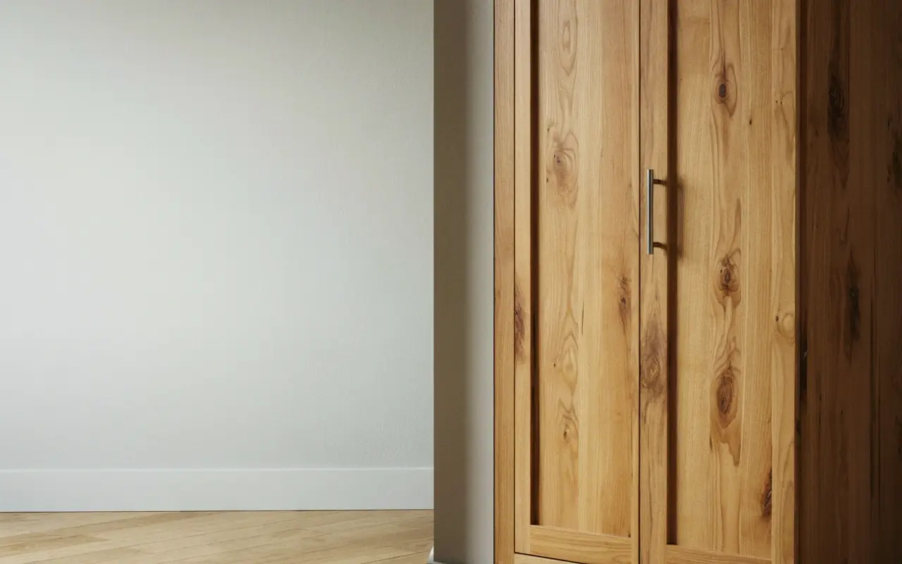
Warm wall colors — cream, tan, honey beige — sit too close to hickory’s own tone and can push the whole room orange. A greige with a cool gray base does the opposite: it sits far enough from hickory’s warmth to neutralize it, without going so cold that the kitchen feels sterile. This single swap solves more “why does my kitchen look orange” complaints than any countertop or hardware change.
To test whether a wall color will calm or clash with your hickory cabinets before buying a full gallon, follow these steps:
- Paint a large sample board, not just a wall patch.
- Hold it directly against your darkest and lightest cabinet doors.
- Check it under both daylight and your kitchen’s evening bulbs before deciding.
13. Trade a Run of Upper Cabinets for Open Shelving to Give Heavy Wood Some Breathing Room
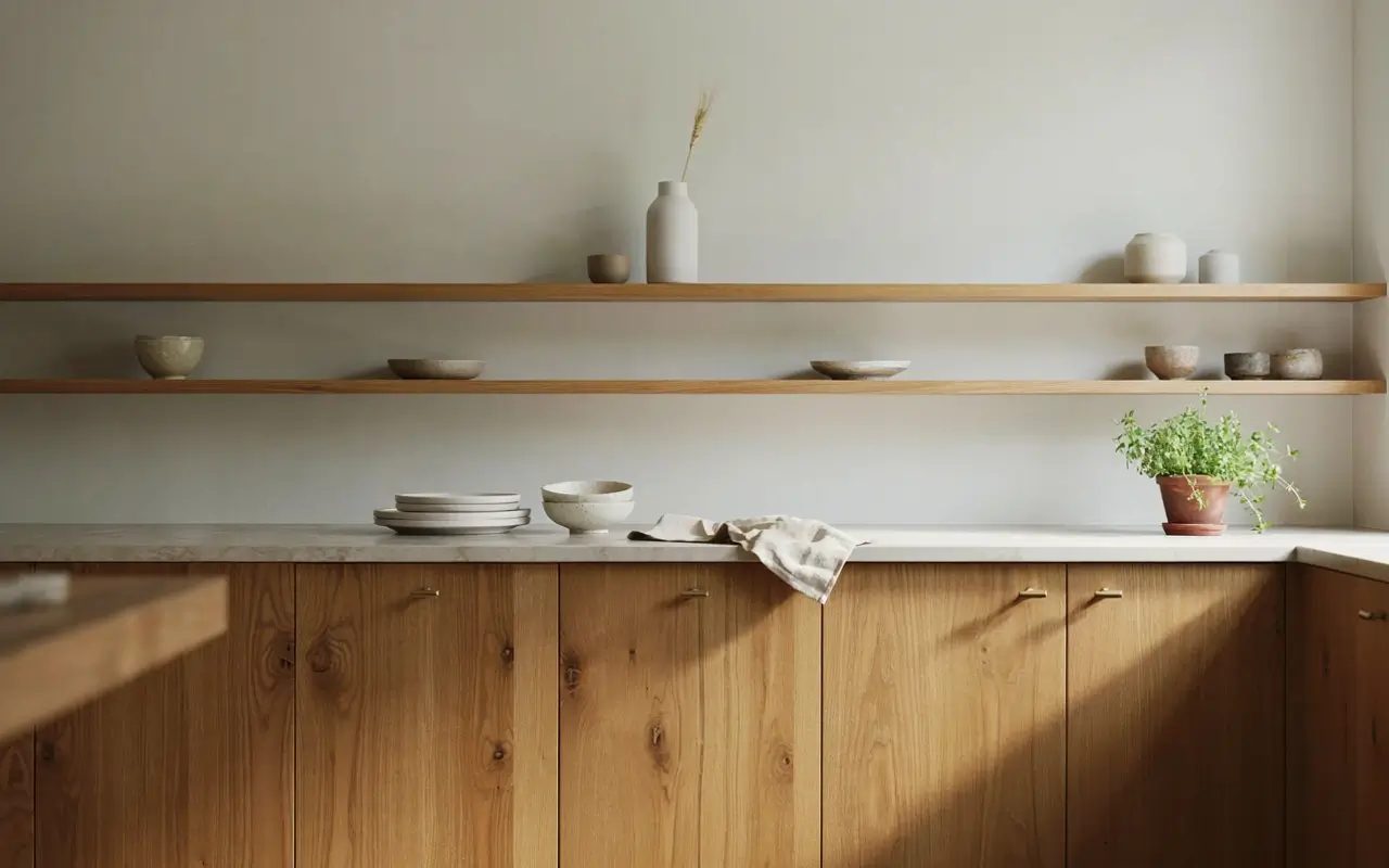
Wall-to-wall hickory uppers can feel heavy fast. Removing one run and replacing it with simple floating shelves breaks up the wood mass and gives the eye a pause. Keep the dishware on the shelves neutral — white stoneware, plain glass — so the shelf itself doesn’t become another busy element competing with the grain behind it.
14. Warm Your Under-Cabinet Lighting to 2700K So Hickory Glows Instead of Looking Orange at Night
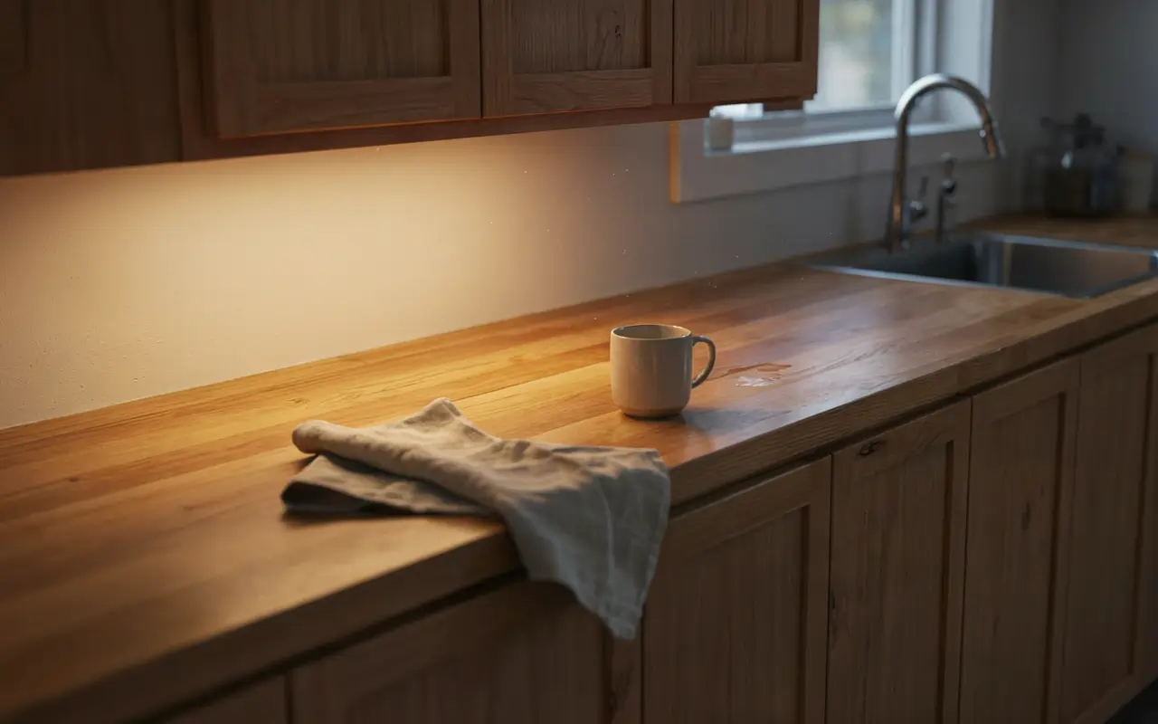
Cool white or daylight-temperature LED strips make hickory’s warm tones look artificially orange after dark. Swapping to a true 2700K warm bulb keeps the wood looking rich and honey-toned instead of harsh. This is a five-minute bulb swap, not a rewiring project, and it’s one of the cheapest fixes on this entire list for the exact “why does it look orange” complaint most hickory owners have at night.
15. Mount a Slim Floating Shelf With Neutral Stoneware to Anchor One Wall Without More Grain
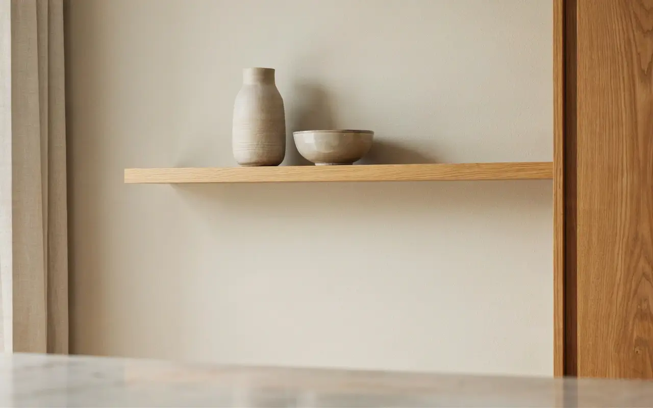
If a full open-shelving swap feels like too much, a single slim floating shelf on one empty wall does similar work at a fraction of the effort. Style it with two or three neutral stoneware pieces, spaced apart, not lined up like a display case. The goal is a quiet visual anchor, not a new collection to dust.
16. Bring In a Painted Wood Island That Isn’t Hickory for One Calm Color Anchor
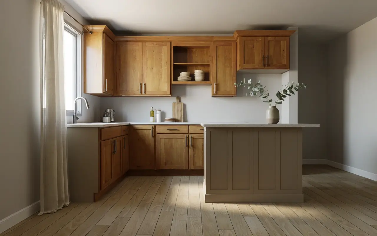
If your island is a separate build from the perimeter cabinets, painting it a solid warm neutral — not touching the hickory perimeter at all — gives the room one calm color anchor to balance the busier wood walls. This isn’t about painting your hickory; it’s about using a non-hickory piece to do contrast work the wood itself shouldn’t have to do. A small furniture-store dresser converted into an island base works the same way if you’re not building custom.
Floor, Runner, and Small-Space Illusions for Busy Grain
17. Lay a Vintage-Style Runner Down the Galley Aisle to Ground the Floor Against Busy Grain
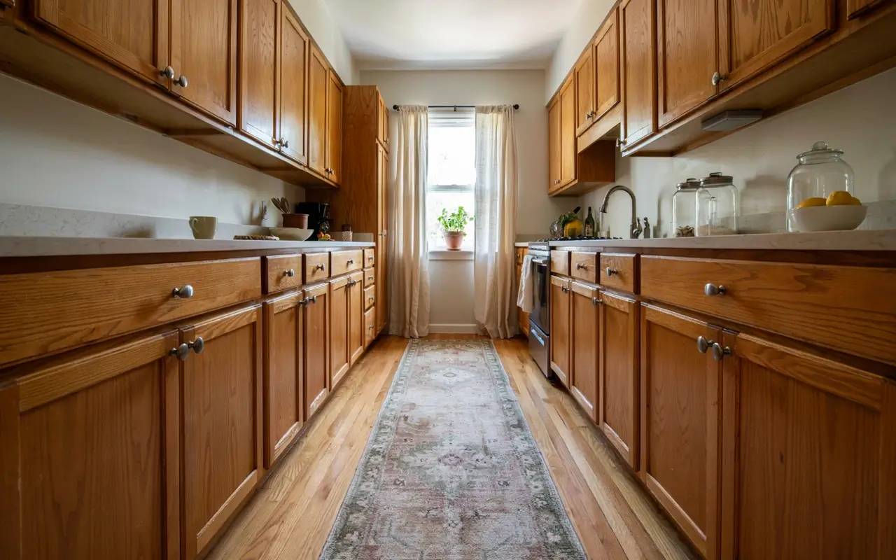
In a narrow galley kitchen, hickory cabinets on both sides can feel like they’re closing in. A low-pile vintage-style runner down the center gives the floor its own defined path, which visually separates “floor” from “cabinet wall” and calms the sense that wood is everywhere. Choose a muted, faded pattern rather than a bold graphic one, so the runner grounds the space instead of adding a third busy layer.
18. Install an Apron-Front Sink as a Visual Pause Between Upper and Lower Cabinets
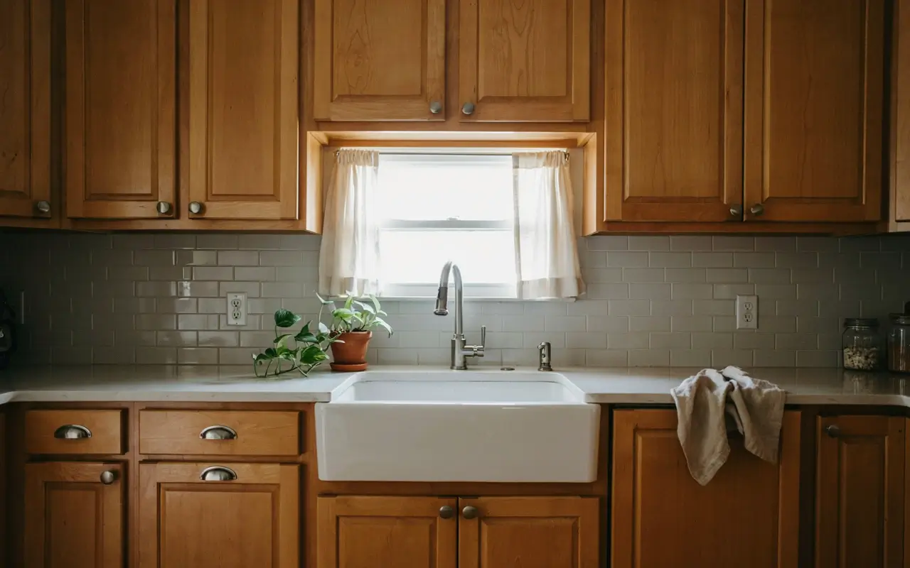
An apron-front sink interrupts the lower cabinet run with a solid, single-color block, usually white or off-white fireclay. That solid block acts as a visual pause between the busy grain above and below it, similar to a plain mat in a picture frame. It’s one of the few fixture swaps that changes how the entire wood run reads, not just the sink area itself.
19. Angle a Diagonal Tile Layout Near the Sink to Visually Widen a Narrow Hickory Galley
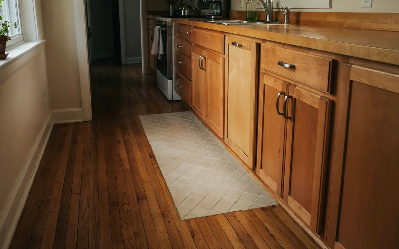
In a tight galley kitchen, a small run of floor tile laid on the diagonal near the sink can visually stretch the width of the room. It’s a trick worth using sparingly — one accent area, not the whole floor — since hickory already provides plenty of visual interest and a fully diagonal floor everywhere would compete with it rather than support it.
Budget and Renter-Friendly Fixes You Can Do This Weekend
20. Hang Simple Linen Café Curtains in a Warm Neutral to Soften Hard Wood Lines at the Window
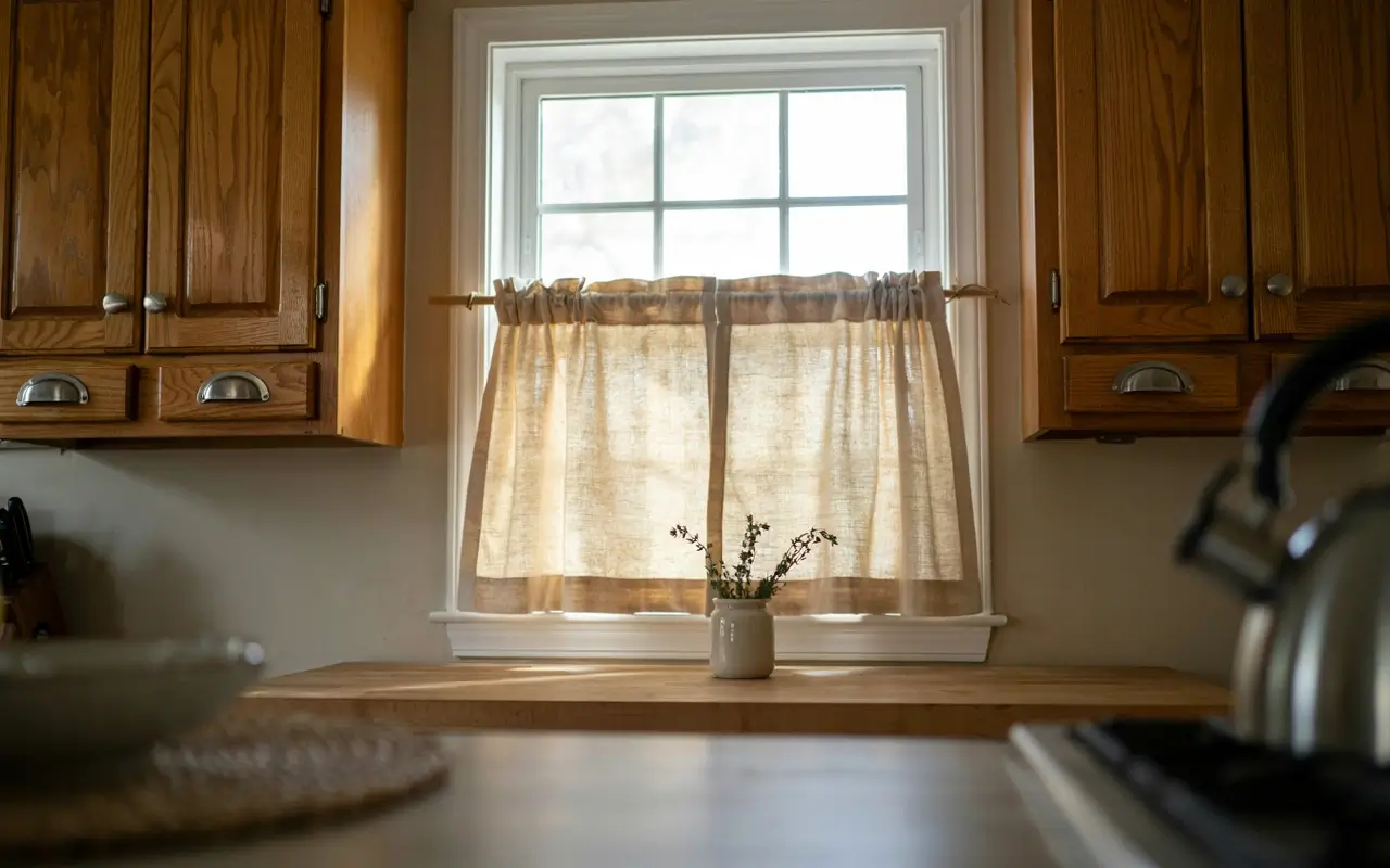
The window is often the one soft surface in an otherwise all-wood kitchen. A simple linen café curtain in a warm neutral tone — not patterned, not heavy — softens the hard edges of the surrounding cabinets and adds texture without adding more visual noise. It’s an inexpensive fix that renters and owners can both do without touching a single cabinet.
21. Use Peel-and-Stick Stone-Look Backsplash Panels When You’re Renting Around Hickory You Can’t Change
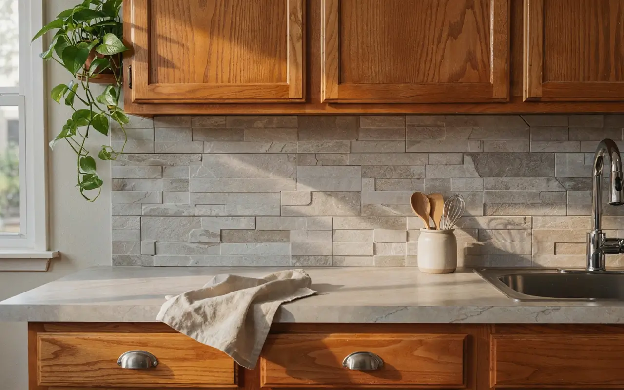
If you’re renting and the hickory cabinets aren’t going anywhere, a peel-and-stick stone-look backsplash panel gives you the same cool-contrast benefit as a real stone backsplash, fully removable at move-out. Stick to a plain, low-pattern stone look rather than a busy printed design, for the same reason a mosaic tile would work against you here.
22. Slide In a Narrow Pull-Out Pantry Beside the Fridge for Small Jars Without More Wood Surface
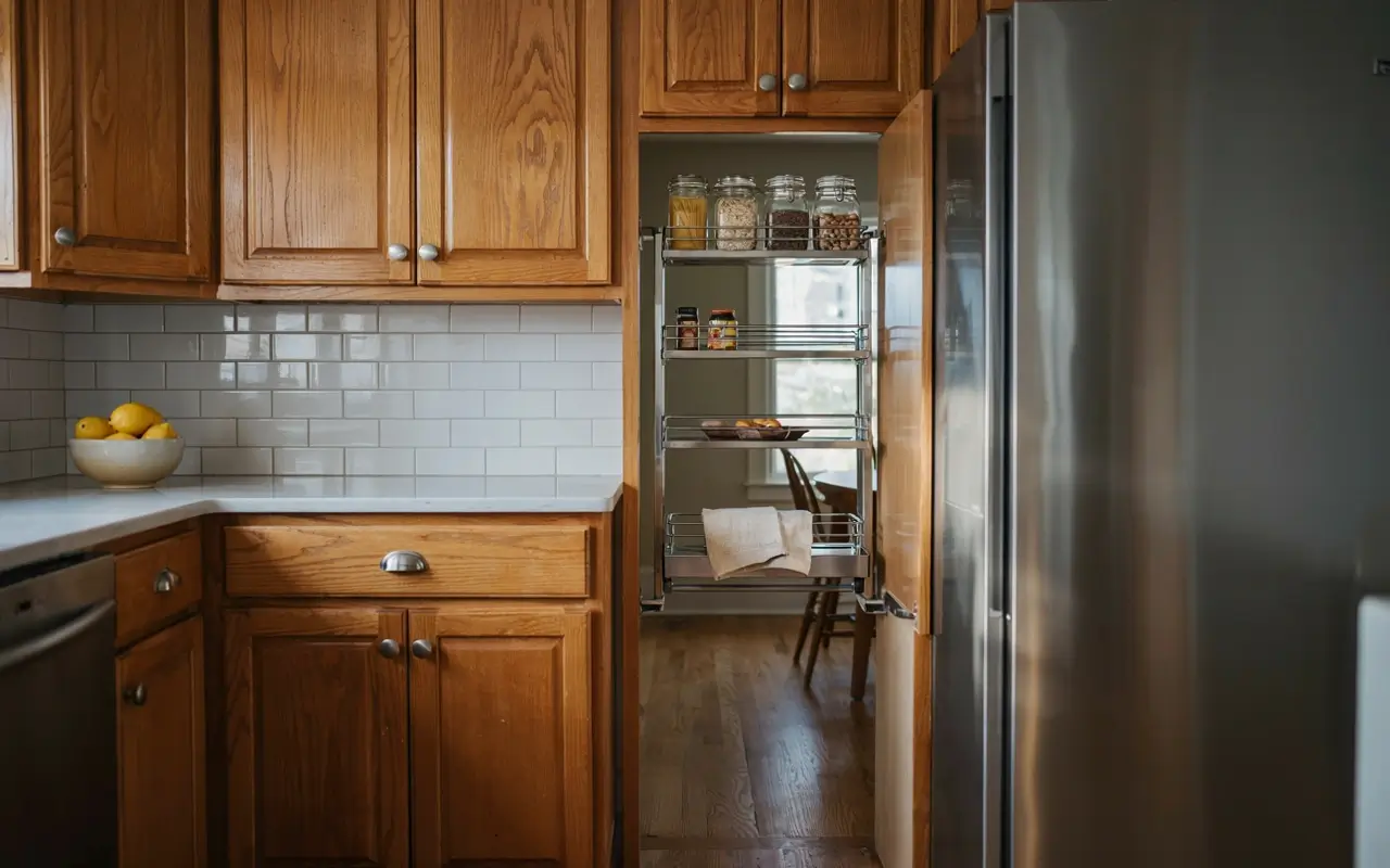
A slim pull-out pantry column beside the fridge adds real storage without adding another full cabinet face to the wood-heavy room. It’s especially useful for spices, oils, and small jars that would otherwise clutter open counters, which matters here since a busy countertop next to busy grain is exactly the combination this whole list is trying to avoid. If a corner or knot in an existing hickory panel ever needs a small touch-up after install, a matching Minwax wood stain pen can blend minor scuffs without refinishing the whole door.
Common Questions About Styling Hickory Kitchen Cabinets
Does hickory always look orange in a kitchen?
Not inherently. Orange tones usually come from warm wall paint or cool-white bulbs fighting the wood, not from the hickory itself.
What countertop color goes best with hickory cabinets?
Warm-white or soft greige quartz with minimal veining works best, since it stays calm against hickory’s natural color variation.
Is black or brass hardware better for hickory cabinets?
Matte black generally calms busy grain best. Aged brass works well as a single accent, like a faucet, rather than all-over hardware.
Can you make hickory cabinets look modern without painting them?
Yes. Simple hardware, a cool wall color, plain backsplash tile, and warm-toned lighting do most of that work without touching the wood.
Do hickory cabinets need special care because of the knots?
No special care beyond normal cabinet maintenance. Knots are part of the wood’s natural structure, not a durability issue.


No Comment! Be the first one.