


24 Kitchen Wall Tile Ideas for Full Walls, Accent Zones, and Small Kitchens
Most kitchen tile articles show you a swatch and call it a day. That’s not helpful when you’re standing in your own kitchen trying to picture how a full-height zellige wall or a tiled...

Most kitchen tile articles show you a swatch and call it a day. That’s not helpful when you’re standing in your own kitchen trying to picture how a full-height zellige wall or a tiled accent zone would actually look behind your stove, your shelving, your window. This list is built around real kitchen situations — small galley layouts, rentals, budget tiers, statement walls — not just tile names. This works best for homeowners and renters planning a wall tile update who want a specific, buildable direction. It won’t help if you’re hoping for a full structural kitchen remodel, since none of these ideas require moving plumbing or removing walls.
Kitchen wall tile ideas refers to ways of using tile beyond a standard countertop-to-cabinet backsplash strip — covering full walls, accent zones, or specific spots like behind a stove or open shelving. It’s about material, layout, and height choices, not just color.
Why Kitchen Wall Tile Is Doing More Than Backsplash Duty Right Now
Tile used to stop at 18 inches above the counter and call it done. Not anymore. The 2026 U.S. Houzz Kitchen Trends Study reports that ceramic tile is still the most popular kitchen backsplash material at 49 percent, with porcelain following at 23 percent, while zellige tile — used in just 4 percent of kitchens — is flagged as an emerging style to watch. My read is that number matters less as a percentage and more as a signal: full-height, handmade-look tile is moving from designer showroom to real kitchens, just slowly.
Full-Height and Accent Wall Tile Ideas
These are the wall treatments that stop the scroll — one bold zone instead of tile everywhere.
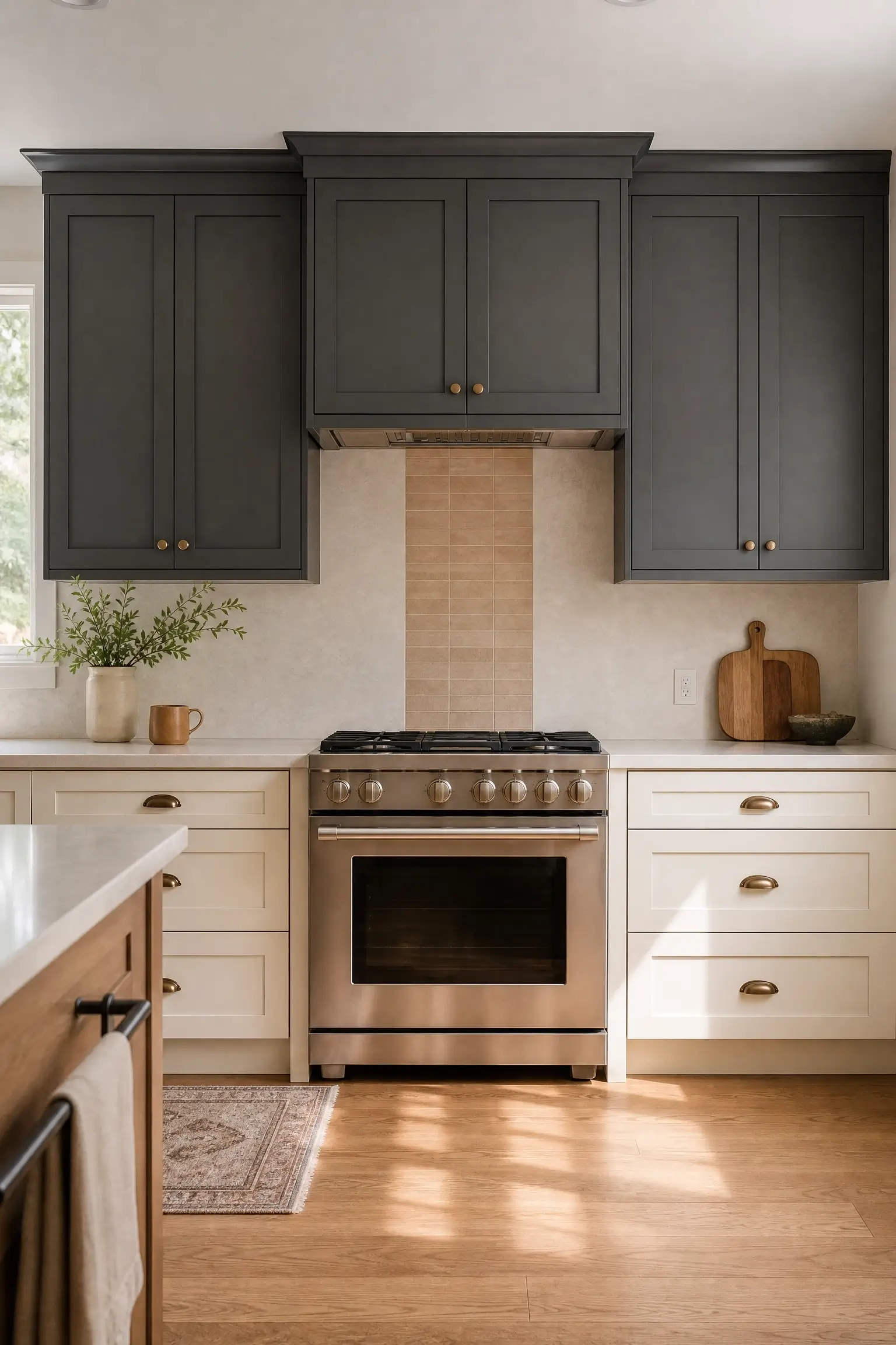
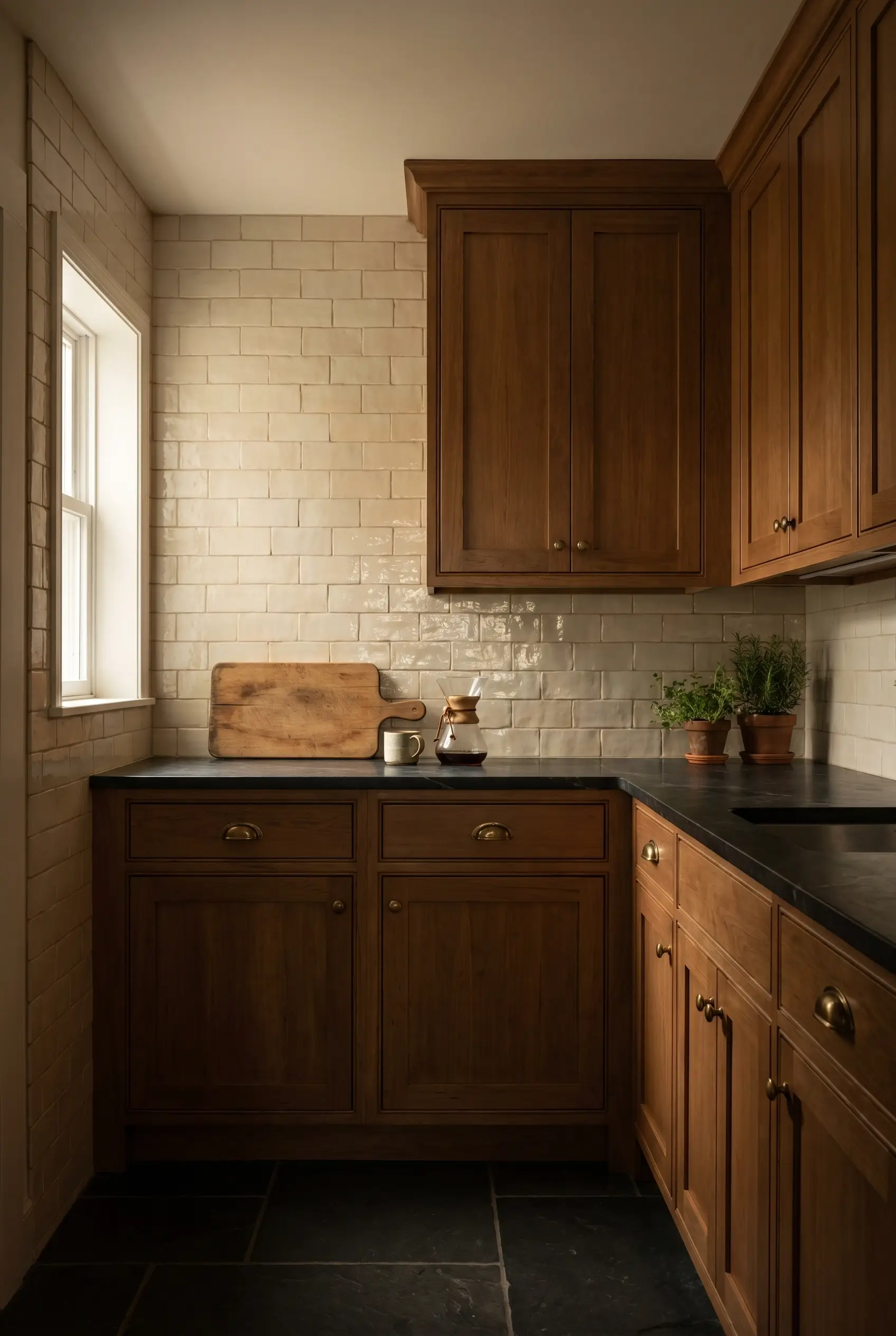
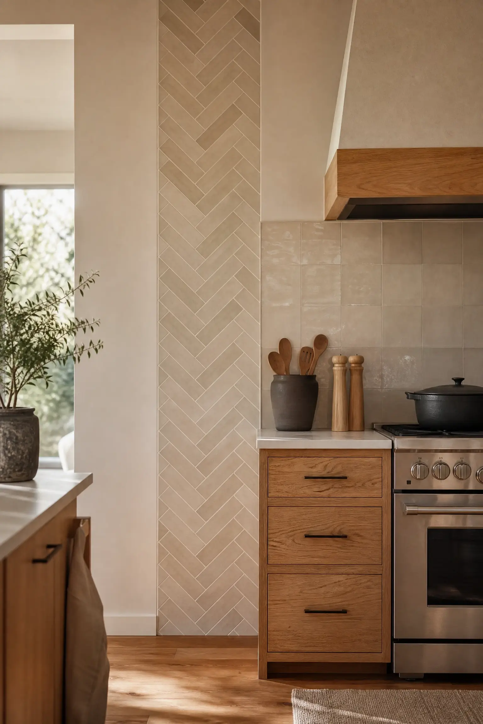
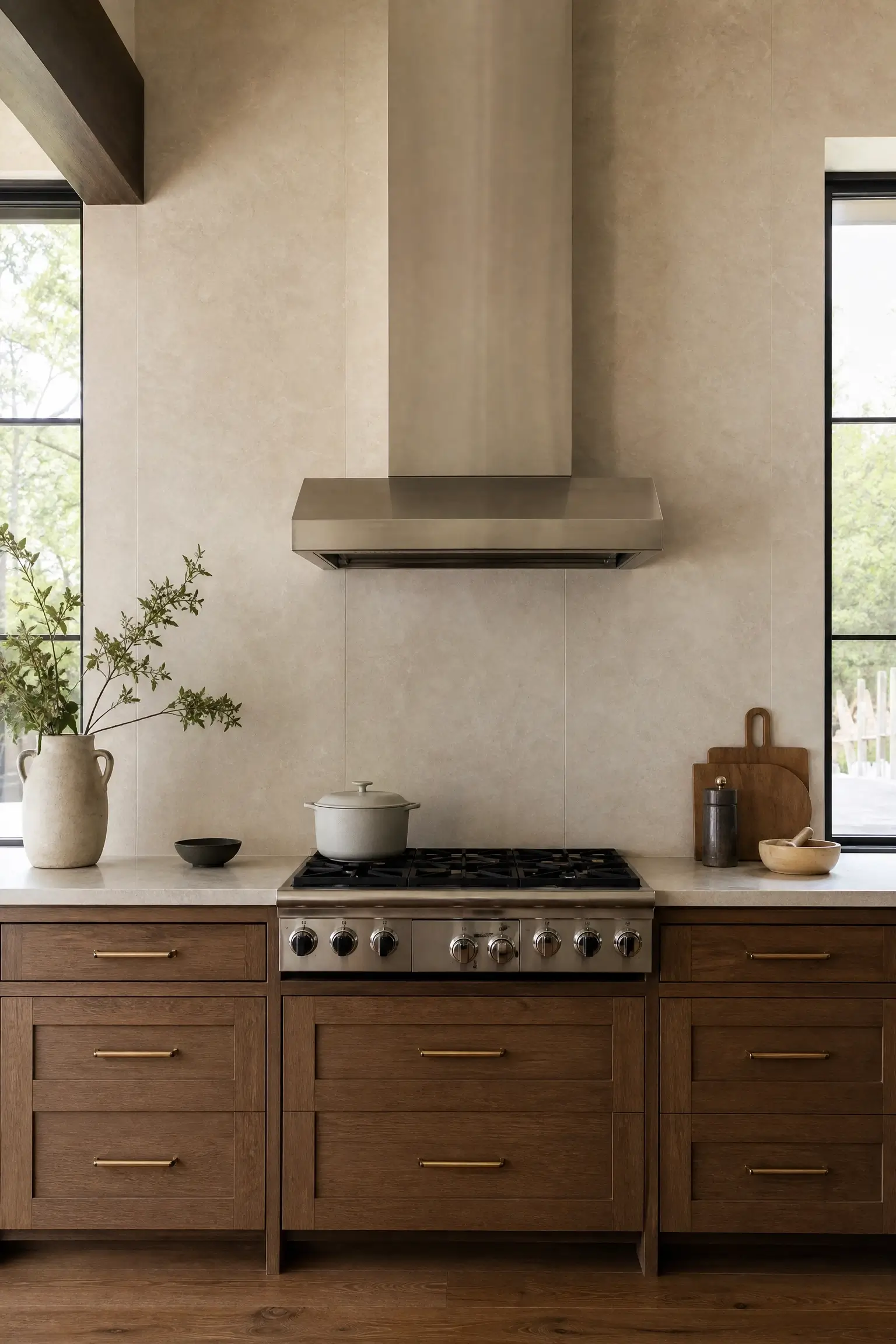
1. Take Zellige Tile Straight From Counter to Ceiling Behind the Stove for a Restaurant-Worthy Focal Wall
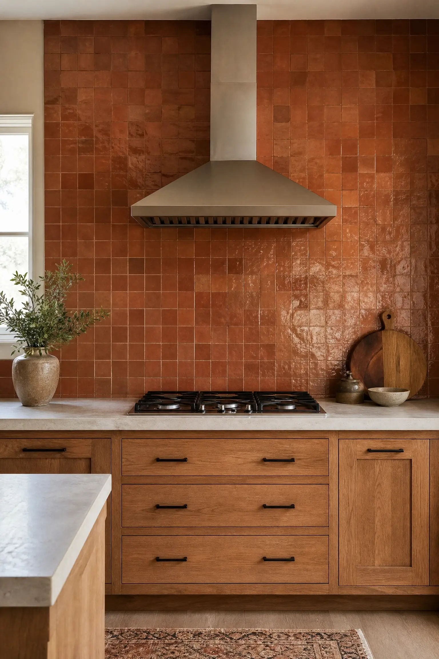
A plain backsplash above the range often reads as unfinished, like the kitchen ran out of budget right at the most-used wall. Running handmade zellige tile from the countertop all the way to the ceiling or hood surround fixes that by turning the cooking zone into the room’s actual focal point, instead of an afterthought behind the burners.
It works because your eye naturally lands on the stove wall anyway — you’re just giving it something worth landing on. Go with a warm terracotta or ivory glaze so the surface catches light unevenly, the way handmade tile is supposed to. It’s the one spot in the kitchen where a little imperfection actually looks intentional.
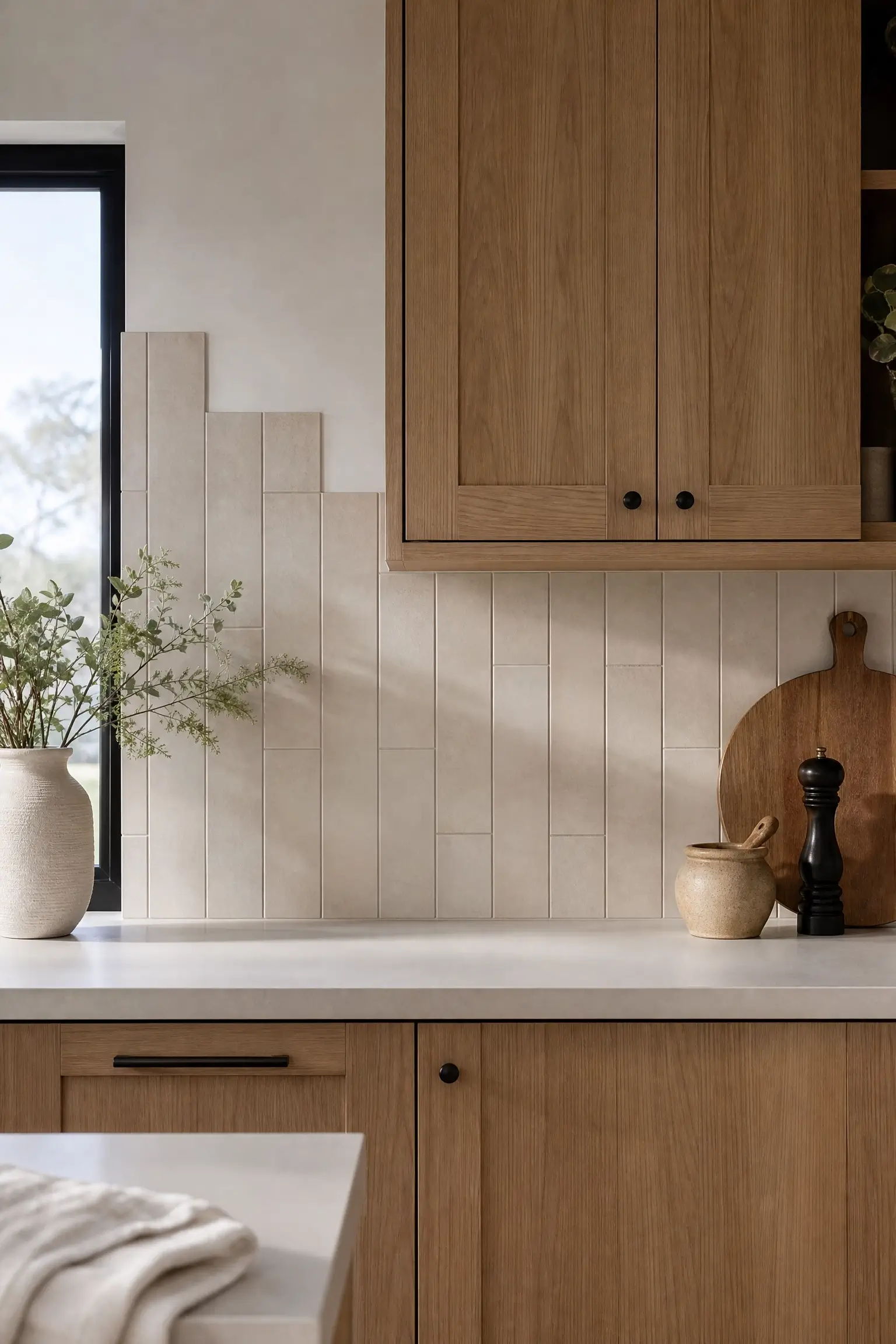
2. Frame Your Kitchen Window in Vertical Subway Tile So the Wall Feels Taller Than It Is
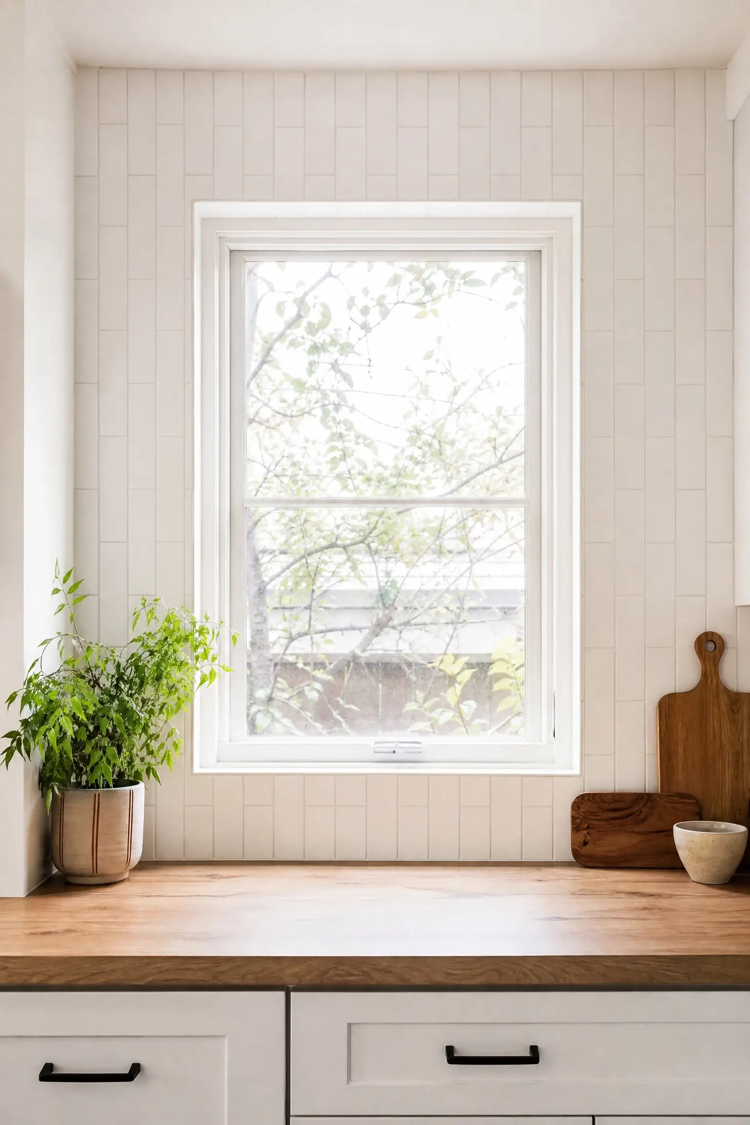
A window flanked by bare wall or a low backsplash can make a kitchen feel squat, especially with standard 8-foot ceilings. Setting vertical subway tile in a stacked (not brick-lay) pattern on either side of the window pulls the eye upward instead of side to side.
The trick is orientation, not tile choice — the same subway tile laid vertically instead of horizontally changes how tall the wall reads. Keep the grout lines thin and close to the tile color so the stripes stay subtle. It’s a small layout switch that does a lot of quiet work.
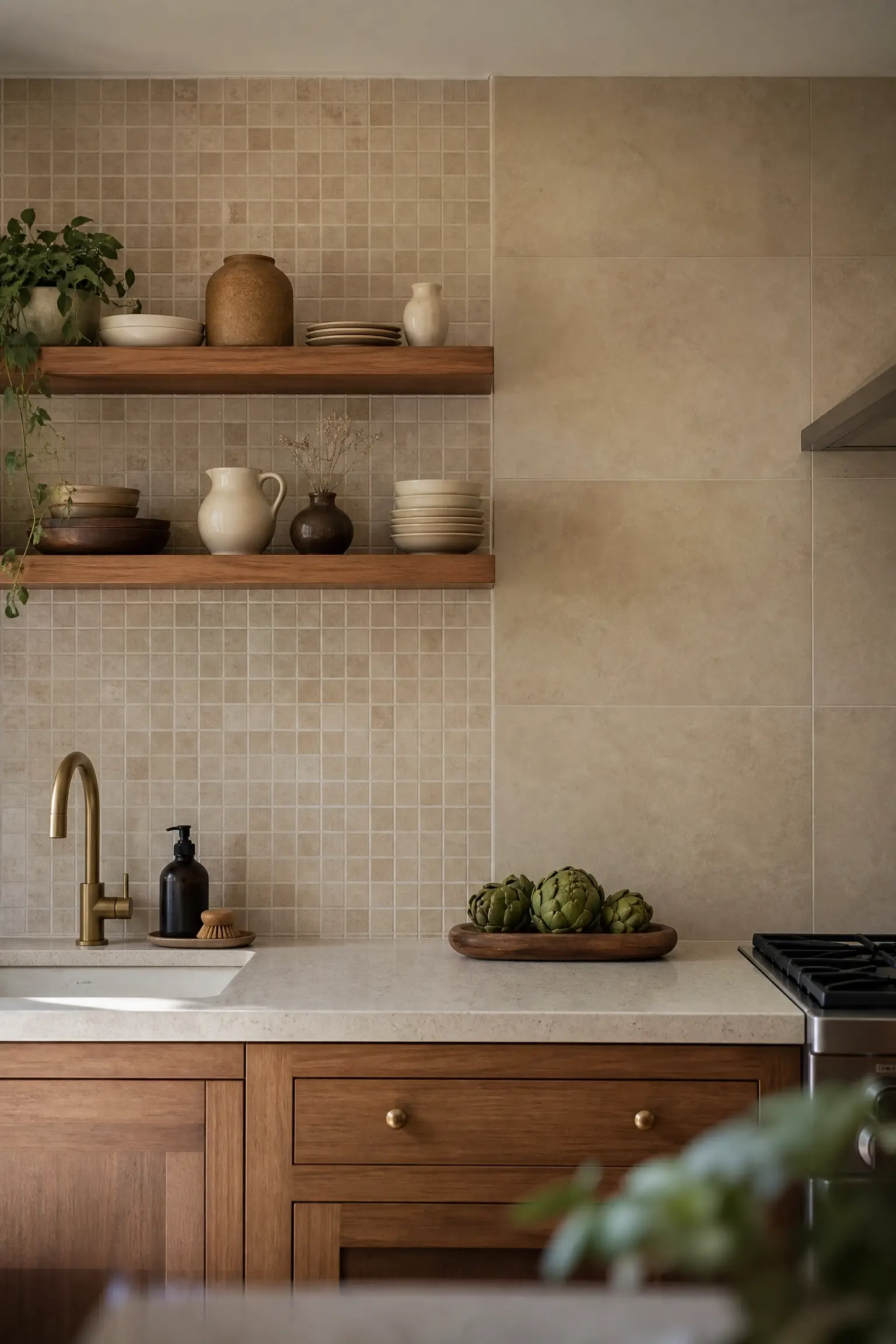
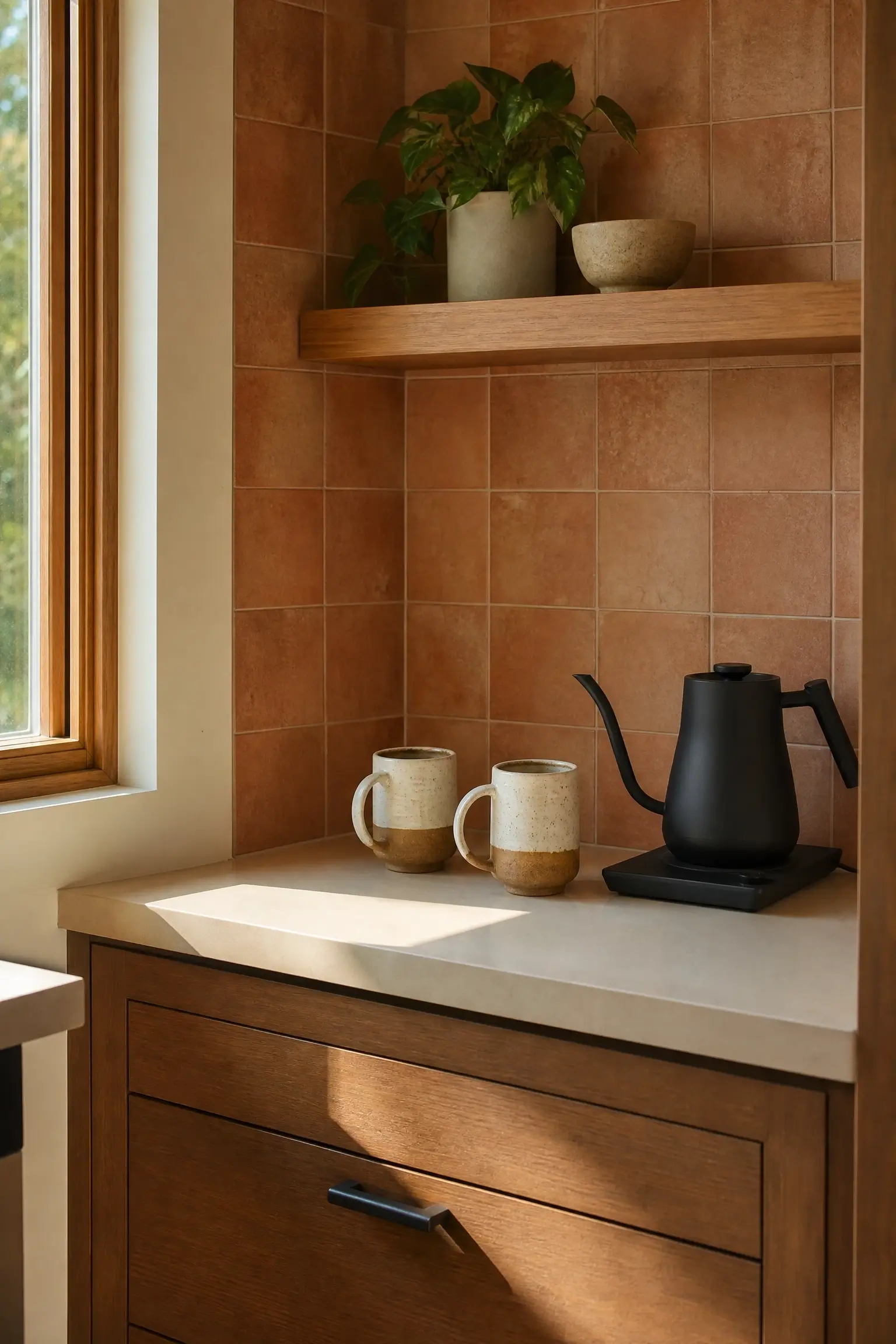
3. Drench the Wall Behind Open Shelving in One Warm Glaze So Everything on the Shelf Looks Curated
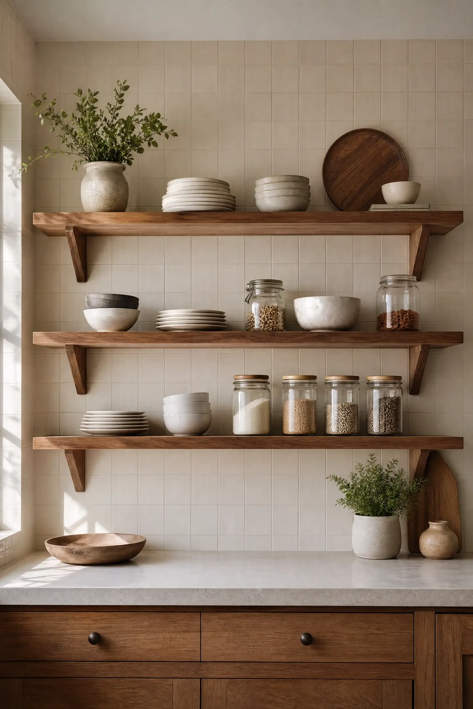
Open shelving against a plain painted wall can look sparse no matter how carefully you style the shelf. Tiling the full wall behind the shelving in one warm, textured glaze gives the objects on the shelf a backdrop with depth, so plates and jars read as styled rather than stranded.
This is tile “drenching” in its most practical form — one wall, one material, floor to top shelf. Pick a matte finish so the wall doesn’t compete with glassware. The shelf items suddenly look like they were chosen on purpose, even on a Tuesday.
4. Break Up Two-Tone Cabinets With a Vertical Tile Stripe Running Floor to Hood
Two-tone cabinets look great until the wall between the upper and lower cabinet colors feels like an afterthought — just a gap filled with the same old backsplash. Running one vertical strip of tile from the counter up to the hood, positioned right where the color break happens, gives that seam a reason to exist.
Visually, it acts like a design connector between the two cabinet tones instead of a random line. Choose a tile tone that pulls slightly from both cabinet colors. My read is this works best in kitchens that already have strong two-tone cabinetry — it would look busy layered onto a single-color kitchen.
5. Pair a Small Decorative Tile Panel With a Plain Slab Backsplash So the Eye Has One Place to Land
A backsplash covered edge-to-edge in patterned tile can overwhelm a small kitchen fast. Instead, use a plain slab or large-format tile for most of the wall and reserve a small decorative tile panel for just one zone — behind the stove, above the sink, or as a niche insert.
This mixed pairing gives you texture without tiling the whole wall, and it’s genuinely more budget-friendly since decorative tile is usually the pricier option per square foot. The plain slab calms the rest of the kitchen down so the patterned panel actually gets noticed instead of getting lost in a sea of pattern.
Small Kitchen and Visual Illusion Tile Ideas
Tile choices can genuinely change how big a small kitchen feels — these ideas lean into that.
6. Run Handmade Ceramic Tile Up a Narrow Galley Wall to Add Texture Without Shrinking the Room
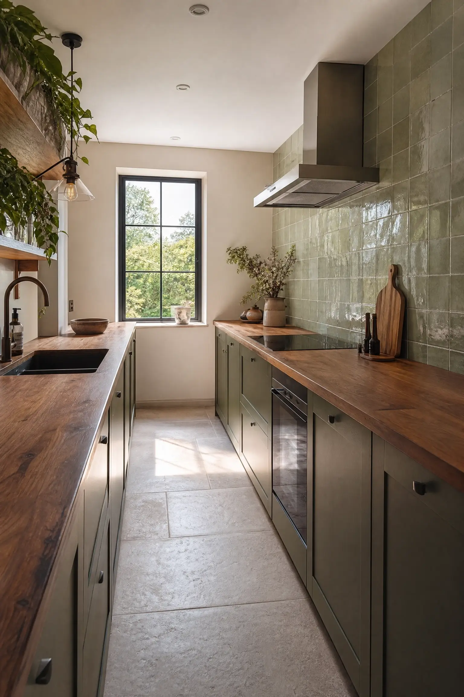
Galley kitchens get a bad reputation for feeling like a hallway with appliances. The instinct is to keep walls plain to avoid closing the space in further, but a flat, texture-free wall can actually make a narrow galley feel more sterile, not bigger.
Handmade ceramic tile with a slight surface variation adds depth without adding visual weight, because the light bounces differently across each tile instead of sitting flat. Keep the color light — warm white or pale sage — and let the texture do the interest-building instead of a bold pattern. Narrow doesn’t have to mean plain.
13. Run Tile Full-Height on One Short Wall in a Small Kitchen to Make the Ceiling Feel Higher
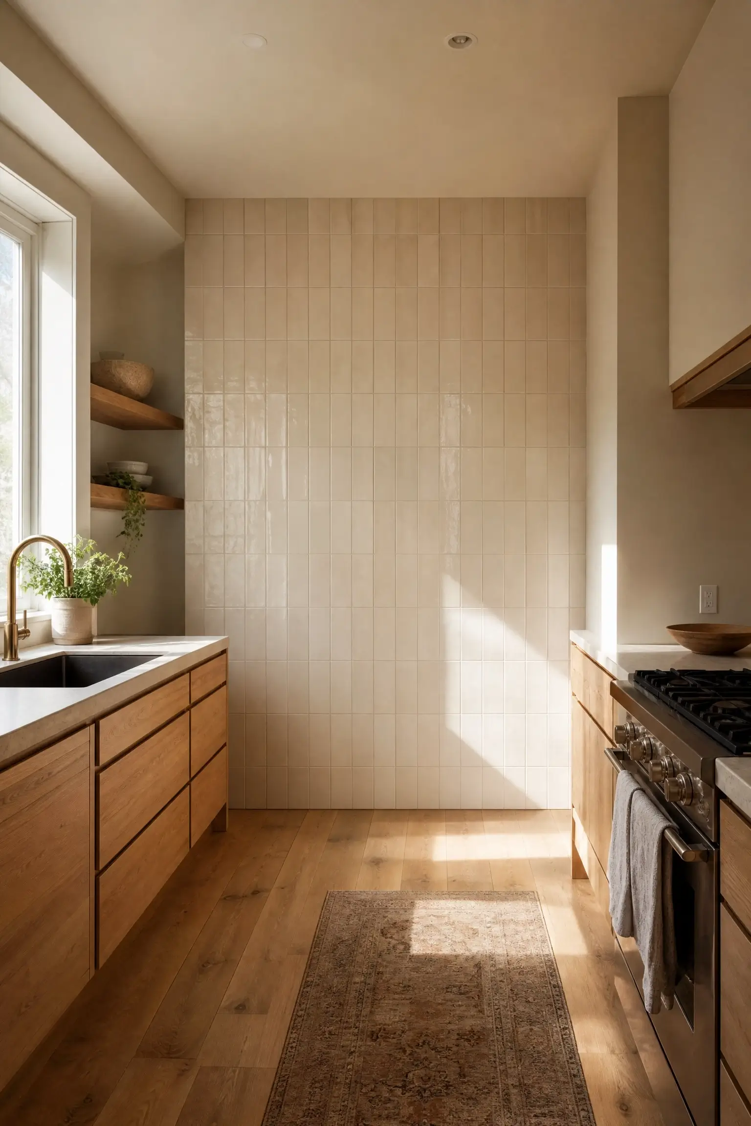
In a small kitchen, tiling every wall can start to feel like standing inside a tile box. A better move is picking just one short wall — often the stove wall or an end wall — and running tile floor to ceiling there only, leaving the rest of the kitchen in paint.
The unbroken vertical line on that single wall tricks the eye into reading the ceiling as taller, while the surrounding painted walls keep the room from feeling closed in. I’d only splurge here if that wall is genuinely the focal point of the room — otherwise you’re paying for height illusion nobody will look at.
19. Choose a Warm Ivory Ceramic Tile in a Small Kitchen So Walls Reflect Light Instead of Absorbing It
Small kitchens with limited windows can feel dim no matter how much you clean or declutter, and the culprit is often wall material, not lighting. Matte dark tile absorbs light; warm ivory ceramic tile with a slight sheen bounces it back into the room instead.
This isn’t about going stark white — that reads clinical. Warm ivory keeps the coziness while still reflecting more daylight than a deep tone would. Pair it with brass or aged-metal hardware so the warmth carries through the whole wall, not just the tile.
24. Use Two Different Tile Sizes on the Same Wall So a Small Kitchen Feels Layered Instead of Cramped
One tile size across an entire small kitchen wall can flatten the space visually — there’s nothing for the eye to measure scale against. Pairing a smaller decorative tile in one zone (like behind open shelving) with a larger-format tile on the rest of the wall gives the room a sense of layering instead of one flat plane.
This only works if the two tiles share a color family — mixing scale is fine, mixing unrelated palettes reads chaotic. Keep grout tone consistent across both to tie them together visually.
To plan a full-height tile accent wall, follow these steps:
- Measure the wall from countertop to ceiling or hood, not just the standard 18-inch backsplash zone.
- Choose one wall only — stove wall or a short end wall works best.
- Pick a grout tone close to the tile color so the height reads as one continuous surface.
Budget-Tier and Renter-Friendly Tile Ideas
Not every idea here needs a contractor or a full material budget.
8. Try Peel-and-Stick Zellige-Look Tile on a Rental Backsplash You Can Remove at Move-Out
Renters get told to just paint or hang art, but a plain rental backsplash is often the least personal-feeling wall in the whole apartment. Peel-and-stick tile made to mimic zellige’s handmade glaze variation gives that wall texture and character without touching the lease terms.
The finish quality has improved enough that it reads as real tile from a normal viewing distance, especially in a warm cream or sage tone. I’d skip this if your rental backsplash is already tiled — layering peel-and-stick over existing grout lines tends to look uneven up close.
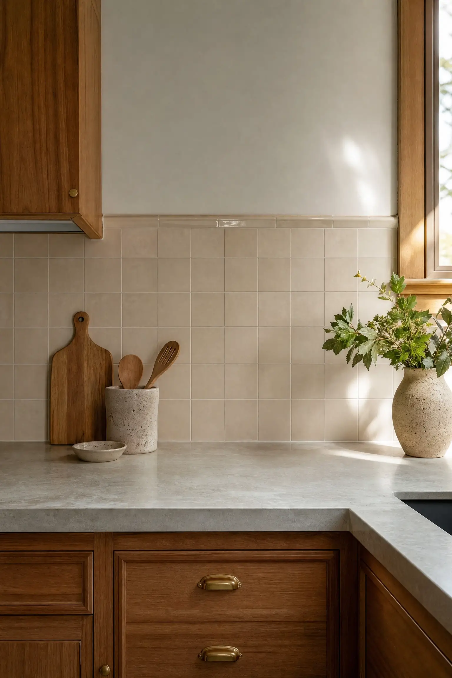
12. Tile Only the Wall Behind Open Floating Shelves So the Rest of the Kitchen Stays Budget-Friendly
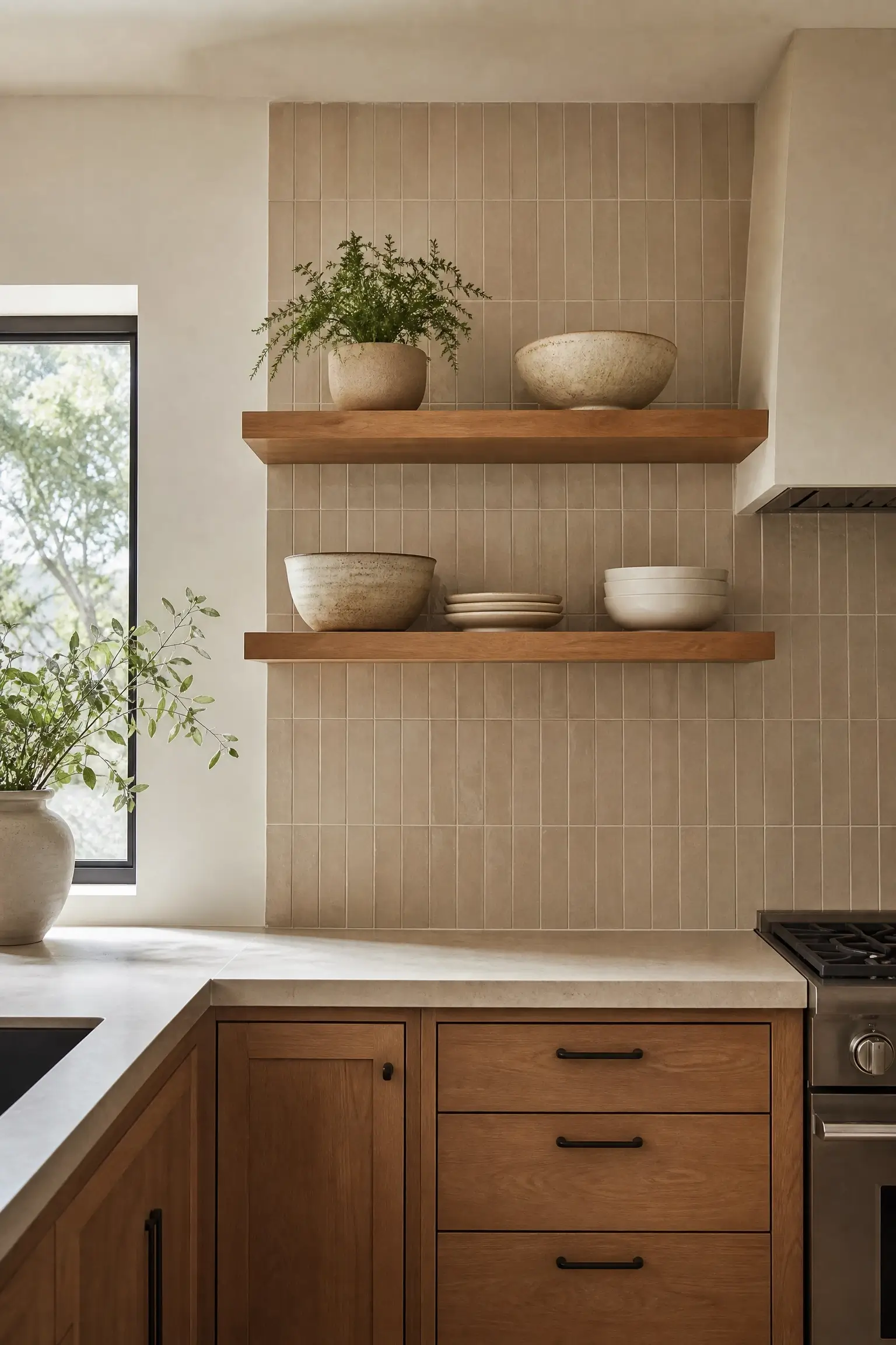
A full-kitchen tile job adds up fast, and not every wall needs the investment. Limiting tile to just the section behind open floating shelves keeps material cost contained to a few square feet while still giving the kitchen a designer detail worth photographing.
This works because that zone is already a visual anchor point — shelves draw the eye regardless — so tiling behind it gets outsized visual return for a small material spend. Paint the surrounding walls in a coordinating neutral so the tiled section doesn’t look like a leftover patch.
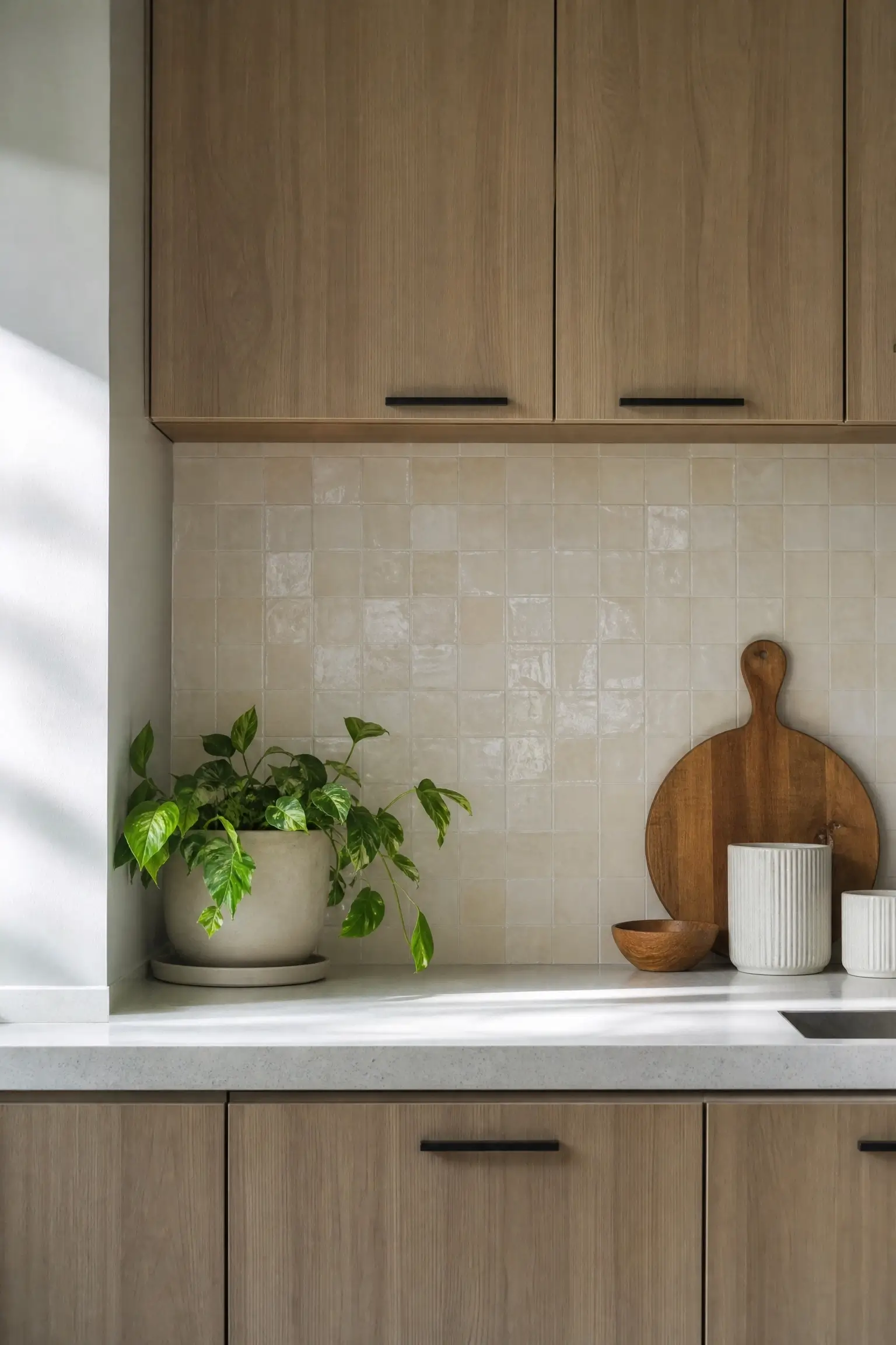
18. Extend Tile Two Inches Above Standard Backsplash Height to Break the “Builder Grade” Line
Standard 18-inch backsplash height is a builder default, not a design decision, and it often leaves a hard, flat line that makes a kitchen look unfinished even when everything else is updated. Extending the tile just two to four inches higher than standard breaks that predictable line for very little added material cost.
It’s a small change most guests won’t consciously clock, but it removes the “this was the cheapest option” read a standard-height backsplash can give off. Keep the extra height consistent across the whole run so it looks intentional, not like tile ran out unevenly.
22. Skip a Full Backsplash and Tile Only a Narrow Vertical Strip Behind the Stove for a Budget-Friendly Focal Point
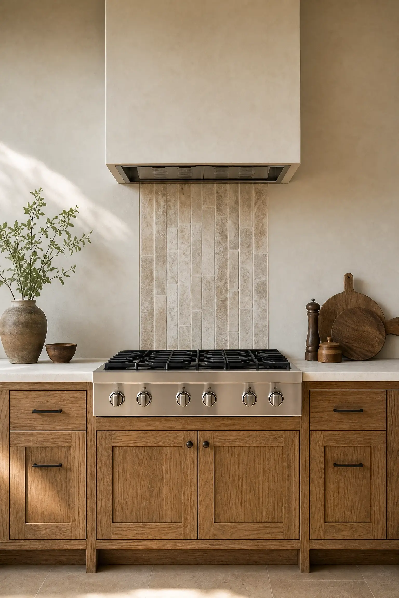
A full backsplash isn’t always in the budget, but a bare stove wall can feel unfinished. A narrow vertical strip of tile — roughly the width of the range — running from counter to hood gives that wall a focal point using a fraction of the material a full backsplash would need.
This works especially well with a higher-end tile you couldn’t otherwise afford across a whole wall, since you’re only buying enough for one strip. Paint the rest of the wall in a matching neutral so the strip reads as a design choice, not a shortage.
| Option | Best For | Key Benefit | Limitation |
|---|---|---|---|
| Ceramic tile | Most budgets and kitchens | Widely available, easiest to source in bulk | Can look generic without a distinct layout or color |
| Porcelain tile | High-splash zones like behind the stove or sink | Dense, easy to wipe clean, holds up to heat | Heavier and harder to cut for custom layouts |
| Zellige-style tile | Accent walls and focal zones | Handmade texture, catches light unevenly for depth | Pricier per square foot, less uniform sizing |
| Peel-and-stick zellige-look | Rentals and short-term spaces | Removable, no contractor needed | Less durable long-term, not ideal over existing grout |
Kitchen Wall Tile Ideas by Zone
Some walls have a specific job — sink, corner, coffee nook — and the tile treatment should match that job.
9. Stack Tile in a Brick-Lay Pattern Behind the Sink to Hide Everyday Water Splashes
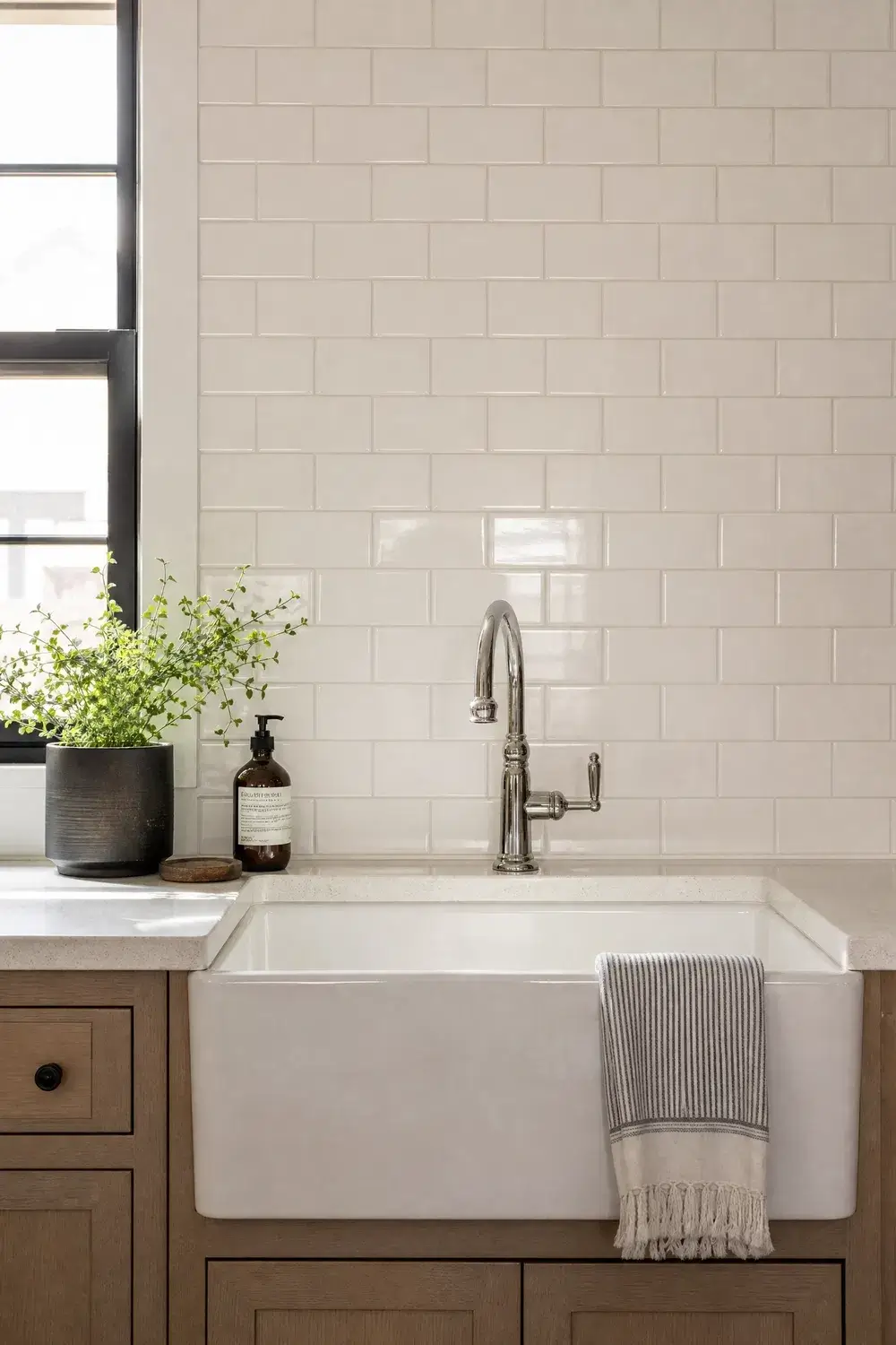
The sink wall takes more daily abuse than almost any other surface in the kitchen — water splashes, soap residue, the occasional dropped dish. A brick-lay tile pattern behind the sink hides minor splash marks better than a stacked or herringbone layout because the offset joints break up sightlines.
This is a practical-first idea more than a purely visual one, though the classic brick-lay pattern still photographs well. Go slightly glossy here specifically because gloss wipes cleaner than matte in a high-splash zone.
10. Wrap Tile Around a Kitchen Corner So There’s No Awkward Seam Where Two Walls Meet
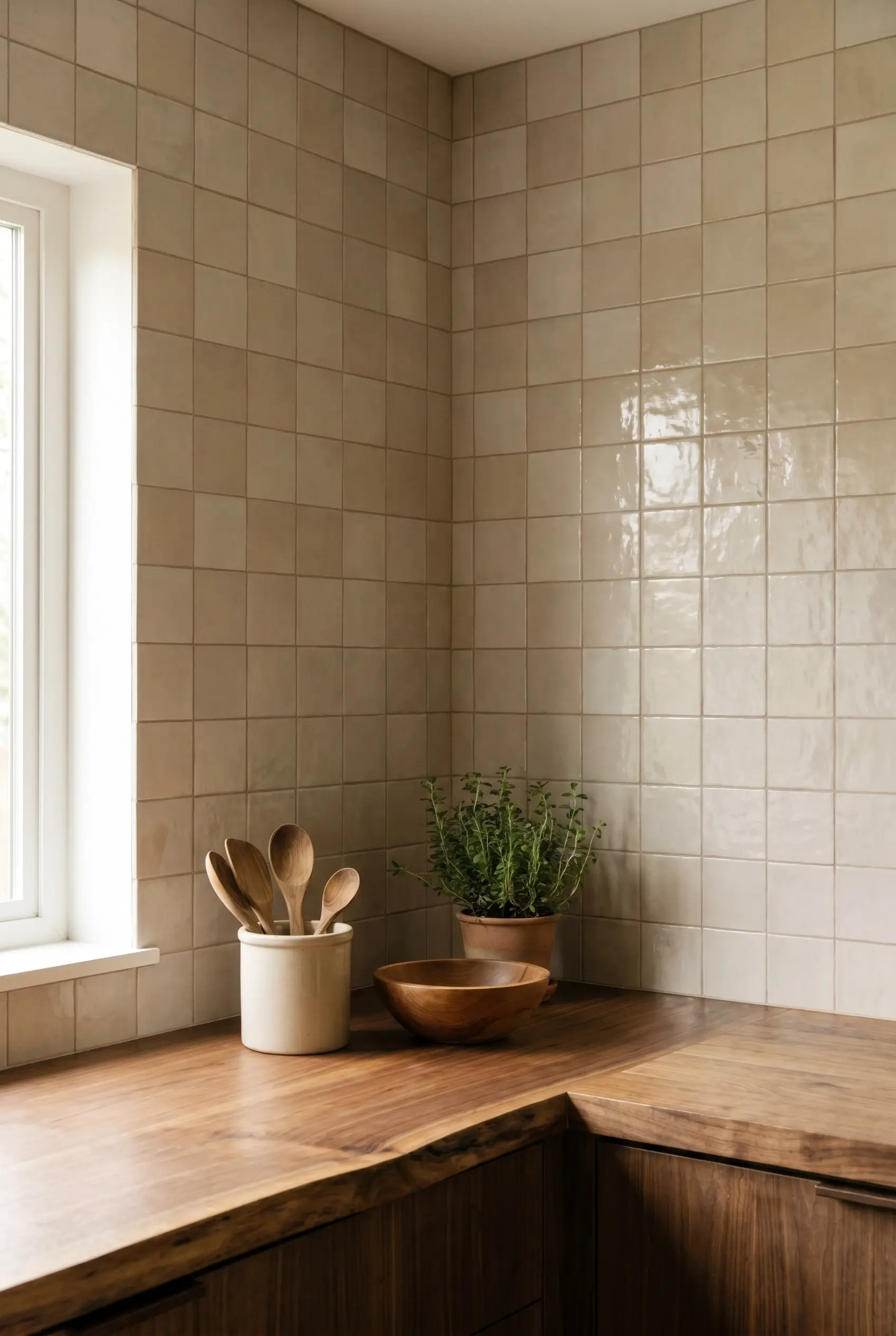
Corners are where a lot of backsplash tile jobs look unfinished — the tile stops abruptly at the seam, leaving a visible line where two walls meet. Wrapping the same tile continuously around the corner, instead of stopping and restarting, removes that seam entirely.
It’s a small installation detail rather than a design choice, but it’s the difference between a wall that looks professionally finished and one that looks like two separate projects. Ask specifically for a mitered or continuous corner treatment when you’re sourcing quotes.
16. Tile the Wall Behind an Open Corner Nook Where the Coffee Station Lives
Coffee stations tend to accumulate mugs, a kettle, maybe a small shelf, all set against whatever wall happened to be free. Tiling just that corner nook gives the coffee station a defined “zone” instead of looking like overflow counter space.
This works especially well in kitchens without room for a full pantry wall, since it carves out a small, intentional feature using a corner that would otherwise go undecorated. A warm terracotta or sage tone here plays nicely against a stainless kettle or wood tray.
21. Use a Single Row of Contrast Tile as a Border Between Backsplash Tile and Painted Wall Above
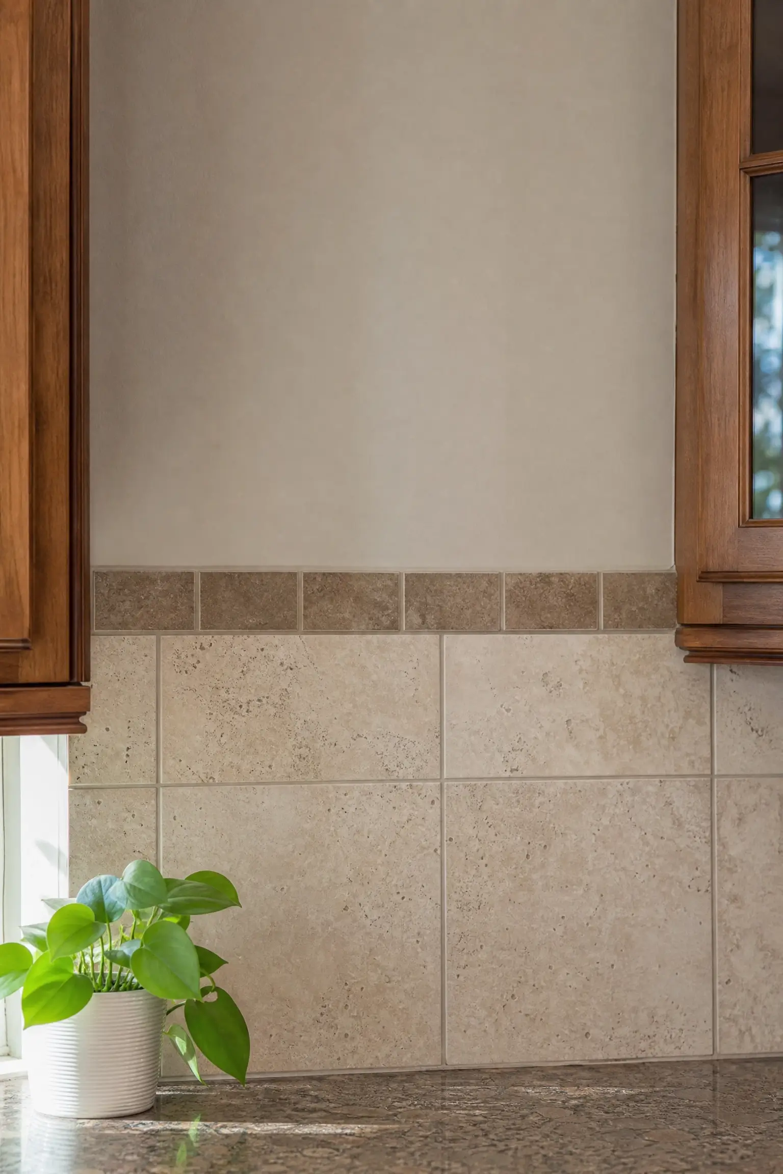
A backsplash that just ends at a straight cut line can look abrupt, especially where tile meets paint. Adding one single row of contrast-color tile along that transition line softens the handoff and gives the wall a finished, framed edge instead of a hard stop.
This is a subtle detail rather than a bold statement — the contrast row should read as a border, not a second pattern. A slightly darker or warmer tone than the main tile works better than a sharp color jump.
Ceramic tile vs zellige tile: Ceramic is better for full-kitchen coverage on a set budget because it’s consistently priced and widely stocked at retailers like Floor & Decor. Zellige works better when you want one accent wall to carry visible handmade texture and light variation. The key difference is uniformity — ceramic gives you predictable, even tile; zellige gives you character at a higher per-tile cost.
Layout, Pattern, and Finish Detail Ideas
The install pattern and finish choice change how a wall reads as much as the tile itself does.
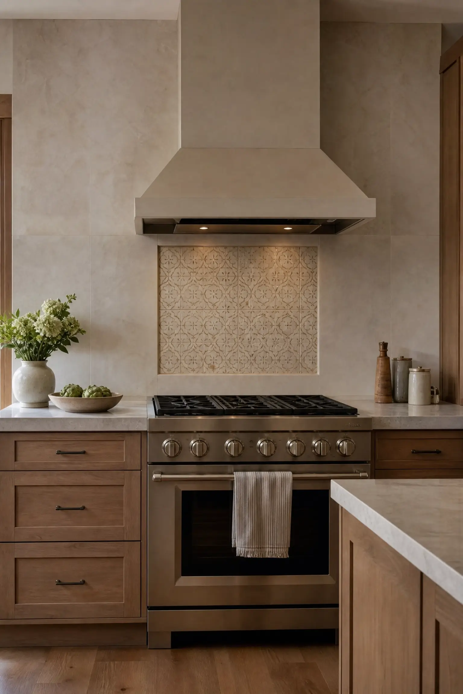
7. Use a Terracotta Zellige Accent Behind the Range Hood as the One Splurge Move in an Otherwise Simple Kitchen
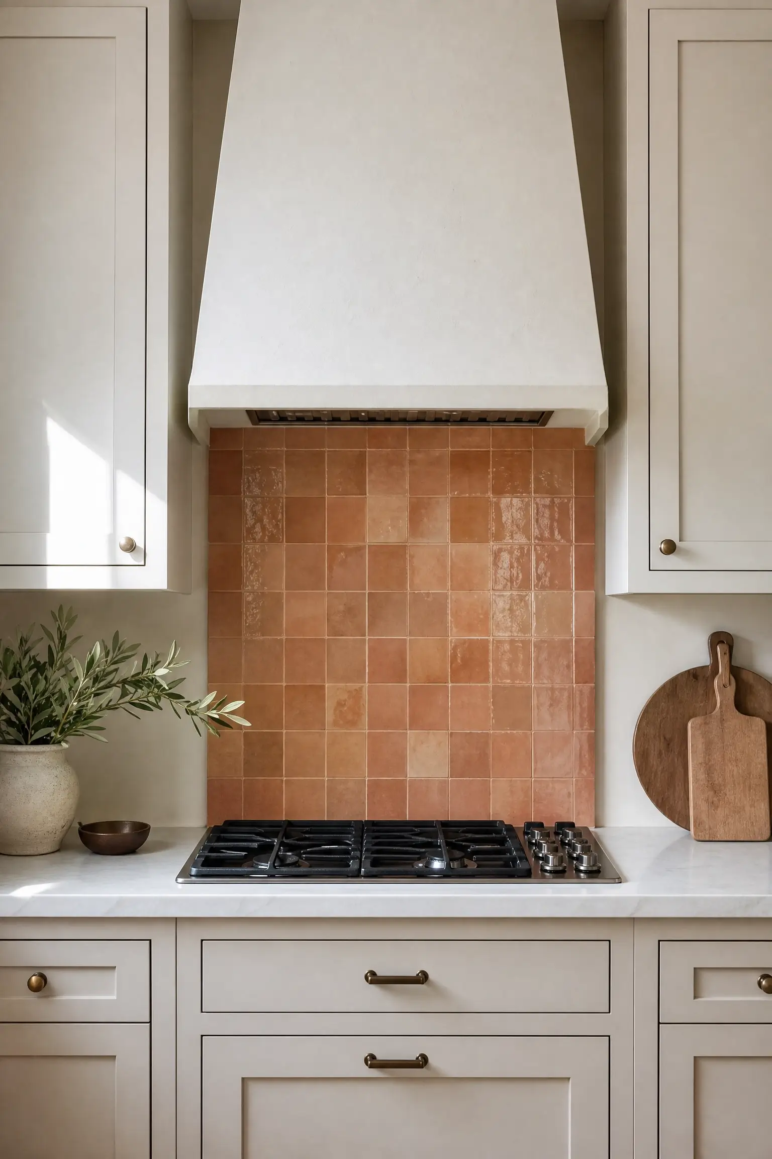
Not every wall needs a splurge tile, but one well-placed accent can carry a whole kitchen’s design story. A terracotta zellige panel sized to the range hood width — not the full wall — lets you use a higher-cost handmade tile without pricing out the rest of the room.
I’d only splurge here if the rest of your cabinetry and counters are kept simple; a busy kitchen with multiple statement materials starts competing with itself. Brands like Fireclay Tile make handmade zellige-style options specifically sized for accent applications like this.
11. Choose a Matte Ceramic Tile for the Lower Wall and a Glossy Cap Tile Along the Top Edge for Quiet Depth
A single flat finish across a whole backsplash can look one-dimensional under kitchen lighting. Using matte tile for the main wall and a slim glossy cap tile along the top edge — where the backsplash meets the upper cabinets or open air — adds a quiet strip of contrast without introducing a second color.
The gloss catches light differently than the matte body, so the wall reads with more depth even though it’s technically one tile family. It’s a finish trick more than a color trick, and it’s easy to miss until you notice how much flatter the all-matte version looks by comparison.
14. Use a Herringbone Layout on a Narrow Accent Strip Beside the Stove for Movement Without Overwhelming a Small Kitchen
Herringbone tile across a full wall can feel busy in a small kitchen, but confined to one narrow vertical strip — beside the stove, in a niche, or framing a window edge — it adds movement without taking over the room. The angled joints create visual energy that a straight-lay pattern doesn’t.
This works because the pattern stays contained to a defined shape, so the eye reads it as a deliberate detail rather than the whole wall’s personality. Keep the surrounding tile or paint simple so the herringbone strip has room to stand out.
15. Match Warm White Tile Grout to the Tile Itself So a Handmade Wall Reads Calm, Not Busy
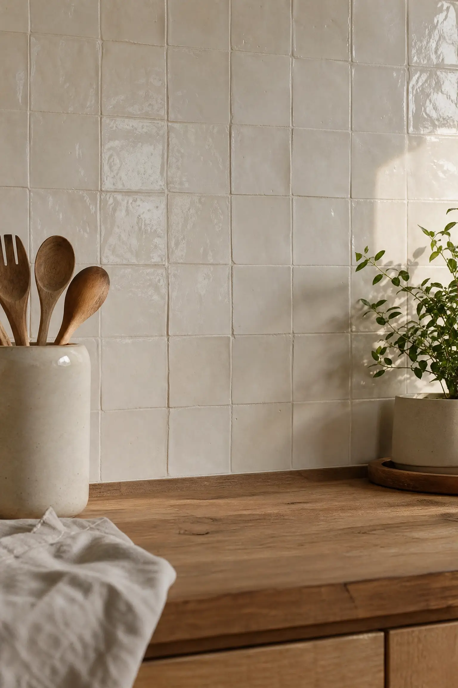
Handmade tile already has natural texture and glaze variation built in — adding a contrasting dark grout on top of that can turn a calm wall into a busy one, with every tile edge outlined and competing for attention. Matching grout color closely to the tile tone lets the texture speak without the grid lines shouting over it.
This is a common miss in DIY tile jobs, where contrast grout gets chosen for “definition” and ends up flattening the handmade character instead of highlighting it. Ask your installer specifically for a grout sample next to your tile sample before committing.
17. Use Sage Green Zellige on a Single Accent Wall So the Rest of the Kitchen Can Stay Neutral
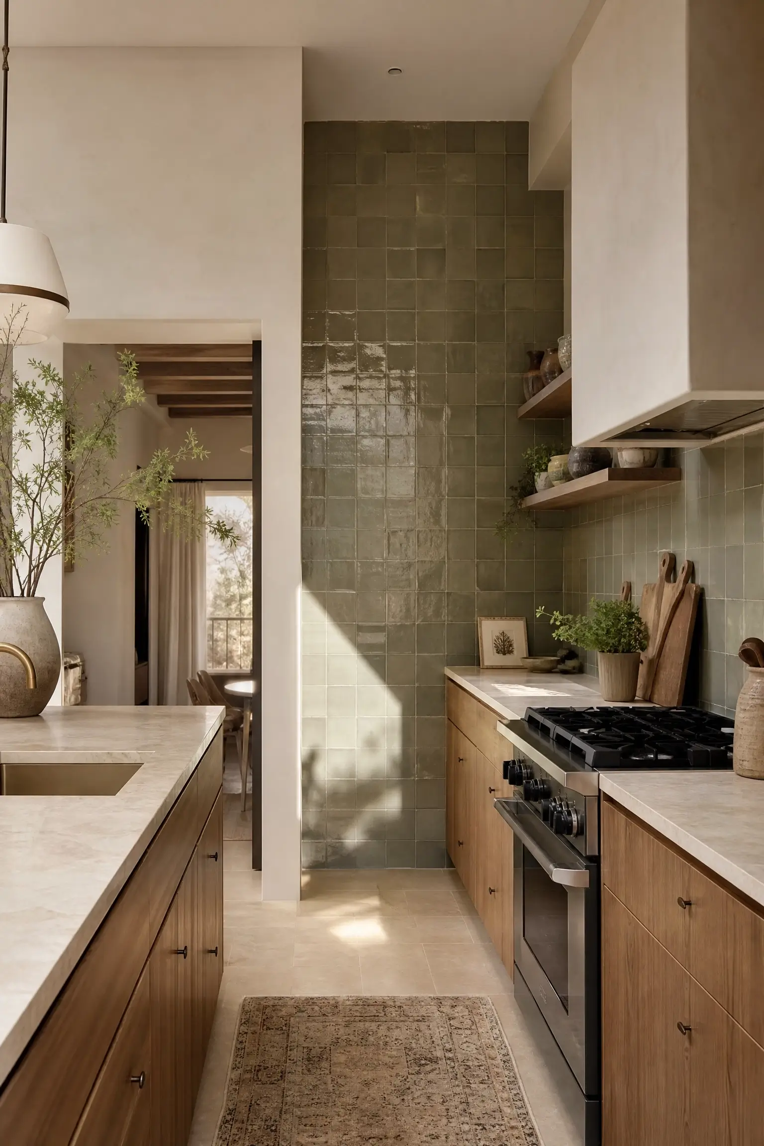
Committing to a bold tile color across a whole kitchen is a big ask, especially if you’re not sure the color will still feel right in a few years. Reserving sage green zellige for one accent wall — stove wall or a short end wall — lets you get the color payoff without betting the whole room on it.
The rest of the kitchen stays in warm neutrals, which means the sage wall reads as a considered design choice rather than a color the whole space is stuck with. Daltile and similar retailers carry zellige-inspired tile in muted greens if handmade sourcing isn’t accessible in your area.
20. Let Handmade Tile’s Uneven Glaze Catch Late-Afternoon Window Light for a Wall That Glows, Not Just Sits There
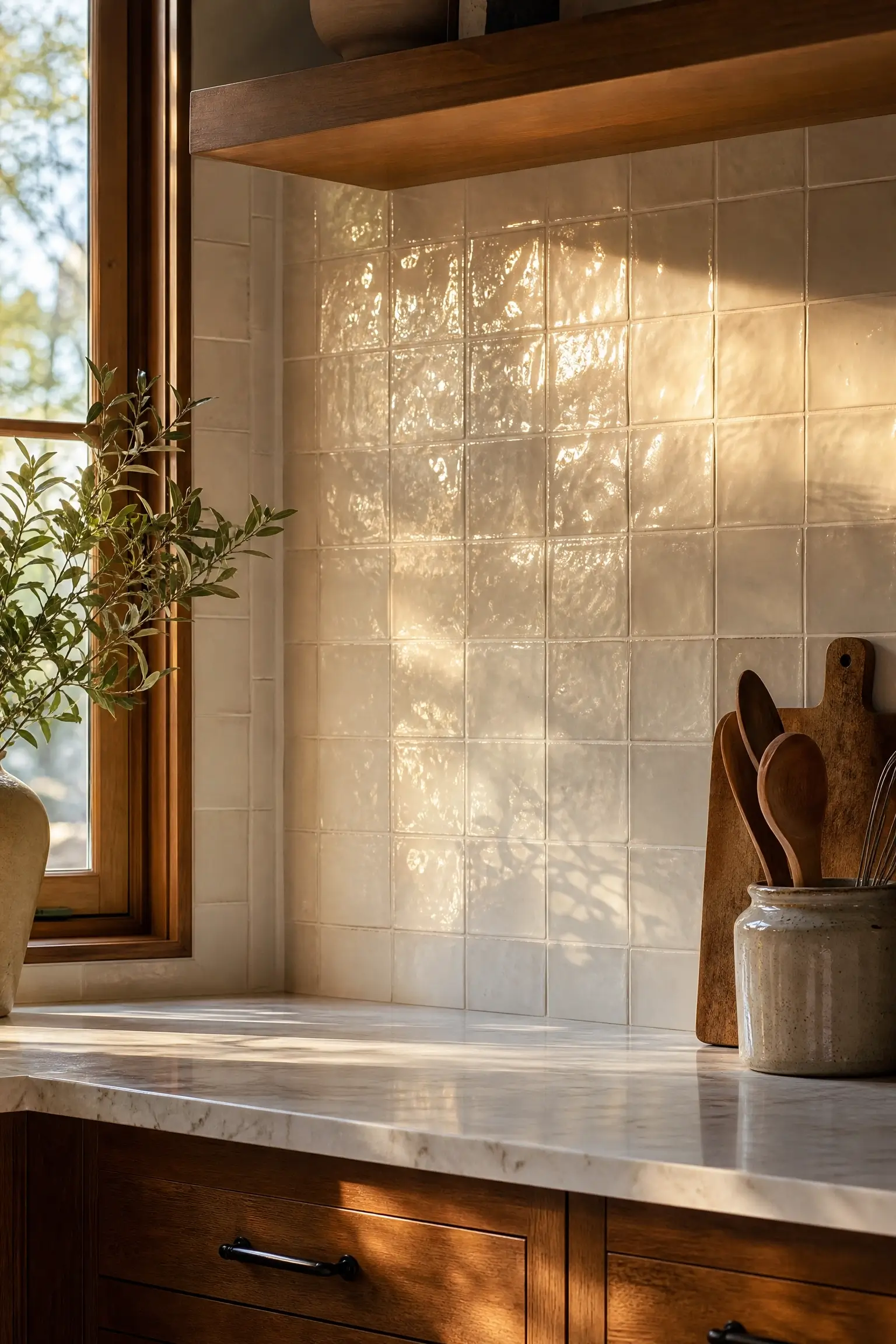
Most backsplash walls are chosen for how they look in daytime photos, but a handmade tile’s real payoff often shows up in late-afternoon light, when the uneven glaze catches low sun at an angle and creates small pools of shine across the wall instead of a flat, even surface.
Position the tiled wall near a west-facing window if you have any layout choice in the matter — it’s a small planning detail that pays off daily. This is the kind of thing a photo can hint at but you really only notice living with it.
23. Pick Porcelain Tile Behind the Stove for a Full-Height Wall That Wipes Clean in Seconds
A full-height tiled stove wall looks incredible until grease and splatter start showing on a porous or heavily textured surface that’s hard to wipe down. Porcelain tile solves that specific problem — it’s dense enough to resist staining and wipes clean fast, which matters more on a full-height wall than a small strip.
This is the practical counterpart to the more textured zellige ideas earlier in this list. I’d choose porcelain over zellige here specifically if you cook often and want the visual impact of full-height tile without the extra maintenance handmade glaze can require.
Common Questions About Kitchen Wall Tile Ideas
What is the best tile for a kitchen accent wall?
Zellige or other handmade ceramic tile works well for accent walls because of its glaze variation. For high-splash zones like behind the stove, porcelain holds up better long-term.
Is full-height kitchen tile more expensive than a standard backsplash?
It depends on the tile and the wall size. A narrow full-height strip can cost less than a wide standard backsplash using pricier tile.
Can renters do a tile accent wall?
Yes, with peel-and-stick zellige-look tile designed to be removed at move-out without damaging the wall underneath.
What’s a good small-kitchen tile idea that won’t make the room feel smaller?
Tile one short wall floor-to-ceiling instead of every wall, and choose a warm, light tone that reflects daylight.
Do I need matching grout for handmade tile?
Not required, but grout matched closely to the tile tone usually reads calmer and lets the tile’s natural texture stand out more.
The Fair Trade-Off Worth Knowing
Some designers argue full-height tile always looks more “finished” than a standard backsplash, and in showroom photos, that’s often true. In a real kitchen, a full wall of tile also means a full wall of grout lines to keep clean and a bigger material cost if plans change later. My honest scope limitation here: these ideas cover styling direction and real-home application, not a full cost breakdown or installation timeline, which varies by region and installer.
Wrapping Up
Twenty-four ideas is a lot to hold in your head while you’re scrolling on your phone at night, so the real move is picking two or three that match your actual kitchen — its size, its light, your budget tier — instead of trying to combine all of them into one wall. A full-height accent behind the stove, one budget-friendly strip, and a small styling detail like matched grout will do more for your kitchen than chasing every trend on this list at once. Start with the wall you look at most, and build outward from there.


No Comment! Be the first one.