


37 Sage Green Kitchen Wall Ideas That Prove the Color Can Be Stunning, Not Safe
The swatch went up. You stood back. And then — nothing. A sage green that looked soft and botanical on the sample card read gray-brown on your actual wall. That single disappointment sends more...

The swatch went up. You stood back. And then — nothing. A sage green that looked soft and botanical on the sample card read gray-brown on your actual wall. That single disappointment sends more people back to beige than any other color failure in a kitchen.
Here’s the thing: sage green doesn’t fail because it’s a weak color. It fails because most guides treat it as a flat paint decision — pick a shade, roll it on — without addressing the three variables that determine how sage actually reads in a real kitchen: light direction, bulb temperature, and the undertones of whatever sits next to it on the walls.
This list covers 37 sage green kitchen wall ideas. Exact paint codes, wall treatments beyond flat paint, cabinet pairings that stop the washed-out look, and the lighting fixes most articles skip entirely.
This guide covers wall paint, wall treatments, and pairing strategies. It does NOT address sage green cabinet painting, which has different prep, product, and durability requirements.
Sage Green Kitchen Wall Ideas — Quick Definition
Sage green kitchen wall ideas cover paint colors by LRV range, textured wall treatments like limewash or beadboard, and the cabinet pairings that determine whether sage reads rich or flat. According to the NKBA 2025 Kitchen Trends Report, muted earthy greens like sage were designers’ top kitchen color for the second consecutive year in 2025.
Why Sage Green Kitchen Walls Keep Failing — And What’s Actually Going Wrong
According to the NKBA 2025 Kitchen Trends Report — which surveyed 523 professional designers in December 2024 — green was the most popular kitchen color for the second consecutive year. Seventy-six percent named it their top shade for 2025, with muted earthy tones like sage specifically cited as driving that preference over bolder or cooler-toned greens. The demand is real.
The execution is where things break down.
The most common culprit isn’t the paint color. It’s the bulb. Most kitchens run on 4000K–5000K cool white LEDs, which push every wall color toward gray and blue. Sage green — which already carries gray undertones — shifts hard in that direction under cool light. The result reads muddier and less green than the sample card. Your sage didn’t fail. Or maybe I should say it this way: the bulb failed the sage. That’s a fixable problem, and it costs about $30.
The second culprit is LRV — Light Reflectance Value, a number between 0 and 100 measuring how much light a color reflects. Typical sages range from LRV 25 (deep, like Farrow & Ball Calke Green) to LRV 47 (very light, like Benjamin Moore October Mist). A sage at LRV 30 in a north-facing kitchen with flat overhead fixtures looks nearly black-green by evening. The same color in a south-facing kitchen with 2700K warm bulbs reads exactly as intended.
I’ve seen conflicting takes on this from designers: some insist any sage below LRV 40 feels claustrophobic in kitchens under 200 square feet, while others argue a lower LRV creates intentional warmth rather than the enclosed feeling you’d expect. My read: ceiling height matters more than floor area. A compact kitchen with 9-foot ceilings handles deep sage far better than a larger kitchen with 7-foot ceilings.
Some designers argue that sage is fundamentally a cabinet color, and that painting walls sage risks a flat, monochromatic look. That’s valid when cabinets are also sage-toned. But if you’re dealing with white, cream, or wood-tone cabinets — and most kitchens are — sage walls create exactly the depth those neutral surfaces need.
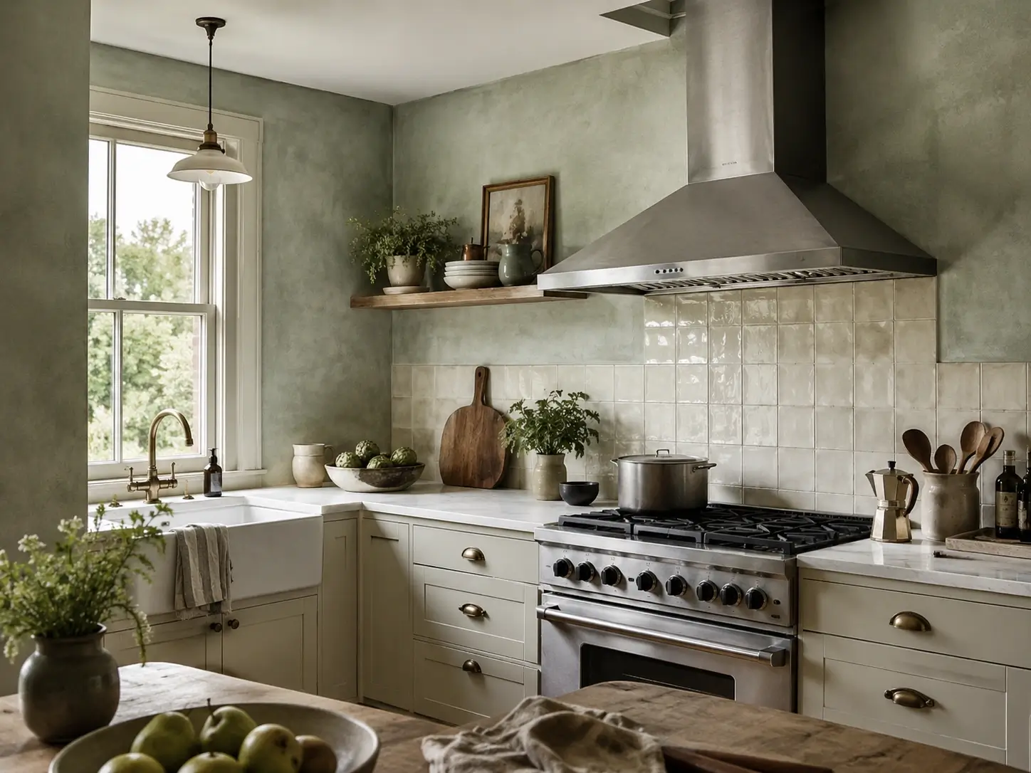
The best sage green kitchen wall color depends on your kitchen’s light direction and bulb temperature. According to the NKBA 2025 Kitchen Trends Report, muted earthy greens like sage were the most-requested kitchen color for 2025. Warmer sages with LRV 38–47 — like Benjamin Moore Saybrook Sage HC-114 or Sherwin-Williams Clary Sage SW 6178 — handle the widest range of kitchen lighting conditions reliably.
Sage Green Kitchen Wall Paint Colors — The Right Code for Your Kitchen’s Light
To choose the right sage green paint color for kitchen walls:
- Identify your light direction — north-facing kitchens need warmer, higher-LRV sages.
- Choose LRV 38–47 for moderate natural light; below 35 only in bright south-facing kitchens.
- Apply swatches on two adjacent walls and check at 7am, noon, and 8pm.
- Compare each swatch against your cabinet color, countertop material, and floor finish before committing.
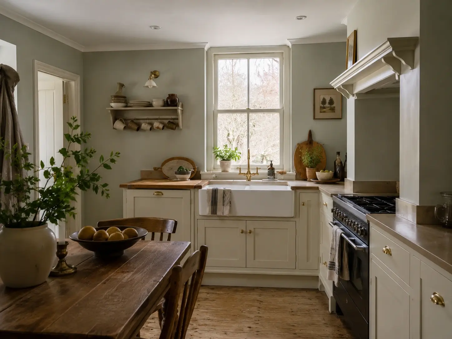
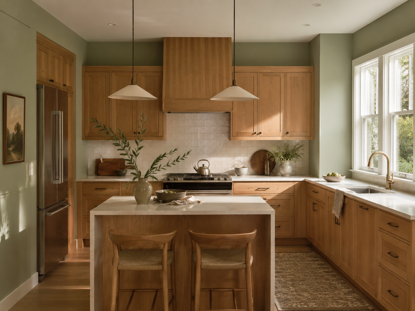
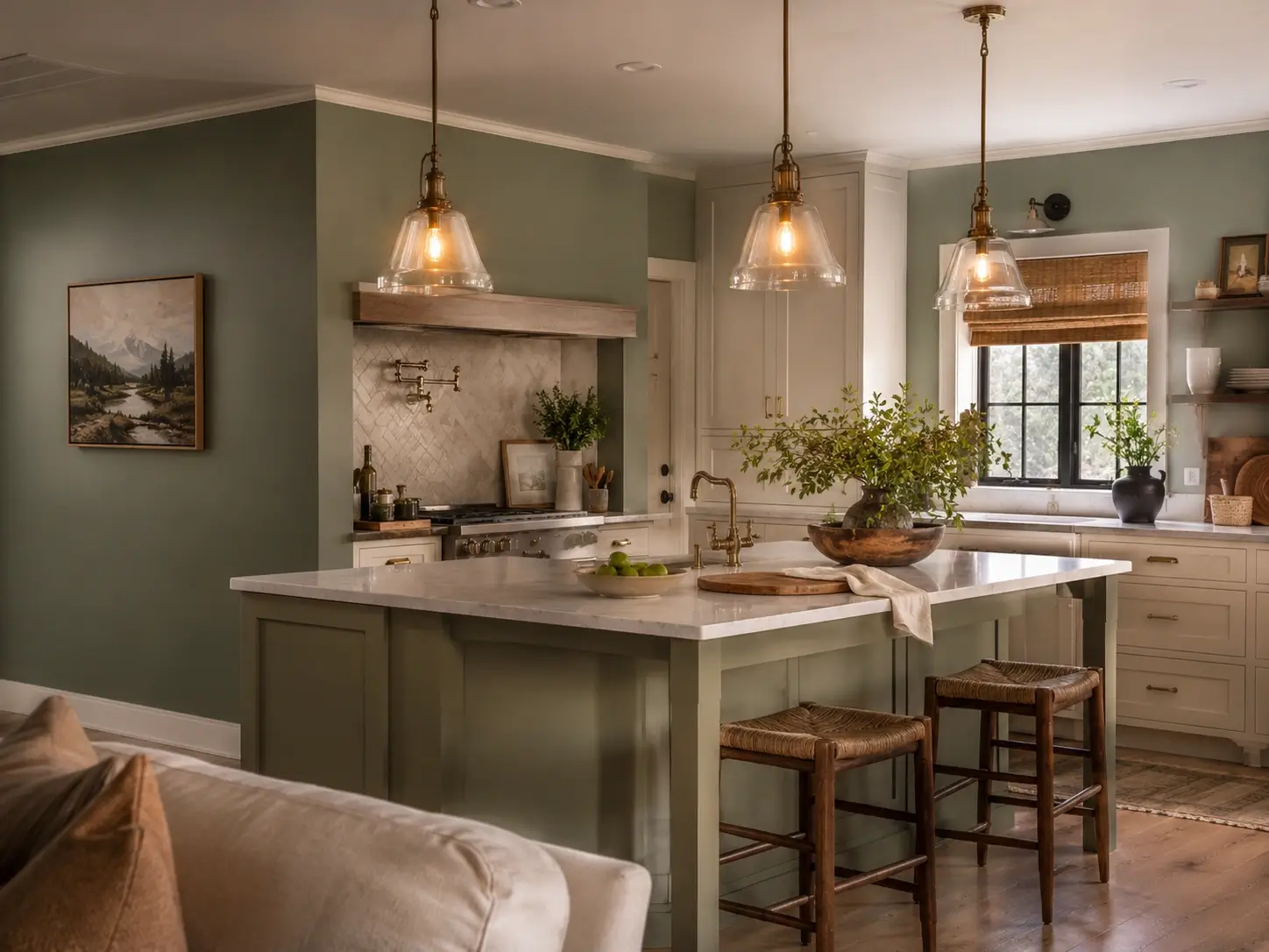
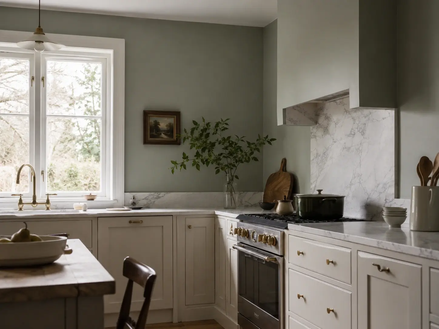
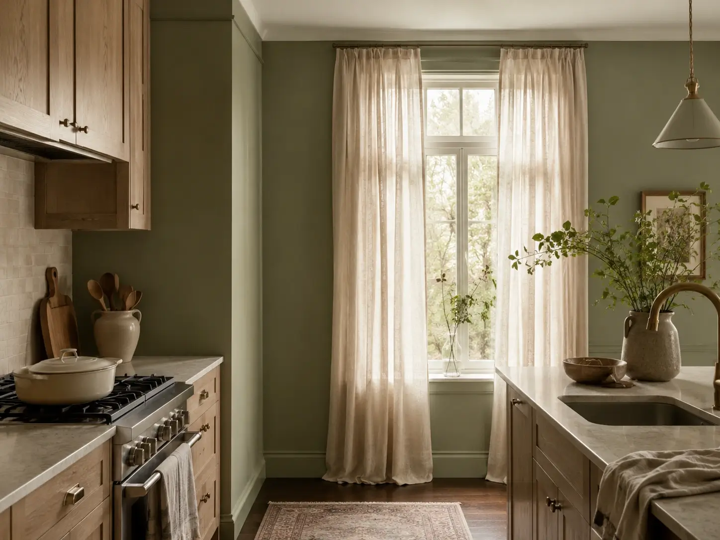
1. Benjamin Moore Saybrook Sage HC-114 — The Balanced Option That Works Across Most Kitchens
LRV 38–45. Interior designers return to Saybrook Sage most often because it sits precisely between earthy and airy — green enough to read as intentional, gray enough to feel sophisticated. In daylight it reads as a clear botanical green. Under 2700K warm bulbs it shifts slightly toward taupe-sage without going muddy. With warm white cabinets and brass hardware, it looks considered, not cautious. Most readers who’ve had a sage swatch fail were using the wrong bulb temperature, not the wrong color.
2. Benjamin Moore October Mist 1495 — The Lightest Sage That Refuses to Turn Gray
LRV 47. Named Benjamin Moore’s 2022 Color of the Year, October Mist reads as barely-there sage in strong light and reveals a soft botanical quality in shadow. It’s the recovery option for anyone whose previous sage swatch went muddy; the lighter LRV is far more forgiving of imperfect lighting. Most first-time sage walls benefit from starting here over Saybrook Sage — lighter is always easier to build from than darker to walk back. Best in kitchens with white cabinets and at least one south-facing window.
3. Sherwin-Williams Evergreen Fog SW 9130 — The Rich, Saturated Option for Feature Walls
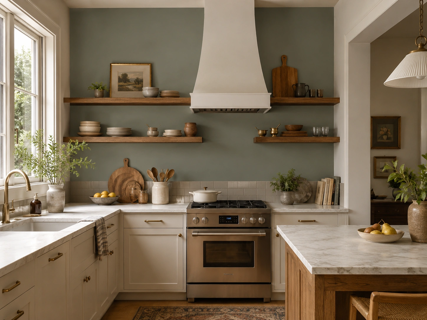
LRV 30. This one doesn’t apologize. Deep enough to anchor a kitchen visually, green enough to read distinctly as sage rather than teal or gray-green. Use it on one feature wall — behind the range, behind open shelving — unless you have ceilings above 9 feet and reliable natural light. Under warm 2700K bulbs in a south-facing kitchen this reads like a serious design decision. Under 5000K cool LEDs in a north-facing room, it darkens dramatically.
4. Sherwin-Williams Clary Sage SW 6178 — The Warm, Yellow-Green Sage for Wood-Toned Kitchens
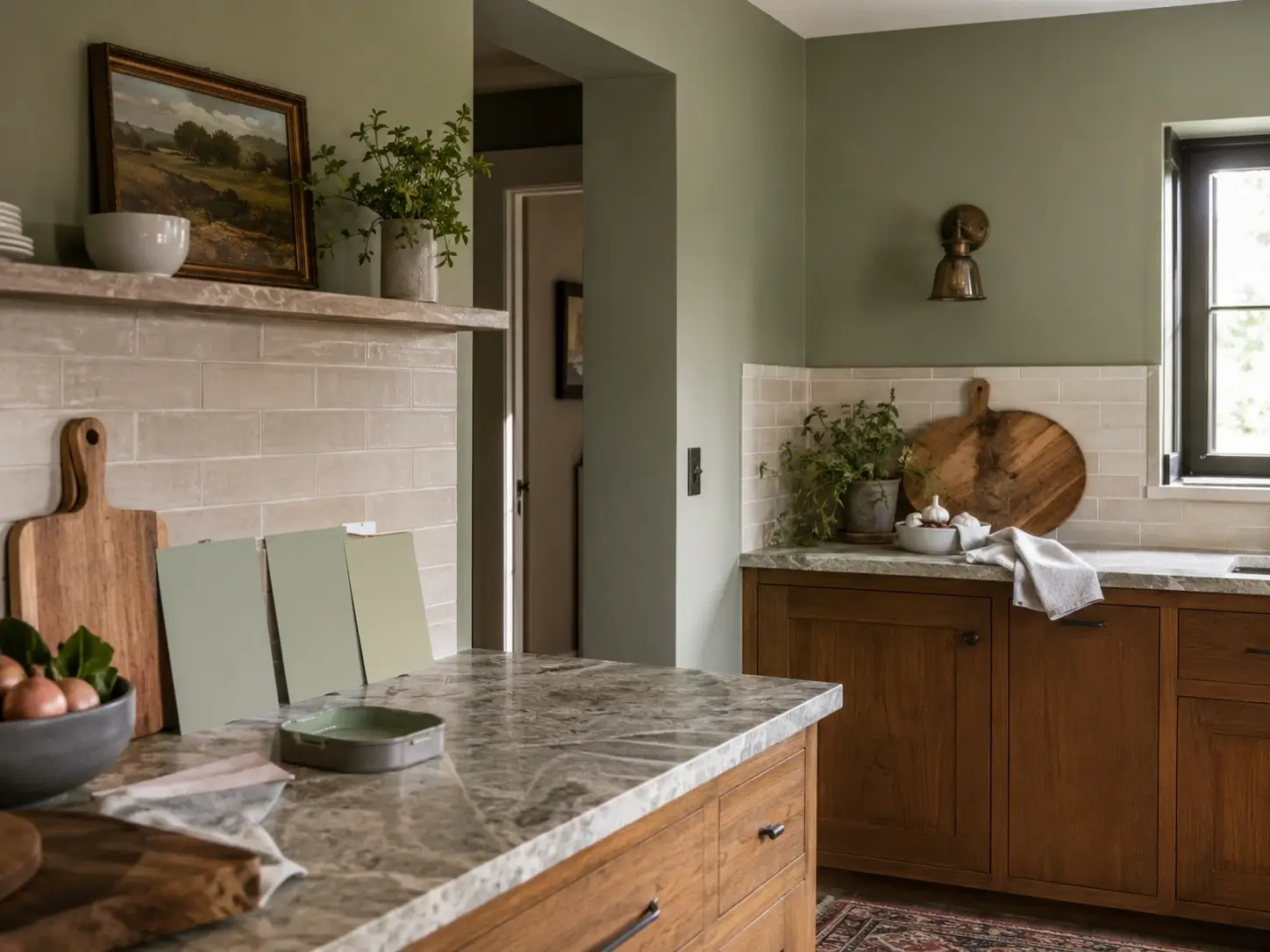
LRV 41. If your kitchen has warm oak floors, honey-toned cabinets, or butcher block countertops, Clary Sage cooperates better than most options on this list. Its slight yellow-green pull fights the blue shift of cool LED bulbs more effectively than gray-leaning sages do. It also prevents the undertone clash that occurs when a cool sage meets warm wood finishes. An underused option in a genuinely crowded category.
5. Farrow & Ball Vert de Terre — A Gray-Layered Sage With Quiet Depth
More gray than green in north-facing rooms — which makes it useful in a specific way. Kitchens where you want walls that feel quietly complex rather than obviously colored will find Vert de Terre cooperative. It pulls from British interior design tradition, where muted layering takes precedence over saturated statement-making. Pair it with warm brass fixtures, aged oak flooring, and cream accents. The combination looks like it took decades to accumulate.
6. Farrow & Ball Calke Green — The Darkest, Most Grounded Earthy Sage on This List
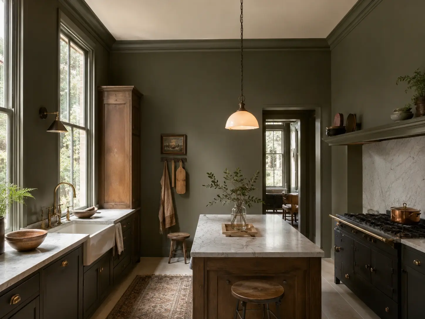
Forest-edged, clay-leaning, and deeply earthy. Calke Green reads closer to deep olive than to typical sage — which makes it polarizing and also the most visually striking when used correctly. Use it in kitchens with strong natural light and high ceilings. In poor lighting it will feel like the walls are advancing. In controlled conditions with 2700K warm bulbs, it photographs like something from an architectural editorial.
7. A Store-Adjusted Sage Blend When No Standard Code Matches Your Existing Finishes
This costs nothing extra. When no standard sage code aligns with your grout, countertop stone, or cabinet stain, ask the paint counter to adjust the base tint. Adding a small amount of raw umber warms any sage formula; a touch of ultramarine blue cools it. Most homeowners don’t know this adjustment exists at no added charge. It solves the “close but not quite right” problem that kills more sage projects than any single wrong color choice.
Wall Treatments That Go Beyond Flat Paint — Limewash, Beadboard, Tile, and Wallpaper
Flat paint on smooth drywall is the default. It’s also why most sage green walls look flat and boring — not because the color is wrong, but because a uniform matte surface under static lighting has no dimensional variation.
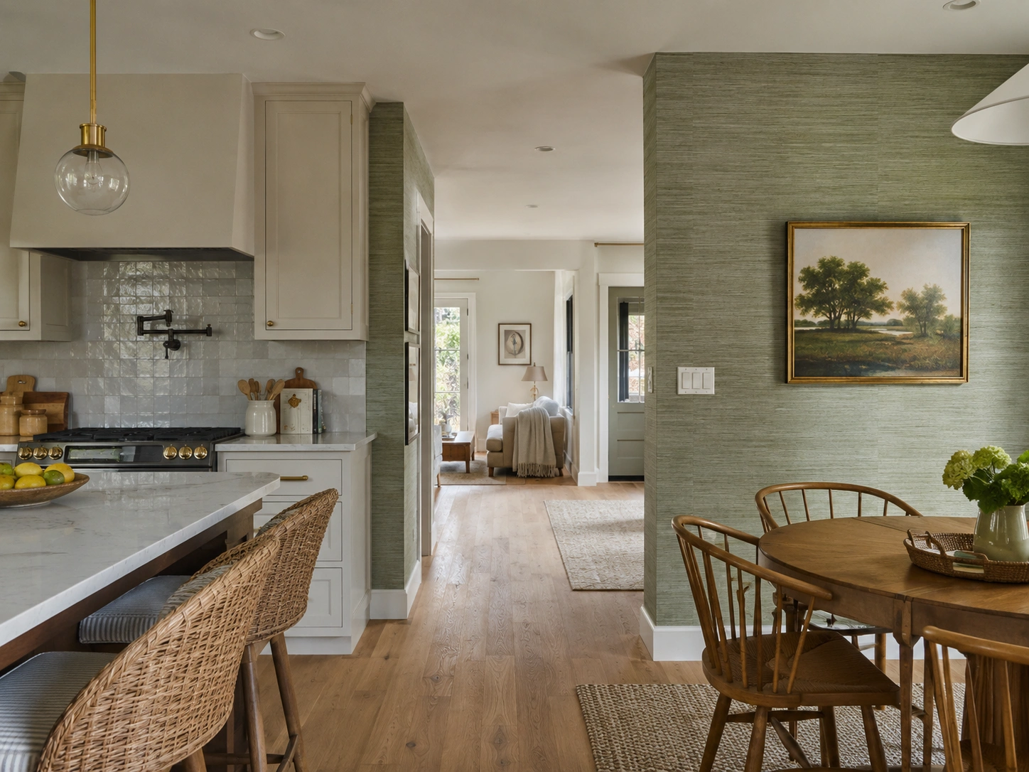
The most-saved sage kitchen walls on Pinterest aren’t painted drywall. They’re limewash, beadboard, shiplap, zellige tile, and textured wallpaper — surfaces that interact with light differently as the day moves. That’s exactly what sage green needs to read rich rather than dull.
Flat sage paint vs. limewash sage treatment: flat paint works best in kitchens with modern cabinets, clean lines, and even artificial lighting. Limewash creates dimensional depth that makes sage richer as light shifts throughout the day — a better fit for kitchens with natural textures like wood shelving, stone counters, or brick elements. The key difference: flat paint reflects light uniformly; limewash absorbs and scatters it for a more layered visual result.
8. Limewash Paint in Sage Green — The Texture That Makes Sage Look Like It’s Always Been There
Limewash sage walls carry a mottled, worn quality that flat paint cannot reproduce. The finish absorbs light differently at each point on the wall, so the color reads lighter where light hits directly and deeper in shadow — a constant, subtle shift that gives the room organic life. Portola Paints Classico Limewash and Roman Venetian Plaster both carry sage-toned options. This is the most-saved sage kitchen wall treatment on Pinterest, and the reason is immediately visible in person.
9. Sage Green Beadboard Wainscoting — Half-Wall Structure That Looks Designed, Not Just Painted
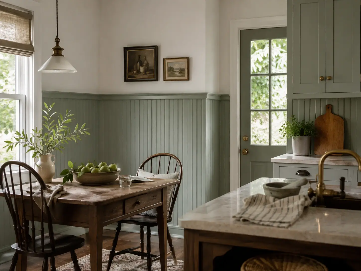
Paint beadboard panels sage below the chair rail, white above. The result reads as a kitchen with architectural intention — defined zones, vertical lines that add structure, and a color that feels grounded rather than floating. Benjamin Moore Saybrook Sage reads well on beadboard’s ribbed surface because the texture adds shadow and depth the color alone can’t produce. The contrasting white upper wall draws the eye upward, increasing perceived ceiling height without any structural change.
10. Sage Green Shiplap on the Range Wall — A Focal Point That Does Real Visual Work
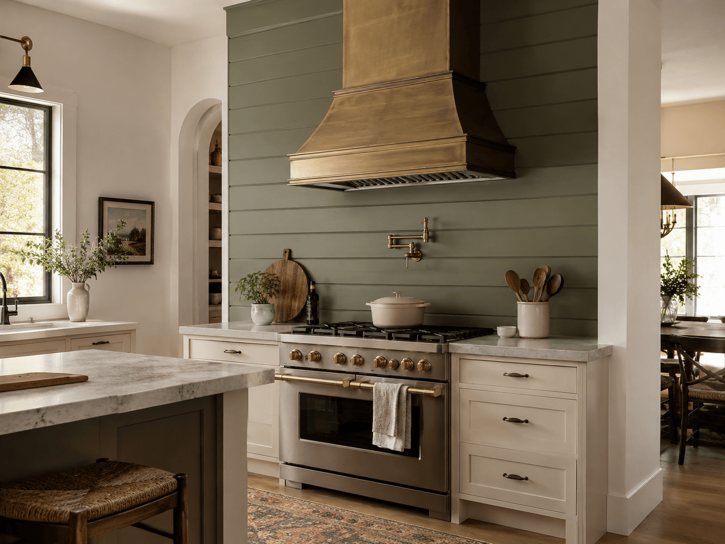
Horizontal shiplap behind the range and hood, painted deep sage, becomes the room’s anchor. Sherwin-Williams Evergreen Fog on shiplap creates shadow between horizontal ridges that adds dimension no flat-painted wall can replicate. Add a stainless or brass range hood in front of it. The texture makes the wall read as a designed feature rather than a background — which is the entire point of choosing sage for a kitchen wall in the first place.
11. Botanical Wallpaper With a Sage Green Palette — One Wall, Maximum Personality
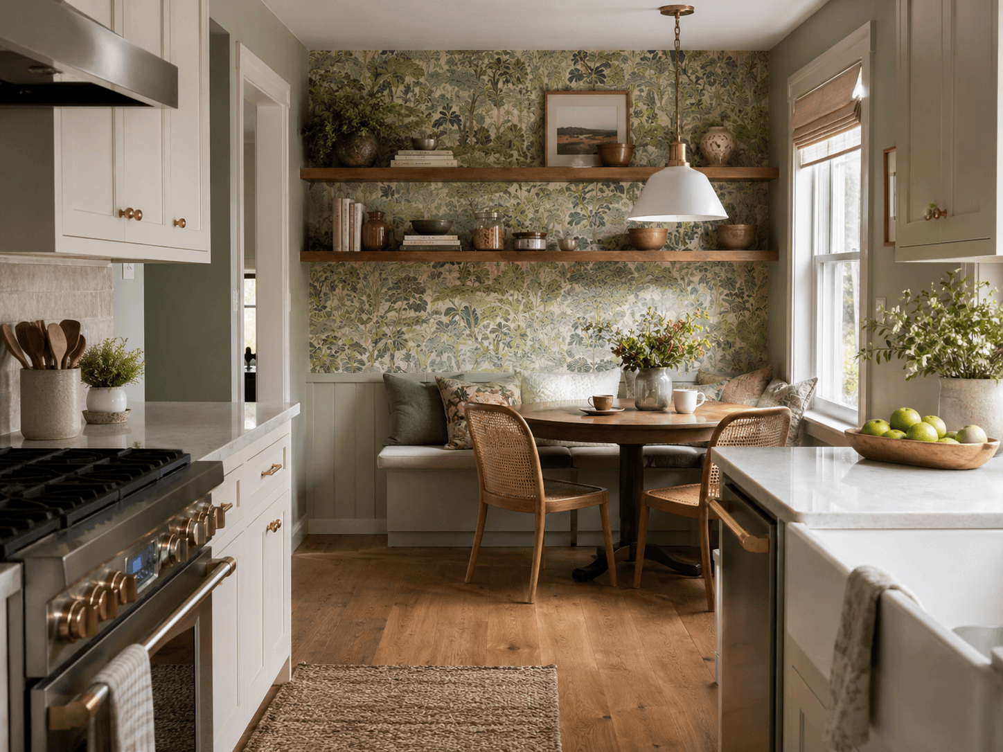
One wallpapered wall — behind open shelving or a breakfast nook corner — changes how sage reads across the entire room. Choose wallpaper with sage as the dominant background tone, then match that exact green for adjacent painted walls. This connects the wallpaper to the room rather than making it look applied and separate. Kitchens with a botanical wallpaper feature wall consistently generate more visual engagement than same-layout rooms with flat-painted sage walls.
12. Floor-to-Ceiling Zellige Tile in Sage Green — Statement Texture That Justifies Every Dollar
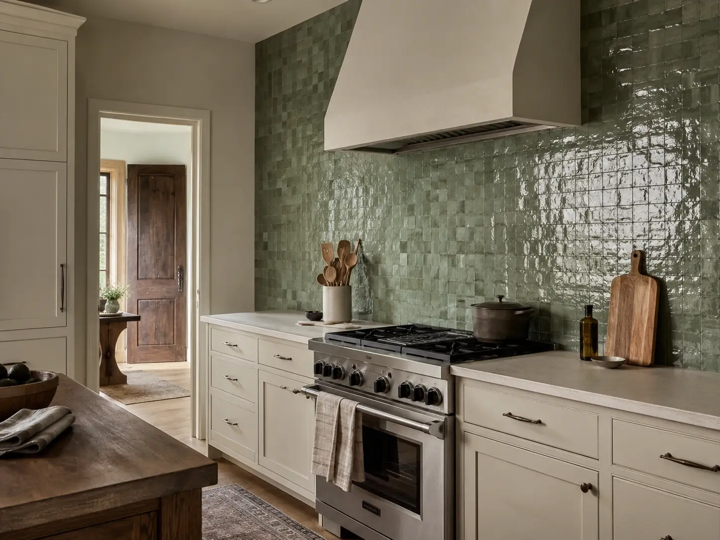
Zellige in sage, seafoam, or moss as a complete wall behind the range or along a galley wall. Each tile catches light at a slightly different angle, so the wall shifts tone as the day moves. This is a genuine splurge — expect $35–$90 per square foot installed — but for kitchens where one wall needs to be visually impossible to ignore, nothing else on this list competes on impact. One wall is enough. The rest of the room should step back.
13. Sage Green Grasscloth Wallpaper — Natural Texture Without the Full Intensity of Paint
Grasscloth in sage or moss tones introduces tactile warmth and natural texture without the full commitment of paint. It also absorbs sound better than painted drywall — which matters in open-plan kitchens where noise carries. One practical constraint: grasscloth isn’t waterproof. Use it only on walls that don’t receive direct splashing — not behind the sink — and keep it away from steam sources near a cooktop.
14. Sage Green Painted Brick — A Surface That Makes Color Richer Through Texture Alone
Painting an exposed brick wall sage — rather than white or black — creates a textured surface that interacts with color the way limewash does. Light and shadow play across the uneven brick face constantly, so the sage never reads flat. Use masonry primer first, then two coats of matte or eggshell sage. This is specifically for kitchens with existing exposed brick or brick surrounds — not a treatment worth creating from scratch.
15. Two-Tone Walls — White Wainscoting Below the Chair Rail, Sage Above
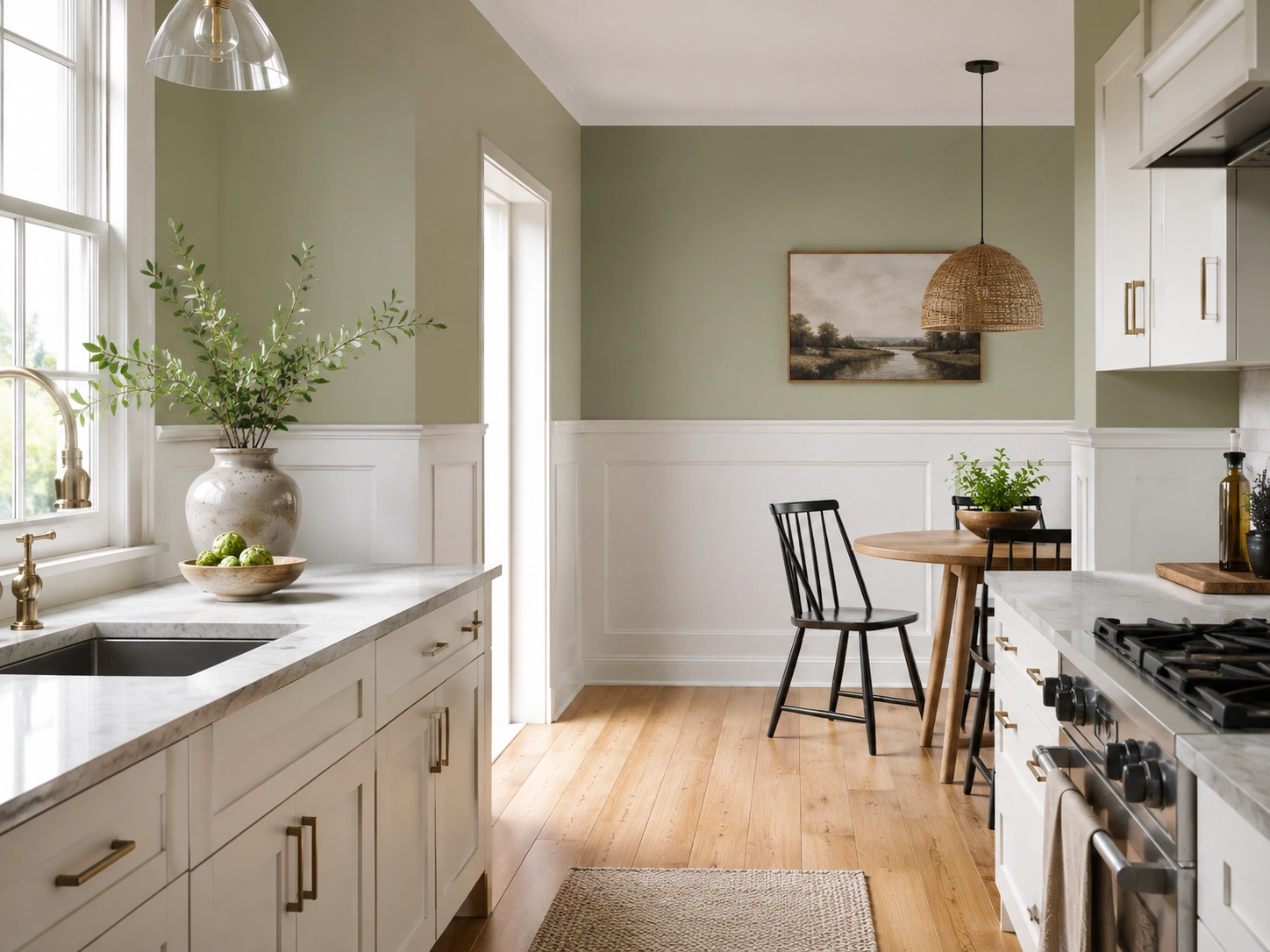
A traditional architectural technique that reads far more contemporary when paired with modern hardware and streamlined cabinetry. The white wainscoting below the chair rail protects lower walls and adds structural definition; the sage above sits at eye level and higher, where color has its greatest visual impact. In kitchens where walls feel undifferentiated and flat, the horizontal chair rail line also acts as a visual cue that increases perceived ceiling height without any ceiling change.
Quick Comparison: Sage Green Wall Treatments
| Option | Best For | Key Benefit | Limitation |
|---|---|---|---|
| Flat paint | Modern, minimal kitchens | Fast, affordable, easy to change | No texture; highly light-reactive |
| Limewash | Farmhouse, cottage, organic kitchens | Natural depth that shifts with light | Requires specific product; harder to DIY |
| Beadboard wainscoting | Traditional and transitional kitchens | Adds architectural structure | Half-wall only; more prep and material cost |
| Zellige tile | Feature walls; high-design kitchens | Maximum texture, daily shimmer | High cost: $35–$90/sq ft installed |
| Botanical wallpaper | One-wall statements; open-plan rooms | Maximum personality from a single wall | Not water-resistant; careful placement needed |
Cabinet Pairings That Make Sage Walls Look Intentional, Not Accidental
You’ve tried the combination, you’ve seen it fall flat, and you’re not sure why — but it’s almost never the sage color that’s the problem. It’s either the white undertone you chose for the cabinets (undertones matter more here than most readers expect), or the absence of contrast that gives the eye nowhere specific to land.
Sage walls need something to be in conversation with. A partner with more warmth, more darkness, or more material texture — or all three.
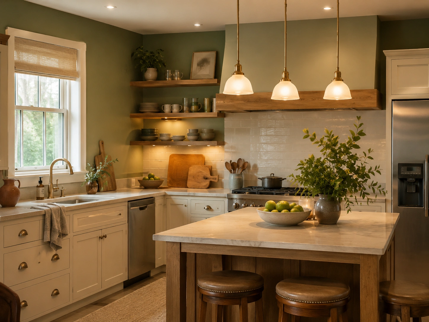
The best cabinet pairings for sage green walls use contrast to prevent the combination from reading flat. Warm white or cream cabinets complement sage without competing. Dark navy lower cabinets or natural wood tones add visual separation that makes sage walls look richer and more deliberate in any kitchen.
16. Sage Walls + Warm White Shaker Cabinets — The Pairing That Dominates Pinterest for a Reason
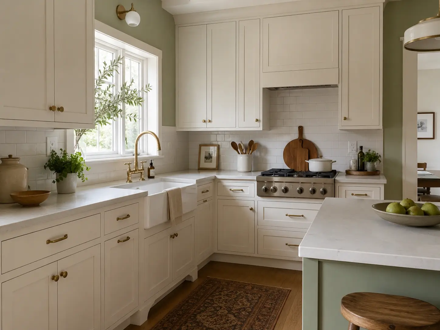
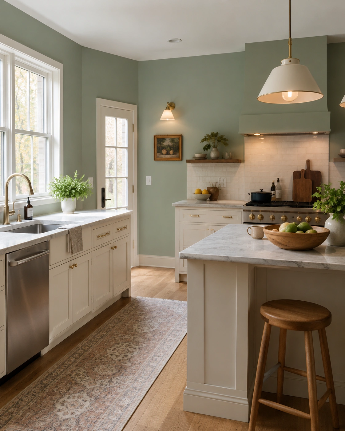
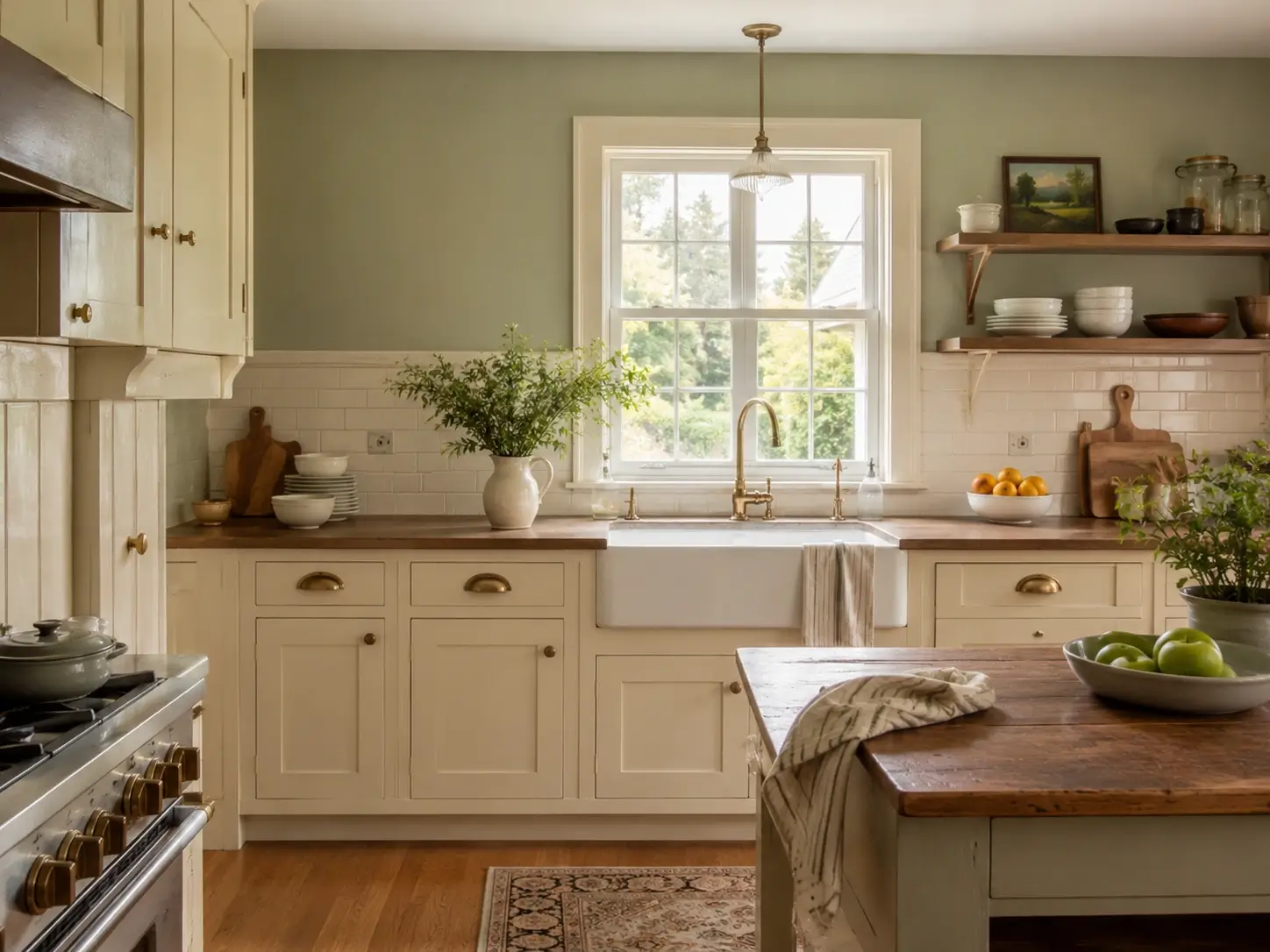
Warm white — Benjamin Moore White Dove or Chantilly Lace, not stark bright white — with sage walls reads as considered, not cautious. Cold bright white next to sage creates an undertone conflict: the blue in bright white fights the yellow-green in sage. Warm white resolves that. Unlacquered brass or aged bronze hardware seals the pairing and prevents it from reading clinical. This combination appears on more Pinterest boards for this keyword than any other by a clear margin.
17. Sage Walls + Cream or Off-White Cabinets — Softer, Warmer, and More Cohesive
Cream cabinets — Sherwin-Williams Antique White or Benjamin Moore Linen White — placed next to sage walls create a palette where the boundary between wall and cabinet almost dissolves in the best way. The warm, slightly yellowed quality of cream pulls sage’s yellow undertones forward, making the combination feel unified rather than contrasted. A natural fit in cottage, farmhouse, and transitional kitchens where softness is the primary goal.
18. Sage Walls + Dark Navy Lower Cabinets — Maximum Contrast With Minimum Risk
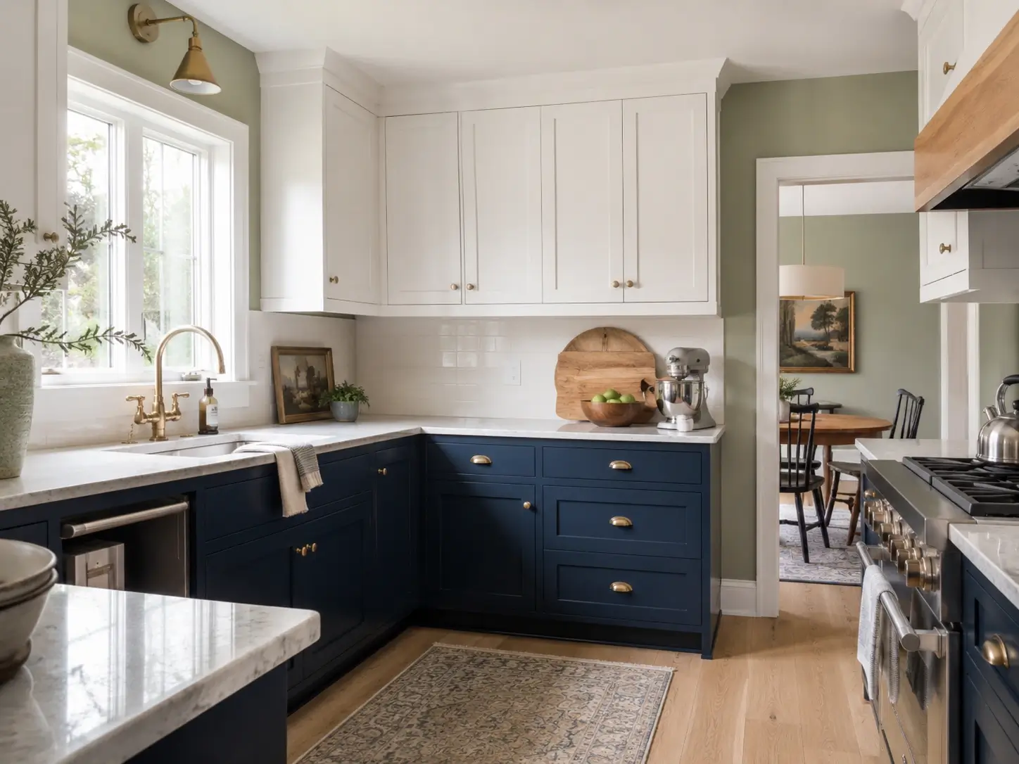
Navy lowers with sage walls and white upper cabinets creates a three-tone arrangement with genuine color depth. Sage bridges the gap between the dark lower zone and the light upper zone, so nothing fights. Use Benjamin Moore Hale Navy or Sherwin-Williams Naval for the lowers. The eye travels from dark at floor level through the sage mid-zone to white above — a grounded visual journey that makes the kitchen read as fully considered.
19. Sage Walls + Natural Walnut or Oak Lower Cabinets — A Combination Borrowed From Scandinavian Design
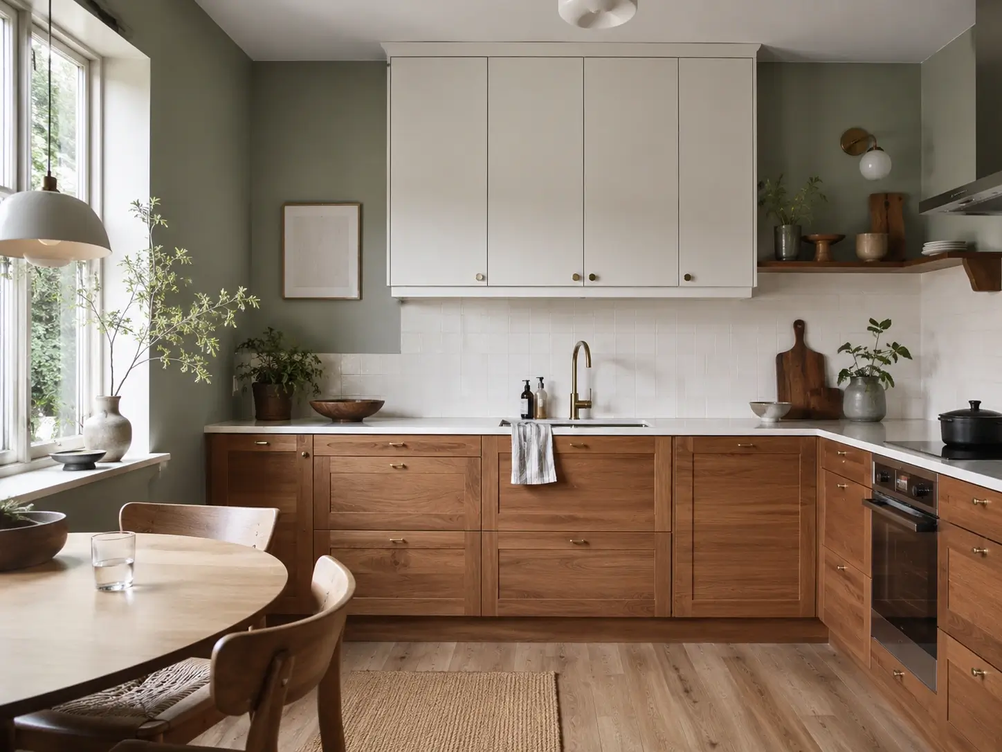
Wood-front lower cabinets against sage green walls are a Japandi and Scandinavian kitchen staple. Warm walnut or mid-tone oak grounds sage’s cooler quality and prevents the room from reading clinical or cold. White or cream upper cabinets complete the arrangement. If you’ve seen this in Swedish interior photography and couldn’t place why it looks so calm without looking dull, this is the pairing.
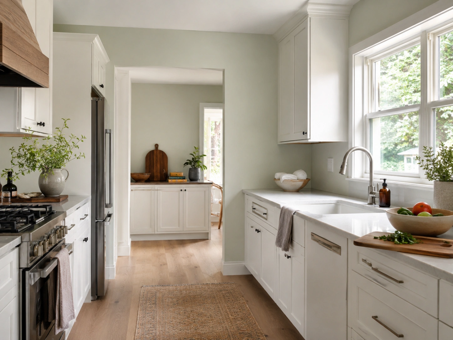
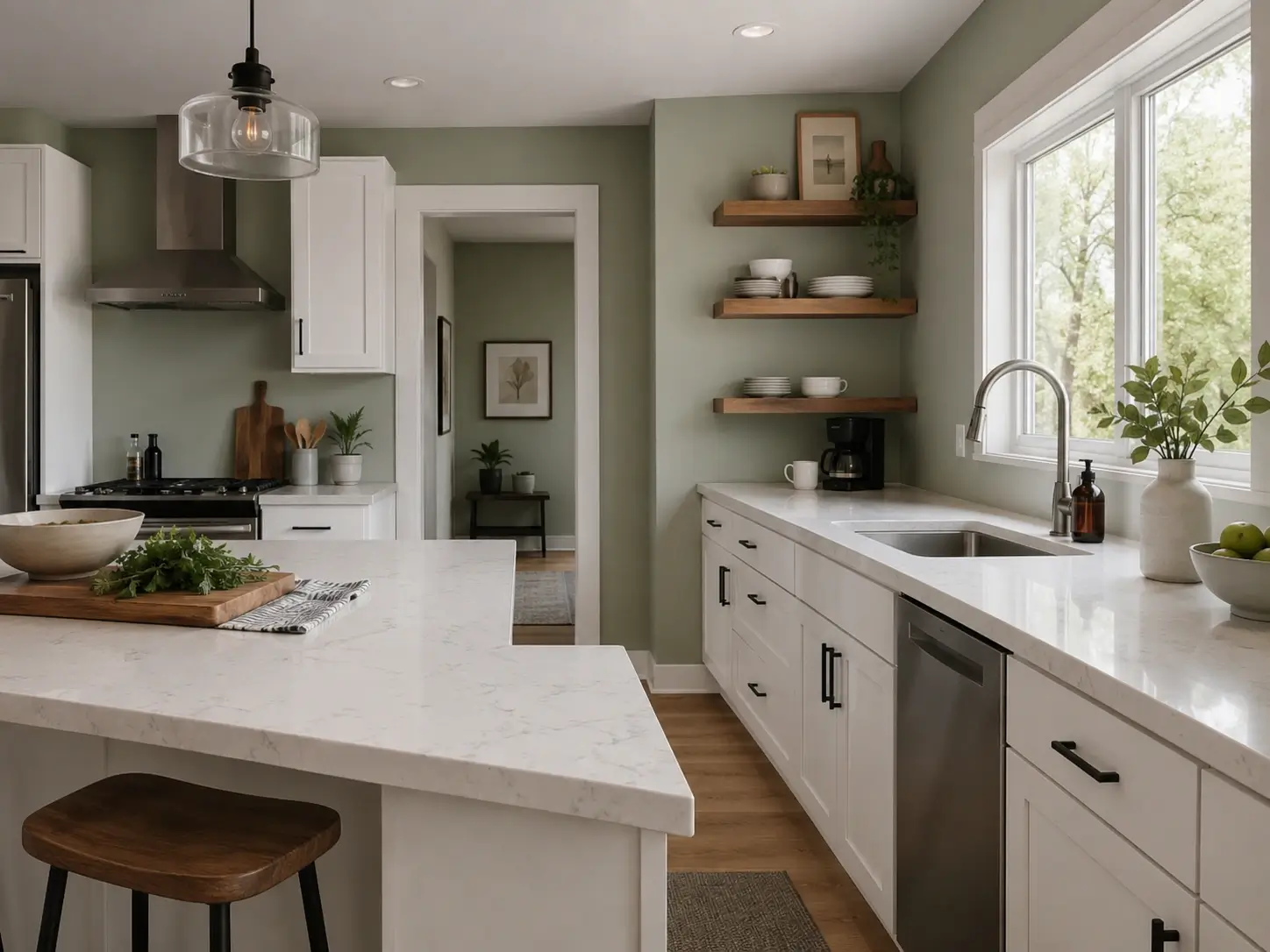
20. Sage Walls + All-White Cabinets — How to Stop the Washed-Out Look Before It Happens
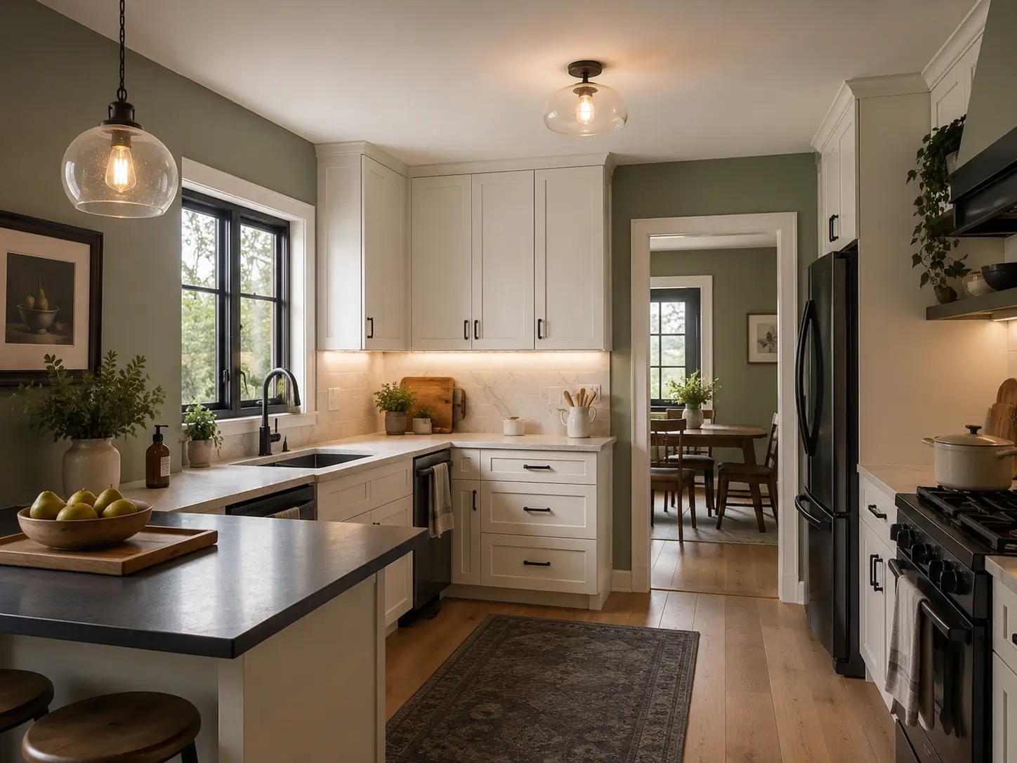
All-white cabinets with sage walls can work — and can also completely disappear if undertones aren’t aligned and lighting is cool. The fix needs three moves: choose a sage with strong LRV contrast relative to your specific cabinet white, switch to 2700K warm bulbs, and introduce one dark anchor element — matte black hardware, a deep rug, a charcoal countertop edge — to give the eye somewhere to land. Without that anchor, sage and white blur into the same visual plane.
21. Sage Walls + Matte Black Hardware on White Cabinets — The Sub-$150 Upgrade That Reads as a Renovation
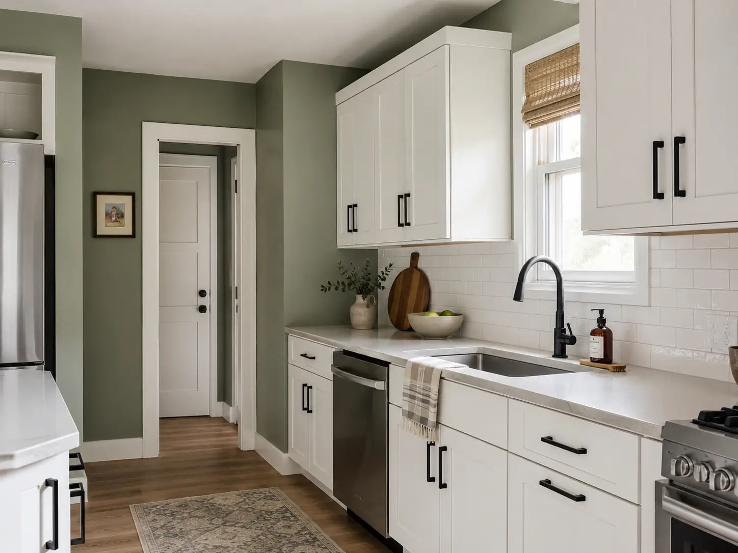
Matte black cabinet handles on white cabinets in front of sage walls is one of the fastest visual improvements in kitchen design. Black hardware pulls from sage’s deep gray-green undertones and adds definition to flat cabinet surfaces. It separates white from sage with enough contrast to make both colors read intentional rather than accidental. A complete kitchen hardware swap typically runs $100–$150. The visual result registers as significantly more expensive.
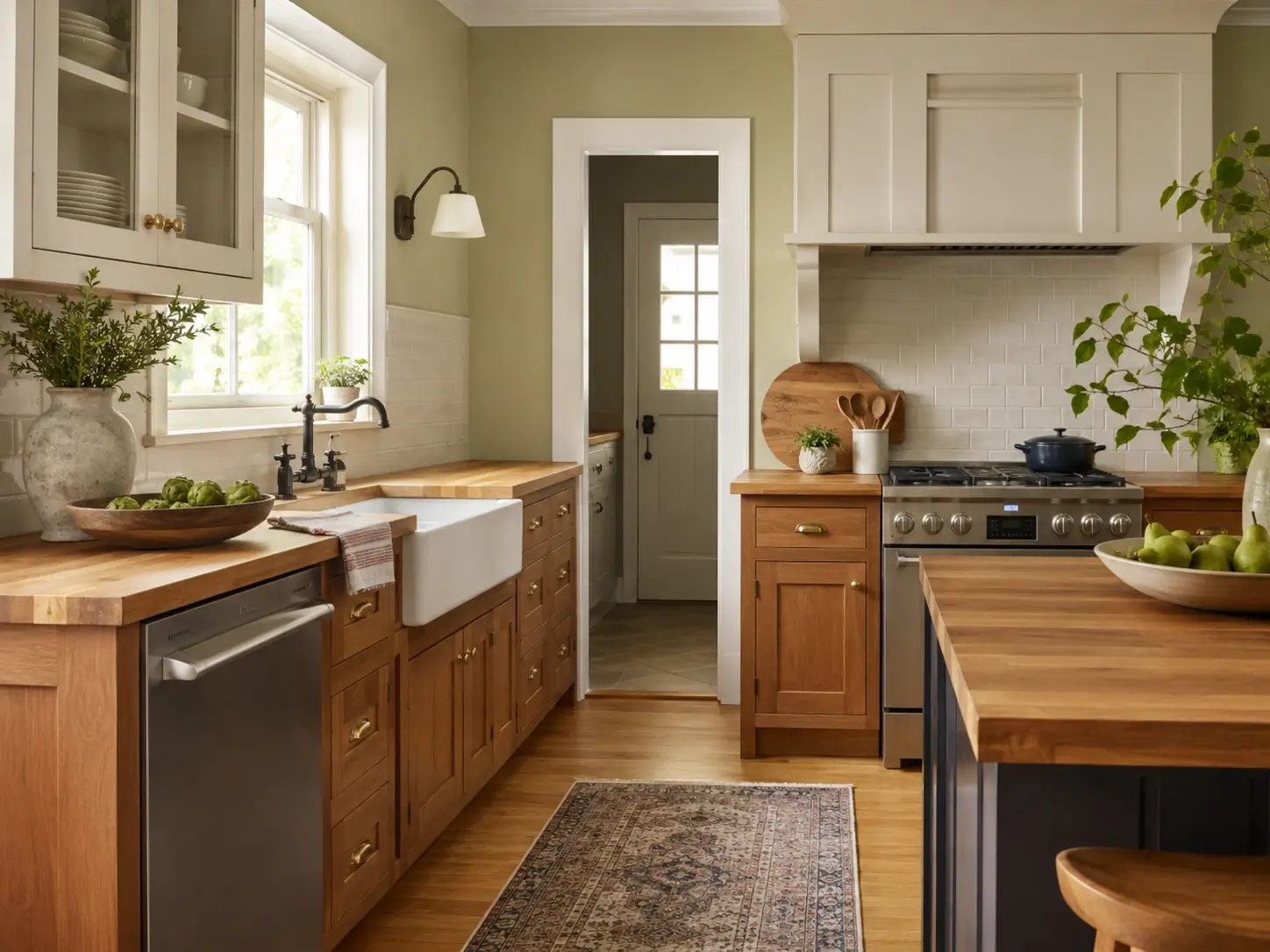
22. Sage Walls + Medium Oak or Birch Cabinets — The Combination That Ages Well Without Trying
Medium wood tones — warm enough to read as honey, not so dark as mahogany — stabilize sage walls by preventing them from swinging too gray or too green. The warm wood acts as a visual bridge between the wall color and the ceiling. A natural fit in Japandi, transitional, and updated farmhouse kitchens. This combination actually improves each year as the wood deepens slightly — something neither all-white nor high-contrast pairings can say.
The Lighting Fixes Most Sage Green Guides Never Cover
Sage green is one of the most light-reactive colors you can apply to a kitchen wall. Its combination of gray undertones and muted green means it responds to changes in bulb temperature and light direction more dramatically than most popular kitchen shades.
Look — if you’re running 5000K cool LEDs in your kitchen right now, sage will fail regardless of which code you choose. Here’s what most articles never say: change the bulb first, then repaint only if needed. Most readers who do this report the color they already have is the color they wanted.
23. Switch to 2700K Warm White Bulbs Before You Do Anything Else
The most actionable single change most readers can make. Kitchens with 4000K–5000K cool LED fixtures are the environments where sage green fails most predictably — the blue-white light surfaces sage’s gray undertones and suppresses the green quality entirely. A pack of 2700K warm white bulbs costs $25–$35 and takes 15 minutes to swap. Test the new bulbs before repainting. Many readers discover they didn’t need to repaint at all — they needed a different bulb.
24. Add Under-Cabinet LED Strips in 2700K — A Light Layer That Changes Everything at Eye Level
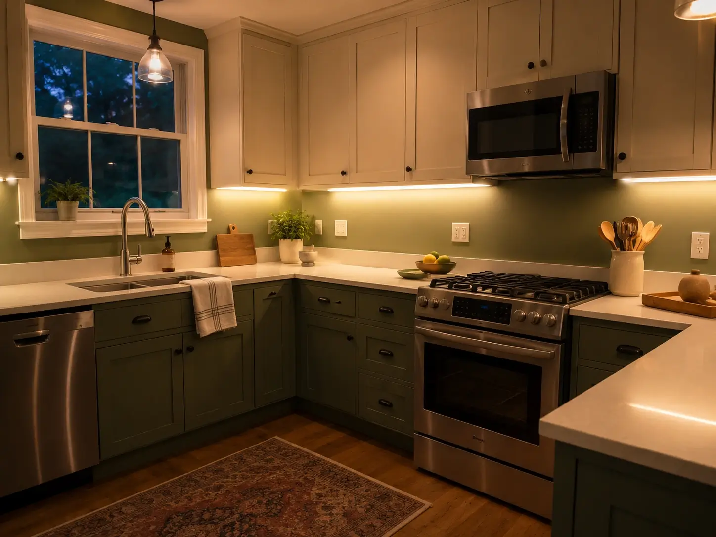
Under-cabinet LED strips at 2700K bounce warm light off countertops and reflect upward onto the lower portion of sage walls. This adds illumination precisely where sage is most visible — at countertop height and slightly above — and changes how the color reads in the evenings when overhead fixtures dominate. If your sage looks flat or dark after sunset, this is almost always a depth-of-light problem. Install a continuous strip under all upper cabinets, not just above the main prep zone.
25. North-Facing vs. South-Facing Kitchens — Choose Your Sage Based on Light Direction
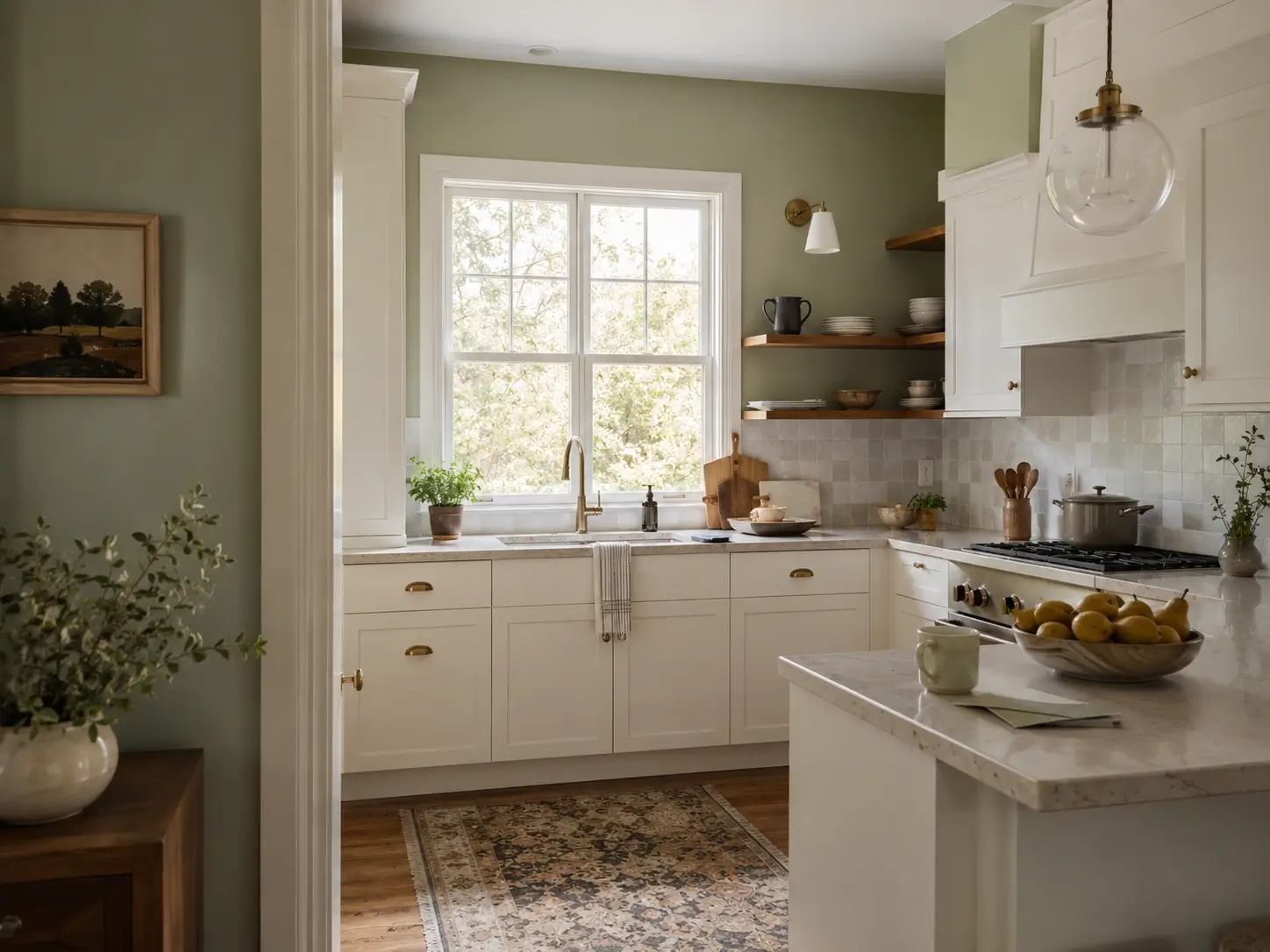
North-facing kitchens receive cool, indirect light throughout the day, which pushes gray-leaning sages — Vert de Terre, Evergreen Fog — even grayer and more muted than their sample cards suggest. In north-facing rooms, choose warmer sages with higher LRV values and yellow-green undertones: Saybrook Sage and Clary Sage handle indirect light more gracefully. South-facing kitchens absorb darker, richer sages well because consistent direct sun keeps them from reading flat.
26. Warm Pendant Lights Over the Island — The Anchor That Makes Sage Feel Chosen
Pendant lights over a kitchen island in warm brass, aged bronze, or amber glass do two things at once: provide task lighting and enrich the sage walls immediately behind and beside the island. That warm, close-range light is what makes sage read as a deliberate design decision at the level most visible from the main living area. Pendants with exposed Edison filaments or amber glass work particularly well for this purpose.
27. Test Your Swatch at Three Times of Day — Not Once at Noon and Never Again
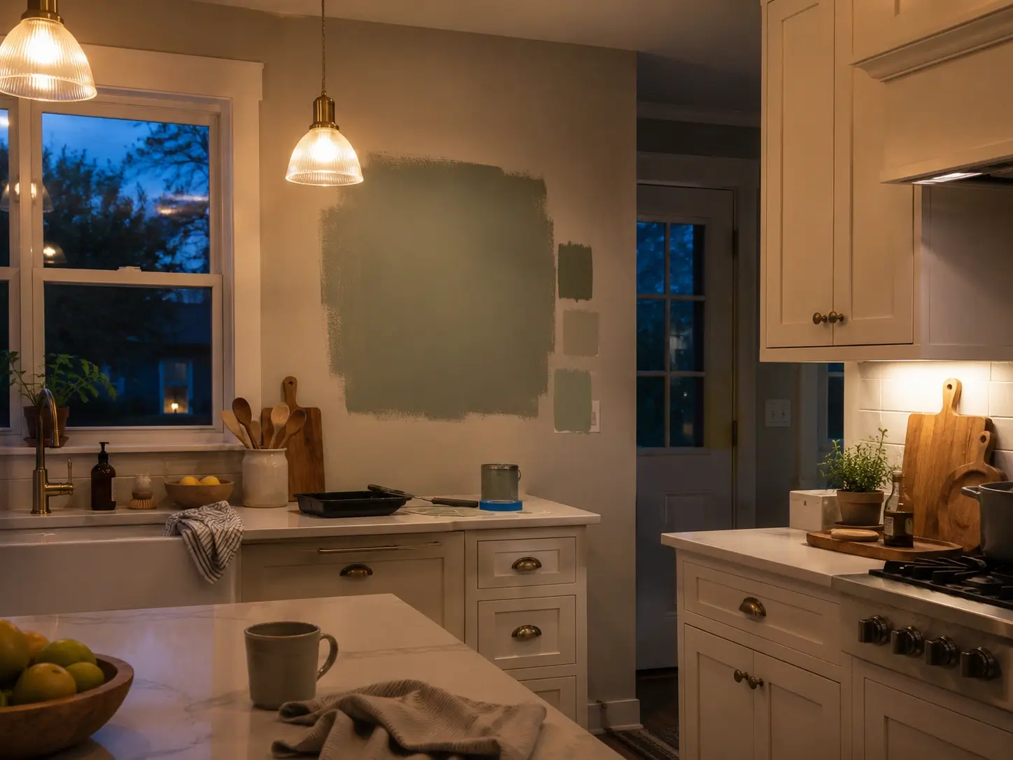
The most common reason readers abandon sage after a single swatch test: they checked it once, at midday, and moved on. Sage changes more noticeably from morning to evening than most other colors because its gray-green combination responds dramatically to shifting light angles and color temperatures. Check your swatch at 7am, noon, and 8pm before committing. The evening reading, under your actual artificial lighting, is almost always the most important one — and the most surprising.
Color Combinations and Finishing Details That Lock In the Look
28. Sage Walls + Unlacquered Brass Hardware — The Most-Saved Metal Pairing for Sage Green Kitchens
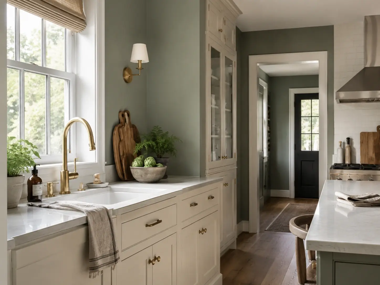
Unlacquered brass ages to a warm, patinated gold that sits organically next to sage — amplifying the green rather than fighting it. Buy one cabinet handle or faucet fixture in unlacquered brass before finalizing your wall color to check the pairing under your actual kitchen lighting. Every sage kitchen that lands on a design blog eventually settles on this metal family. There’s a reason.
29. Sage Walls + White Quartz With Gray Veining — Clean, Contemporary, Cohesive
White quartz with subtle gray veining gives sage walls a visual anchor that’s clean and connective simultaneously. The gray in the quartz links to sage’s gray undertone, creating a palette where surfaces relate to each other without having to match. If your quartz reads cooler gray, lean toward a grayer sage; if it has warm cream specks, choose a warmer sage like Clary Sage to maintain harmony across surfaces.
30. Sage Walls + Marble Countertops — The Quietly Expensive Look That Requires No Explanation
Carrara marble or Calacatta-style quartz against sage walls borrows directly from European kitchen tradition. Marble’s white-and-gray palette neither fights sage’s green nor overpowers it — it sits alongside it. The result reads expensive because the combination of natural stone and a restrained botanical wall color signals taste rather than trend-chasing.
31. Sage Walls + Butcher Block or Warm Wood Countertops — Farmhouse, Cottage, Organic
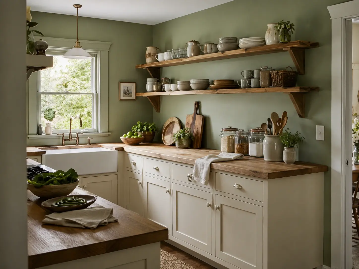
Sage plus warm wood countertop is a kitchen version of a working cottage garden: purposeful but not controlled. Butcher block in walnut or white oak grounds sage and adds natural warmth that no stone countertop delivers in quite the same way. Cream ceramic hardware and open wood shelving above complete the direction. This combination has dominated cottage kitchen inspiration boards since 2022 and shows no signs of leaving.
32. Sage Walls + Terracotta Floor Tile or Accents — The Unexpected Earth Tone That Works
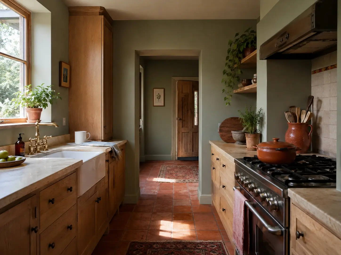
Terracotta and sage appear opposite — one warm orange-red, one cool gray-green. They share an origin in the same earthy, botanical palette, which is why they cooperate so unexpectedly well. Terracotta floor tiles or scattered accents — a glazed pot, a ceramic jug, a tile trim detail — next to sage walls create a kitchen that reads warm, layered, and genuinely unhurried. Once you see the pairing in person, it’s hard to un-see it.
33. Sage Walls + Matte Black Fixtures — For the Kitchen That Refuses to Read Soft
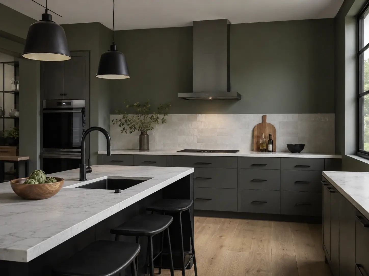
Matte black faucets, pendant lights, and cabinet hardware push sage toward a more graphic, contemporary aesthetic. The contrast is high and deliberate — it makes sage read bold rather than botanical. Use a darker sage (Evergreen Fog or Calke Green) for this pairing so the green isn’t visually absorbed by the black. This is the sage version specifically for readers who don’t want a kitchen that reads “cozy.”
34. Sage Walls + Natural Linen or Cream Window Treatments — Softness That Frames Rather Than Competes
Floor-to-ceiling linen curtains in cream, oat, or undyed natural linen slow sage walls down instead of competing with them. The soft textile boundary frames the sage and makes it feel like a considered backdrop — not a paint decision still being tested. Roman shades in the same linen tone work in smaller kitchens with less wall space. Avoid bright white window treatments; the target is natural cream or undyed linen.
35. Sage Walls + Warm Wood Open Shelving — The Statement That Outperforms Upper Cabinets Visually
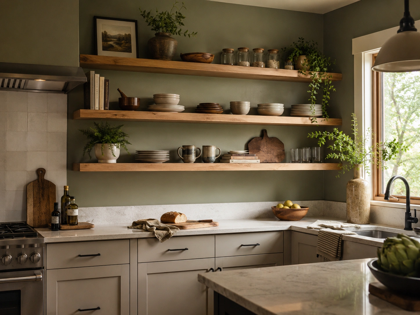
Pull a section of upper cabinets out and install floating shelves in walnut, white oak, or warm-stained pine. Against sage walls, each shelf becomes a display zone — every item reads as a styled object in front of a botanical backdrop. This combination performs better on Instagram and Pinterest for this keyword than almost any other pairing, and material cost is typically far lower than a full cabinet replacement.
36. Sage Walls + Copper or Rose Gold Accents — The Warmth Most Sage Kitchens Are Missing
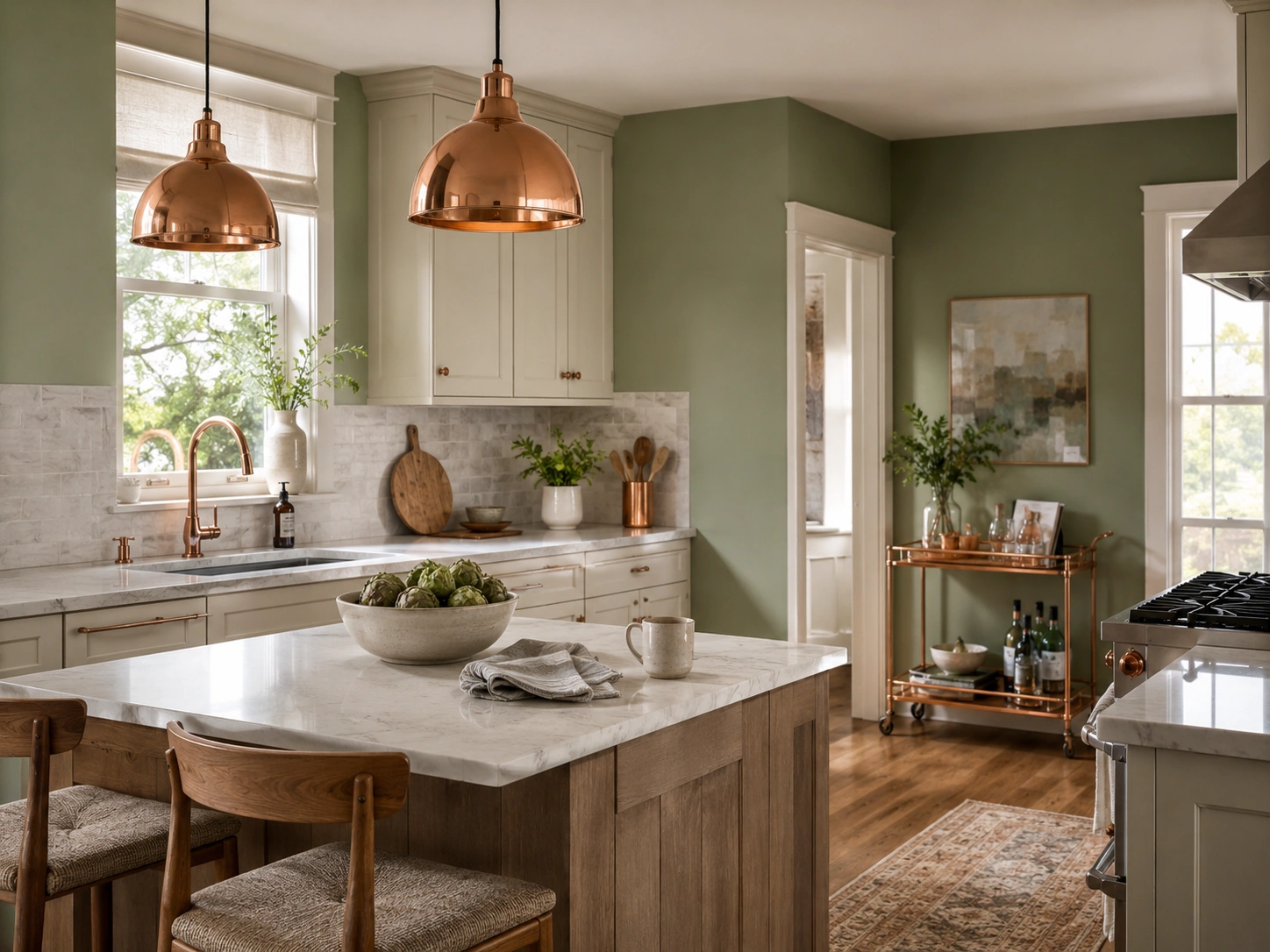
Copper and rose gold are underused in sage kitchens. Most readers default to brass or black — but copper’s warm orange-red undertone does what terracotta does at floor level: it introduces warmth into sage’s cooler palette without creating conflict. A copper pendant, copper faucet finish, or copper bar cart is often exactly what a sage kitchen needs to feel finished rather than still-in-progress. The combination surprises people in the most useful way.
37. Sage Walls + a Neutral Woven Kitchen Rug — The Ground That Completes the Palette at Floor Level
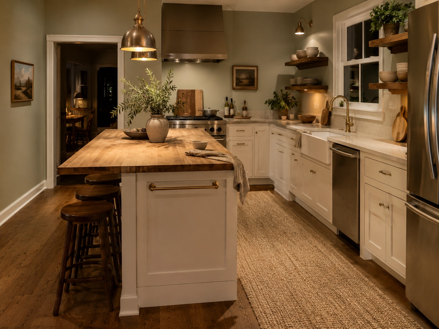
A jute, sisal, or wool rug in cream, camel, or warm gray under the island or along the galley walkway grounds the sage palette at floor level. Without it, sage walls feel visually unconnected to the floor — floating in a way that makes the room feel unresolved. The rug adds texture and warmth, the two qualities most sage kitchens lack at their feet. A 2×3 or 3×5 jute runner runs $40–$120 and shifts the room’s visual weight entirely.
FAQs
What’s the best sage green paint color for kitchen walls?
Benjamin Moore Saybrook Sage (HC-114) performs reliably across the most kitchen types, with an LRV of 38–45. For kitchens with warm wood floors, Sherwin-Williams Clary Sage. For the lightest, most forgiving option, Benjamin Moore October Mist 1495.
Why does my sage green paint look gray on the wall?
Cool LED bulbs at 4000K–5000K push sage’s gray undertones forward and suppress the green quality. Switch to 2700K warm white bulbs before repainting — this solves the problem in most kitchens without any additional color changes needed.
Should I paint sage green on all kitchen walls or just one?
One feature wall — behind the range, behind open shelving, or facing the main entry — is usually enough. All-wall sage works in kitchens with good natural light, ceilings above 8 feet, and white or cream cabinets that provide visual contrast.
Does sage green work with white kitchen cabinets?
Yes, but use warm white, not bright white. Cold stark white clashes with sage’s undertones. Benjamin Moore White Dove or Chantilly Lace paired with unlacquered brass hardware is the most reliable combination for sage walls with white cabinets.
How do I stop sage green from looking washed out in my kitchen?
Swap cool bulbs for 2700K warm white LEDs, add under-cabinet lighting, and introduce one dark visual anchor — matte black hardware, a deep area rug, or a charcoal countertop edge — to give the eye contrast and prevent sage from disappearing into the background.
A Final Note
Sage green doesn’t fail on walls because it’s a bad color. It fails because it’s a reactive one — acutely sensitive to light direction, bulb temperature, and the undertones of everything placed near it. The difference between a sage kitchen that looks stunning and one that looks like a failed experiment is almost always one of three things: the wrong bulb, the wrong white next to it, or a wall surface that offers no texture for the color to interact with.
Pick a paint code from this list that matches your light conditions. Test it at three times of day. Pair it with something warm.
The color works.


No Comment! Be the first one.