




9 Decorating Rules I Was Wrong About (And What I Do Instead Now)
I used to treat decorating rules like they were the law. White ceilings, matching wood tones, furniture pushed flat against the wall, one metal finish per room. I followed all of it, thinking that...

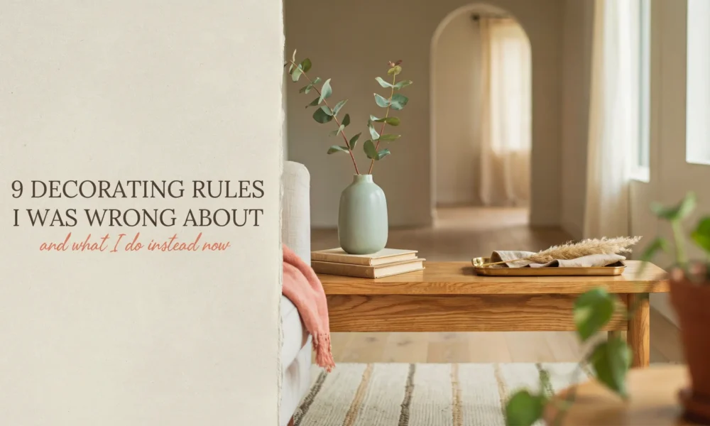
I used to treat decorating rules like they were the law. White ceilings, matching wood tones, furniture pushed flat against the wall, one metal finish per room. I followed all of it, thinking that was the secret to a home that looked “done.”
It took a few rooms I actually hated living in to figure out I was wrong. Not about everything. Some of those rules turned out to matter more than I gave them credit for. But most of them were just habits I never questioned, and breaking them is what finally made my home feel like mine.
Here is every decorating rule I was wrong about, what changed my mind, and what I would tell my old self to do instead.
1. Ceilings Always Have to Be White
For years I painted every ceiling in builder white without a second thought. It was just what you did. The wall color was the decision that mattered, and the ceiling was an afterthought.
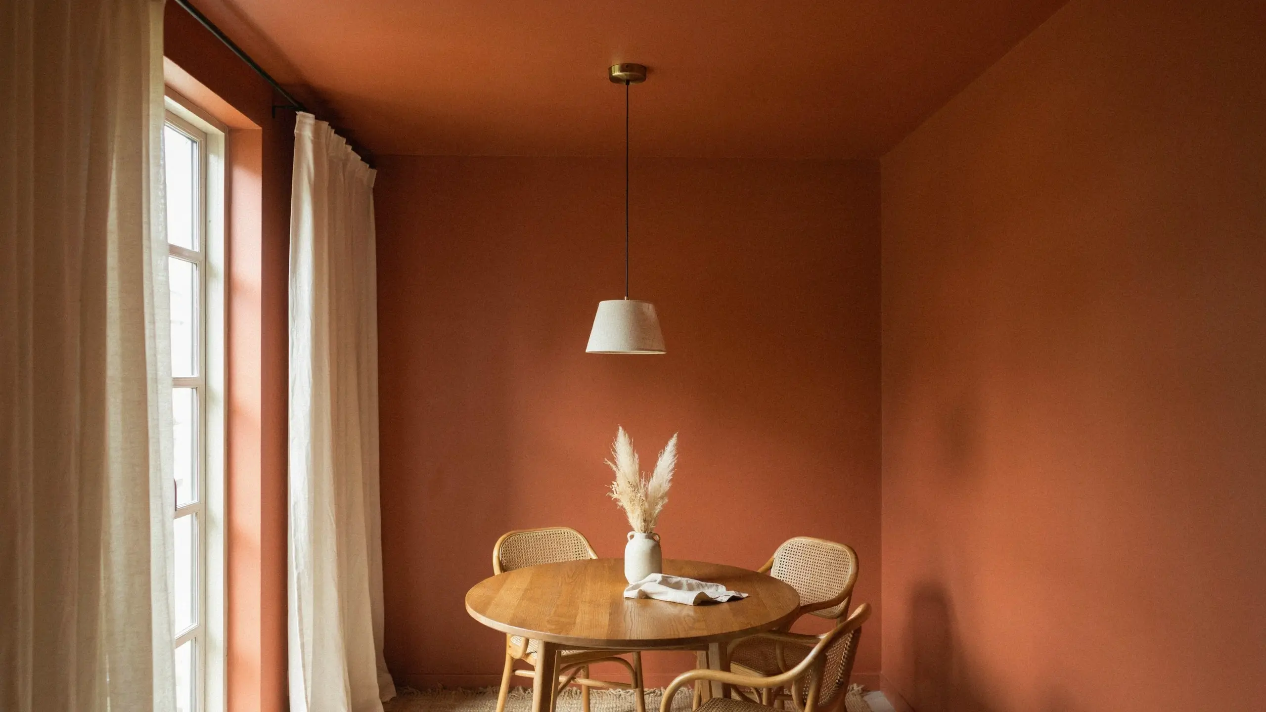
Then I painted a small dining nook a warm terracotta, walls and all, and left the ceiling white out of habit. It looked strange, like the room stopped halfway through. So I painted the ceiling the same color as the walls, and the whole room finally felt intentional instead of unfinished.
Designers call the ceiling the fifth wall for a reason. In a small room especially, a white ceiling with colorful walls can actually make the space feel choppier, not bigger, because your eye keeps hitting a hard stop at the top.
What I do now
In small or low-ceiling rooms, I paint the ceiling the same color as the walls, or one shade darker, in a flat or matte finish so it doesn’t reflect glare. In rentals where painting isn’t allowed, a removable wallpaper strip on the ceiling trim or a peel-and-stick ceiling medallion gives a similar effect without breaking a lease.
Mistake to avoid
Don’t do this in a north-facing room with almost no natural light and no plan for extra lighting. Test a large paint swatch on the actual ceiling and look at it morning and night before committing.
2. Never Mix Metal Finishes
I once had a well-meaning friend tell me to keep every faucet, hinge, and light fixture the same metal for resale value. So I did, for years, in every house I lived in. It looked fine. It also looked like nothing.
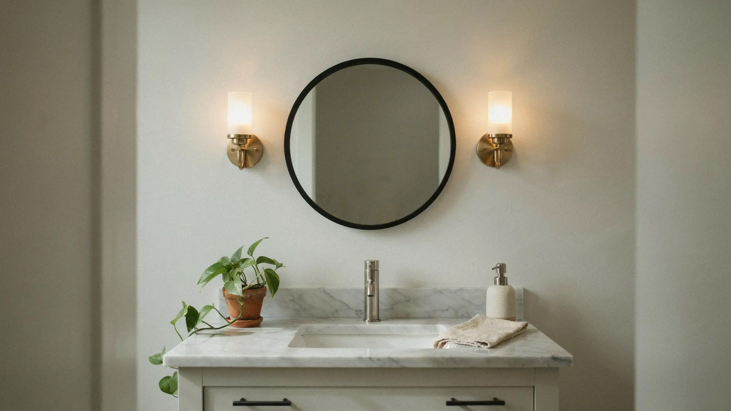
When I redid a small bathroom, I broke that rule on purpose. Brushed nickel faucet, a black-framed mirror, and warm brass sconces. I kept nickel as the dominant metal and used black and brass as accents, and it read as curated instead of chaotic.
What I do now
I pick one dominant metal and one accent metal, then repeat each of them at least twice in the room so it looks like a choice, not a mistake. A black mirror frame paired with black cabinet pulls. A brass lamp base echoed in a brass picture frame.
Mistake to avoid
Three or more metals in a small space usually tips into messy. Cap it at two, especially in bathrooms and kitchens where fixtures are already competing for attention.
3. Light, Neutral Colors Are the Only Way to Make a Small Room Feel Bigger
I painted a tiny home office pale gray for two years because every design article said light colors open up small spaces. It didn’t feel open. It felt flat, a little sad, and honestly kind of cold.
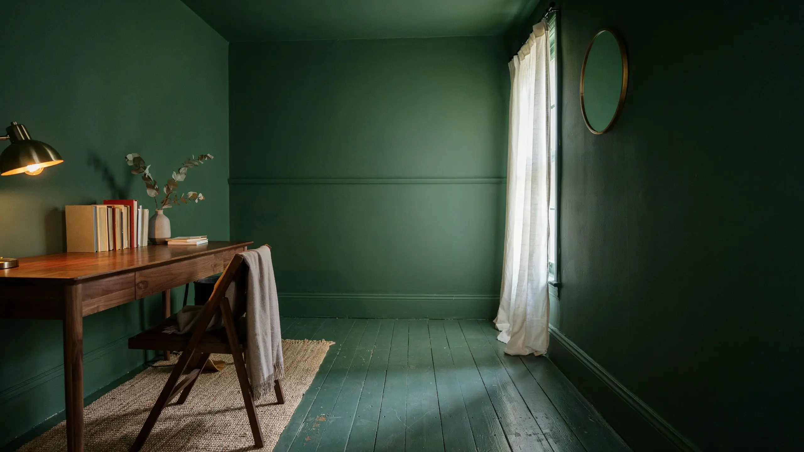
I finally repainted all four walls a deep forest green, trim included, and the room felt smaller in square footage but so much more comfortable to sit in. It stopped feeling like a leftover closet and started feeling like a room I chose on purpose.
This is one of those decorating rules that made sense on paper but never matched how a small room actually feels to be in. Dark, saturated color in a tight space can read as cozy and intentional instead of cramped, especially when the trim matches the walls so there’s no hard line for your eye to stop at.
What I do now
For small rooms, I go for one bold, saturated color across walls and trim (called color drenching) instead of a light neutral. I add a mirror near the main light source to bounce light around, and I skip busy patterns since the color is already doing the work.
Mistake to avoid
This works best with some layered lighting to offset the darkness. A room with zero natural light and only a single overhead bulb can start to feel like a cave. Add a warm floor or table lamp before you commit to the dark paint.
4. Every Wood Tone in a Room Has to Match
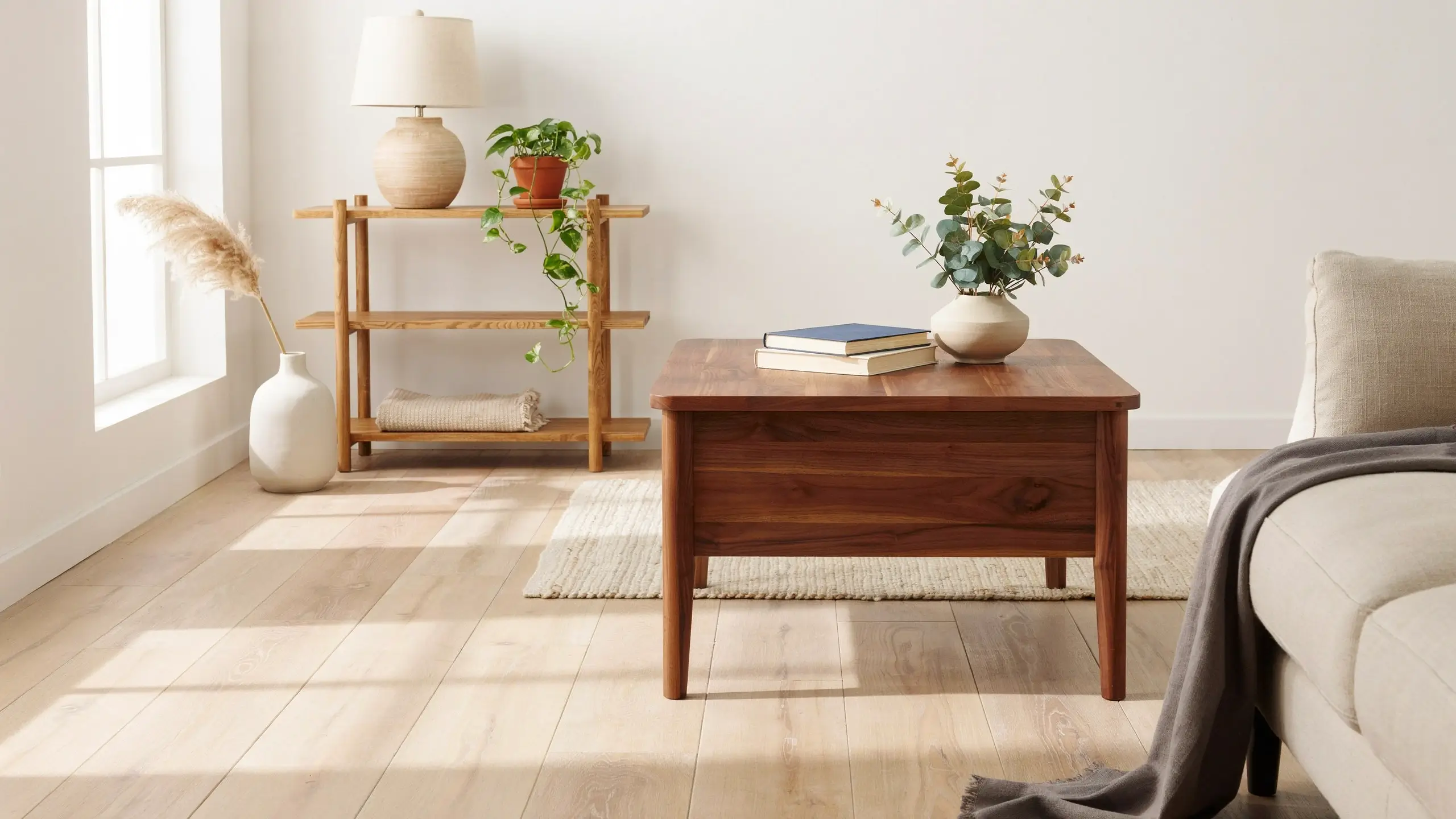
I once sold a perfectly good nightstand because it was “the wrong wood” next to my bed frame. I spent years chasing a matching wood family across every piece of furniture I owned, and the room still felt like a furniture showroom, not a home.
Mixing wood tones on purpose, oak floors with a walnut coffee table and a honey pine shelf, ended up looking more collected and more like it came together over time. The trick isn’t avoiding different woods. It’s repeating them with intention.
What I do now
I pick one dominant wood tone that shows up at least twice (floor and a large furniture piece), then let one or two accent tones repeat in smaller items like a lamp base, a picture frame, or a side table. Balance and repetition matter more than matching.
Mistake to avoid
Having every wood piece in a totally different tone, with none of them repeating anywhere else in the room, reads as random instead of collected.
5. Furniture Has to Sit Against the Walls
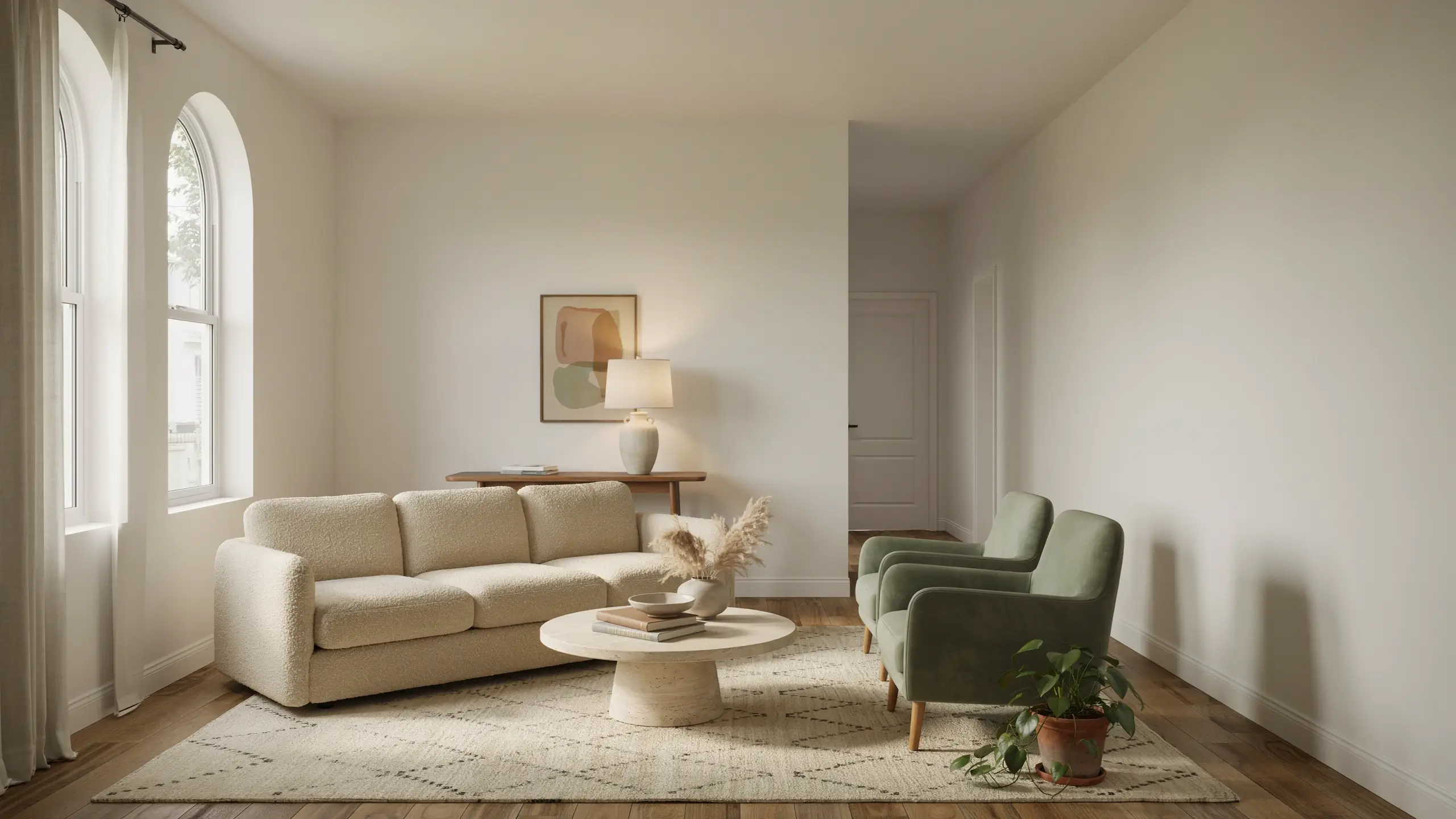
My first apartment living room had every single piece pushed flat against the wall. I thought that was how you made a small space feel bigger. Instead it felt like a waiting room, with a huge dead zone of carpet in the middle and no real spot to actually sit and talk to someone.
Floating the sofa a few feet off the back wall, with a slim console table and a lamp behind it, created an actual gathering spot in the middle of the room. The space felt more finished with furniture pulled in than it ever did pushed out.
What I do now
I float major seating pieces to create a defined conversation area, and I leave at least 30 to 36 inches of walking space around it. A rug underneath helps anchor the grouping so it doesn’t feel like it’s drifting.
Mistake to avoid
This only works if the room is big enough to spare the space behind the sofa. In a genuinely tight room, measure your walkways first. Sometimes against the wall really is the right call, and that’s fine.
6. Skipping a Rug Saves Money and Doesn’t Really Matter
This is the one I was wrong to break. As a renter trying to save money, I skipped rugs for years. Bare floors, furniture floating with nothing to anchor it, and every open-concept apartment I lived in felt colder and louder than it needed to.
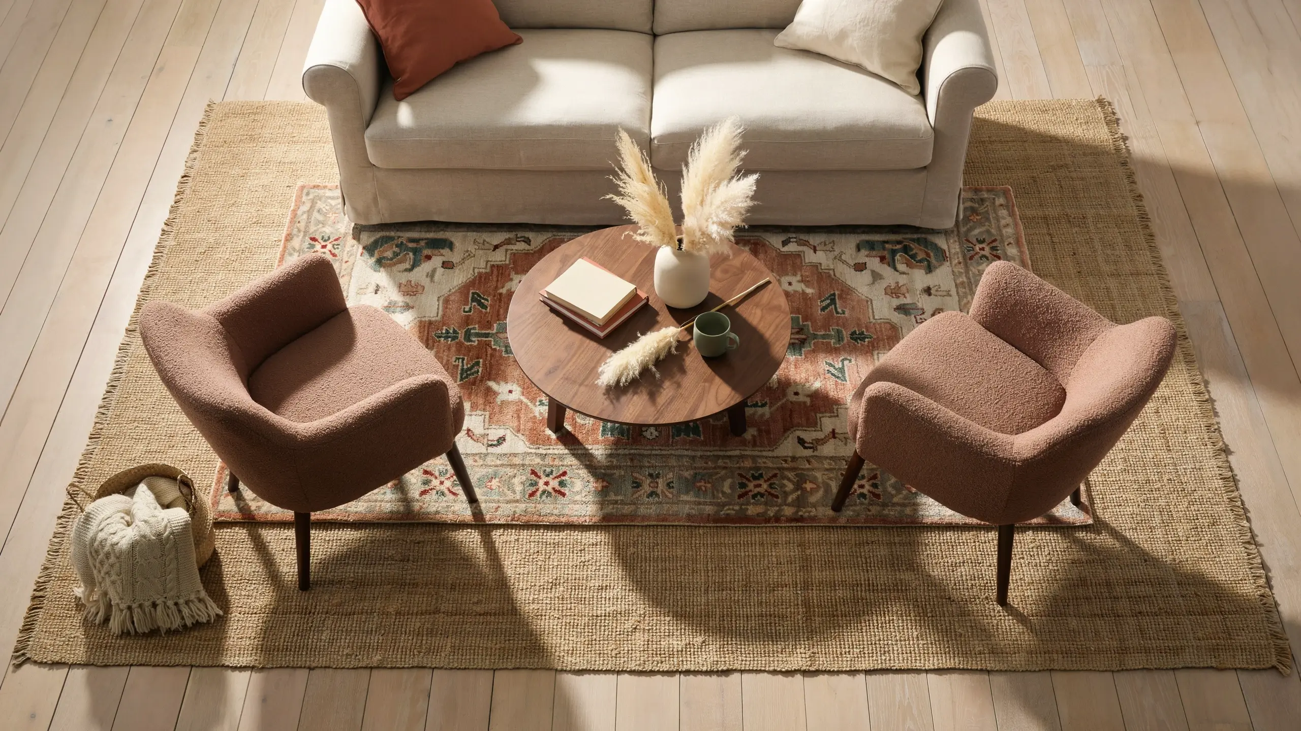
Turns out the old rule about rug sizing is one of the ones that actually holds up. A rug that’s too small, or missing altogether, makes a seating area feel disconnected, even if everything else in the room is right.
What I do now
I make sure at least the front legs of my main seating pieces sit on the rug, ideally all four legs in a larger room. For budget, an 8×10 rug in the $150 to $250 range covers most living rooms, and layering a cheap flatweave or jute rug under a smaller patterned one is an easy way to fake a bigger footprint for less money. Renters can use rug tape instead of a rug pad with adhesive backing to avoid flooring damage.
Mistake to avoid
The classic floating rug mistake is buying one just big enough for the coffee table and calling it done. If your sofa and chairs are hovering off the edges, size up.
7. You Need Overhead Lighting as Your Main Light Source
I used to feel like a room wasn’t finished unless it had a working ceiling fixture. As a renter who couldn’t hardwire anything, that left me frustrated for years, staring at a bare bulb in a ceiling box.
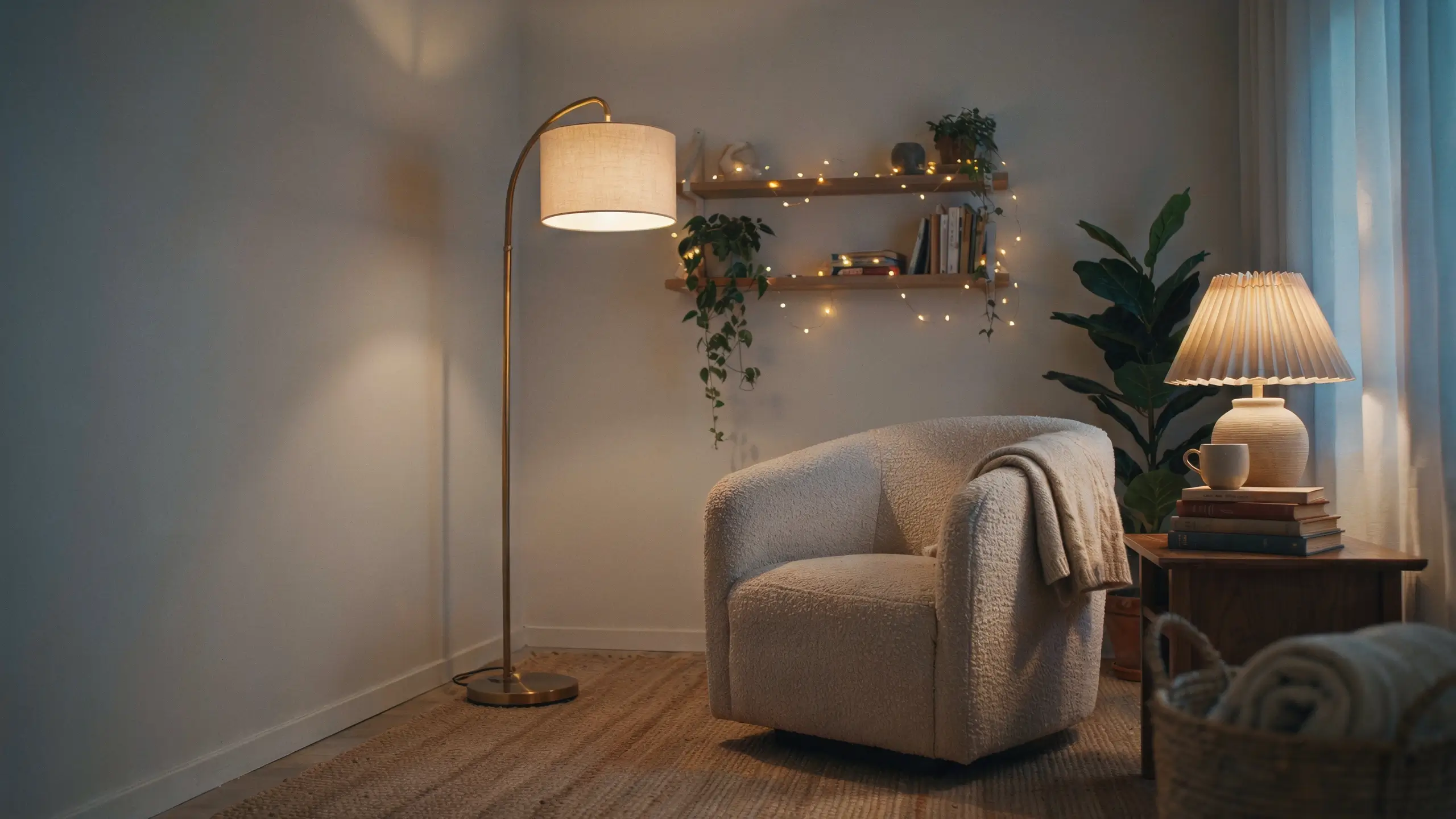
Layered lighting turned out to matter a lot more than one overhead source ever did. A single ceiling light flattens a room, in photos and in person. A mix of lamps at different heights does more work for less money and no electrician.
What I do now
I aim for three light sources in a main living space: a floor lamp, a table lamp, and one accent source like string lights or a small picture light. Warm bulbs in the 2700K to 3000K range keep the light cozy instead of clinical. Plug-in wall sconces with a cord cover are an easy renter upgrade that mimics hardwired lighting without touching the wiring.
Safety note
Don’t overload a single outlet with multiple lamps and extension cords. Use a surge protector power strip rated for your total wattage, and keep cords away from walkways.
8. Odd Numbers Are the Only Way to Style a Shelf
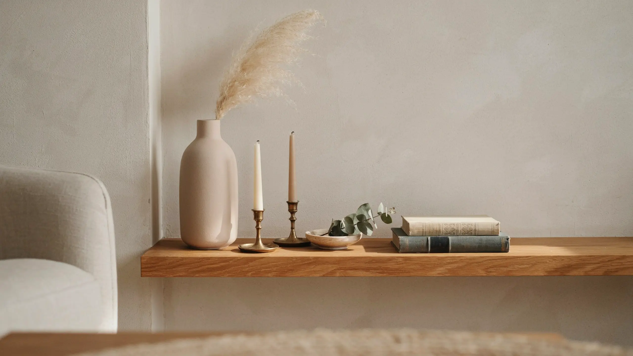
I drove myself a little crazy trying to force every shelf and coffee table vignette into groups of three. If I had two candles and a book, I’d go hunting for a random third object just to hit an odd number, and it usually looked cluttered instead of styled.
The real rule isn’t about counting objects. It’s about varying height, texture, and scale, and leaving some negative space so the eye has somewhere to rest. A pair of matching lamps or two stacked books can anchor a vignette just fine if the rest of the shelf has some asymmetry to balance it.
What I do now
I mix a tall item, a medium item, and something low and let one section of the shelf stay empty on purpose. I stop counting and start looking at whether the shapes and textures feel balanced.
Mistake to avoid
Don’t cram in a random extra object just to hit an odd number. An intentional pair often looks more finished than a forced triangle.
9. Decorate for Resale Value, Not What You Actually Love
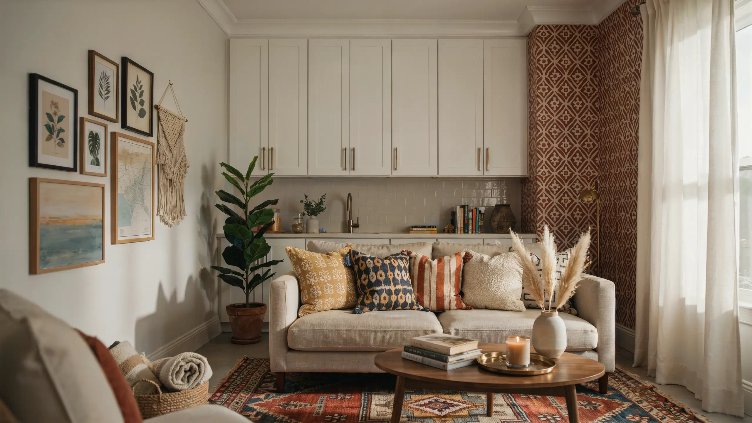
This is the decorating rule I was wrong about the longest. I kept everything safe and neutral for years, greige walls, generic art, nothing with any real personality, because I was told it would help resale value someday.
Most people don’t sell for five, ten, or more years, if they ever sell at all. In the meantime I was living in a home that felt like a hotel room. And most buyers repaint anyway, so the neutral gamble didn’t even pay off the way I expected.
What I do now
I keep the big, expensive, hard-to-change things fairly neutral and timeless: cabinets, tile, major furniture. Everything else, paint, textiles, art, hardware, is where I let personality show, because those are the easiest and cheapest things to change again later if I ever need to. Renters can get the same effect with peel-and-stick wallpaper, removable cabinet hardware, and command hook gallery walls.
Mistake to avoid
Don’t confuse neutral with personality-free. Warm tones, texture, and layered materials can be neutral and still feel like you.
The Rule Worth Remembering
Every decorating rule I was wrong about taught me the same thing in the end. Rules are a decent starting point when you don’t know what you’re doing yet, but they stop being useful the moment you follow them without asking whether they actually fit your space.
Some of these, I was wrong to follow so strictly. One of them, I was wrong to ignore. That’s kind of the point. Test things in your own home before you trust a rule just because it sounds official.
Which of these rules have you already broken, and which one are you still too nervous to try? Tell me in the comments. I want to hear what changed your mind, or what’s stopping you.
The article has been formatted while preserving the original meaning, paragraph order, tone, and wording. Headings have been organized, the “What I do now,” “Mistake to avoid,” and “Safety note” sections have been converted into proper H3 headings, and the “Read Also” section has been presented as a bullet point. No unnecessary content was added or removed.



No Comment! Be the first one.